Have you ever stopped to think about why certain logos make you feel a certain way? Could it be that the colors used in logo design are secretly manipulating your emotions? Well, buckle up, because we’re about to dive into the wild and wacky world of color psychology and its impact on logo design. Grab your preferred color swatch (mine is “sunset vibes”) and let’s embark on this chromatic journey together.
Understanding Color Psychology
Color psychology is a mysterious world full of intrigue and wonder. Have you ever stopped to think about why certain colors make you feel a certain way? Well, fear not my friends, for I am here to enlighten you with the secrets of the rainbow!
Let’s start with everyone’s favorite color – **red**. Did you know that red is associated with power, passion, and fire? It’s like the Taylor Swift of colors – bold, fiery, and always making a statement. When you see red, you can’t help but feel a rush of energy and excitement.
On the other end of the spectrum, we have **blue**. Blue is like that cool, calm, and collected friend who always knows how to bring you back down to earth. It’s associated with tranquility, trust, and peace. So, if you’re feeling stressed or overwhelmed, surround yourself with a sea of blue and let all your worries drift away.
And let’s not forget about **yellow** – the color of sunshine and happiness. Yellow is like a ray of light, bringing warmth and joy wherever it goes. It’s no wonder why we associate yellow with optimism, laughter, and all things bright and beautiful. So, next time you’re feeling down, just add a pop of yellow to your life and watch your mood soar!
The Importance of Color in Logo Design
When it comes to logo design, color plays a crucial role in conveying the right message to your audience. Choosing the right colors can make your logo stand out from the crowd and leave a lasting impression on potential customers.
Colors can evoke different emotions and associations, so it’s important to think carefully about the message you want to convey. For example, red can symbolize passion and energy, while blue conveys trust and reliability. Make sure to choose colors that align with your brand values and target audience.
Not only do colors have psychological effects, but they can also help with brand recognition. Consistency in color usage across your branding materials can help customers quickly identify your brand and distinguish it from competitors. So, don’t be afraid to be bold and experiment with different color combinations to find what works best for your logo.
In conclusion, cannot be overstated. It’s not just about making your logo look pretty – it’s about creating a visual identity that connects with your audience on a deeper level. So, next time you’re designing a logo, remember to think about the power of color and how it can help your brand stand out in a sea of competitors.

How Different Colors Evoke Different Emotions
Have you ever noticed how certain colors make you feel a certain way? It’s like they have magical powers over our emotions. Here’s a rundown of how different colors can evoke different emotions:
Red: This fiery hue is known for evoking passion and power. It can make you feel energized and ready to take on the world. But be careful, too much red can also bring out feelings of anger and aggression. So, maybe skip the red paint for your bedroom walls.
Blue: Ah, the color of tranquility. Blue has a calming effect on the mind and body, making you feel at peace with the world. It’s like a big, cozy hug in color form. Plus, studies have shown that staring at the color blue can actually lower your heart rate. So, go ahead and paint your whole house blue for maximum chill vibes.
Yellow: Bright and cheery, yellow is the color of happiness and positivity. It can instantly lift your mood and make you feel like you’re walking on sunshine. Just be careful not to overdo it, as too much yellow can be overwhelming and even cause feelings of anxiety. A little goes a long way with this sunny hue.

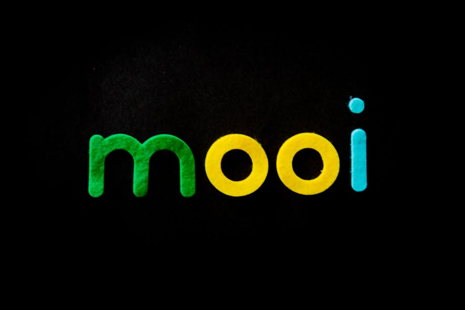
The Role of Color Harmony in Logo Design
When it comes to logo design, color harmony plays a crucial role in capturing the attention of your target audience. It’s like trying to put together a puzzle without all the pieces- you need the right colors to make your logo pop!
Imagine a world where logos are a mishmash of clashing colors that make your eyes hurt just looking at them. That’s what happens when color harmony is ignored. It’s like listening to a band where everyone is playing a different tune- chaotic and confusing.
By using complementary colors in your logo design, you can create a harmonious visual experience that will leave a lasting impression on your audience. It’s like a symphony of colors coming together to create a masterpiece that resonates with your viewers.
So, next time you’re brainstorming logo ideas, remember the importance of color harmony. It’s the secret ingredient that can take your logo from good to great!
![]()
Using Color Contrast to Create Impactful Logos
Who knew that picking the right colors could make or break your logo design? Well, it turns out that color contrast is key to creating an impactful logo that catches the eye and leaves a lasting impression. Here are some tips on how to use color contrast to your advantage:
First off, you want to make sure your logo is easily recognizable and stands out from the crowd. The best way to do this is by using colors that are opposite on the color wheel. Think of it like yin and yang – they contrast each other and create a harmonious balance that draws the viewer in.
Another trick is to use bold and vibrant colors next to each other. This creates a sense of energy and excitement, making your logo pop off the page. Don’t be afraid to experiment with different color combinations – after all, you want your logo to be memorable, not just another boring design.
Remember, the key to a successful logo is to use color contrast strategically. Play around with different hues and shades to see what works best for your brand. And most importantly, have fun with it – after all, nothing grabs attention quite like a well-designed, colorful logo!
The Influence of Color on Brand Perception
Have you ever thought about the impact that color can have on how we perceive brands? It’s more than just choosing your favorite color for a logo; it can actually play a huge role in shaping our opinions without us even realizing it.
Let’s take a closer look at how colors can influence brand perception:
- Red: This bold and energetic color is often associated with excitement and passion. It’s no wonder that many fast-food chains like McDonald’s and KFC use red in their branding to stimulate appetite and drive impulse purchases.
- Blue: A calming and trustworthy color, blue is often used by tech companies like Facebook and IBM to convey stability and reliability. After all, who wouldn’t trust a brand bathed in the soothing hues of the ocean?
But don’t underestimate the power of black and white! While they may seem basic, these colors exude sophistication and timelessness. Brands like Apple and Chanel have built their empires on the simplicity and elegance of black and white.
Implementing Color Psychology in Logo Design for Success
When it comes to logo design, color psychology can play a huge role in the success of your brand. By choosing the right colors, you can evoke specific emotions and reactions from your audience. Here are some tips to help you implement color psychology in your logo design:
- Red: Red is a powerful color that can evoke feelings of excitement, passion, and energy. It’s a great choice for brands that want to make a bold statement.
- Blue: Blue is a calming and trustworthy color that is often associated with stability and professionalism. It’s a popular choice for many corporate logos.
- Yellow: Yellow is a cheerful and optimistic color that can help your brand stand out from the competition. It’s a great choice for brands that want to convey a sense of happiness and positivity.
Remember, the key to successful logo design is to choose colors that not only reflect your brand’s personality, but also resonate with your target audience. So, don’t be afraid to experiment with different color combinations until you find the perfect fit for your brand.
FAQs
Why is color psychology important in logo design?
Well, imagine trying to convey power and authority with a logo that’s bright pink. It just wouldn’t have the same effect, now would it?
How can different colors evoke different emotions?
Think of it this way – red might make you feel hungry (hello, McDonald’s), while blue might make you feel calm and relaxed (perfect for a spa logo).
Can color choices impact brand perception?
Absolutely! Just like wearing a sleek black suit to a job interview gives off a different vibe than showing up in tie-dye, color choices can make or break how a brand is perceived.
Are there any universal color associations to keep in mind when designing a logo?
Yes, indeed! For example, orange is often associated with energy and excitement, while green is typically linked to nature and health.
How should one go about choosing the right colors for a logo?
First, consider what emotions or feelings you want your brand to evoke. Then, do a bit of research on color psychology to see which hues align with those emotions. And voila – you’ve got yourself a snazzy logo!
Color Me Impressed!
Thanks for diving into the colorful world of logo design with us! Remember, the choices you make in your logo’s color palette can have a big impact on how your brand is perceived. Whether you’re feeling blue, seeing red, or feeling green with envy, make sure you choose colors that truly represent your brand and leave a lasting impression on your audience. So go on, paint the town red (or whatever color you choose) with your awesome logo design!


