Embark on a whimsical journey through the wild world of logo design, where client briefs are as clear as mud, feedback is all over the map, and the finished product is a stroke of genius (if we do say so ourselves). Join us as we decode the mysterious process of turning a simple idea into a standout symbol that says, “Hey world, look at me!” So grab your magnifying glass and get ready to uncover the secrets of the logo design journey from start to finish. It’s a rollercoaster ride of creativity, compromise, and a whole lot of coffee. Let’s dive in, shall we
Understanding the Client’s Vision and Objectives
So, you’ve finally landed a new client. Congratulations! But hold on, before you start brainstorming ideas, it’s crucial to understand their vision and objectives. This is like trying to crack a secret code, except it’s not as exciting as a spy movie.
First things first, schedule a meeting with the client to discuss their goals. Remember, no mind reading allowed. Ask all the right questions and take notes like your life depends on it. You don’t want to be caught clueless later on.
Next, it’s time to dig deeper into their vision. Dive into the abyss of their expectations and dreams. It’s like spelunking, but with less danger and more coffee. Make sure you understand every detail, even if it feels like deciphering hieroglyphics.
Lastly, create a plan of action that aligns with their vision. Lay out the roadmap to success – complete with twists, turns, and maybe a few detours. Remember, you’re not just a marketer, you’re a visionary detective on a mission to crack the case and deliver results.
Researching Industry Trends and Competition
When it comes to staying ahead of the game in your industry, knowing the latest trends and keeping an eye on the competition is key. Here are some tips to help you research like a pro:
First things first, get cozy with Google. You’d be surprised what a simple search can reveal. Dive deep into the rabbit hole of industry news, blogs, and forums. You never know what juicy tidbits you might uncover.
Next, don’t be afraid to get your spy on. Check out what your competitors are up to. Stalk their social media, sign up for their newsletters, maybe even hire a private investigator (just kidding, kinda). It’s all fair in love and business, right?
And lastly, don’t underestimate the power of networking. Attend industry events, conferences, and webinars. Rub elbows with the bigwigs and maybe snag some insider info along the way. Who knows, you might even score some free swag!

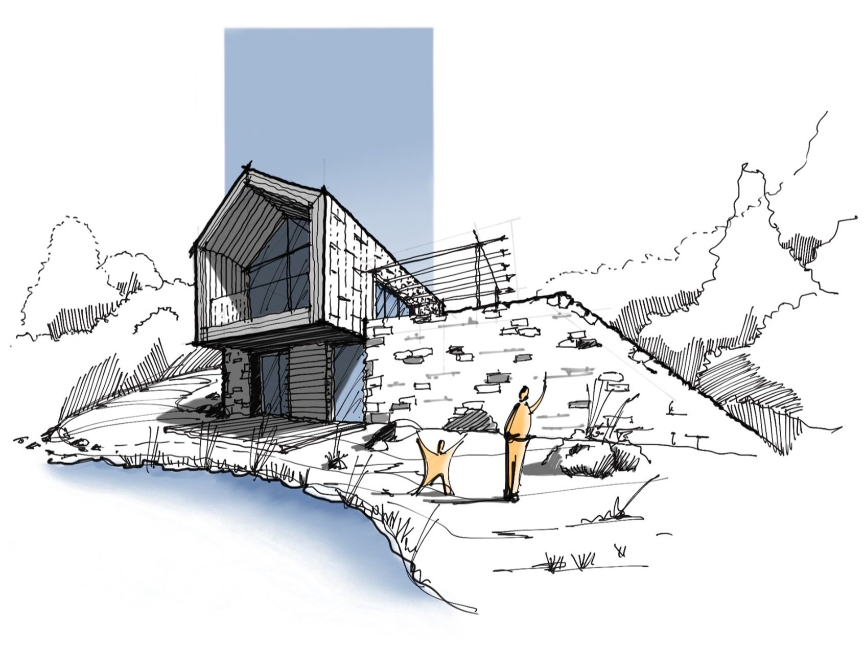
Developing Initial Concepts and Sketches
When it comes to , the creative juices should be flowing like a never-ending waterfall. It’s time to let your imagination run wild and sketch out all those crazy ideas that pop into your head. Think outside the box, or better yet, throw the box out the window and let your mind take you on a journey filled with unicorns and rainbows.
So grab your sketchbook and favorite drawing utensils, whether it be a trusty pencil or a fancy set of markers. Let your hand guide you as you put pen to paper and start turning those abstract thoughts into tangible designs. Remember, there are no bad ideas at this stage – only opportunities for greatness to emerge.
As you delve into this creative process, **bold** words like “what if” and “why not” should become your best friends. Push the boundaries of traditional design and challenge yourself to come up with something truly unique and unexpected. Play around with shapes, colors, and textures until you stumble upon a concept that makes you say, “Yes, this is it!” And don’t be afraid to get a little messy along the way – after all, creativity is a messy business.
Refining Design Elements and Typography
When it comes to , it’s all about adding that extra flair to your work. Think of it as adding a sprinkle of pixie dust to make your design truly magical. So, grab your magic wand (a.k.a. your design software) and let’s get started!
First things first, let’s talk about typography. Fonts are like the spices of design – they can make or break your dish. So, when choosing fonts, think outside the box. Mix and match different typefaces to create a unique and dynamic look. And remember, size matters! Play around with font sizes to create hierarchy and visual interest in your design.
Next up, design elements. Just like a good outfit, your design needs the right accessories to make it pop. Add some pizzazz with bold colors, playful patterns, and eye-catching graphics. Don’t be afraid to experiment – after all, Picasso didn’t stick to stick figures. Layer elements, play with spacing, and just have fun with it!
And last but not least, consistency is key. Just like a good romantic comedy, your design elements and typography should be in perfect harmony. Use a cohesive color palette, stick to a few key typefaces, and make sure your design elements work together like a well-oiled machine. Remember, the devil is in the details – so pay attention to spacing, alignment, and overall balance. And voila! Your design will be ready for its red carpet debut in no time.
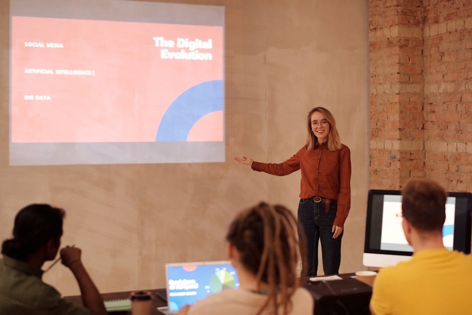
Presenting Drafts and Gather Client Feedback
So, you’ve finally finished putting together those initial drafts that you’ve been toiling away on. Congratulations! It’s time to share your masterpiece with the client and gather their oh-so-valuable feedback. Here are a few tips to help you navigate this crucial stage of the design process:
First things first, make sure you clearly label your drafts with something catchy and enticing. You want your client to be excited to open that email and see what you’ve come up with. Maybe something like “Design Delights: A Sneak Peek Just For You” or “Your Brand, Your Vision: Take a Look!” will do the trick.
When you present your drafts, be sure to highlight the key features and ideas that you want the client to focus on. Use bold text, italics, or even some strategically placed emojis to draw their attention to the most important elements. Remember, you want to guide their feedback in a way that aligns with your design vision.
And finally, don’t forget to ask for specific, actionable feedback. Instead of just asking, “What do you think?” try framing your questions in a way that prompts the client to provide detailed insights. Ask things like, ”How do you feel about the color palette?” or “Do you think the layout effectively communicates your brand’s message?” This will help you gather the feedback you need to refine your drafts and move forward with confidence.
Making Revisions and Finalizing Design
So, you thought you had the perfect design, huh? Well, think again! It’s time to roll up your sleeves, grab a cup of coffee, and dive into the world of . Here are a few tips to help you through the process:
– **Color Palette:** Ah, yes, the world of colors. Make sure your color palette is consistent throughout your design. You don’t want a neon green button clashing with a baby pink background. Trust me, it’s not a good look.
– **Typography:** Fonts, fonts, fonts. Make sure your typography is on point. Choose fonts that are easy to read and complement each other. Comic Sans and Times New Roman might be good on their own, but together? Not so much.
– **Spacing:** Give your design some breathing room. Don’t make everything so cramped that it feels like you’re suffocating. White space is your friend, embrace it.
– **Feedback:** Don’t be afraid to ask for feedback. Your design might be your baby, but sometimes you need an outsider’s perspective to see things you didn’t notice. Plus, two heads are better than one, right
Delivering High-Quality Logo Files to Client
When it comes to delivering high-quality logo files to our clients, we don’t mess around. We make sure that every pixel is perfect, every color is pristine, and every line is flawlessly aligned. We want our clients to feel like they’re getting the royal treatment, even if they’re only receiving a bunch of digital files.
One of the keys to creating top-notch logo files is using the right software and techniques. We’re not just throwing some clipart together and calling it a day. We’re using state-of-the-art design programs and our own creative genius to craft logos that make our clients say, “Wow!” Plus, we always make sure to save our files in the proper formats, whether it’s .ai, .eps, .jpg, .png, or whatever else our clients need.
Another important aspect of delivering high-quality logo files is organization. We don’t want our clients to be sifting through a jumbled mess of files trying to find what they need. That’s why we carefully label and organize everything, making it easy for our clients to locate the files they need quickly and efficiently.
So, when it comes to delivering high-quality logo files to our clients, rest assured that we’ve got everything covered. From the design process to the delivery, we’re here to make sure our clients are blown away by the results. Because when our clients are happy, we’re happy.
FAQs
What should I include in a design brief for my logo?
Include all your hopes and dreams, your deepest desires, your favorite colors, and maybe even a secret message for aliens. Just kidding! Be sure to include your company name, business goals, target audience, preferred colors, and any specific imagery or symbols you want to incorporate.
How long does it typically take to design a logo?
Well, that really depends on how inspired the designer is feeling that day. But on average, the logo design journey can take anywhere from a few days to a few weeks. Just be patient – Rome wasn’t built in a day, and neither was the Nike swoosh.
What should I look for in a designer to create my logo?
Look for someone with a keen eye for design, a wild imagination, and maybe a slightly quirky personality. Bonus points if they also know how to juggle flaming chainsaws while reciting the periodic table backwards. But most importantly, make sure they understand your vision and can bring it to life.
How important is feedback during the design process?
Feedback is like the GPS of the logo design journey – without it, you might end up lost in a sea of bad font choices and mismatched colors. Be sure to communicate openly with your designer and provide constructive criticism. Just remember, they’re fragile creatures with delicate egos, so be gentle.
What should I expect in the final product of my logo design journey?
Expect nothing short of pure logo perfection – a design that captures the essence of your brand, resonates with your target audience, and looks so good that even your grandma wants it tattooed on her forehead. And remember, a great logo is like a fine wine – it only gets better with age (and maybe a little bit of Photoshop).
And there you have it!
Next time you see a logo, remember the wild and wacky journey it went through to get there. From the initial brief to the finished product, it’s been a rollercoaster ride of creativity, revisions, and maybe a few tears (mostly from the designers).
So the next time you spot a logo out in the wild, give it a little salute and nod in appreciation for all the hard work that went into creating it. And maybe even give a little wink to the designers who poured their hearts and souls into bringing it to life.
Until next time, keep decoding those logos and remember, it’s not just a logo - it’s a work of art!


