Have you ever looked at a logo and thought, “What in the world does that even mean?” Well, fear not, dear reader, for we are about to embark on a journey to decode the hidden messages and symbolism behind some of the most iconic logo designs out there. Get ready to uncover the mysteries, solve the puzzles, and maybe even discover some mind-blowing connections you never knew existed. So grab your magnifying glass and prepare to dive into the world of logo secrets – it’s going to be a wild ride!
– The Power of Colors in Logo Designs
When it comes to logo designs, colors play a significant role in conveying a brand’s message and identity. The right combination of colors can evoke emotions, create associations, and leave a lasting impression on consumers. Let’s delve into the fascinating world of color psychology in logo designs!
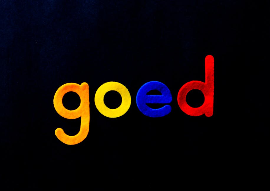
First up, we have red. This fiery hue symbolizes passion, energy, and power. It’s no wonder many food and beverage brands use red in their logos to stimulate appetite and convey a sense of urgency. Think McDonald’s iconic golden arches or Coca-Cola’s bold red script – these logos are hard to miss!
Next, we have blue. This calming color is often associated with trust, stability, and professionalism. That’s why many tech companies, like Facebook and IBM, opt for blue logos to instill confidence in their users. Remember, when in doubt, blue it out!
Now, let’s talk about yellow. This sunny shade symbolizes warmth, optimism, and creativity. Brands like IKEA and Best Buy use yellow in their logos to stand out and create a sense of cheerfulness. So, if you want to inject some sunshine into your brand, why not paint the town yellow?
– Shapes and Their Messages in Logo Symbolism
Shapes play a crucial role in logo symbolism, sending messages to consumers without saying a word. From triangles to circles, each shape conveys a unique meaning that can influence how a brand is perceived. Let’s dive into the fascinating world of shapes and decode their secret messages!
When it comes to logos, **circles** are considered the ultimate shape of perfection and unity. They represent eternity, wholeness, and harmony. So, if you see a circle in a logo, you can bet that the brand is all about balance and completeness. It’s like they’re saying, “We’ve got everything under control, so sit back, relax, and trust us!”
On the flip side, **triangles** are the shape of power and energy. They’re all about strength, progression, and ambition. A logo with a triangle is basically shouting, ”We’re here to conquer the world, one customer at a time! Join us on our epic journey to success!” Who wouldn’t want to be a part of that adventure?
Now, **squares and rectangles** are the stable and reliable shapes of the logo world. They symbolize security, trustworthiness, and organization. If you come across a brand with a square logo, you can rest assured that they’ve got everything neatly lined up and ready to serve you. It’s like walking into a perfectly organized pantry – you know exactly where to find what you need!
- Using Typography to Convey Meaning in Logos
Typography is a powerful tool when it comes to creating logos that convey meaning. By choosing the right fonts, sizes, and styles, you can instantly evoke certain emotions and associations in your audience. Here are some tips on how to use typography to make your logo really pop:
– **Choose fonts that match your brand personality**: Whether you want to come across as serious and professional or fun and quirky, the type of font you use can make a big difference. Imagine using a playful, hand-drawn font for a logo representing a law firm – it just wouldn’t work!
– **Experiment with different sizes and weights**: Playing around with the size and weight of your typography can help emphasize certain words or elements in your logo. Bold, larger text can draw attention to key words, while lighter, smaller text can create a more subtle effect.
– **Consider the spacing between letters**: The spacing between letters, also known as kerning, can greatly impact the readability and overall aesthetic of your logo. Too tight or too loose spacing can make your logo look messy or hard to read, so make sure to find the right balance.
In conclusion, typography is not just about picking a font and slapping it on your logo - it’s about creating a cohesive design that effectively communicates your brand’s identity. So next time you’re designing a logo, remember to think about how typography can help convey meaning and make your logo stand out from the crowd.
– Symbols and Their Cultural Significance in Logo Designs
In the world of logo design, symbols play a crucial role in conveying a brand’s identity and values. From ancient symbols to modern icons, each symbol has its own cultural significance that can greatly impact how a logo is perceived by the public.
Here are some common symbols and their cultural meanings found in logo designs:
- Stars: Stars are often used to symbolize excellence, success, and achievement. They can also represent guidance, as in the North Star, or could simply be a playful nod to the night sky.
- Arrows: Arrows can symbolize direction, movement, and progress. They can also represent protection or defense, as seen in the shield and arrow logo of a well-known delivery company.
- Keys: Keys are often used to symbolize access, secrets, or unlocking potential. They can also represent security, like in the logo of a cybersecurity company.
When designing a logo, it’s important to carefully consider the cultural significance of the symbols you choose to include. A well-chosen symbol can make a logo memorable and impactful, while a poorly chosen one can leave a brand looking lost and confused.

– How Negative Space Can Enhance Logo Symbolism
Negative space in logo design is like the cherry on top of a fabulous logo sundae. It adds that extra oomph that makes a logo go from meh to magnificent. Just like how a magician uses misdirection to create illusions, negative space uses the power of nothingness to create visual tricks that wow the audience.
When negative space is cleverly utilized in logo design, it can enhance the symbolism of the logo in ways you never thought possible. It’s like having a secret weapon up your sleeve, ready to surprise and delight anyone who lays eyes on your logo. It’s the ninja of logo design – stealthy, powerful, and always packing a punch.
Imagine a logo that looks like a simple silhouette of a bird. But wait, if you look closer, you’ll see that the space between the wings forms the shape of a hidden heart. Voila! With the magic of negative space, your logo has instantly transformed into a symbol of love and freedom, ready to tug at the heartstrings of your target audience. It’s symbolism on steroids, baby!
FAQs
Why do companies use symbolism in their logos?
Well, companies use symbolism in their logos because it’s like putting a secret code in plain sight! It’s a sneaky way to convey their values, message, or mission without having to spell it out for you.
Can you give an example of a logo with hidden meanings?
Sure thing! Take a look at the FedEx logo. If you stare at the space between the ”E” and the ”x,” you’ll see an arrow pointing to the right. This symbolizes speed and efficiency in their deliveries. Mind blown, right?
How do designers come up with these hidden meanings?
Designers are basically like secret agents, except instead of saving the world, they’re hiding messages in logos. They brainstorm, sketch, and brainstorm some more until they come up with a design that’s not only visually appealing but also has layers of meaning hidden within.
What’s the most important thing to consider when designing a logo with symbolism?
The most important thing to consider is making sure the symbolism actually makes sense. You don’t want to end up with a logo that looks cool but has a hidden meaning that leaves people scratching their heads. It’s all about finding that perfect balance between style and substance.
Do all logos have hidden meanings?
Not all logos have hidden meanings, but the good ones usually do. Think of it like finding Easter eggs in a video game – it adds an extra layer of fun and intrigue for those who are paying attention.
Unlocking the Mysteries of Logo Designs
Congratulations, you’ve now cracked the code of logo symbolism! The next time you see a logo, you’ll be able to decipher its hidden meanings like a logo detective. Remember, every line, color, and shape is a clue waiting to be unravelled. Keep exploring and digging deeper into the secrets of logo designs, and who knows, maybe you’ll uncover the next big mystery in the world of branding. Stay curious and keep unveiling those symbols!


