Have you ever found yourself feeling blue after seeing a certain logo? Or perhaps seeing red over a particular brand’s color choices? Well, fear not dear reader, for there is a method to this madness! In the world of logo design, color psychology is the unsung hero, working its magic to evoke emotions and shape our perceptions. So grab your rainbow-colored glasses and prepare to delve into the colorful world of logo design and the powerful emotions it can stir up.
The Impact of Color on Consumer Perception
When it comes to shopping, we all know that first impressions are everything. And what’s the first thing that catches our eye? That’s right – color! It’s amazing how a simple change in hue can completely alter our perception of a product.
Imagine walking into a store and seeing a bright red sale sign versus a dull grey one. Which one would grab your attention more? Studies have shown that colors have a huge impact on our emotions and behaviors, so it’s no surprise that businesses spend hours deliberating over the perfect shade of blue for their logo.
So, what do different colors actually say to us consumers? Well, let me break it down for you:
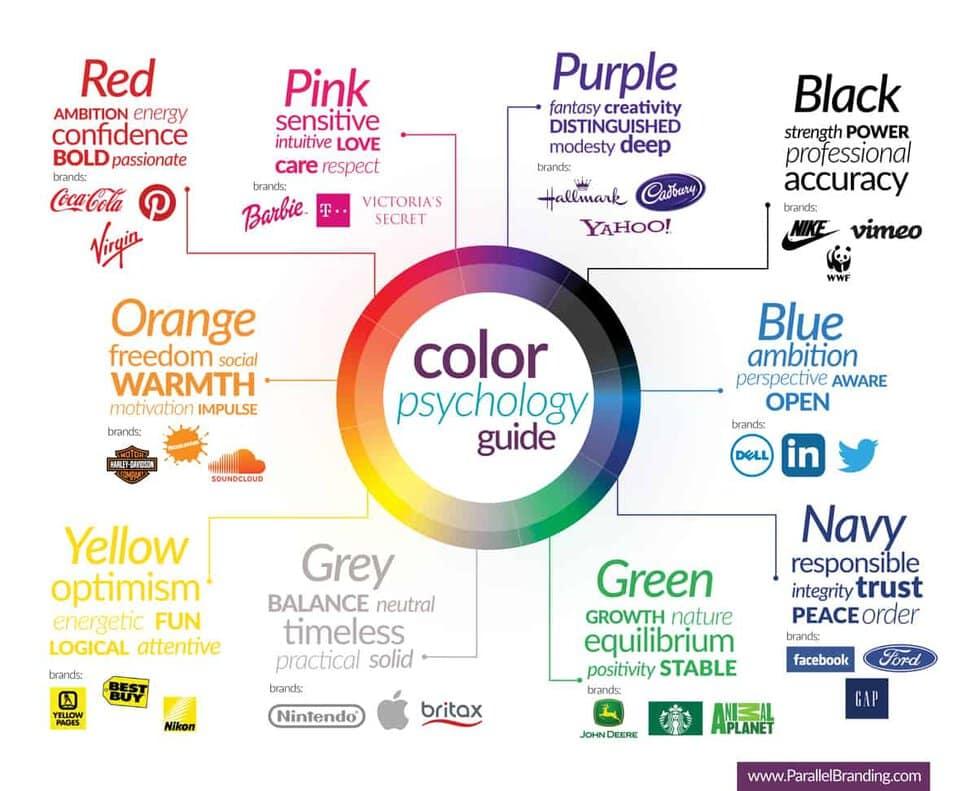
- Red: Excitement, passion, and urgency. That’s why it’s often used in clearance sales or fast-food chains.
- Yellow: Happiness, optimism, and warmth. No wonder it’s a popular choice for children’s products or summer ads.
- Green: Nature, health, and wealth. It’s no wonder eco-friendly brands love to splash this color all over their packaging.

Color Psychology: Understanding How Colors Influence Emotions
Did you know that the color of your surroundings can actually impact your emotions? It’s true – color psychology is a fascinating field that explores how different colors can affect our moods in various ways. Let’s dive into the world of colors and emotions, shall we?
First up, let’s talk about red. This bold and fiery color is often associated with passion, excitement, and energy. It can also evoke feelings of anger and intensity – so beware of painting your walls bright red if you want to keep the peace in your household!
On the other end of the spectrum, we have blue. This calming and cool color is known to promote feelings of tranquility, serenity, and trust. It’s no wonder that many hospitals and medical facilities use shades of blue to create a soothing atmosphere for patients.
And let’s not forget about yellow – the color of happiness and optimism. This cheerful hue is said to boost mood and energy levels, making it a great choice for brightening up a room or adding a pop of color to your wardrobe.

Using Color Theory to Create Powerful Logo Designs
When it comes to creating powerful logo designs, color theory is your secret weapon. By understanding how colors work together and evoke different emotions, you can create logos that truly stand out. Here are some tips to help you harness the power of color theory in your designs:
- Contrast is key: Make sure there is enough contrast between the colors in your logo so that it is easily readable and eye-catching. A bold color paired with a neutral tone can create a striking effect.
- Consider color meanings: Different colors can evoke different emotions and associations. For example, red is often associated with energy and passion, while blue conveys trust and stability. Think about what message you want your logo to communicate and choose colors accordingly.
- Go monochromatic: Sometimes less is more. Using varying shades of the same color in your logo can create a sophisticated and cohesive look. Plus, it’s a great way to keep things simple and impactful.
So next time you’re designing a logo, don’t just pick colors at random. Think about the power of color theory and how it can help you create a logo that truly makes a statement. Remember, a well-designed logo can do wonders for your brand, so why not unleash the power of color and see where it takes you?
Color Associations: How Different Colors Evoke Specific Feelings
In the world of color psychology, different colors have the power to trigger specific emotions and reactions within us. It’s like a secret code that our brains automatically decipher without us even realizing it. Here’s a rundown of some common color associations that might surprise you:
When you think of red, what comes to mind? Danger? Passion? Maybe even that annoying “low battery” notification on your phone? **Red** is often associated with strong emotions like love, anger, and power. It’s a color that demands attention, kind of like that friend who always has to be the center of the party.
On the flip side, **blue** is like the calming presence in the room. It invokes feelings of tranquility, trust, and dependability. Just like how you can always count on your favorite pair of denim jeans to make you feel more put together, blue is a color that brings comfort and stability.
And then there’s **yellow**, the color of sunshine and happiness. It’s like a burst of energy that can lift your spirits and make you feel more optimistic. Yellow is like that friend who’s always down for a spontaneous adventure, ready to bring some brightness into your day.
So next time you’re feeling a certain type of way, take a look at the colors around you. They might just be influencing your mood more than you realize.
Choosing the Right Color Palette for Your Brand Identity
When it comes to choosing the perfect color palette for your brand identity, it’s important to remember that color speaks louder than words, especially when it comes to branding. Here are some tips to help you pick the right colors that will make your brand stand out:
1. Know your audience: Before you start picking colors willy-nilly, think about who your target audience is. Are they young and hip? Sophisticated and classy? Make sure the colors you choose resonate with your audience.
2. Consider color psychology: Each color has its own unique psychological impact. For example, blue is often associated with trust and reliability, while red is known to evoke passion and excitement. Choose colors that align with the message you want to convey.
3. Don’t be afraid to be bold: While it’s important to choose colors that reflect your brand’s personality, don’t be afraid to think outside the box. Sometimes, a bold and unexpected color choice can help your brand stand out from the competition.
The Importance of Consistency in Color Usage for Brand Recognition
In the world of branding, consistency in color usage is absolutely crucial for creating strong brand recognition. Just imagine if McDonald’s golden arches suddenly turned neon pink – you’d be more likely to think you stumbled upon a funky new art installation rather than a fast food joint.
By sticking to a consistent color palette, you’re essentially creating a visual fingerprint for your brand. This makes it easier for consumers to recognize your brand at a glance and fosters trust and familiarity. It’s like having a trusty sidekick that always shows up in the same snazzy costume.
Think of some of the most iconic brands out there – Coca-Cola’s cherry red, Tiffany & Co.’s signature blue, and Starbucks’ comforting green. These brands have nailed down their color schemes so well that you could spot them from a mile away. It’s like playing a never-ending game of “Where’s Waldo?” but with corporate logos instead.
So, whether you’re designing a logo, creating marketing materials, or revamping your website, remember that color consistency is key. Don’t be that brand that’s all over the place like a chicken with its head cut off. Stick to your colors like a loyal dog and watch your brand recognition soar!
FAQs
Why do companies choose specific colors for their logos?
Companies choose specific colors for their logos strategically to evoke emotions and create associations with their brand. It’s like picking a mood ring, but for your business identity.
How do certain colors make people feel?
Different colors can make people feel a variety of emotions. For example, red can evoke feelings of passion and excitement, while blue can give off a sense of trust and calmness. It’s like getting a mood boost from a rainbow.
Can the psychology of color influence consumer behavior?
Absolutely! The psychology of color can influence consumer behavior in many ways. For example, using bright colors might attract attention and make people more likely to purchase, while dull colors might make people feel sleepy and uninterested. It’s like having a secret weapon to hypnotize your customers.
Are there cultural differences in how colors are perceived?
Yes, there are cultural differences in how colors are perceived. For example, in Western cultures, white is associated with purity and weddings, while in Eastern cultures, it can symbolize mourning and funerals. It’s like playing an international game of “Guess the Color.”
What are some common color associations in logo design?
Some common color associations in logo design are red for passion and energy, blue for trust and reliability, and yellow for happiness and positivity. It’s like a color-coded cheat sheet for decoding brand personalities.
How can businesses use the psychology of color to their advantage?
Businesses can use the psychology of color to their advantage by carefully selecting colors that align with their brand values and target audience. It’s like painting your company’s personality in shades of success.
Color Me Impressed
Well, there you have it folks! The secret power behind logo design revealed - it’s all in the colors! So next time you see a logo that makes you feel a certain way, just remember to thank the psychology of color for manipulating your emotions. And hey, if you’re feeling inspired to create your own logo now, just remember to choose your colors wisely. Who knew that a simple color choice could have such a profound impact on our perceptions? It’s enough to make you see red…or green…or blue…or yellow…you get the idea.


