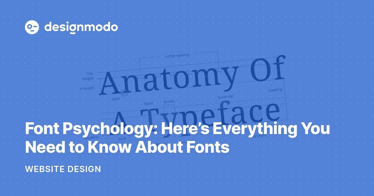
Typography isn’t just choosing between Comic Sans and Papyrus anymore. Oh no, my friend, it’s a serious business. In the world of branding, the power of typography can make or break your entire company. So buckle up, buttercup, because we’re about to take you on a wild ride through the wonderful world of fonts, where every letter counts and every spacing matters. Let’s dive in, shall we
Choosing the Right Font for Your Brand
Alright folks, it’s time to talk about fonts. is crucial – it’s like picking the perfect outfit for a first date. You want to make a good impression, right?
Here are a few tips to help you navigate the wild world of typography:
- Consider your brand personality – Are you a fun and quirky startup? Go for a playful font like Comic Sans (just kidding, please don’t).
- Think about readability – No one likes squinting at tiny, fancy cursive letters. Stick to clean, legible fonts like Arial or Helvetica.
- Don’t be afraid to mix and match - Pairing a bold sans-serif with a delicate script font can create a dynamic visual impact.
Remember, your font choice is a reflection of your brand identity, so choose wisely. And if all else fails, just go with Comic Sans – I hear it’s making a comeback.
The Impact of Typography on Consumer Perception
When it comes to typography, you might think it’s just a bunch of fancy fonts and styles, but in reality, it can have a huge impact on how consumers perceive a brand or product.
Have you ever stopped to think about why you feel more confident in a brand’s professionalism when they use a sleek, sans-serif font rather than a childish, comic-style font? It’s all about how typography communicates the personality and values of a brand.
Imagine walking into a luxury store with signs written in a quirky, mismatched font – it just wouldn’t have the same effect, would it? Typography can elevate a brand from looking amateur to sophisticated in an instant.
With the right typography choices, you can create a cohesive and visually appealing identity that resonates with your target audience. From bold and confident to soft and inviting, the right font can make all the difference in how consumers perceive your brand. So, next time you’re designing a logo or packaging, remember – typography matters!

Typography as a Reflection of Brand Personality
In the wacky world of branding, typography plays a crucial role in reflecting a company’s personality. Just like choosing the right outfit for a first date or deciding whether to go for a firm handshake or a fist bump, selecting the perfect font is a make-or-break decision for any brand looking to make a lasting impression.
Imagine you’re a hip, trendy startup trying to appeal to the cool kids on the block. **Comic Sans** is definitely not going to cut it. You need something sleek and modern like **Helvetica Neue** or maybe even **Gotham** if you’re feeling extra fancy. These fonts scream “I’m hip, I’m happening, I’m the next big thing” without saying a word.
On the flip side, if you’re a traditional, old-school company trying to convey a sense of reliability and trustworthiness, **Times New Roman** might be more up your alley. Sure, it’s a bit boring and overused, but sometimes playing it safe is the best way to go. There’s a reason grandma’s famous chocolate chip cookie recipe never goes out of style.
Of course, there’s always room for a little fun and experimentation. **Papyrus** might be the laughingstock of the font world, but hey, maybe that’s the exact vibe you’re going for. Embrace your inner quirkiness and let your typography reflect your brand’s unique personality. After all, life’s too short for boring fonts. Choose wisely, my friends.
The Role of Typography in Brand Recognition
When it comes to brand recognition, typography plays a crucial role in making sure your audience knows who you are without even having to see your logo. The right font can convey a sense of professionalism, playfulness, or anything in between. Remember, Comic Sans may be fun, but it won’t exactly scream “luxury watch brand” to your customers.
Imagine if the Nike swoosh was replaced with a curly, cursive script. Sure, it might look pretty, but would you still feel the urge to ”Just Do It” as strongly? Probably not. That’s the power of typography in brand recognition – it has the ability to convey a message and evoke emotions without saying a single word.
Think about some of the most recognizable brands in the world - Coca-Cola, McDonald’s, Google. Each of these brands has a distinct font that is instantly associated with their products and services. In fact, studies have shown that people are more likely to remember and trust a brand if it has consistent and well-chosen typography. So, don’t underestimate the impact that a well-designed font can have on your brand’s success.
So, the next time you’re choosing a font for your brand, remember that it’s not just about selecting something that looks pretty. Consider the message you want to convey, the emotions you want to evoke, and how you want your audience to perceive your brand. And hey, if all else fails, you can always fall back on good ol’ Helvetica – it’s a classic for a reason!

Using Typography to Establish Brand Consistency and Cohesion
Typography may seem like a fancy word for choosing fonts, but it plays a crucial role in establishing your brand’s identity and creating a cohesive look across all platforms. Imagine if Coca-Cola suddenly started using Comic Sans for all their marketing materials - chaos would ensue! Here’s how you can use typography to keep your brand on point:
When selecting fonts for your brand, consider choosing 2-3 fonts that complement each other well. **Mixing too many fonts can make your brand look schizophrenic**. Stick with a serif or sans-serif font for your headlines and body copy to maintain consistency throughout your marketing materials. Remember, you want people to recognize your brand by its fonts, not confuse it for a ransom note.
Another way to use typography to establish brand consistency is to create a style guide for your fonts. This guide should include guidelines for font sizes, spacing, and colors to ensure that your brand’s fonts always look sharp and on-brand. **Consistency is key, unless you’re talking about pineapple on pizza**.
Don’t be afraid to get creative with your typography, but make sure it aligns with your brand’s personality and values. **Using a quirky font for a law firm might not convey the level of professionalism that’s needed**. Experiment with different font pairings and sizes to see what works best for your brand. Just remember, **Comic Sans is never the answer**.
FAQs
Why is typography important in branding?
Well, have you ever judged a book by its cover? Same concept! Typography sets the tone, conveys the personality, and attracts the right audience for a brand. So, if you want to make a good first impression, choose your fonts wisely!
How does typography affect brand recognition?
Imagine if McDonald’s suddenly changed its iconic golden arches font to Comic Sans… Chaos would ensue! Consistent use of fonts creates a strong brand identity, making it easier for customers to recognize and remember your brand.
What should be considered when choosing typography for branding purposes?
First and foremost, legibility! No one wants to squint to read your brand name. Also, consider the tone you want to convey – serif fonts for a classic look, sans-serif for modernity, or script fonts for a touch of elegance. Finally, make sure your chosen fonts are scalable and versatile across different mediums.
Can typography alone make a brand successful?
As much as we love fonts, they can’t do all the heavy lifting. Typography is just one piece of the branding puzzle. You still need a strong visual identity, killer marketing strategy, and a product or service worth raving about. But hey, a little typography magic never hurt!
That’s a Wrap!
Well, folks, we’ve reached the end of our journey through the wonderful world of typography in branding. Remember, whether it’s bold and eye-catching or sleek and sophisticated, the power of typography can make or break a brand. So next time you’re designing a logo or creating a marketing campaign, don’t underestimate the impact of choosing the right font. After all, as any font fanatic will tell you, there’s nothing quite like the thrill of discovering the perfect typeface to elevate your brand to new heights. Happy branding!


