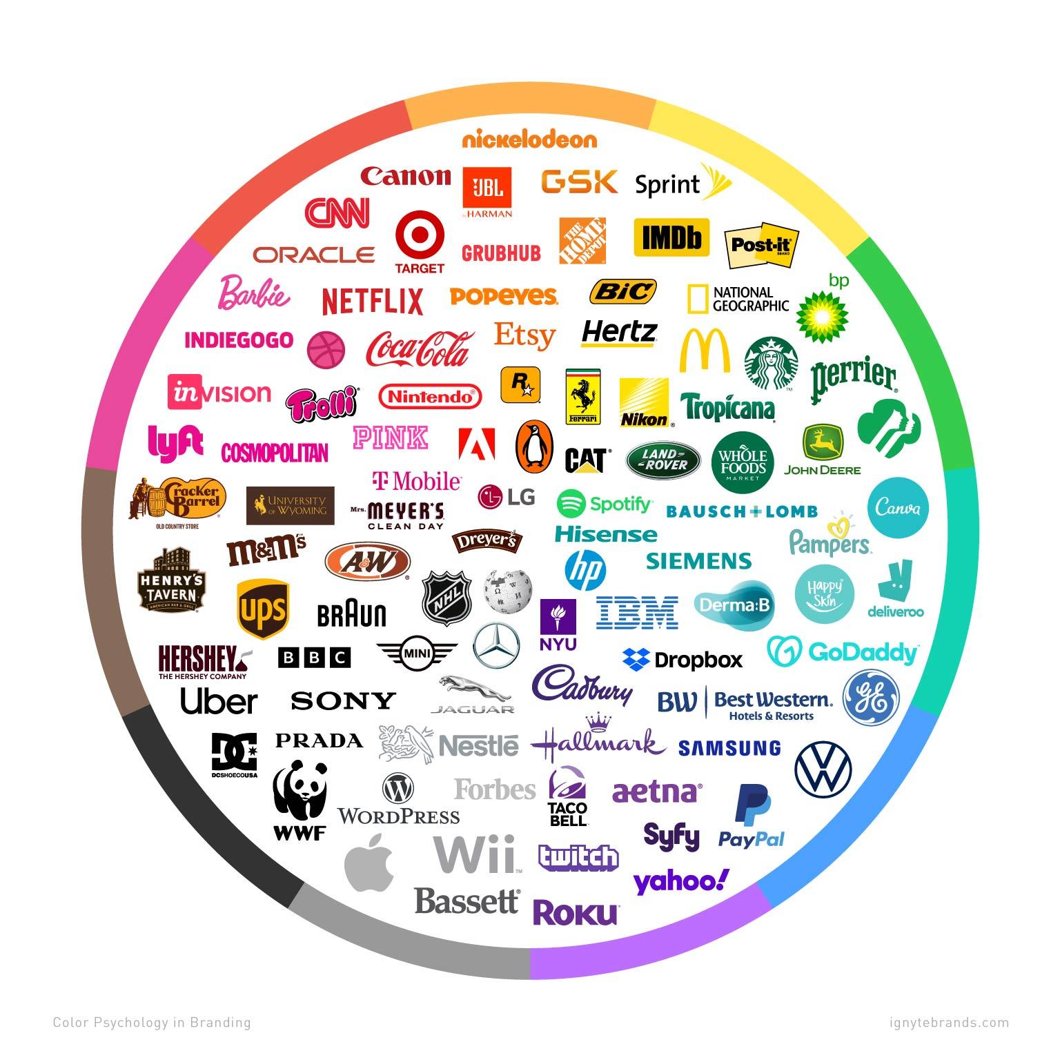
Behold the mystical world of color psychology, where the hues of the power-of-color-creating-logos-with-strategic-hues/” title=”The Power of Color: Creating logos with strategic hues”>rainbow hold more power than you ever imagined. And what better place to witness this sorcery in action than in the realm of logos? That’s right, dear reader, buckle up as we embark on a chromatic adventure to uncover the secrets of how colors can make or break a brand’s image. Get ready to dive headfirst into a kaleidoscope of creativity and discover just how much impact a simple splash of color can have on our subconscious. Let’s paint the town red (or blue, or yellow, or green) with the power of color psychology in logos!
The Importance of Color Psychology in Logo Design
Color psychology plays a crucial role in logo design, as different colors can evoke different emotions and associations in people’s minds. Whether you’re aiming for a professional look or a fun and quirky vibe, choosing the right colors for your logo can make a big impact on how your brand is perceived.
Here are some reasons why color psychology is so important in logo design:
- Brand Identity: The colors you choose for your logo can help establish your brand’s identity and make it easily recognizable to customers.
- Emotional Connection: Colors have the power to evoke emotions, so selecting the right color scheme can help create a strong emotional connection with your audience.
- Stand Out: A well-designed logo with the right colors can help your brand stand out from the competition and attract more attention.
So, the next time you’re designing a logo, don’t just pick your favorite colors or use the ones that look pretty. Take some time to consider the psychological impact of each color and how it aligns with your brand’s values and messaging. Your logo will thank you for it!

Creating Brand Recognition with Strategic Color Choices
When it comes to creating brand recognition, a huge part of the puzzle is choosing the right colors to represent your brand. You can’t just slap any old color on your logo and call it a day – oh no, my friend, it requires a strategic approach! So grab your color wheel and let’s dive in!
First things first, you need to think about what message you want your brand to convey. Are you going for a sophisticated vibe? Maybe stick to sleek blacks and silvers. Want to come off as fun and quirky? Go for a bright, eye-catching color palette. Remember, the colors you choose will be the first thing people associate with your brand, so choose wisely!
Next, consider the psychology of colors. Yes, colors have the power to evoke certain emotions and feelings in people. For example, blue is often associated with trust and reliability, while red can incite feelings of passion and excitement. By understanding the psychology behind different colors, you can choose ones that will resonate with your target audience.
And finally, don’t be afraid to get a little bold and experimental with your color choices. While it’s important to stay true to your brand’s identity, a pop of unexpected color can really make you stand out from the competition. So take some risks, have some fun, and watch as your brand’s recognition skyrockets!

How Different Colors Evoke Specific Emotions in Consumers
In the world of marketing, colors play a crucial role in evoking specific emotions in consumers. Each color has its own unique way of grabbing attention and influencing our feelings. Let’s take a look at how different colors can make us feel:
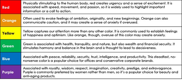
- Red: This fiery color is known for its ability to grab our attention and evoke feelings of passion and excitement. It’s no wonder that many brands use red in their logos to stand out in a crowd!
- Blue: Cool as a cucumber, blue exudes feelings of calmness and trustworthiness. It’s the perfect color for brands looking to establish a sense of reliability and stability.
- Yellow: Bright and cheerful, yellow is the color of sunshine and happiness. It can evoke feelings of joy and optimism, making it a popular choice for brands targeting a younger audience.
It’s important for marketers to consider the emotional impact of colors when designing their branding and packaging. By choosing the right colors, they can subliminally influence consumer behavior and create a lasting impression. So, next time you’re out shopping, pay attention to the colors around you – they might just be playing tricks on your emotions!

The Impact of Color on Consumer Decision-Making
When it comes to consumer decision-making, color plays a crucial role in influencing our choices. Have you ever wondered why you always seem to gravitate towards that bright yellow shirt or that sleek black smartphone? It’s all about the psychology of color and how it affects our emotions and perceptions.
So, what impact does color have on our buying decisions? Let’s break it down:
- Red: This color is known to evoke strong emotions like passion and excitement. That’s why you often see it used in clearance sales or fast food logos to create a sense of urgency.
- Blue: A calming and trustworthy color, blue is often used by tech companies and banks to convey reliability and professionalism.
- Green: Associated with nature and growth, green is often used in organic products to appeal to environmentally conscious consumers.
Remember, the next time you’re faced with a choice between two products, the color of their packaging or branding might just sway your decision without you even realizing it. It’s all part of the colorful world of consumer psychology!

Utilizing Color Symbolism to Build Trust and Credibility
When it comes to building trust and credibility, the strategic use of color symbolism can be your secret weapon. People respond to colors on a deeply psychological level, so why not take advantage of that by incorporating the right hues into your branding?
One way to utilize color symbolism for trust and credibility is to choose colors that are associated with reliability and stability. For example, blue is often seen as a color that inspires trust and competence, making it a great choice for businesses that want to convey professionalism. On the other hand, yellow can convey a sense of optimism and friendliness, which can help to build a more personal connection with your audience.
Another tactic is to use color to create a cohesive and visually appealing brand identity. By choosing a consistent color scheme across all of your marketing materials, website, and social media channels, you can establish a strong and memorable brand presence. This consistency can help to build trust with your audience, as they will come to associate your brand with the positive emotions and qualities that your chosen colors represent.
Remember, the key to successfully using color symbolism to build trust and credibility is to not only choose the right colors, but also to use them in a thoughtful and intentional way. Whether it’s through your logo, website design, or marketing materials, incorporating color strategically can help to create a positive and trustworthy image for your brand.
Strategies for Incorporating Color Psychology in Logo Design
When it comes to incorporating color psychology into logo design, there are a few strategies that can help you create a logo that resonates with your target audience. Here are some tips to help you get started:
- Choose the Right Colors: Different colors evoke different emotions, so it’s important to choose colors that align with the message you want to convey. For example, blue is often associated with trust and professionalism, while red can evoke feelings of excitement and passion.
- Consider Cultural Differences: Keep in mind that the meanings of colors can vary across different cultures. For example, while white is often associated with purity and innocence in Western cultures, it can symbolize death and mourning in some Eastern cultures.
- Use Color Combinations Wisely: Pairing the right colors together can create a visually appealing logo. Complementary colors (those opposite each other on the color wheel) can create a sense of harmony, while analogous colors (those next to each other on the color wheel) can create a sense of unity.
By incorporating color psychology into your logo design, you can create a logo that not only looks great but also resonates with your target audience on a deeper level. So don’t be afraid to get creative with color and experiment with different combinations to see what works best for your brand!
Maximizing the Effectiveness of Your Logo through Thoughtful Color Selections
When it comes to selecting the perfect colors for your logo, it’s important to remember that each color conveys a different message and elicits a particular emotion. To make sure your logo is as effective as possible, here are some tips on choosing the right colors:
- Consider the psychology: Think about what message you want your logo to communicate. For example, if you want to convey trust and reliability, choose blue. If you want to appear energetic and bold, go for red.
- Avoid color overload: While it may be tempting to use every color of the rainbow in your logo, too many colors can actually dilute your message and make your logo appear cluttered. Stick to a maximum of three colors to keep things clear and concise.
- Think about your target audience: Consider who your target demographic is and choose colors that will resonate with them. For example, if you’re targeting a younger audience, bright and vibrant colors may be more appealing, whereas a more mature audience may prefer more muted tones.
Remember, the colors you choose for your logo will have a lasting impact on how your brand is perceived, so choose wisely! By taking the time to consider the psychology of color, avoiding color overload, and thinking about your target audience, you can maximize the effectiveness of your logo and ensure that it leaves a lasting impression on your audience.
FAQs
What role does color psychology play in logo design?
Color psychology plays a huge role in logo design as different colors evoke different emotions and associations. Choosing the right colors can help create a strong brand identity and leave a lasting impression on consumers.
How can the use of warm colors impact a logo?
Warm colors like red, orange, and yellow are known to convey energy, excitement, and passion. Using warm colors in a logo can grab attention and create a sense of urgency or action.
What about cool colors like blue and green?
Cool colors like blue and green are associated with calmness, trust, and stability. They can make a logo feel more relaxing and soothing, perfect for brands that want to establish a sense of reliability and professionalism.
Can the wrong color choice in a logo have negative consequences?
Absolutely! Choosing the wrong colors for a logo can send the wrong message to consumers. For example, using red in a logo for a healthcare company might evoke feelings of danger or alarm, rather than trust and comfort.
How can color psychology be used to target specific demographics?
By understanding how different colors are perceived by different demographics, companies can tailor their logo designs to appeal to specific target audiences. For example, bright, bold colors might attract younger consumers, while muted, pastel colors may appeal to an older demographic.
Don’t be blue, see red, and paint the town green!
Color psychology in logos is no joke – it has the power to make or break a brand. So next time you’re designing a logo, remember to think pink, be bold with gold, and say hello to yellow. And if you’re feeling a little color confused, just remember: orange you glad you read this article? It’s time to brush up on your color psychology and make your logo pop like never before!


