Have you ever wondered why some logos make you crave a chocolate bar or feel oddly comfortable with a telecommunications company? It’s not magic, it’s the power of color in logo psychology! From soothing blues to aggressive reds, colors have a sneaky way of manipulating your subconscious and influencing your mood. So buckle up, because we’re about to take a rainbow-colored trip through the wild and wacky world of logo psychology!
The Role of Color in Logo Design
When it comes to logo design, color plays a crucial role in conveying the right message to your audience. The colors you choose can evoke certain emotions and associations that can help make your brand memorable and identifiable. So, let’s dive into the colorful world of logo design and explore the impact of different hues!
First off, let’s talk about the power of bold, vibrant colors in logo design. These eye-catching hues can grab attention and make a statement. Think of brands like Coca-Cola or McDonald’s – their use of bright reds and yellows instantly catch your eye and make you crave a burger and fries (or a soda, depending on your preference!). So, don’t be afraid to go big and bold with your color choices!
On the flip side, soft, muted colors can also have a powerful impact. These colors can convey a sense of sophistication and elegance, perfect for brands that want to exude a sense of luxury and class. Just think of Tiffany & Co.’s iconic robin’s egg blue – it instantly brings to mind luxury and elegance. So, if you want your brand to exude a sense of refinement, consider going for a more subdued color palette.
Remember, at the end of the day, the key is to choose colors that not only reflect your brand’s personality and values but also resonate with your target audience. So, whether you go for bold and vibrant or soft and subdued, make sure your color choices are intentional and help tell your brand’s story in the most colorful way possible!
Understanding Color Psychology in Marketing
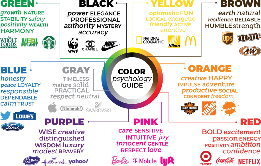
Color psychology plays a huge role in how consumers perceive and interact with marketing materials. By strategically choosing colors, marketers can evoke specific emotions and feelings in their target audience. Here are some key points to consider when utilizing color psychology in your marketing efforts:
- Blue is often associated with trust and security, making it a popular choice for financial institutions and tech companies.
- Red can create a sense of urgency and excitement, which is why it’s commonly used in clearance sales and promotions.
- Green is linked to nature and wellness, making it ideal for eco-friendly and health-conscious brands.
Remember, color perception can vary based on cultural backgrounds and personal experiences, so it’s essential to research your target audience before settling on a color scheme. And don’t be afraid to get creative with your choices – after all, who wouldn’t want their marketing to stand out from the competition like a neon pink elephant in a room full of gray mice?

How Color Influences Consumer Behavior
Did you know that the color of a product can actually influence whether or not a consumer decides to buy it? It’s true! In fact, studies have shown that different colors can evoke different emotions and feelings in people, ultimately affecting their purchasing decisions.
For example, blue is often associated with trust and security, making it a popular choice for financial institutions and tech companies. On the other hand, red can create a sense of urgency and excitement, which is why it’s commonly used in clearance sales and fast food restaurants.
When it comes to packaging, green is often used to convey a sense of health and well-being, making it a popular choice for organic and natural products. And let’s not forget yellow, which is known to grab people’s attention and create a sense of optimism and happiness.
- So, the next time you’re designing a product or packaging, consider the impact that color can have on consumer behavior. Remember, a little splash of color can go a long way in influencing a potential customer’s decision to purchase!
- And who knows, maybe that bright purple packaging will be the key to getting your product flying off the shelves!
The Importance of Choosing the Right Colors for Your Logo
Colors are like spices in a logo design recipe – they can make it pop or leave it tasting bland like unseasoned chicken. You wouldn’t want your logo to be the unseasoned chicken of the business world, would you?
Choosing the right colors for your logo is crucial because it can convey the right message to your audience. Are you a fun, playful brand? Then slap some bright, vibrant colors on that logo! Are you a sophisticated, luxurious brand? Opt for elegant, muted tones that scream “classy.”
On a practical note, colors also evoke certain emotions. Blue is calm and trustworthy, perfect for financial institutions. Red is bold and attention-grabbing, great for grabbing the eye of impulse shoppers. Green is associated with nature and health, ideal for eco-friendly products. So choose your colors wisely, or your logo might as well be screaming “I don’t know what I’m doing!”
Remember, your logo is the face of your brand. And just like you wouldn’t show up to a first date in a mismatched outfit, you shouldn’t present your brand with clashing colors either. So take the time to pick the perfect palette, and let your logo shine brighter than a disco ball at Studio 54!
Creating Emotional Connections Through Color Choices
Choosing the right colors for your brand can make all the difference in creating emotional connections with your audience.
Think of the colors you choose as the characters in a play – each one playing a specific role in evoking feelings and emotions from your audience.
Here are some tips to help you choose the right colors for your brand:
- Consider Your Audience: Are they bold and adventurous or more reserved and traditional? Choosing colors that resonate with your target audience will help create a stronger emotional connection.
- Understand Color Psychology: Different colors have different meanings and can evoke various emotions. For example, red can convey excitement and passion, while blue can evoke trust and reliability.
- Don’t Forget Contrast: Using contrasting colors can help elements stand out and draw attention. Just remember, too much contrast can be overwhelming, so find the right balance.
Utilizing Color to Establish Brand Identity and Recognition
When it comes to establishing brand identity and recognition, color plays a crucial role. It’s not just about picking your favorite shade of blue and calling it a day. No, no, no. Colors have personality, they have meaning, and they can make or break your brand’s image.
Think about it – McDonald’s wouldn’t be the same without those golden arches. And don’t even get me started on Tiffany & Co.’s iconic blue boxes. So, how can you leverage color to make your brand stand out from the crowd?
First off, you need to choose the right colors that reflect your brand’s values and resonate with your target audience. Do some research, see what colors are trending in your industry, and then make it your own. Once you’ve nailed down your color palette, use it consistently across all your branding materials – from your logo to your website to your packaging. Consistency is key, my friends.
Remember, color is more than just a visual cue – it can evoke emotions, trigger memories, and create a lasting impression. So, choose wisely, be bold, and let your brand’s colors do the talking. Who knows, maybe one day you’ll see your brand’s color on a pair of socks or a coffee mug, and you’ll know you’ve made it.
FAQs
Can the color of a logo really impact a customer’s perception of a brand?
Absolutely! Just like how wearing a red shirt might make you feel bold and confident, seeing a red logo can evoke those same feelings in a customer. It’s all about psychology, baby.
What are some common associations people have with different colors?
Oh, there are so many! Blue is often associated with trust and dependability (like your BFF who always has your back), while yellow can bring up feelings of happiness and optimism (like a sunny day at the beach).
Are there any colors that should be avoided in logo design?
Oh, absolutely. Unless you’re a Halloween store, you probably want to steer clear of using too much black and orange together. It might give off some spooky vibes that you’re not exactly going for.
Can using multiple colors in a logo be effective, or is it better to keep it simple?
Hey, sometimes more is more! Using multiple colors can give your logo a vibrant and dynamic feel. Just make sure they all work together harmoniously, like a colorful bouquet of flowers.
How important is it to consider cultural differences when choosing colors for a logo?
It’s crucial, my friend! What might be seen as lucky in one culture could be a major faux pas in another. So be sure to do your research and make sure your color choices resonate with your target audience.
Let Your Logo Shine!
Next time you’re designing a logo, remember the power of color in logo psychology. Choose wisely, and watch as your brand makes a lasting impression on your audience. With the right combination of colors, your logo will stand out from the competition and leave a memorable mark on everyone who sees it. So, go ahead and unleash the power of color in your logo design – the rainbow’s the limit!


