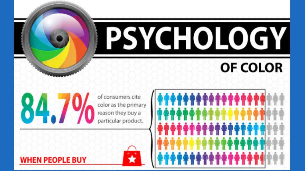
Step aside, black and white logos – there’s a new sheriff in town and its name is COLOR. That’s right, we’re diving headfirst into the world of logo hues and how they hold the key to unlocking the minds of consumers everywhere. So grab your rainbow parachute and get ready to jump into the wild and wacky world of color psychology in branding. It’s going to be a colorful ride!
The Psychology of Color in Logo Design
Ever wondered why fast food chains like McDonald’s and KFC use yellow and red in their logos? Or why many tech companies like Apple and Samsung opt for sleek, minimalist designs with shades of silver and gray? It’s all about !
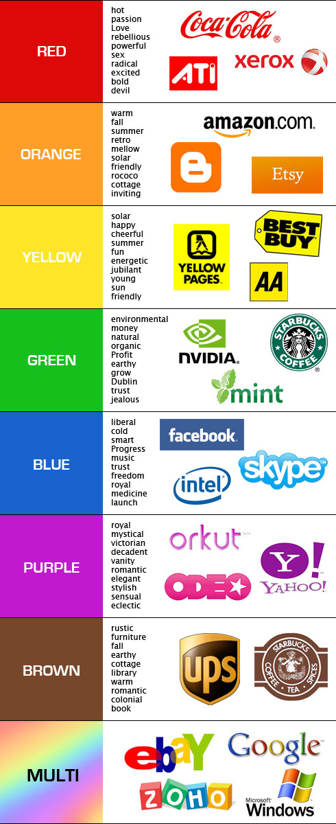
Color plays a crucial role in how we perceive brands and logos. Here’s a breakdown of some common colors and their psychological effects:
- Red: This fiery hue symbolizes energy, passion, and excitement. It can grab attention and create a sense of urgency, making it perfect for brands that want to stand out in a crowded market.
- Blue: A cool and calming color, blue is often associated with trust, reliability, and professionalism. It’s no wonder many banks and financial institutions choose blue for their logos.
- Green: The color of nature and growth, green represents harmony, balance, and freshness. It’s a popular choice for eco-friendly and sustainable brands.
When choosing colors for your logo, it’s essential to consider your target audience and the emotions you want to evoke. Remember, colors speak louder than words, so make sure your logo sends the right message!

The Impact of Red, Blue, and Green Logos on Consumer Behavior
Have you ever stopped to think about the impact that colors have on your decision-making process as a consumer? Well, let me tell you, it’s a lot more than you might think! In fact, studies have shown that the colors red, blue, and green can all play a significant role in influencing consumer behavior.
When it comes to red logos, they are often associated with passion, energy, and urgency. This is why you might notice many fast-food chains and retail stores using red in their logos to create a sense of excitement and stimulate appetite or impulse buying. So, if you find yourself craving a Big Mac or impulse buying that cute sweater you saw in the window, blame it on the power of the color red!
On the other hand, blue logos are often seen as calming, trustworthy, and reliable. This is why many banks, tech companies, and social media platforms use blue in their branding to convey a sense of security and professionalism. So, the next time you feel a sense of calmness while scrolling through your Facebook feed or checking your bank account online, you can thank the color blue for that!
And let’s not forget about green logos, which are often associated with nature, health, and wealth. This is why you might see many eco-friendly brands, organic products, and financial companies using green in their logos to connect with consumers who value sustainability and prosperity. So, if you find yourself feeling a sense of well-being while sipping on a green smoothie or checking your investment portfolio, you can credit the color green for that!

Color Schemes and Brand Perception
Imagine a world where a brand’s colors could speak for themselves. Where a simple glance at a logo could tell you everything you need to know about a company. Well, in a way, that’s exactly what color schemes do! They play a crucial role in shaping brand perception, whether we realize it or not.
Let’s start with the basics – the psychology of colors. We all know that red is bold and attention-grabbing, while blue is calming and trustworthy. But did you know that yellow screams optimism and purple radiates luxury? It’s like each color has its own little personality, just waiting to be unleashed on the world.
Now, let’s talk about some famous examples. Think about McDonald’s – those golden arches practically scream fast food. Or how about Coca-Cola’s iconic red and white? You can practically taste the fizz just by looking at it. And don’t even get me started on Starbucks’ soothing green – you can practically smell the espresso from miles away. It’s like these brands have cracked the code to color psychology, and they’re using it to their advantage.
In the end, it all comes down to one thing – making a lasting impression. So next time you’re choosing a color scheme for your brand, remember to think about the message you want to send. Whether you’re aiming for excitement, trust, or sophistication, the right colors can make all the difference. So go ahead, let your brand’s colors do the talking – they’ve got a lot to say!
Choosing the Right Color for Your Logo
is crucial because colors have a way of influencing people’s emotions and perceptions. Here are some tips to help you select the perfect hue for your brand:
- Consider your target audience. Are they more attracted to vibrant colors or muted tones?
- Think about the message you want to convey. Do you want to exude sophistication with a deep blue, or creativity with a bold purple?
- Pay attention to current color trends, but don’t be afraid to break the rules and go with something unique!
Remember, different colors have different meanings and associations. For example, red can symbolize passion and energy, while green is often associated with growth and nature. Don’t be afraid to get creative and mix and match colors to create a unique and eye-catching logo!
Pro tip: Make sure to test your logo in different color variations to see how it looks in different contexts. It’s always a good idea to get feedback from others to see if your color choice resonates with your target audience.

Utilizing Color Psychology to Enhance Brand Identity
Have you ever noticed how certain colors can make you feel a certain way? No, I’m not talking about that one time you accidentally painted your living room neon green and it gave you a headache. I’m talking about the powerful effect colors can have on our emotions and perceptions. So why not harness that power to enhance your brand identity?
When it comes to color psychology, it’s all about choosing the right hues to evoke the right feelings in your audience. For example, if you want to convey trust and reliability, you might want to consider using blue. If you’re aiming for a bold and energetic vibe, you can’t go wrong with red. And if you want to exude sophistication and luxury, black and gold are your go-to colors.
But it’s not just about picking a color and slapping it on your logo. You also need to consider how different colors work together to create a cohesive brand identity. Think about using complementary colors to make certain elements pop, or using analogous colors for a harmonious look.
So next time you’re designing your brand’s visual identity, don’t just throw some colors together willy-nilly. Be strategic, be intentional, and watch as your audience connects with your brand on a whole new level. Who knew that choosing colors could be so powerful?
The Role of Contrast and Brightness in Logo Design
When it comes to logo design, contrast and brightness play a crucial role in making your brand stand out like a disco ball on a dance floor. These two elements are like the dynamic duo of design, working together to create a visual impact that can’t be ignored.
Imagine your logo as the star of its own show, strutting its stuff on the runway of recognition. Without the right levels of contrast and brightness, your logo might as well be wearing a burlap sack instead of a designer gown. It’s all about catching the eye of your audience and making them say, “Wow, that logo is brighter than my future!”
In the world of logo design, contrast is like the yin to brightness’s yang. They both play off each other to create a harmonious balance that keeps your logo from blending into the background like a wallflower at a party. Think of contrast as the sassy friend who helps highlight all the best features of your logo, while brightness is the flashy accessory that adds that extra pop of personality.
So, the next time you’re designing a logo, remember that contrast and brightness are the secret ingredients to making your brand shine brighter than a disco ball covered in glitter. Embrace the power of these design elements and watch as your logo becomes the talk of the town!
Creating Emotional Connections Through Color Choices
When it comes to , it’s all about tapping into the feelings and moods that different colors evoke. Just like choosing the right wine to pair with your meal, selecting the perfect color palette can set the tone for your design and create a lasting impression on your audience.
Here are a few tips on how to effectively use color to convey emotions:
- Warm vs Cool Colors: Warm colors like reds, yellows, and oranges can evoke feelings of passion, energy, and excitement, while cool colors like blues, greens, and purples can create a sense of calmness, tranquility, and harmony.
- Contrast is Key: Using contrasting colors can create a sense of balance and visual interest in your design. Whether it’s a pop of bold color against a neutral background or complementary colors that work harmoniously together, contrast can help to grab your audience’s attention.
Remember, color is a powerful tool that can not only enhance the aesthetics of your design but also elicit emotional responses from your audience. So next time you’re picking out colors for your project, think about the message you want to convey and choose your palette wisely!
FAQs
Why do companies carefully choose colors for their logos?
Because they’re secretly trying to hypnotize you into buying their products. Just kidding! It’s because colors have a profound impact on our emotions and can influence our perception of a brand.
How does the color blue make consumers feel?
Ah, the color of calm seas and clear skies. Blue is often associated with trust, reliability, and professionalism. So, if a company wants you to think they’ve got it all together, they’ll probably slap some blue in their logo.
Can the color red really make people hungry?
Yes, it’s like a siren call to our taste buds. Red is not only eye-catching but also stimulates our appetite. That’s why so many fast-food chains use it in their logos. Sneaky, right?
What emotions does the color yellow evoke?
Yellow is the color of sunshine and happiness. It can make people feel cheerful, optimistic, and energetic. No wonder it’s often used by brands that want to radiate positivity!
Do different cultures perceive colors differently?
Absolutely! What may be seen as lucky in one culture might be associated with danger in another. So, companies have to be mindful of how colors are perceived globally if they want their logos to be effective across borders.
Color Your World and Your Wallet!
Thanks for diving into the vibrant world of color psychology and how it affects our purchasing decisions. Next time you’re shopping, pay attention to the colors of the logos around you – you might just find yourself reaching for that red soda or green eco-friendly product without even realizing it. Remember, when it comes to marketing, color isn’t just a pretty hue – it’s a powerful tool that can sway your decisions without you even knowing it. So keep your eyes peeled for those sneaky logos and let the colors work their magic on your wallet!


