Have you ever felt an unexplainable urge to design/” title=”Law Firm Logo Design”>logo-design/” title=”Farm Logo Design”>buy something simply because it had a certain color? Or maybe you’ve found yourself drooling over a logo, not because of its design, but because of its irresistible shade of green? Well, my friends, you are not alone. In the wild world of marketing and branding, the power of color is no joke. So buckle up, because we’re about to dive deep into the fascinating world of logo design and how it can hijack your mind faster than you can say “ROYGBIV”.
The Importance of Color Psychology in Logo Design

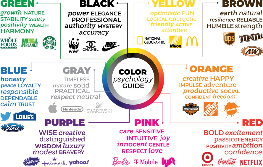
Choosing the right colors for your logo design isn’t just about making it look pretty – it’s about tapping into the subtle power of color psychology. The colors you choose can evoke certain emotions and associations in your audience, making your brand more memorable and impactful. Here’s a breakdown of .
Stand Out: In a sea of bland, boring logos, yours will be the shining star with the perfect color scheme to catch the eye of potential customers. Be bold and bright with your colors to make a statement that says, “Look at me, I’m fabulous!”
Build Trust: People are more likely to trust a brand that uses colors they associate with positivity and reliability. Think about the warm, friendly vibes of yellow or the calm, trustworthy nature of blue. You want your logo to say, “Hey, we’re cool, you can trust us.”
Create a Mood: Colors have the uncanny ability to set the mood for your brand. Want to be seen as luxurious and sophisticated? Go for regal purples and golds. Or maybe you’re more laid-back and fun - in that case, a pop of bright orange or pink could be just what you need. Whatever mood you’re aiming for, let your colors do the talking.
How Different Colors Evoke Specific Emotions in Consumers
Have you ever wondered why certain colors make you feel a certain way when you’re shopping? It’s not just a coincidence – different colors actually have the power to evoke specific emotions in consumers. Let’s dive into the colorful world of consumer psychology!
**Red**: This bold and attention-grabbing color is known to evoke feelings of passion, excitement, and urgency. That’s why you often see it used in clearance sales or fast-food logos. It’s like the color is screaming, “Buy me now!”
**Blue**: On the other end of the spectrum, blue is a cool and calming color that promotes trust, security, and reliability. No wonder you see it used by big tech companies and banks – they want you to feel safe entrusting your money and data to them.
**Yellow**: Ah, the color of sunshine and happiness! Yellow evokes feelings of joy, optimism, and warmth. That’s why you’ll often find it in ads for travel destinations or feel-good products – it’s like a little ray of sunshine in your shopping experience.

The Impact of Color on Brand Perception and Recognition
When it comes to brand perception and recognition, color plays a huge role in how consumers perceive and remember a brand.
Did you know that blue is often associated with trustworthiness and dependability? That’s why tech companies like IBM and social media giants like Facebook use blue in their logos. So next time you see that familiar blue hue, you know you’re in good hands!
On the other hand, green is often associated with health, nature, and wealth. No wonder companies like Whole Foods and Starbucks use green in their branding – they want you to feel healthy, connected to nature, and wealthy while enjoying their products!
And let’s not forget about red – the color of passion and excitement! Brands like Coca-Cola and Target use red to evoke feelings of energy and enthusiasm. So next time you see that bold red logo, get ready for a thrilling shopping experience!

Creating a Memorable Logo through Strategic Use of Color
Color plays a crucial role in creating a captivating logo design that leaves a lasting impression on your audience. By strategically selecting the right colors, you can convey the personality of your brand and evoke specific emotions in your target market. Here are a few tips to help you create a memorable logo through the strategic use of color:
1. Understand Color Psychology: Before diving into the design process, it’s essential to understand the psychological impact of different colors. For example, warm colors like red and orange are associated with passion and energy, while cool colors like blue and green evoke feelings of calmness and tranquility. By using these color associations effectively, you can communicate your brand’s message more effectively.
2. Choose a Dominant Color: Selecting a dominant color for your logo can help establish a strong brand identity. Consider the industry you’re in and the message you want to convey. For example, if you’re in the food industry, using vibrant, appetizing colors like red or yellow can stimulate hunger and capture attention.
3. Create Contrast: Contrast is key to making your logo stand out and grab the viewer’s attention. Incorporating contrasting colors can help highlight specific elements of your design and make it more visually appealing. Experiment with complementary colors to create a striking visual impact that resonates with your audience.

Color Combinations and Their Effects on Consumer Behavior
Ever wondered why some fast-food chains use red and yellow in their logos? Or why luxury brands always seem to stick with black and gold? It all comes down to color psychology and its impact on consumer behavior. So, let’s dive into some of the most popular color combinations and how they influence our shopping habits:
- Red and Yellow: These colors are known to stimulate appetite and increase urgency. That’s why you’ll often see them in fast-food restaurants and clearance sales. It’s like they’re saying, “Hurry up and buy that burger before it’s too late!”
- Blue and White: This combo gives off feelings of trust and calmness. That’s why many tech companies use these colors in their branding. “Trust us, we won’t crash your computer… maybe.”
- Green and Brown: These colors are associated with nature and health. That’s why organic food brands and eco-friendly products love using them. “Buy our granola bars and save the planet… one crunchy bite at a time!”
So, next time you’re out shopping, pay attention to the colors around you. They might just be guiding your purchasing decisions without you even realizing it. Talk about a pretty sneaky sales tactic, huh?
Using Color to Connect with Target Audience and Enhance Brand Identity
So, you want to use color to connect with your target audience and enhance your brand identity, huh? Well, you’re in luck because I’ve got all the tips and tricks you need to create a color scheme that will make your competitors green with envy (pun totally intended).
First things first, you need to think about who your target audience is. Are they young and hip? Older and sophisticated? Once you figure that out, you can start choosing colors that will appeal to them. Remember, different colors evoke different emotions, so choose wisely!
Next, it’s time to pick your main brand color. This will be the color that represents your brand and sets you apart from the competition. Choose a color that reflects the personality of your brand and resonates with your target audience. And hey, if you’re feeling extra bold, why not choose a couple of accent colors to add some variety to your color palette? The more the merrier, right?
Finally, don’t forget to test out your color scheme on different platforms and mediums to make sure it looks just as good on a billboard as it does on a business card. And remember, a little bit of color coordination can go a long way in making your brand stand out in a sea of boring black and white. So go ahead, get creative with color and watch your brand identity shine!
FAQs
How can color impact consumers’ perception of a logo?
Color has the power to evoke certain emotions and associations in the mind of consumers. For example, red can symbolize excitement and passion, while blue can convey trust and reliability. By strategically incorporating certain colors into a logo design, businesses can influence how their brand is perceived.
Can changing the color of a logo impact brand perception?
Absolutely! Think of it like getting a new haircut – a fresh color can completely change the vibe of a logo and how people view a brand. For example, switching from dull grey to vibrant yellow can make a brand seem more energetic and fun.
Why do some companies choose to use a monochromatic logo?
Monochromatic logos can exude a sense of sophistication and simplicity. By sticking to one color, a company can create a sleek and elegant image that appeals to a more refined audience. Plus, it’s a great way to stand out in a sea of bright and flashy logos.
How can contrasting colors be used effectively in logo design?
Contrasting colors can create visual interest and make a logo pop. Combining colors that are opposite on the color wheel, like black and white or red and green, can make a logo stand out and grab the viewer’s attention. Just be sure not to go overboard – you don’t want your logo to look like a rainbow threw up on it!
Are there any cultural considerations to keep in mind when choosing colors for a logo?
Absolutely! Colors can have different meanings in various cultures, so it’s important to do your research before settling on a color scheme. For example, while white may symbolize purity and innocence in Western cultures, it can represent mourning or death in some Eastern cultures. So, unless your target market is actually zombies, you might want to think twice about that all-white logo.
In Conclusion: Let Your Logo Shine Bright
Now that you know the secret power of color in logo design, it’s time to unleash your creativity and let your brand shine bright! Remember, colors have the ability to influence emotions, perceptions, and even purchasing decisions, so choose wisely. Whether you want to convey trust with blue, excitement with red, or sophistication with black, make sure your logo design reflects the personality of your brand. So go ahead, put on your designer hat, and paint the town… colorful!


