In a world where a rainbow can make you smile and a burgundy can make you boil with anger, it’s no surprise that the colors we encounter have a direct line to our emotional center. And when it comes to logo design, those colors aren’t just a pretty hue—they’re emotional masterminds, pulling strings we didn’t even know we had. So buckle up, because we’re about to dive into the captivating world of color psychology and how it can make you fall head over heels for a logo faster than you can say “teal me more!”
The Importance of Color in Logo Design
When it comes to logo design, color plays a vital role in making a lasting impression on your audience. A well-chosen color scheme can evoke certain emotions and convey your brand’s personality effectively. Here are some reasons why color is so essential in logo design:
1. Branding Identity: Color is a crucial part of your branding identity. It helps to differentiate your brand from your competitors and creates a sense of recognition among your target audience. A unique color palette can make your logo instantly memorable and distinguishable.
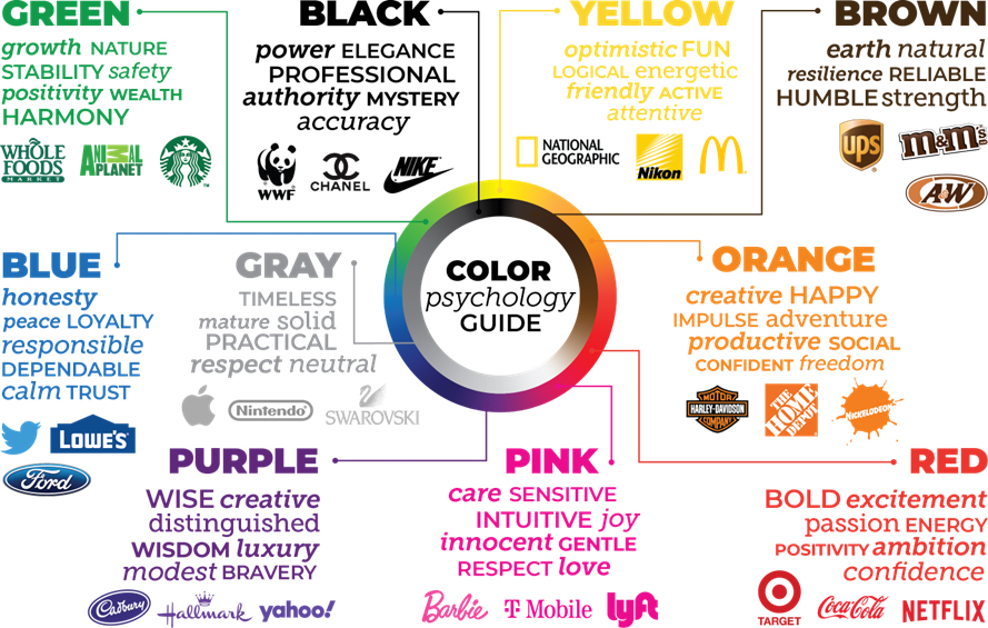
2. Emotional Appeal: Colors have the power to evoke specific emotions and feelings in people. By choosing the right colors for your logo, you can convey the desired message and connect with your audience on a deeper level. For example, warm tones like red and orange can create a sense of excitement and energy, while cool tones like blue and green can evoke feelings of calmness and tranquility.
3. Visibility and Accessibility: Choosing the right colors for your logo is also crucial for its visibility and accessibility. A well-balanced color scheme ensures that your logo is easily recognizable across different platforms and mediums. Additionally, considering color blindness and other visual impairments can help make your logo more inclusive and accessible to a wider audience.
Understanding Color Psychology
Color psychology might sound like something only a bunch of art nerds would care about, but believe it or not, the colors around us can actually have a big impact on our mood and behavior. So strap in, because we’re about to take a deep dive into the wacky world of color theory!
Ever wonder why fast food restaurants always seem to be decked out in shades of red and yellow? It’s not just because they look delicious (although that doesn’t hurt). Red is known to stimulate hunger and increase energy levels, while yellow is associated with happiness and optimism. So next time you’re craving a cheeseburger, you can blame it on the colors!
On the flip side, if you’re feeling stressed out and need to calm down, surrounding yourself with cool colors like blue and green can help. Blue is often seen as a soothing and calming color, while green is associated with balance and harmony. So if you find yourself in need of a little zen, just throw on a blue shirt and head out for a walk in the park.
Of course, everyone’s reaction to colors is a little different, so don’t be afraid to experiment and see what works best for you. Whether you’re trying to rev up your energy levels, calm down after a long day, or just make your living room look a little more stylish, can help you make the most of the colors around you. Happy coloring!

How Different Colors Elicit Different Emotions
Color psychology is a fascinating field that explores how different colors can evoke various emotions and feelings in people. It’s amazing how something as simple as a color can have such a profound impact on our mood and behavior. So let’s dive into the world of colors and see how they can affect our emotions!
**Red**: This fiery hue is known for eliciting feelings of passion, excitement, and energy. It’s no wonder that red is often associated with love and romance – just think about how your heart races when you see a red-hot flame or a vibrant red dress. Red is also said to stimulate appetite, which explains why so many fast food restaurants use it in their branding.
**Blue**: Ah, the calming color of blue. This shade is often linked to feelings of peace, tranquility, and serenity. It’s no surprise that blue is a popular choice for bedrooms and bathrooms, where people go to relax and unwind. Blue is also associated with trust and reliability, which is why many corporations use it in their logos to build credibility with consumers.
**Yellow**: Bright and cheery, yellow is the color of sunshine and happiness. It’s no wonder that yellow is often used to evoke feelings of joy, optimism, and positivity. Just think about how a sunny day can instantly lift your spirits and put a smile on your face – that’s the power of yellow! Yellow is also said to stimulate creativity and innovation, making it a great choice for artists and designers looking to get those creative juices flowing.

Choosing the Right Color Palette for Your Brand
When it comes to , you want to make sure you’re sending the right message to your customers. Here are some tips to help you pick the perfect colors:
- Consider your target audience – think about the age, gender, and interests of your customers. Are they more likely to respond to bright, bold colors or muted, earthy tones?
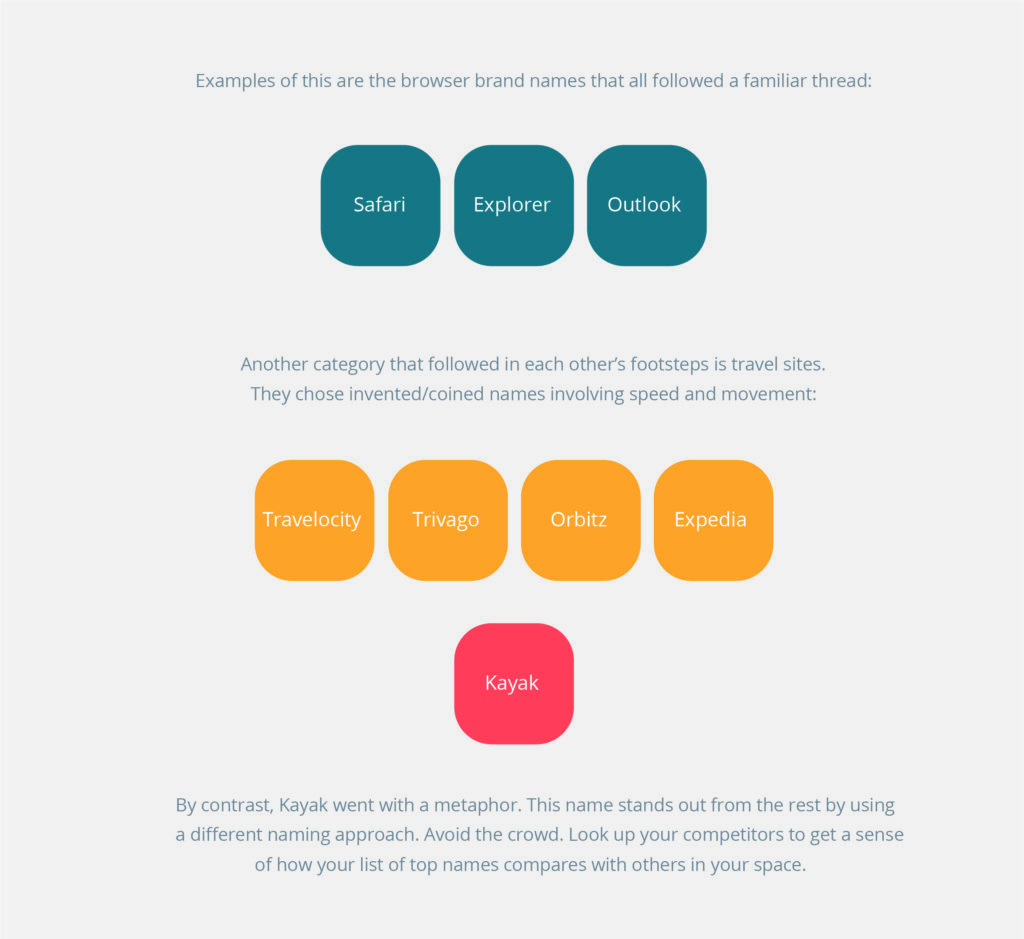
- Research your competition – take a look at what colors other brands in your industry are using. You want to stand out, but not stick out like a sore thumb.
- Get inspired – look to nature, art, fashion, or even your favorite snack foods for color inspiration. Who knows, maybe your brand’s color palette will be inspired by a bag of Doritos!
Remember, colors evoke emotions and can influence how customers perceive your brand. Red can make people hungry (hello, McDonald’s!), while blue is often associated with trust and reliability. So, choose wisely!
Once you’ve settled on a color palette, make sure to use it consistently across all your branding materials – from your logo and website to your social media profiles and packaging. This will help customers recognize your brand and create a sense of cohesion and professionalism.

The Impact of Color on Consumer Behavior
Have you ever noticed how certain colors seem to make you want to buy everything in sight? It’s not just a coincidence – color psychology plays a huge role in consumer behavior. Let’s dive into the colorful world of shopping and see how different hues affect what we buy.
When it comes to influencing consumer behavior, color is a silent but powerful persuader. Here are some ways in which different colors can impact our shopping habits:
- Red: This vibrant color grabs our attention and creates a sense of urgency. That’s why so many sale signs are in red – it makes us want to buy now!
- Blue: Calming and trustworthy, blue is often used by banks and businesses to instill a sense of reliability. It’s no wonder we feel more inclined to spend our money with companies that use this color.
- Yellow: Associated with happiness and optimism, yellow can make us feel more cheerful and impulsive. That’s why you might find yourself buying that bright yellow sweater you never knew you needed.
So the next time you find yourself reaching for that red lipstick or blue tie, remember – it’s not just a color choice, it’s a subconscious decision guided by years of clever marketing tactics. Happy shopping!
Creating a Memorable Brand Identity Through Color Choice
Have you ever noticed how certain colors can make you instantly recognize a brand? It’s all in the power of color choice when it comes to creating a memorable brand identity. Here are some tips on how to use color effectively:
- Choose colors that reflect your brand’s personality. Are you fun and energetic? Perhaps a bright and playful color palette is right for you. Are you a more serious and professional brand? Opt for more subdued and classic colors.
- Consider the psychology of color. Did you know that yellow can convey optimism and happiness, while blue can evoke trust and reliability? By choosing colors that align with the emotions you want to evoke in your audience, you can create a strong brand identity.
When it comes to standing out from the crowd, don’t be afraid to be bold with your color choices. After all, who wants to be just another boring brand in a sea of mediocrity? Use colors that pop and grab attention, making your brand memorable and impossible to ignore.
Remember, consistency is key when it comes to building a strong brand identity. Make sure to use your chosen color palette across all of your branding materials, from your website to your business cards. By creating a cohesive visual identity, you can make a lasting impression on your audience and solidify your brand’s place in their minds.
FAQs
Why do certain colors evoke specific emotions in people?
Well, it all goes back to caveman times when our ancestors had to rely on color cues for survival. If a big red berry made old Grok feel sick, he knew to avoid it next time. Our brains have been hardwired to associate certain colors with certain emotions ever since!
How can businesses use color in their logo design to influence consumer perceptions?
Businesses are like modern-day Jedi using the Force of color to control consumer emotions. By strategically choosing colors that align with their brand message, they can evoke trust, excitement, or even hunger (looking at you, fast food chains).
Can the same color elicit different emotions in different cultures?
Absolutely! Just like how certain gestures can be friendly in one culture and offensive in another (looking at you, thumbs up), colors can have different meanings across different societies. So, make sure to do your global homework before slapping a color on your logo!
What are some commonly used colors in branding and their associated emotions?
Red for passion, power, and hunger (think fiery mama bear protecting her cubs). Blue for trust, peace, and intelligence (like a wise old turtle). Yellow for happiness, energy, and optimism (imagine a fluffy chick frolicking in a sunflower field).
Can using multiple colors in a logo design enhance its emotional impact?
Absolutely! Just like a rainbow is way more awesome than just a single color (sorry, beige), combining colors in a logo can create a whole spectrum of emotions. It’s like mixing potions in a wizard’s cauldron, but less likely to explode.
Color Your World with Emotion!
Thanks for joining us on this colorful journey through the power of logo design and how it can elicit all sorts of emotions. Remember, when it comes to creating a strong brand identity, the colors you choose can play a huge role in how your audience perceives your company. So don’t be blue - get creative with your color choices and watch your logo design work its magic!


