Picture this: you’re walking down the street, minding your own business, when suddenly a logo catches your eye. It’s sleek, it’s bold, it’s… using Comic Sans? We’ve all been there, folks – the wild world of typography trends can make or break a brand’s identity faster than you can say “Papyrus”. Join us as we delve into the impact of these font fiascos on brand identity, and maybe learn a thing or two about the power of good (and bad) typography along the way. Let’s get ready to font-tastic!
Arial vs. Times New Roman: Choosing the Right Font for Your Brand
So, you’re faced with the daunting task of choosing the right font for your brand. Do you go with the classic and elegant Arial or the tried-and-true Times New Roman?
Let’s break it down for you:
- Arial: This font is sleek, modern, and professional. It exudes confidence and sophistication. If you want your brand to appeal to the younger, tech-savvy crowd, Arial is the way to go. Plus, it’s easy to read on screens, making it perfect for digital marketing materials.
- Times New Roman: Ah, the timeless font that screams tradition and stability. If you want your brand to come across as reliable and trustworthy, Times New Roman is your best bet. It’s also great for print materials like business cards and brochures.
Ultimately, the choice between Arial and Times New Roman comes down to your brand’s personality and target audience. So, go forth and font wisely!

The Rise of Minimalist Typography in Modern Branding
Minimalist typography has taken the branding world by storm, sweeping through sleek logos and chic packaging like a minimalist tornado. Gone are the days of overly elaborate fonts and dizzying design elements – simplicity is the name of the game now, baby!
Picture this: a logo with nothing but a single, bold letter, standing tall and proud against a stark white background. It’s so simple, yet so striking. Who knew that less could truly be more?
Brands everywhere are jumping on the minimalist bandwagon, paring down their design elements to the bare essentials. Forget about elaborate patterns and excessive colors – all you need now is a clean font and a whole lot of whitespace.
So embrace the rise of minimalist typography, dear readers. Embrace it like you would a warm hug from a stylish designer. Because in this world of clutter and chaos, sometimes all you need is a simple, bold font to make a statement. Keep it clean, keep it chic, and watch your brand soar to new heights!

Serif or Sans Serif: Understanding the Difference for Brand Identity
When it comes to choosing between serif and sans serif fonts for your brand identity, the decision may seem as daunting as choosing between pizza or tacos for dinner. But fear not! We’re here to break it down for you in a way that even the most tech-challenged grandma can understand.
Think of serif fonts as those fancy little hats that letters wear to a black tie event. These fonts are embellished with little decorative flourishes, or “serifs,” that give them a more traditional and formal appearance. They’re like the James Bond of fonts - sophisticated, classy, and always ready for a martini (shaken, not stirred).
On the other hand, sans serif fonts are like the cool kids who show up to the party in jeans and a t-shirt. They’re sleek, modern, and oh-so-chic. Sans serif fonts don’t have those fancy little hat decorations, making them cleaner and more minimalistic. They’re the Audrey Hepburn of fonts – effortlessly stylish and always in vogue.
So, when it comes to choosing between serif and sans serif for your brand’s identity, consider the message you want to convey. Do you want to exude old-school elegance and tradition, or do you prefer a more contemporary and hip vibe? Whichever you choose, just remember to own it like a boss and watch your brand’s identity soar to new heights!

Custom Typography: How Unique Fonts Can Set Your Brand Apart
Have you ever found yourself scrolling through a website and instantly falling in love with the font they used? Maybe you didn’t even care about the content, you were just mesmerized by the beautiful typography. That’s the power of custom fonts, my friends. They can make or break your branding game.
Imagine this scenario: you walk into a party wearing the same outfit as someone else. Awkward, right? Well, that’s how your brand feels when it’s using the same old boring fonts everyone else is using. Stand out from the crowd with some unique typography that screams “I’m different, I’m special, and I’m here to party!”
Custom fonts give your brand personality. They can convey emotions, set the tone, and create a memorable experience for your audience. Whether you’re going for a whimsical vibe with a curly, handwritten font or a sleek, modern look with a minimalist sans-serif, the possibilities are endless. So why settle for basic Times New Roman when you can have a font that truly reflects who you are as a brand? Time to ditch the boring and embrace the bold (literally, make that font size bigger).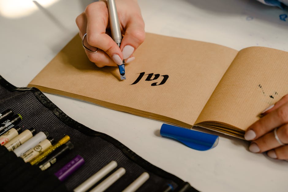
Incorporating Handwritten Fonts for a Personalized Brand Experience
Ever thought about spicing up your brand with a touch of personalization? Look no further than incorporating handwritten fonts! Adding this unique element to your brand can create a fun and engaging experience for your audience.
But wait, you might be wondering, how can handwritten fonts really make a difference? Well, let me tell you, using handwritten fonts can add a human touch to your brand that just can’t be achieved with standard fonts. It’s like giving your brand a virtual hug – who wouldn’t want that?
Picture this: your logo, your website, your packaging – all personalized with a quirky handwritten font. It’s bound to make your brand stand out from the crowd and leave a lasting impression on your customers. Plus, it shows that you put in the extra effort to make your brand feel special. Who doesn’t love a little personal touch?
So, if you’re looking to take your brand to the next level and give it that extra oomph, consider incorporating handwritten fonts. It’s a simple yet effective way to create a personalized brand experience that your audience will love. Trust me, you won’t regret it!
Bold and Eye-Catching: The Impact of Colorful Typography on Branding
Who knew that a splash of color and an unconventional font could make such a big impact on branding? Well, those of us in the know, of course! Forget boring black and white text – colorful typography is where it’s at! Bold, bright, and bursting with personality, colorful typography can take your brand from drab to fab in a heartbeat.
Imagine scrolling through your Instagram feed and coming across a post that stops you dead in your tracks. What is it that caught your eye? A beautifully designed graphic with vibrant, eye-catching typography, that’s what! With just a few clicks of a mouse, you can transform your brand’s image and make a lasting impression on your audience.
So why settle for the same old, same old when you can jazz things up with some colorful typography? Stand out from the crowd, make a statement, and show the world that your brand is anything but boring! Whether you’re designing a logo, creating social media graphics, or revamping your website, don’t be afraid to think outside the box – or in this case, outside the black and white text box!
Embrace the power of colorful typography and watch as your brand’s identity transforms right before your very eyes. Who knows, you might just become the talk of the town – or at least, the talk of your target audience! So go ahead, be bold, be daring, be colorful – your brand will thank you!
FAQs
How can typography trends affect brand identity?
Well, just like your outfit can make or break your first impression on a date, typography trends can seriously impact how people perceive your brand. The type of font you use can convey different emotions and associations, so staying on top of typography trends can help keep your brand looking fresh and relevant.
What are some current typography trends that brands are using?
Oh, where do I begin? Right now, we’re seeing a lot of brands ditching the traditional serif fonts for sleek, modern sans-serif options. Bold and eye-catching typography is also a big hit, as well as using playful and quirky typefaces to inject some fun into their brand image.
Why is it important for brands to keep up with typography trends?
Think of typography trends like the latest dance craze - if you’re still doing the Macarena while everyone else is dabbing, you’re gonna look pretty outdated. Keeping up with typography trends can show that your brand is current, creative, and in touch with what’s happening in the world.
Can using trendy fonts backfire for a brand?
Absolutely! Just like trying to rock a fanny pack in 2021, using a trendy font without considering your brand’s personality and target audience can come off as awkward and forced. It’s important to choose fonts that align with your brand identity and values, rather than just following the latest fad.
How can a brand find the right balance between following trends and staying true to its identity?
It’s like finding the perfect ratio of milk to cereal – you want just the right amount of trendiness to keep things interesting, but not so much that you lose sight of what makes your brand unique. It’s all about understanding your audience, staying true to your brand’s core values, and using trends as seasoning rather than the main course.
In Conclusion: Putting the “Type” in Typography
Whether it’s trendy serifs or minimalist sans-serifs, typography plays a crucial role in shaping a brand’s identity. Just like a well-designed font, a strong brand identity can leave a lasting impression. So next time you’re choosing a font for your brand, remember to kern responsibly and never underestimate the power of a well-placed ligature. Stay type-tastic, my friends!


