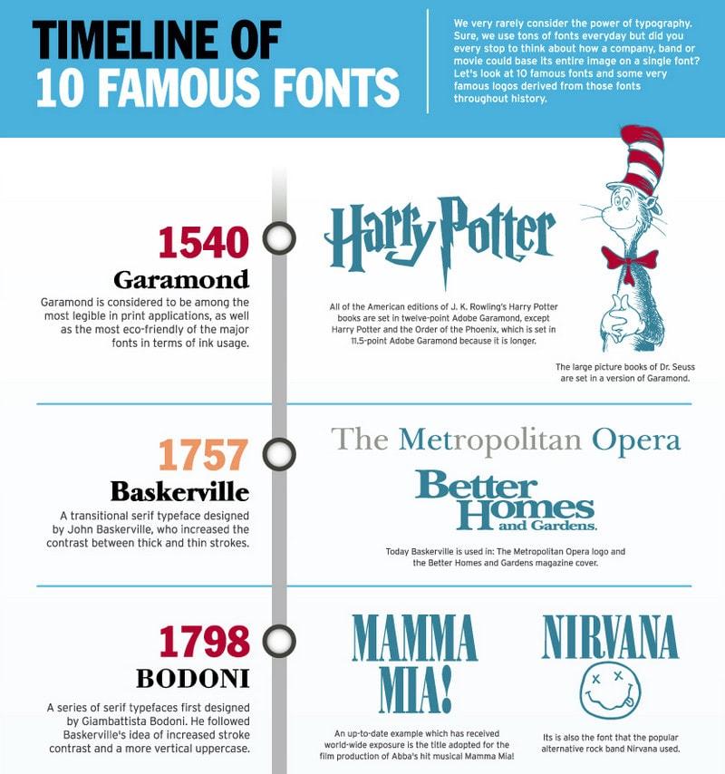
What do fonts and outer space have in common? They both involve an exploration of uncharted territory, a careful balance of elements, and a whole lot of kerning. Yes, we’re talking about the captivating world of typography and space in design. So buckle up, because we’re about to take you on a wild ride through the cosmos of creativity, where every letter matters and every space has a purpose. Get ready to boldly go where no designer has gone before!
Understanding Typography: The Backbone of Design
Typography is like the secret sauce of design. It’s that special something that can take a boring old document and transform it into a work of art. It’s the backbone of design, the unsung hero that holds everything together. Let’s dive into the world of typography and uncover its true power.
When it comes to typography, there’s more than meets the eye. It’s not just about picking a nice font and calling it a day. There are so many elements to consider – from line spacing to font pairing to kerning (yes, that is a real word). It’s like a carefully choreographed dance where every element plays a crucial role in the overall design.
One of the key things to keep in mind when working with typography is hierarchy. This is all about creating visual order and prioritizing information. You don’t want your text to be shouting at each other, like a group of unruly teenagers. Instead, you want them to harmonize and work together like a well-oiled machine.
So next time you’re working on a design project, remember to give typography the attention it deserves. Play around with different fonts, sizes, and styles. Experiment with bold and italics. Embrace the power of typography and watch as your designs take on a whole new life.

Balancing Visual Hierarchy: The Art of Prioritization
When it comes to creating visually appealing designs, mastering the art of prioritization is key. With so many elements vying for attention, finding the right balance is crucial. Here are a few tips to help you navigate the tricky waters of visual hierarchy:
- **Size Matters:** Make sure that the most important elements in your design are the largest. After all, nobody wants to miss out on the big stuff!
- **Color Me Impressed:** Use contrasting colors to help important elements stand out. It’s like giving them a neon sign that says, “Look at me!”
- **Whitespace is Your Friend:** Don’t be afraid to leave some breathing room around key elements. It’s like giving them their own personal space to shine.
Remember, the goal is to guide the viewer’s eye through the design in a way that feels natural and intuitive. So go ahead, channel your inner design guru and start prioritizing like a pro!

Creating a Sense of Harmony: Utilizing White Space
White space, also known as negative space, is the unsung hero of design. It’s like the oxygen in a room – you don’t notice it until it’s gone. Creating a sense of harmony in your designs is all about utilizing white space effectively. Here are some tips to help you achieve that perfect balance:
– **Don’t Be Afraid to Embrace the Blank Space**: White space isn’t wasted space, it’s deliberate breathing room for your design elements to shine. Embrace the emptiness and let your content breathe.
– **Less is More**: Just like how you can’t wear all your clothes at once (unless you want to look like a fashion disaster), don’t clutter your design with too many elements. Simplify, simplify, simplify.
– **Think of White Space as the Maestro of Your Design Orchestra**: It conducts the eye, leads the viewer through your layout, and sets the mood. Without it, your design would be a cacophony of chaos.
Remember, white space is your friend, not your enemy. Use it wisely, and your designs will thank you.
The Power of Alignment: Enhancing Readability and Impact
When it comes to writing, alignment is the unsung hero that can truly make or break your content. Just like a superhero coming to save the day, proper alignment can enhance readability and pack a powerful punch that leaves a lasting impact on your readers.
Imagine reading a paragraph where the text is all over the place – jumping around like a hyperactive squirrel on caffeine. It would be chaos, right? But with the magic of alignment, you can create a smooth and organized flow that guides the reader’s eyes effortlessly from one point to the next.
Think of alignment as the secret weapon in your writing arsenal. Whether it’s aligning text to the left, right, center, or justified – each choice can have a different effect on how your content is perceived. Want to draw attention to a key point? Align it to the center for maximum impact. Need to list out important details? Utilize a clean and crisp left alignment to keep things neat and tidy.
So, next time you sit down to write, don’t underestimate the power of alignment. Embrace it, wield it like a mighty sword, and watch as your words transform into a masterpiece that captivates and dazzles your audience. Trust me, alignment is not just a formatting tool – it’s a literary superpower waiting to be unleashed!

Exploring Contrast: Adding Depth and Dimension to Designs
Have you ever looked at a design and thought, “Hmm, this could use some more oomph?” Well, fear not, dear designer, for we have just the trick to take your creations to the next level. By exploring contrast, you can add depth and dimension that will make your designs pop like never before!
One way to play with contrast is through color. Mix bold, vibrant hues with subtle, muted tones to create a visual feast for the eyes. Think of it as pairing a spicy curry with a cool cucumber raita – surprising, delightful, and oh-so mouthwatering. Embrace the clash of colors and watch as your designs come to life in ways you never thought possible.
Texture is another key player in the game of contrast. Imagine a sleek, shiny surface juxtaposed against a rough, weathered material. It’s like wearing a fancy tuxedo with worn-out sneakers – unexpected, but undeniably cool. Experiment with different textures to add interest and intrigue to your designs.
And let’s not forget about scale. Mix large, bold elements with small, intricate details to create a sense of drama and intrigue. It’s like going to a party where everyone is wearing the same outfit, except you show up in a ball gown made entirely of glitter – talk about making an entrance! So go ahead, play with scale and watch as your designs take on a whole new dimension.
Typography as a Branding Tool: Establishing Identity and Recognition
When it comes to establishing your brand’s identity and recognition, typography plays a crucial role in making a memorable impression on your audience. Good typography is like a well-tailored suit – it shows that you mean business and that you have style.
Choosing the right font can convey a lot about your brand’s personality. Are you fun and quirky? Maybe a playful handwritten font is the way to go. Are you sleek and modern? Opt for a clean, sans-serif font that screams sophistication. The key is to pick a font that not only looks good but also resonates with your target audience.
Consistency is key when using typography as a branding tool. Make sure to use the same font(s) across all your branding materials – from your website to your business cards. This will help create a cohesive and recognizable brand identity that will stick in people’s minds. Remember, you want people to see your font and think, “Oh, that’s so-and-so’s brand!”
Don’t be afraid to play around with typography to make your brand stand out. Mix and match fonts, experiment with colors and sizes, and use bold and italics to emphasize key points. Just remember, while a little creativity can go a long way, be sure not to go overboard and end up with a font mishmash that confuses rather than captivates your audience.
FAQs
What is the importance of typography in design?
Typography is like the Spice Girls of design – it sets the tone, adds character, and can make or break the entire look. Whether it’s sleek and modern or fun and funky, the right font can convey the message loud and clear.
How does space play a role in design?
Think of space in design like a good roommate – it’s all about finding the right balance. Too much and things feel cramped, too little and it’s like a cluttered closet. Just the right amount creates harmony and allows everything to shine.
How can typography and space work together to create effective design?
It’s like a beautifully choreographed dance – typography and space need to work in perfect harmony. The right font with the right amount of breathing room can make a design pop like a Bollywood musical number.
What are some common mistakes to avoid when working with typography and space in design?
Avoid the Comic Sans crime and the Papyrus punishment – stick to more sophisticated fonts and leave the gimmicky ones in the ’90s. And when it comes to space, don’t be a hoarder – make sure there’s enough breathing room so your design isn’t suffocating.
Wrap it up!
And there you have it, folks! The beauty of typography and space in design is like the peanut butter and jelly of the creative world – they just go hand in hand. So next time you’re designing something amazing, don’t forget to play around with fonts, sizes, spacing, and all that good stuff. Trust us, your design will thank you for it! Now go forth and create some design magic! 🎨✨


