Do you ever stop and wonder why the color red makes you crave a Coke, or why seeing purple makes you think of royalty (or perhaps a certain dinosaur-loving children’s show)? Well, my friend, that’s the magic of strategic branding and the power of color in logo design. So grab your rainbow-colored glasses and buckle up, because we’re about to dive deep into the colorful world of branding and discover how to harness the rainbow in your logo design. It’s time to turn your brand from drab to fab with the stroke of a paintbrush…or, you know, a few clicks in Photoshop. Let’s make branding great again, one hue at a time!
Understanding Color Psychology in Branding
Have you ever noticed how certain brands use specific colors to evoke certain emotions in their consumers? It’s not just a coincidence – it’s all part of color psychology in branding!
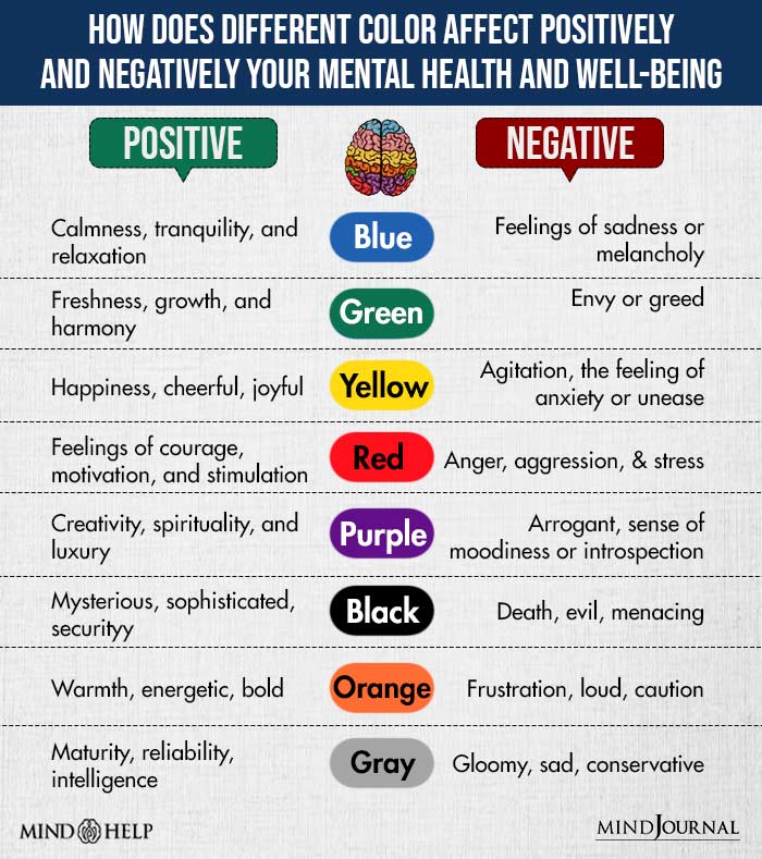
Here’s a breakdown of some common colors and the emotions they can convey:
- Red: Often associated with passion and excitement, red can make consumers feel energized and motivated. It’s no wonder that many fast food chains use red in their logos!
- Blue: Blue is known for its calming and trustworthy qualities. That’s why many financial institutions use blue in their branding – they want you to feel secure when dealing with your finances.
- Yellow: Yellow is bright and cheerful, often associated with happiness and positivity. It’s no wonder that many brands selling products geared towards children use yellow in their logos.
So next time you’re designing a logo or creating a brand identity, keep in mind the power of color psychology. Choose your colors wisely – they could be the key to connecting with your target audience on a deeper level!
The Impact of Color on Consumer Perception
Color plays a crucial role in shaping consumer perception, influencing everything from the mood of a room to the taste of a product. Don’t believe me? Just think about how different you feel when surrounded by soothing blues versus energizing yellows.
In the world of marketing, colors are carefully chosen to evoke specific emotions and associations in consumers. For example:
- Red: Bold and attention-grabbing, often used to convey passion and excitement.
- Green: Associated with nature and health, often used to promote eco-friendly products.
- Black: Symbolizes luxury and sophistication, making it a popular choice for high-end brands.
- Pink: Feminine and playful, often used to market products to women and girls.
But goes beyond just emotional associations. Studies have shown that colors can also affect how we perceive the quality and value of a product. This is why you’ll often see premium brands opting for sleek, minimalist designs in neutral tones, while budget-friendly brands may use brighter colors and bold patterns to convey affordability.
So next time you’re making a purchase decision, take a moment to consider the colors surrounding you. You might be surprised at how much they’re influencing your perceptions without you even realizing it!

Choosing the Right Color Palette for Your Brand
When it comes to choosing the perfect color palette for your brand, you want to make sure you’re not just picking your favorite colors or the ones that are currently trending. You need to think about what each color represents and how it will make your audience feel. Here are a few tips to help you pick the right colors:
- Consider the psychology of color: Different colors evoke different emotions. For example, yellow is often associated with happiness and optimism, while blue is calming and trustworthy. Choose colors that align with the message you want to convey.
- Avoid color clichés: Don’t just go with the same ol’ boring color combinations that every other brand is using. Stand out from the crowd by choosing a unique and unexpected color palette that truly represents your brand.
- Test it out: Before committing to a color palette, test it out on different backgrounds and materials to see how it looks in various contexts. Make sure the colors work well together and are easily readable.
Remember, your brand’s color palette is one of the first things people will notice about your business, so make sure it reflects your personality and values. With the right colors, you can create a strong and memorable brand identity that will set you apart from the competition. So go ahead, get creative with your color choices and watch your brand come to life!

Creating Emotional Connections Through Color
When it comes to , there are a few key things to keep in mind. First and foremost, consider the impact of color on our subconscious minds. Different colors can evoke different emotions, so it’s important to choose wisely when trying to make a connection with your audience.
One way to do this is by utilizing a color scheme that resonates with your target demographic. For example, if you’re targeting a younger audience, you might want to use bright, playful colors like **bright pink and turquoise** to evoke feelings of happiness and excitement. On the other hand, if you’re targeting an older demographic, more muted tones like **soft pastels or earthy tones** might be more appropriate.
Another important factor to consider is the cultural significance of color. Different cultures associate different emotions with certain colors, so it’s crucial to do your research and make sure you’re not inadvertently sending the wrong message. For example, in Western cultures, **white** is often associated with purity and innocence, while in some Eastern cultures, it symbolizes mourning and death.
By carefully selecting and incorporating colors that resonate with your audience and taking into account cultural differences, you can create powerful emotional connections that will leave a lasting impact. So next time you’re designing a project, don’t underestimate the power of color!

Strategies for Incorporating Color into Logo Design
When it comes to incorporating color into logo design, you want to make sure you choose a palette that not only looks good, but also conveys the right message about your brand. Here are some strategies to help you do just that:
- Start with the basics: Before you start mixing and matching colors, make sure you understand the basics of color theory. This will help you create a cohesive and visually appealing design that resonates with your target audience.
- Consider your audience: Think about who your target audience is and what colors are likely to appeal to them. For example, if you’re targeting a younger demographic, bold and bright colors may be more effective than muted tones.
- Keep it simple: While it can be tempting to incorporate a rainbow of colors into your logo, sometimes less is more. Stick to a few key colors that complement each other and avoid overwhelming your design with too many competing hues.
By following these strategies, you can create a logo that not only stands out, but also effectively communicates the essence of your brand through color.
Maximizing Brand Recognition Through Color Choices
When it comes to maximizing brand recognition, color choices play a crucial role. It’s not just about picking your favorite color or the latest trend, but rather selecting hues that resonate with your target audience and evoke the emotions you want associated with your brand.
Here are a few tips to help you make the most of your color choices:
- Know your audience: Understanding who your target demographic is can help you choose colors that will appeal to them. For example, if you’re targeting a younger audience, bright and bold colors may be more effective. On the other hand, if your audience is more conservative, sticking to classic tones like navy blue or forest green might be a better bet.
- Be consistent: Once you’ve chosen your brand colors, make sure to use them consistently across all platforms. This includes your website, social media profiles, packaging, and any other marketing materials. Consistency is key to building brand recognition and establishing trust with your audience.
- Consider the psychology of color: Different colors can evoke different emotions and associations. For example, red is often associated with passion and energy, while blue is seen as calming and trustworthy. Think about what message you want to convey and choose colors that align with that message.
By taking the time to carefully select and use your brand colors, you can create a cohesive and memorable brand identity that resonates with your audience and helps you stand out from the competition.
FAQs
Why is color so important in logo design?
Because colors have magical powers! Just kidding. But seriously, colors evoke emotions and can influence how customers perceive a brand. Choosing the right colors can help communicate the brand’s values and personality.
How can I choose the right colors for my brand?
First, you need to understand the psychology of colors. Are you a bold, passionate brand? Go for red! A calming, trustworthy brand? Blue is your color! Also, consider your target audience and what colors resonate with them.
Can I use multiple colors in my logo design?
Absolutely! Just make sure the colors complement each other and don’t overwhelm the design. Think of it like cooking – you don’t want to throw every spice in the cabinet into a dish, right?
What if I want to stand out by using unconventional colors?
Go for it! But be mindful of what message you’re trying to convey. Using unconventional colors can be a great way to differentiate yourself from competitors, but make sure it aligns with your brand’s identity.
Should I consider cultural meanings of colors when designing a logo?
Absolutely! Colors can have different meanings in different cultures. For example, white symbolizes purity in Western cultures, but death in some Eastern cultures. So make sure your choice of colors doesn’t unintentionally offend anyone!
Branding Brilliance: Color Your World
Congratulations, you’ve reached the end of our colorful journey through the world of strategic branding! Remember, when it comes to logo design, the power of color cannot be underestimated. So go forth, embrace your inner design guru, and paint the town red (or blue, or green…you get the idea). Stay creative, stay vibrant, and most importantly, stay on brand! Good luck, brave brand warriors!


