Are you tired of your outdated logo looking more like a relic from the Stone Age than a modern representation of your brand? Well, fear not, fellow logo warriors! It’s time to dust off those design skills and embark on a logo evolution journey that would make Darwin proud. In this article, we’ll explore expert strategies for revamping your logo design and unleashing a brand transformation that will have your competitors shaking in their boots. So grab your design tools and get ready to let your logo soar to new heights!
Top Signs That It’s Time for a Logo Redesign
Is your logo in need of a facelift? Here are some tell-tale signs that it’s time to hit redesign on that outdated logo:
- Your logo looks like it was designed in the ’90s – if your logo is rocking gradient colors, drop shadows, and lots of beveling and embossing, it might be time to bring it into the 21st century.
- Your logo doesn’t scale well – if your logo looks great on your business card but turns into a pixelated mess when blown up for a billboard, it’s time for a new design.
- Your logo no longer reflects your brand – if your business has evolved and grown but your logo is stuck in the past, it’s definitely time for a refresh.
Remember, your logo is the face of your brand – make sure it’s sending the right message to your customers! Don’t be afraid to shake things up and give your logo the makeover it deserves.
Identifying Your Brand’s Core Values and Messaging
When it comes to , think about what makes your brand stand out from the rest. Is it your dedication to using only sustainable materials? Or maybe it’s your commitment to providing top-notch customer service. Whatever it is, make sure to highlight these values in all of your branding efforts.
One way to figure out your brand’s core values is to sit down with your team and brainstorm. Write down all of the words and phrases that come to mind when you think about your brand. Remember, there are no wrong answers here – unless someone suggests using Comic Sans as your official font, in which case, feel free to laugh them out of the room.
Once you’ve identified your core values, it’s time to think about how you want to communicate them to your audience. Do you want to go for a more serious, professional tone? Or maybe you’d prefer to keep it light and fun. Whatever you decide, make sure your messaging is consistent across all platforms, from your website to your social media accounts.
Remember, your core values are what set you apart from the competition, so don’t be afraid to shout them from the rooftops. Well, maybe not literally – that could get you in trouble with the neighbors. But you get the idea. Be proud of what your brand stands for and let that shine through in everything you do.

Utilizing Color Psychology to Enhance Brand Perception
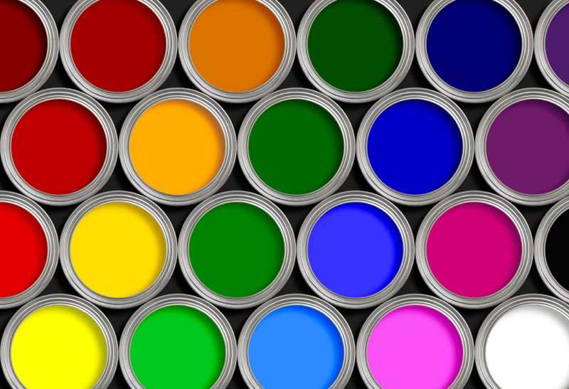
Are you tired of your brand being perceived as bland and forgettable? It’s time to spice things up with a little color psychology! By strategically selecting colors that resonate with your target audience, you can enhance brand perception and leave a lasting impression.
When choosing colors for your brand, consider the following:
- Red: This fiery hue is associated with passion, energy, and excitement. Perfect for brands looking to make a bold statement and stand out from the competition.
- Blue: A calming and trustworthy color that instills a sense of security. Ideal for brands in the finance or healthcare industry.
- Yellow: Bright and cheerful, yellow is often used to convey happiness and optimism. Great for brands targeting a younger demographic.
By incorporating the right colors into your branding materials, you can create a powerful emotional connection with your audience and build a strong brand identity. So go ahead, unleash the power of color psychology and watch your brand perception soar!

Incorporating Modern Design Trends for a Timeless Logo
When it comes to designing a logo that stands the test of time, you’ll want to incorporate modern design trends that won’t go out of style faster than last year’s avocado toast. Here are some tips to keep your logo fresh, yet timeless:
- Keep it simple, silly! A cluttered logo will only confuse your audience and make your brand look like a mess. Opt for clean, minimalistic designs that are easy on the eyes.
- Think outside the box, but not too far outside. You want your logo to be unique and memorable, but not so trendy that it becomes outdated in a matter of months. Strike a balance between modern and classic elements.
- Play with colors, but don’t go overboard. Choose a color scheme that reflects your brand’s personality while still remaining versatile across various mediums.
Remember, a timeless logo is like a fine wine – it only gets better with age. By incorporating modern design trends in a thoughtful and strategic way, you can create a logo that will withstand the test of time and keep your brand looking fresh for years to come.

Collaborating with Professional Designers for a Seamless Brand Evolution
Ever tried to design a logo and ended up with something that resembled a potato more than your brand identity? We’ve all been there. That’s why collaborating with professional designers is crucial for a seamless brand evolution. These talented individuals not only have the skills to make your brand look good, but they also have the experience to ensure that every design decision serves a purpose.
When you work with professional designers, you’re not just getting someone to slap a logo on your business card and call it a day. You’re getting a partner in crime who will help you navigate the murky waters of branding. From choosing the right color palette to creating a killer website, these designers will be with you every step of the way.
Not convinced yet? How about this: professional designers have a knack for turning your vague ideas into stunning visuals that’ll make your competition green with envy. They know how to take your brand’s essence and translate it into something that speaks to your audience on a whole new level. Plus, they can make your brand look so good that you’ll want to put it on a billboard and shout, “Look at me, I’ve made it!”
So, if you’re tired of dealing with design disasters and want to take your brand to the next level, it’s time to collaborate with professional designers. Trust us, your brand will thank you for it!
Implementing Consistent Branding Across All Platforms and Marketing Materials
Are you tired of seeing your brand’s logo stretched, squished, and distorted on various marketing materials? It’s time to implement consistent branding across all platforms to avoid this branding nightmare. But fear not, we’ve got some tips and tricks to help you maintain brand integrity no matter where your logo lands.
First things first, make sure your logo is always displayed in its original proportions. No more Franken-logos with elongated or shortened elements! Keep that logo looking sharp and recognizable on every platform.
Use the same color palette across all materials to ensure visual consistency. No more teal on your website, turquoise on social media, and aquamarine on your business cards. Stick to your brand colors like your life depends on it!
Don’t forget about typography! Use the same fonts throughout your marketing materials to maintain a cohesive look. Say no to Comic Sans on your website and Times New Roman on your flyers. Consistency is key, people!
FAQs
Why should a company consider revamping their logo design?
Companies should consider revamping their logo design to keep up with changing trends, stay ahead of their competitors, and reflect any changes in their brand identity. Plus, who doesn’t love a good makeover?
How can a company ensure their new logo design still resonates with their audience?
To ensure their new logo design resonates with their audience, a company should conduct thorough market research, gather feedback from customers, and maybe even consult with a psychic. You never know what insights they might have!
What are some key strategies for a successful brand evolution through logo design?
Key strategies for a successful brand evolution through logo design include staying true to your brand values, creating a logo that is versatile and scalable, and adding a secret subliminal message that hypnotizes customers into buying your products. Just kidding…or am I?
How can a company make sure their new logo design is memorable and stands out?
To make sure their new logo design is memorable and stands out, a company should focus on simplicity, use bold and unique colors, and maybe even hire a celebrity to endorse it. Who wouldn’t want to buy a product that Beyoncé approves of?
What are some common mistakes companies make when revamping their logo design?
Some common mistakes companies make when revamping their logo design include following trends too closely, not considering the longevity of the design, and accidentally turning their logo into a meme. Oops, better luck next time!
Ready to give your brand a whole new look?
So there you have it - some expert strategies to help revamp your logo design and breathe new life into your brand. Remember, a logo is like a first date – you want to make a great first impression! Take these tips, get creative, and watch your brand evolution take flight. Good luck, and may your new logo design be as fabulous as you are!


