Welcome to the wild and wonderful world of branding and logo design synergy – where magic happens and dreams come true! Just imagine a world where your brand identity shines brighter than a disco ball at Studio 54, and your logo is so iconic that people tattoo it on their bodies (hopefully not in regret). Yes, my friends, we are talking about mastering the art of branding and logo design synergy, where creativity meets strategy, and brilliance is born. So buckle up, grab your design tools, and get ready to embark on a journey to branding greatness like never before!
Understanding the Importance of Branding
So, you think branding is just slapping your logo on things and calling it a day? Think again! Here’s why branding is the bread and butter of any successful business:
First off, **branding sets you apart** from the sea of competition out there. It’s like showing up to a fancy party in a killer outfit while everyone else is wearing sweatpants. People notice you, remember you, and want to be friends with you (aka buy your products).
Secondly, **branding builds trust**. Just like how you trust your best friend to always have your back, consumers trust brands that are consistent, reliable, and deliver on their promises. Be that ride-or-die brand that your customers can always count on!
And let’s not forget about **brand loyalty**. When customers love your brand so much that they wouldn’t dream of swiping right on a competitor, you know you’ve hit the branding jackpot. Make them feel like they’re part of an exclusive club, and they’ll keep coming back for more.
The Role of Logo Design in Creating Brand Identity
Did you know that a well-designed logo can make or break a brand identity? It’s like the cherry on top of a sundae – it adds that extra special touch that makes everything look just right. Without a logo, a brand is like a ship without a sail, lost in a sea of competition.
A logo is more than just a pretty picture – it’s the face of a brand. It’s the first thing people see when they come across a company, and it’s what they remember long after they’ve left. A logo should be unique, memorable, and easily recognizable. It’s like a signature – it should stand out and leave a lasting impression.
Think of some of the most iconic logos out there – the golden arches of McDonald’s, the swoosh of Nike, the apple of, well, Apple. These logos are simple, yet powerful. They convey a sense of trust, reliability, and quality. They’re like old friends that we instantly recognize and feel comfortable with.
So, the next time you’re thinking about creating a brand identity, don’t underestimate the power of a logo. Put some thought into it, get creative, and don’t be afraid to think outside the box. After all, a great logo can turn a brand from a nobody into a household name faster than you can say “brand identity”.

Key Elements of an Effective Logo
When it comes to creating an effective logo, there are a few key elements that you should always keep in mind. Without these elements, your logo might as well be a stick figure with a poorly drawn smiley face. So let’s dive in and explore what makes a logo stand out from the crowd.
First and foremost, your logo should be simple. A complicated logo with too many elements is like a messy closet – nobody wants to deal with that. Keep it simple so that people can easily recognize and remember your brand. Think of it like a superhero costume – bold, distinct, and instantly recognizable.
Next up, your logo should be memorable. You don’t want your logo to be forgettable like that one time you forgot your keys in the fridge. Make sure it’s unique and eye-catching so that people will remember it long after they’ve seen it. Think of it like a catchy one-hit wonder song - once it’s stuck in your head, there’s no getting it out.
Lastly, don’t forget about relevancy. Your logo should reflect your brand’s personality and values. If your logo doesn’t match your brand, it’s like wearing a tutu to a business meeting – it just doesn’t make sense. Make sure your logo represents who you are and what you stand for. Think of it like a mirror – it should reflect the essence of your brand perfectly.

How to Align Branding and Logo Design
Let’s face it, matching your branding with your logo design can be as tricky as pairing wine with cheese. But fear not, we’re here to help you navigate this treacherous territory with style and a touch of humor!
First things first, make sure your logo design reflects the personality of your brand. If your brand is playful and quirky, don’t be afraid to show it in your design! Think bright colors, unique fonts, and perhaps a sprinkle of whimsy.
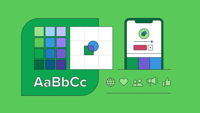
Next, consistency is key. Make sure your branding elements, such as color palette and typography, are carried through in your logo design. This will create a cohesive look that screams professionalism – or at least whispers it seductively.
Lastly, don’t be afraid to think outside the box! The best branding and logo designs are often the ones that break the rules (just like your rebellious teenage years). So go ahead, mix things up, experiment, and most importantly, have fun with it!

Building Brand Consistency Across Different Platforms
When building your brand across different platforms, consistency is key. You want your audience to recognize your brand no matter where they encounter it. Whether it’s on social media, your website, or even a billboard, keeping your brand consistent will help you stand out and build trust with your audience.
One way to achieve brand consistency is through using the same colors, fonts, and logos across all platforms. This will help create a cohesive look and feel for your brand, making it easier for your audience to recognize you. Plus, it’s a lot less work than trying to come up with new designs for each platform!
Another important aspect of brand consistency is using the same voice and tone in your messaging. Whether you’re posting on Twitter, Instagram, or your blog, make sure your brand personality shines through. Are you quirky and funny? Educational and informative? Whatever it is, stick to it!
Don’t forget about your imagery, too. Use the same style of photography or graphics on all platforms to create a unified look. Consistent imagery will not only help reinforce your brand identity but also make your content more visually appealing to your audience.
The Significance of Flexibility in Logo Design
When it comes to logo design, flexibility is key. A logo should be able to adapt to different contexts and mediums without losing its impact. Think of it as the chameleon of the design world – able to blend in seamlessly no matter the environment.
- **Size Matters:** A truly flexible logo is scalable, able to be resized without losing its clarity or detail. Whether it’s blown up on a billboard or shrunk down on a business card, a good logo should never lose its charm.
- **Color Me Impressed:** Color can make or break a logo’s flexibility. A versatile logo should be able to work in both full color and black and white, giving it the ability to shine no matter the palette.
Just like a good yoga instructor, a flexible logo knows how to bend and stretch to fit the needs of its surroundings. So next time you’re designing a logo, remember the importance of flexibility - your design will thank you for it!
Strategies for Evolving Your Brand and Logo Design
Looking to shake things up with your brand and logo design? It’s time to get creative and think outside the box! Here are some strategies to help you evolve your brand and logo in a way that will leave your competitors green with envy:
First off, consider incorporating bold, eye-catching colors into your branding. Say goodbye to boring black and white logos and hello to a veritable rainbow of possibilities. Think neon pink, electric blue, and chartreuse. Let your logo pop like a can of soda on a hot summer day.
Next, why not play around with different fonts and typography styles? Mix and match serif with sans-serif, cursive with block letters. The sky’s the limit when it comes to font choices, so don’t be afraid to experiment and see what really speaks to your brand’s personality.
And finally, don’t underestimate the power of incorporating playful and whimsical elements into your brand and logo design. Whether it’s a cute mascot, a quirky illustration, or a clever play on words, injecting a bit of fun into your branding can help you stand out from the crowd and make a memorable impression on your audience.
FAQs
Why is branding and logo design synergy important?
Well, think of it this way – what’s a superhero without their costume? Just a regular old person in pajamas. Your brand is the superhero, and the logo is its costume. They need to work together seamlessly to save the day (or sell your product).
How can I ensure that my branding and logo design are in sync?
It’s all about communication, baby! Your branding should tell a compelling story, and your logo should be like the headline that grabs attention. Make sure they’re speaking the same language, or else it’s like having a BBQ without any sauce – bland and disappointing.
What are some common mistakes to avoid when creating branding and logo design synergy?
Don’t be a rebel without a cause – you need to have a clear vision and stick to it. Also, don’t let your logo overshadow your branding - it’s like having a sidekick steal the spotlight from the hero. And lastly, don’t try to be something you’re not - your branding and logo should authentically reflect who you are.
How can I make my branding and logo design stand out from the competition?
Think of your branding and logo as the dynamic duo - they need to be unique, memorable, and kick-ass. Do some research on your competitors, see what they’re up to, and then do the opposite. Be bold, be brave, and be the caped crusader of your industry!
Time to Put Your Brand on the Map!
Now that you’ve learned the ins and outs of branding and logo design synergy, it’s time to unleash your creativity and make your mark in the business world! Remember, a strong brand and a killer logo can take you from zero to hero in no time. So go forth, create, and conquer the world of branding with confidence and style! And don’t forget to have fun along the way – after all, that’s what it’s all about. Happy branding!


