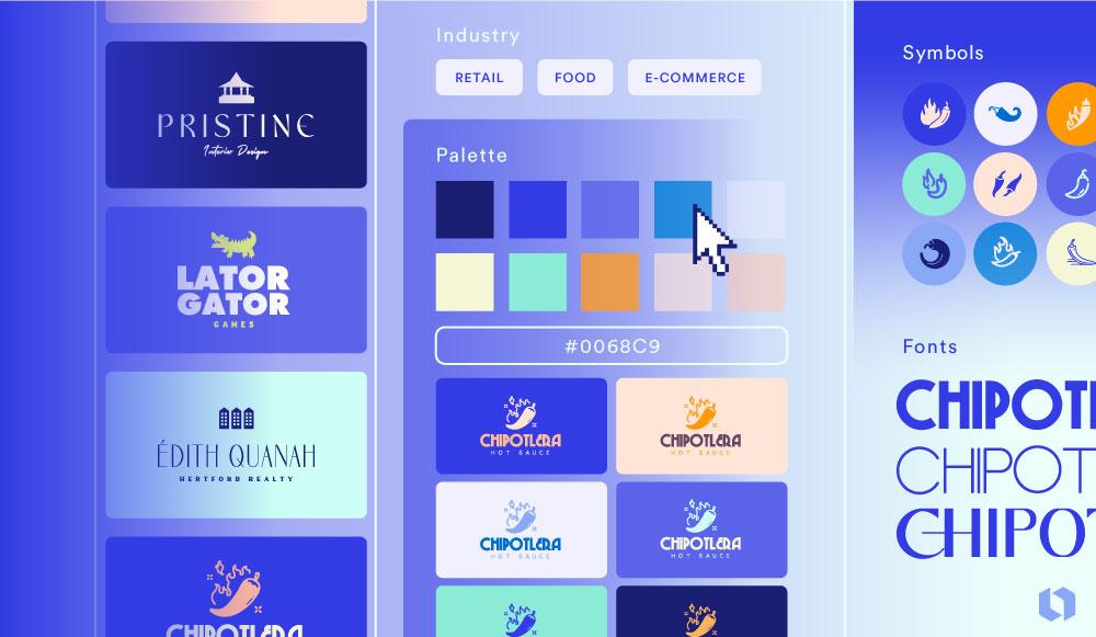
Have you ever looked at a logo and thought, “Wow, that’s some seriously impressive design magic”? Well, you’re not alone! The world of logo creation is a mystical realm where the power of design principles reigns supreme. From color theory to typography wizardry, mastering the art of logo creation is like unlocking the secrets to the universe (or at least the key to a killer brand identity). So buckle up, fellow logo lovers, because we’re about to dive headfirst into the wild and wacky world of logo design principles. Let’s get ready to create some logo masterpieces that will make your competitors green with envy!
Understanding the Importance of Design Principles in Logo Creation
When it comes to creating a logo, design principles are absolutely crucial. Without them, you might end up with a logo that looks like it was designed by a blindfolded monkey with a paintbrush. And nobody wants that.
So, what are these magical design principles, you ask? Well, let me break it down for you:
- Balance: A well-designed logo should feel balanced, like a perfectly executed yoga pose. If your logo is lopsided, it might give off a vibe that you’re not quite sure what you’re doing. And nobody wants to do business with someone who can’t even balance a logo, right?
- Contrast: Contrast is key in creating a logo that pops. Without it, your logo might end up looking as boring as a beige wall. And who wants a logo that blends into the background like that?
So, to sum it up, design principles are incredibly important when creating a logo. They can mean the difference between a logo that makes people say “wow, that’s awesome!” and a logo that makes people say “um, what even is that?” Choose wisely, my friends.
simplicity-in-logo-design”>Applying the Rule of Simplicity in Logo Design
Let’s face it, nobody likes a cluttered logo. It’s like trying to find a needle in a haystack – except the needle is your company’s brand identity. That’s why is crucial. Keep it simple, stupid! (But don’t worry, we won’t actually call you stupid).
When it comes to logo design, less is definitely more. Remember, your logo isn’t a novel – it’s a visual representation of your brand. Keep it clean, keep it simple, and keep your customers from scratching their heads in confusion. Here are a few tips to help you embrace the beauty of simplicity:
- Minimalist Approach: Less is more, my friend. Stick to the essentials and avoid unnecessary frills and decorations.
- Color Palette: Don’t go overboard with colors. Stick to a simple color palette that reflects your brand and doesn’t overwhelm the viewer.
- Typography: Keep your fonts clean and legible. Avoid using multiple fonts in your logo – unless you want people to think you have a split personality.
So, next time you’re designing a logo, remember to keep it simple. Your customers will thank you, your designer will thank you, and most importantly, your logo will thank you for not turning it into a hot mess.

Utilizing the Rule of Balance for Effective Logo Composition
When it comes to designing logos, balance is key. Utilizing the rule of balance can take your logo composition from meh to magnificent! Here are some tips and tricks to help you create a logo that is visually appealing and well-balanced:
- Symmetry is your friend: Make sure elements in your logo are evenly distributed to create a sense of balance. A lopsided logo is like wearing mismatched socks – it just looks off.
- Play with proportions: Mix up the size of your logo elements to create visual interest. Just like a good recipe, the right proportions can make all the difference.
- Keep it simple: Don’t overload your logo with too many elements. Remember, less is more! A cluttered logo is like a messy room – nobody wants to look at it.
By incorporating the rule of balance into your logo design process, you can create a logo that is not only visually appealing but also effective in conveying your brand message. So next time you’re brainstorming logo ideas, remember to keep balance in mind – your logo will thank you for it!

Incorporating Color Theory to Enhance Logo Impact
Who knew that choosing the right colors for your logo could make such a big impact? Well, according to color theory, it can! By incorporating the principles of color theory into your logo design, you can make sure that your logo stands out and leaves a lasting impression on your audience.
So, what exactly is color theory, you ask? It’s basically a set of guidelines that help designers choose the right colors for their projects based on how colors interact with each other. By understanding these principles, you can create a logo that not only looks great but also conveys the right message to your audience.
When it comes to choosing colors for your logo, it’s important to consider things like color harmony, contrast, and the emotions that different colors evoke. For example, using complementary colors like red and green can create a striking look, while using analogous colors like blue and purple can create a more soothing effect.
By applying these principles of color theory to your logo design, you can make sure that your logo not only looks great but also resonates with your audience on a deeper level. So, next time you’re designing a logo, don’t forget to think about how color theory can help enhance its impact!

The Role of Typography in Creating Memorable Logos
Typography plays a crucial role in the creation of memorable logos. It’s not just about picking a fancy font and calling it a day. Nope, typography is an art form that can make or break a logo design. Here are some key points to keep in mind:
- Font Choice: The font you choose can say a lot about your brand. Whether you go for something sleek and modern or quirky and fun, make sure it reflects the personality of your company.
- Legibility: No one wants to strain their eyes trying to figure out what your logo says. Keep it clear and easy to read, even if you’re going for a more artistic look.
- Spacing: Don’t cramp your letters together like they’re waiting in line for the bathroom. Give them some breathing room so they can shine individually.
Remember, a logo is often the first impression people have of your brand. So make sure it’s a good one! Use typography wisely to create a logo that sticks in people’s minds like a catchy jingle. Who knows, maybe 20 years from now, someone will see your logo and say, “Hey, I remember that! It’s the one with the cool font!
Harnessing the Power of Proportion and Scale in Logo Design
When it comes to logo design, size does matter! Proportion and scale are like the secret ingredients that can make or break a design. Let’s dive into the magic of harnessing these elements to create logos that leave a lasting impression.
Imagine a tiny logo on the side of a truck. What was supposed to be an eye-catching design now looks like a speck of dust. That’s why it’s crucial to play around with proportions to ensure your logo stands out, no matter where it’s displayed. Whether it’s on a billboard or a business card, the scale of your logo should always be just right.
One way to play with proportion is by using oversized elements to draw attention to key elements of your logo. For example, you can highlight your company name in bold, while keeping the other elements more subtle. This not only creates visual interest but also helps in communicating your brand message effectively.
Don’t be afraid to experiment with scale and see what works best for your logo design. Just remember, balance is key! Whether you’re going big and bold or keeping things small and subtle, make sure your logo reflects the personality of your brand. So go ahead, unleash the power of proportion and scale in your logo design and watch your brand shine!
FAQs
Why is understanding design principles important for creating a logo?
Well, you wouldn’t try to bake a cake without knowing the ingredients, would you? Design principles are the essential building blocks that help you create a logo that’s not just pretty to look at, but actually works in conveying your brand’s message effectively.
What design principles should I focus on when creating a logo?
Think of design principles as your superhero squad – you’ve got unity, balance, contrast, hierarchy, repetition, and space. Each one plays a crucial role in creating a logo that stands out and gets your message across loud and clear.
How can I ensure my logo design is memorable and timeless?
Ah, the age-old question! To create a logo that withstands the test of time, focus on simplicity, versatility, and relevance. Sure, adding a bunch of bells and whistles might be tempting, but remember, less is often more when it comes to logo design.
What’s the deal with color theory in logo design?
Color theory is like the spice rack of logo design – it adds flavor and personality to your creation. Different colors evoke different emotions and convey various messages, so choose your palette wisely to ensure your logo makes the right impression.
How can I make my logo design process more efficient and effective?
Practice makes perfect, my friend! The more you design, the better you’ll get at understanding what works and what doesn’t. Don’t be afraid to experiment, seek feedback, and keep pushing yourself to create logos that truly resonate with your audience.
Now go forth and create logos like a boss!
Remember, mastering logo creation is all about understanding and applying design principles to your work. With great power (of design principles) comes great responsibility (to create awesome logos). So channel your inner design superhero and let your creativity soar!
Keep experimenting, keep practicing, and most importantly, keep having fun with it. Who knows, maybe you’ll be the next logo design legend in the making!
And if all else fails, just remember: when in doubt, make the logo bigger. 😉


