Welcome to the wonderful world of color psychology! No, we’re not talking about diagnosing your favorite rainbow with anxiety issues. We’re diving deep into the art of using color to evoke emotions, communicate messages, and yes, even manipulate minds in logo design. So buckle up, because we’re about to harness the power of ROYGBIV like never before.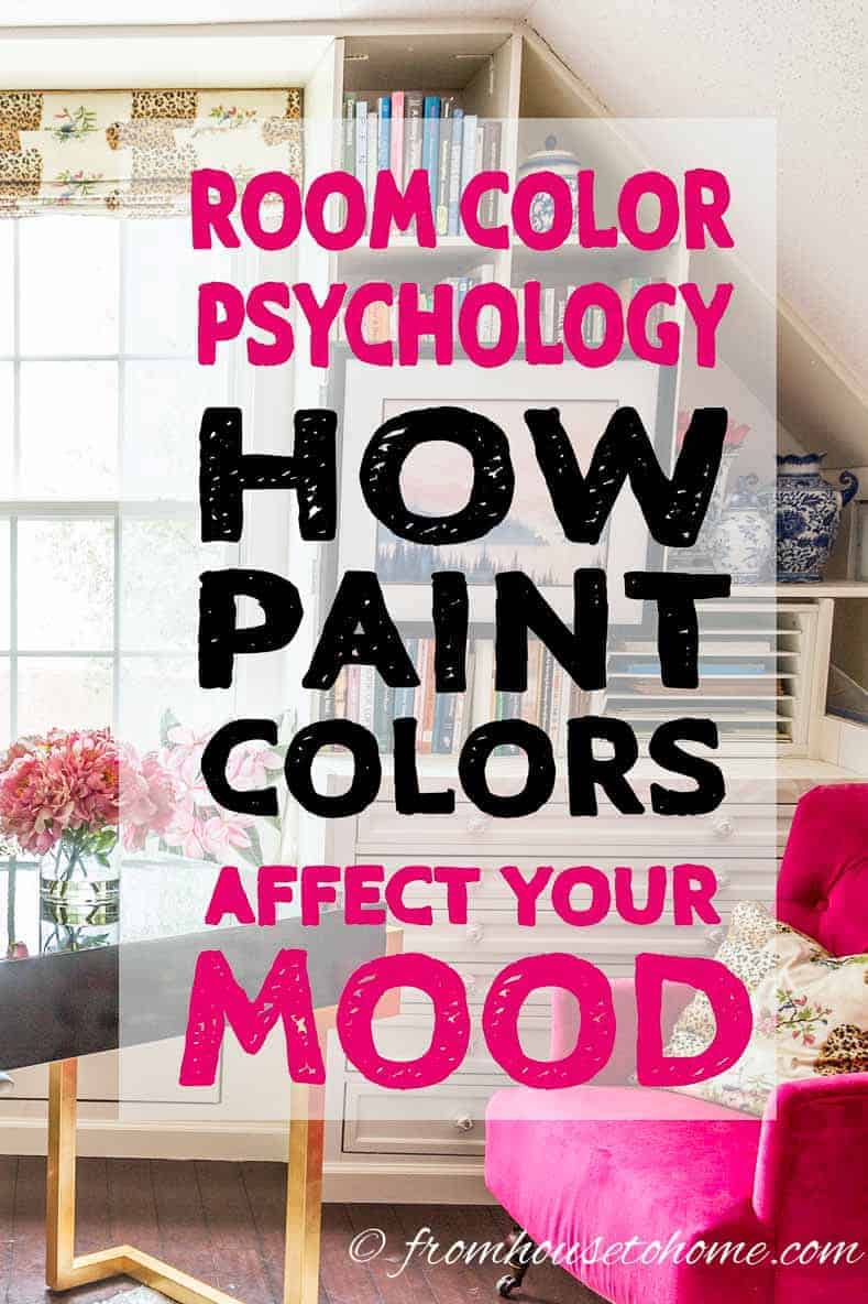
Understanding Color Psychology
Have you ever wondered why you feel so calm and relaxed when surrounded by shades of blue, or why you suddenly feel energized in a room filled with vibrant reds and oranges? Color psychology plays a huge role in our daily lives, influencing our moods, emotions, and even our decisions without us even realizing it.
Colors have the power to evoke specific feelings and reactions in us. For example, red is often associated with passion, anger, and love, while yellow typically symbolizes happiness, optimism, and warmth. Green is known for its calming and balancing effects, while purple is often associated with luxury, creativity, and royalty.
When designing a space or choosing a color to wear, it’s important to consider the emotional impact it may have on you and those around you. A neutral color palette can create a sense of calm and tranquility, while bold and bright colors can add energy and excitement to a room or outfit.
So next time you’re feeling down or need a little pick-me-up, consider surrounding yourself with colors that reflect the emotions you want to feel. Let the power of color psychology work its magic and watch as your mood transforms before your very eyes!

Choosing the Right Colors for Your Brand
When it comes to choosing the perfect colors for your brand, it’s crucial to remember that they can make or break your image. You want your colors to reflect your brand’s personality and values, while also capturing the attention of your target audience. Here are some tips to help you nail your color scheme:
- Know your audience: Consider who your target demographic is and what colors will appeal to them. If you’re targeting a younger audience, vibrant and bold colors might be the way to go. On the other hand, if your brand is more upscale and sophisticated, you might want to stick to a more muted palette.
- Consider color psychology: Different colors evoke different emotions and can influence how people perceive your brand. For example, blue is often associated with trust and reliability, while red can create a sense of urgency or excitement. Think about what feelings you want your brand to evoke and choose your colors accordingly.
- Stay on brand: Your color scheme should align with your brand’s overall aesthetic and message. If your brand is all about sustainability and nature, it wouldn’t make sense to choose neon pink and electric blue as your primary colors. Make sure your colors reflect who you are as a brand.
Creating Emotional Impact with Color
Color has the power to evoke emotions and set the tone for a design. Whether you’re creating a vibrant and energetic piece or a soothing and tranquil one, choosing the right colors is key to making an emotional impact. Here are a few tips to help you master the art of using color to convey emotion:
Incorporate contrasting colors: Using colors that are opposite each other on the color wheel can create a dynamic and eye-catching contrast that evokes strong emotions. Think of pairing bold reds with deep greens or bright yellows with rich purples to make a statement that demands attention.
Play with shades and tints: Lighter shades and darker tints of a color can have vastly different emotional effects. Experiment with pastels for a soft and whimsical feel, or deep tones for a sense of sophistication and drama. Mixing and matching shades and tints can add depth and nuance to your design.
Consider cultural connotations: Different colors can have varying meanings and associations in different cultures. While white may symbolize purity and innocence in Western cultures, it can represent death and mourning in Eastern cultures. Be mindful of cultural connotations when choosing colors to ensure your design resonates with your intended audience.
Don’t be afraid to break the rules: While color theory can provide a useful framework for , don’t be afraid to think outside the box and break the rules. Experiment with unconventional color palettes, unexpected combinations, and unique interpretations to create designs that are truly one-of-a-kind and emotionally resonant. Remember, creativity knows no bounds when it comes to color!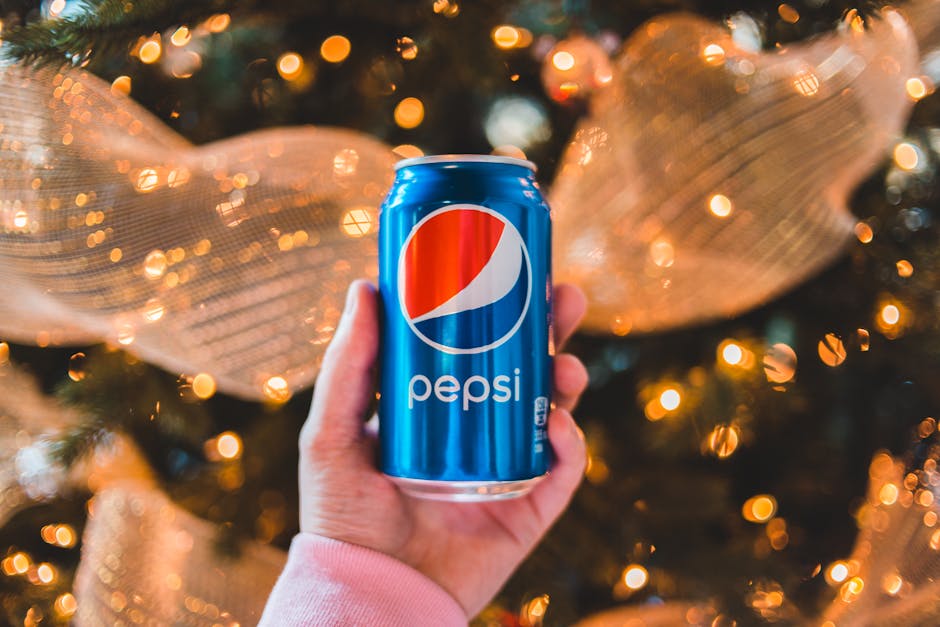
The Influence of Color on Consumer Behavior
Color, oh glorious color! It can make or break a sale faster than you can say “purple polka dots”. But seriously, is no joke. Let’s break it down, shall we?
First off, did you know that red is the color of passion and excitement? That’s why it’s often used to grab attention and create a sense of urgency. Ever notice how many “Sale!” signs are painted in bright red? That’s no coincidence, my friend.
On the other end of the spectrum, we have blue. This cool and calming color is often associated with trust and reliability. That’s why many banks and financial institutions use blue in their branding. Who wouldn’t trust a bank with a logo that’s as soothing as a clear summer sky?
And let’s not forget about yellow. This cheerful hue is often used to evoke feelings of warmth and happiness. That’s why fast food chains like McDonald’s use yellow in their branding. After all, who can resist a smiley face and some golden arches?

Balancing Aesthetics and Brand Messaging
When it comes to , it’s like trying to walk a tightrope while juggling flaming torches and reciting Shakespearean soliloquies. It’s a delicate dance between looking good and getting your message across. Here are some tips to help you navigate this high wire act:
First off, **know your audience**. Are they more drawn to sleek, modern designs or do they prefer something with a bit more pizzazz? Understanding who you’re trying to reach will help you tailor your aesthetics to appeal to them while still staying true to your brand.
**Use color wisely**. A vibrant color palette can catch the eye, but too much can overwhelm your message. Stick to a few key colors that complement your brand and create a cohesive look throughout your marketing materials.
**Don’t be afraid to take risks**. Sometimes, the most memorable brands are the ones that push the envelope and break the rules. Experiment with different styles and designs to find what works best for your brand while still staying true to your core messaging.
Utilizing Color to Enhance Brand Recognition
Color can be a powerful tool in your branding arsenal - it’s like the secret sauce that makes your brand stand out from the competition. Think of it as the sprinkles on top of your ice cream sundae, but with a lot more impact!
So, how can you use color to enhance brand recognition? Well, it’s all about consistency and creativity. You want your brand colors to be as recognizable as the Golden Arches or the Starbucks mermaid. Here are some tips to help you make the most of your color palette:
- Choose Your Colors Wisely: Your brand colors should reflect your company’s personality and values. Are you bold and daring? Go for fiery reds and electric blues. Are you more laid-back and approachable? Soft pastels might be more your style.
- Be Consistent: Once you’ve chosen your brand colors, stick with them. Use them in all your marketing materials, from your website to your business cards. Consistency is key to making your brand colors instantly recognizable.
- Don’t Be Afraid to Experiment: While consistency is important, that doesn’t mean you can’t have a little fun with your colors. Try different color combinations and see what works best for your brand. Who knows, you might discover a new winning color palette!
Remember, color is more than just a pretty visual – it’s a powerful tool that can help you build a strong brand identity. So, don’t be afraid to think outside the (color) box and let your brand’s true colors shine!
FAQs
How can I use color psychology to evoke certain emotions in my logo design?
Certainly! You can use warm colors like red and orange to convey excitement and energy, while cooler colors like blue and green can create a sense of calmness and trustworthiness. Do your research and choose colors that align with the emotions you want your brand to evoke.
What are some common color associations and meanings in logo design?
Oh, there are plenty! For example, yellow is often associated with positivity and happiness, while black can convey sophistication and elegance. Purple is linked to creativity and luxury, and green is all about nature and growth. Choose wisely!
How many colors should I include in my logo design to effectively communicate my brand message?
Well, less is more, my friend! It’s best to stick to a maximum of three colors to keep things visually appealing and cohesive. Too many colors can be overwhelming and dilute your brand message.
Should I consider cultural differences when choosing colors for my logo design?
Absolutely! Different colors can have different meanings in various cultures, so it’s crucial to research and ensure that your color choices are appropriate and well-received by your target audience. You don’t want to accidentally offend anyone with your logo design!
How can I make my logo design stand out using color psychology?
Get creative with it! Experiment with unconventional color combinations or shades to make your logo pop. Don’t be afraid to think outside the box and push the boundaries – just make sure it still aligns with your brand message and resonates with your audience.
Color Psychology: Unleash Your Logo’s True Potential!
So there you have it, folks! You are now equipped with the knowledge and skills to create a logo that not only looks great but also speaks volumes to your audience through the power of color psychology. Remember, colors are like spices – use them wisely to create a harmonious blend that will leave a lasting impression on your customers.
Go forth and design with confidence, knowing that your logo is not just a pretty picture, but a powerful tool that can help take your brand to new heights. And who knows, maybe your logo will be the next big thing that everyone is talking about!
Until next time, keep coloring outside the lines and let your creativity shine bright. Cheers to mastering color psychology in your logo design!


