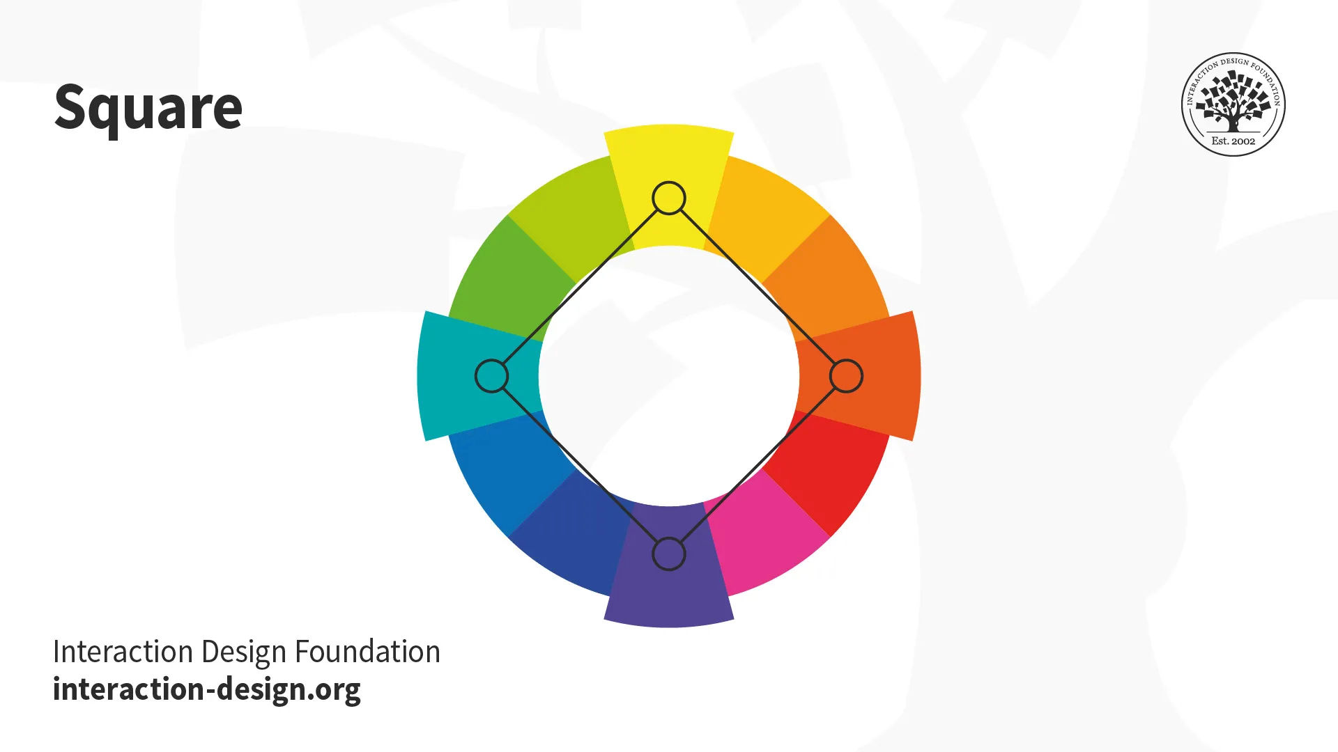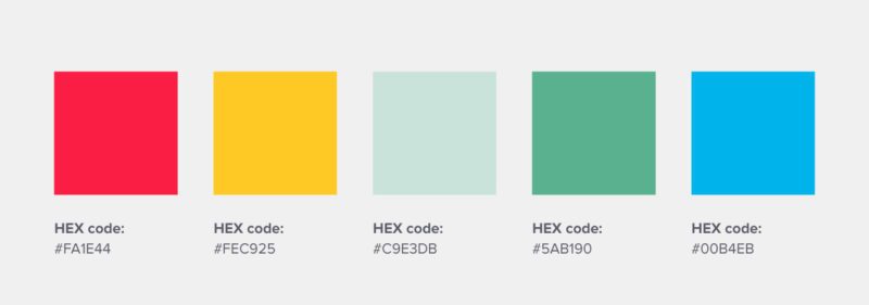
Color harmony is like the elusive pot of gold at the end of a rainbow when it comes to design/” title=”Dental Logo Design”>logo design. It’s the secret sauce that takes your logo from meh to magnificent, from bland to breathtaking. In this article, we’ll dive deep into the world of color-psychology-logo-design/” title=”Color Psychology in Logo Design”>color harmony and reveal the keys to unlocking logo design success. Get ready to paint the town red (or blue, or green, or whatever color harmonizes best, really).
Understanding the Basics of Color Theory
Primary Colors: These are the building blocks of all colors out there. Just like how peanut butter and jelly are the foundation of a good sandwich, red, blue, and yellow are the foundation of all colors. So if you’ve ever thought about being a painter, just remember that in order to make all the colors of the rainbow, you just need these three amigos.
Secondary Colors: Once you’ve got your primary colors down, it’s time to meet their children – the secondary colors! These are what happens when you mix two primary colors together. Think of them as the offspring of a wild night out between red and yellow, blue and yellow, and red and blue. Can you imagine the drama at family gatherings?
Complementary Colors: Ah, the yin to your yang, the Bonnie to your Clyde, the Netflix to your chill. Complementary colors are the ones that sit directly across from each other on the color wheel. They might seem like opposites, but together they create a harmonious balance that would make even the toughest critics nod in approval. So remember, next time you’re struggling to pick a color scheme - just look to these dynamic duos for inspiration!
Choosing the Right Color Palette for Your Logo
is almost as important as choosing the right drink at a party. You want something that will impress everyone and make you stand out, but you don’t want to be the one guy drinking milk at a kegger. Here are a few tips to help you navigate through the rainbow of options:
First things first, determine what emotions you want your logo to evoke. Do you want to make people feel calm and relaxed, like they just took a nap on a cloud? Or do you want to make them feel energetic and ready to take on the world, like they just chugged a case of Red Bull? Pick colors that align with the vibe you’re going for. Remember, it’s all about the mood, baby!
Next, consider your target audience. Are you trying to appeal to lovers of the great outdoors, or are you targeting city slickers who can’t live without their daily dose of skyscrapers and Starbucks? Think about what colors would attract your ideal customers. Just remember, you want to reel them in like a fish on a hook, not scare them away like a herd of stampeding elephants!
Finally, don’t be afraid to get a little wild with your color choices. Sure, black and white are classic, like a good ol’ pair of jeans, but sometimes you need to throw on a sequined jumpsuit and hit the dance floor. Embrace your inner rainbow and don’t be afraid to let your logo shine brighter than a disco ball at Studio 54!

Balancing Contrast and Harmony in Logo Design
Ah, the age-old struggle of . It’s like trying to mix oil and water while walking a tightrope – a delicate dance between making a statement and creating a cohesive visual identity.
When it comes to contrast, think of it as the sassy best friend of your logo design. It’s there to shake things up, add some spice, and make your brand stand out from the crowd. Whether it’s playing with bold colors, contrasting shapes, or quirky typography, contrast is essential for drawing attention and leaving a lasting impression.
On the other hand, harmony is like the calm, collected older sibling who keeps things grounded and in balance. It’s all about finding the right mix of elements that work together seamlessly, like a well-oiled machine. From complementary color schemes to consistent spacing and alignment, harmony ensures that your logo looks polished and professional.
So, how do you strike the perfect balance between contrast and harmony in logo design? Here are a few tips to help you navigate this creative tightrope:
– Experiment with different color combinations to find the right balance between contrasting hues
– Play around with varying font weights and styles to create visual interest without losing overall coherence
- Use negative space strategically to create a sense of harmony and balance in your logo design
– Don’t be afraid to push the boundaries and think outside the box, but always keep the overall message and brand identity in mind
Remember, the key to a successful logo design is finding that sweet spot between contrast and harmony – so go forth and create with confidence!
Utilizing Color Psychology to Make a Strong Impression
In the wild world of marketing, colors are like secret weapons that can make or break your brand. You might think you’re just picking out a nice shade of blue for your logo, but little did you know, you’re actually tapping into the mystical powers of color psychology. It’s like being a wizard, but instead of a wand, you have a Pantone color palette.
So, what exactly do these colors say about your brand? Let’s break it down:
– **Red**: This fiery hue screams passion, energy, and excitement. It’s like the salsa dancer of colors, commanding attention wherever it goes. If you want to create a sense of urgency or make a bold statement, red is your go-to.
– **Blue**: Ah, the soothing color of the ocean. Blue exudes trust, reliability, and professionalism. It’s like that friend who always has your back no matter what. If you want to build a strong, trustworthy brand, blue is your best buddy.
– **Yellow**: Hello, sunshine! Yellow is all about optimism, youthfulness, and creativity. It’s like the quirky artist who sees the world in a different light. If you want to inject some fun and lightheartedness into your brand, yellow is the way to go.
So, next time you’re designing a logo or revamping your website, remember the power of color psychology. Choose wisely, dear marketer, for the right hue could be the key to making a lasting impression on your audience.
Exploring Different Color Combinations for Impactful Logos
When it comes to creating impactful logos, the right color combinations can make all the difference. Your logo is like the superhero cape of your brand, so why not make it pop with some bold and unexpected color choices?
One fun color combination to try is **electric blue** and **neon pink**. This combo is sure to grab attention and give your logo a futuristic vibe. It’s like having a dance party in logo form!
If you’re feeling a bit more sophisticated, **emerald green** and **gold** can add a touch of elegance to your logo. This pairing is perfect for brands that want to convey luxury and sophistication.
For a more playful look, why not mix **sunshine yellow** with **bubblegum pink**? This combo is fun, bright, and sure to put a smile on people’s faces. Just like your brand, your logo should stand out and show off your personality, so don’t be afraid to experiment with different color combinations!
Tips for Achieving Cohesive Color Harmony in Logo Design
When it comes to creating a cohesive color harmony in logo design, it’s important to consider a few key factors. Follow these tips to ensure your logo is visually appealing and on brand:
- Choose a color scheme that reflects your brand’s personality and values. Whether you want to convey trustworthiness with blues or creativity with oranges, make sure the colors align with your brand’s identity.
- Limit your color palette to a few key shades. Too many colors can overwhelm the viewer and detract from the overall impact of your logo. Stick to a maximum of three or four hues for a clean and cohesive look.
- Experiment with different color combinations to see what works best for your logo. Don’t be afraid to think outside the box and try unexpected pairings – sometimes the most unique color schemes make the biggest impact.
Remember, color is a powerful tool in logo design, so use it wisely. A well-thought-out color scheme can convey emotion, evoke a mood, and ultimately help your logo stand out from the competition. By following these tips, you’ll be well on your way to achieving cohesive color harmony in your logo design.
FAQs
Why is color harmony important in logo design?
Well, let me tell you, it’s like having a symphony of colors that sing in perfect harmony! Your logo is the face of your brand, so you want it to visually appeal to your audience. Color harmony helps create a cohesive and visually pleasing design that captivates and leaves a lasting impression.
How can I choose the right color scheme for my logo?
Choosing the right color scheme can be a daunting task, but fear not! Start by considering the emotions and messages you want your brand to convey. Research color psychology and how different colors can evoke specific feelings. Experiment with various color combinations until you find the perfect harmony that resonates with your brand identity.
What are some common color harmonies used in logo design?
Ah, the age-old question! Some common color harmonies include complementary colors (opposites on the color wheel), analogous colors (next to each other on the color wheel), and triadic colors (equidistant on the color wheel). Each harmony has its own unique vibe, so play around and see which one speaks to you!
Can I use multiple color harmonies in my logo design?
Why not spice things up a bit? Mixing and matching different color harmonies can create a dynamic and visually engaging logo. Just make sure the colors work well together and don’t clash like a bad blind date. Balance is key!
Any tips for achieving color harmony in logo design?
Oh, darling, I’m full of tips! Start by limiting your color palette to a few shades to avoid overwhelming your audience. Use color theory to your advantage and create a sense of balance and unity in your design. And don’t be afraid to think outside the box and get a little creative – after all, that’s what sets you apart from the rest!
In Conclusion: Color Your Logo World with Harmony!
Thanks for diving into the colorful world of logo design with us! We hope you’ve learned a thing or two about the importance of color harmony in creating a winning logo. So go forth, fearless design warriors, and master the art of color harmony to unlock the secret to logo design success! Remember, when it comes to logos, it’s not just about looking good, it’s about feeling good too. Stay harmonious, stay creative, and may your logos shine bright like a rainbow in a sea of black and white. Happy designing!


