Are you tired of watching your precious logo get lost in the vast sea of online content? Do you cringe every time you see it squished, stretched, or just plain butchered on various websites and social media profiles? Fear not, dear reader, for we are here to rescue your logo from its digital disarray! In this article, we will unveil the secrets to mastering the art of displaying your logo online with finesse and flair. So grab your virtual paintbrush and get ready to make your logo shine like a diamond in the rough of the internet!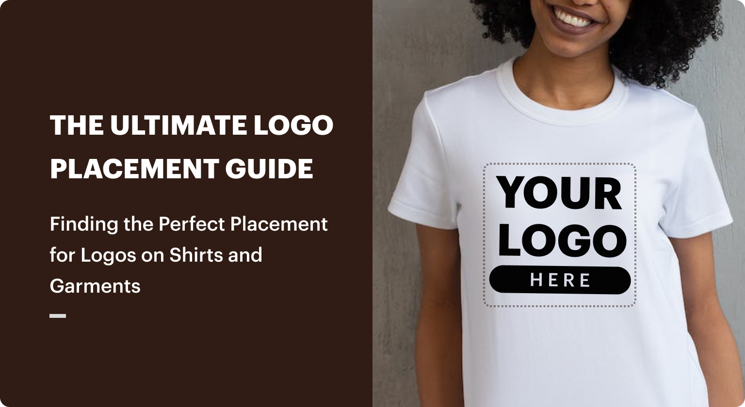
placement-for-your-logo”>Choosing the Right Placement for Your Logo
When it comes to placing your logo, you want to make sure it’s in a spot that gets noticed but doesn’t scream “look at me!” like that one friend who always wears neon from head to toe.
One great option is to place your logo smack dab in the center of your website header. It’s like the bullseye of your brand – right where everyone’s eyes will be drawn. Just don’t make it so big that it looks like your site was hijacked by a giant logo monster.
Another fun spot for your logo is on your product packaging. It’s like a little surprise for your customers – “Hey, remember us? We made this awesome product you’re about to buy!” Plus, it’s a great way to remind people to come back for more of your amazing goods.
And let’s not forget about social media. Placing your logo in the corner of your posts is like signing your name on a masterpiece. It’s a subtle way to say, “Yep, this is ours – aren’t we just the coolest?” Just don’t go overboard and plaster your logo on every inch of your profile. That’s a surefire way to get unfollowed faster than you can say ”brand overload.”

size-for-optimal-visibility“>Selecting the Correct Size for Optimal Visibility
When it comes to choosing the correct size for optimal visibility, it’s important to keep a few key things in mind. First and foremost, you need to make sure that the size of whatever it is you’re trying to see is large enough to actually be seen. Seems obvious, right? Well, you’d be surprised how many people try to squint at tiny text on their screens and wonder why they’re struggling to read it.
So, how do you know if you’ve got the right size for optimal visibility? Well, a good rule of thumb is to make sure that whatever you’re looking at takes up a decent chunk of your field of vision. If you have to strain to see it, chances are it’s too small. On the other hand, if it’s so big that you have to crane your neck just to take it all in, you’ve probably gone a bit too far in the other direction.
Remember, the goal is to find that sweet spot where you can easily see whatever it is you need to see without it overwhelming your visual field. And hey, if all else fails, there’s always the trusty old “Ctrl +” and “Ctrl -” keys to help you zoom in or out on your screen. Who knew that technology could be so helpful in solving all our visibility woes?
branding-across-all-platforms”>Utilizing Consistent Branding Across All Platforms
Let’s talk about consistency, my friends. No, not the kind that makes your favorite reality TV show predictable. We’re talking about the kind that makes your brand memorable, recognizable, and all-around awesome.
Imagine this: a potential customer sees your logo on Instagram and thinks, “Wow, that looks cool!” They click through to your website and it’s a totally different story. Their excitement fades faster than a scoop of ice cream on a scorching summer day.
But fear not, dear readers! Here are some tips to keep your brand consistent across all platforms:
- Logo Love: Make sure your logo is the same on every platform. Whether it’s Facebook, Twitter, or good ol’ LinkedIn, your logo should be like that trusty sidekick that never lets you down.
- Color Coordination: Pick a color palette and stick with it. Your brand should be like a fine wine – complex, but with just the right amount of punch.
- Font Fabulousness: Find a font that speaks to your brand’s personality and use it consistently. It’s like finding the perfect pair of jeans – they make you feel confident and ready to take on the world.
The Importance of High-Quality Images for Your Logo
Have you ever come across a logo that looked like it was designed by a toddler with a crayon? Yeah, me too. Let’s face it, having a high-quality image for your logo is crucial in making a good first impression. Here’s why:
First impressions are everything, and your logo is often the first thing people see when they encounter your brand. A pixelated, blurry logo is like showing up to a job interview in your pajamas – not a good look. A high-quality image, on the other hand, screams professionalism and attention to detail.
High-quality images make your logo stand out from the competition. In a sea of mediocre logos, a crisp, clear image will catch the eye and make a lasting impression. Your logo should be memorable and instantly recognizable, like a celebrity in a crowd of nobodies.
Investing in a high-quality image for your logo is like buying a designer handbag instead of a knockoff from the flea market. Sure, it might cost a little more upfront, but the payoff in terms of brand recognition and credibility is priceless. Plus, you’ll avoid the embarrassment of having your logo mistaken for a blurry blob on a business card.
Incorporating Your Logo into Your Social Media Strategy
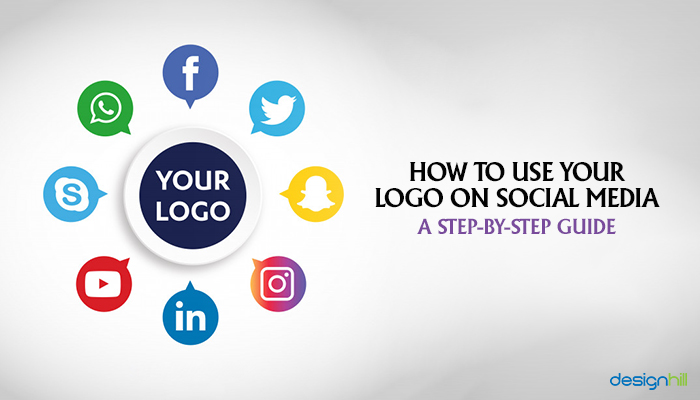
Think of your logo as the superhero cape for your brand – it’s the one thing that makes you instantly recognizable in a sea of social media feeds. So, why not flaunt it like your favorite accessory?
Here are some fun ways to incorporate your logo into your social media strategy:
Be the life of the party with branded stickers and GIFs. Slap your logo on some fun stickers or create a GIF that showcases your logo in a unique way. It’s like giving your logo a little dance party on your social media posts.
Dress up your profile pictures and cover photos. Your logo should be front and center on your social media profiles. Whether it’s your profile picture or cover photo, make sure your logo is prominently displayed so everyone knows who’s boss.
Get crafty with branded hashtags. Create a catchy hashtag that incorporates your logo, so every time someone uses it, they’re essentially promoting your brand. It’s like free advertising, but with a side of creativity.
So go ahead, let your logo shine bright like a diamond on your social media channels. After all, it’s your brand’s best friend – and who doesn’t love a little bling
Maximizing SEO Benefits Through Logo Placement
So you’ve got your website all set up with the perfect keywords, meta tags, and backlinks. But have you considered the sneaky little tool that can boost your SEO even further? That’s right, your logo!
By strategically placing your logo throughout your website, you can not only increase brand recognition but also improve your search engine rankings. Here are a few tips to help you maximize the SEO benefits through logo placement:
- Header Placement: Make sure your logo is prominently displayed in the header of your website. This will ensure that it is one of the first things that search engine crawlers see when they visit your site.
- Footer Placement: Don’t forget about the footer! Adding your logo here can help reinforce your brand identity while also providing another opportunity for search engines to pick up on your keywords.
- Alt Text: When adding your logo to your website, be sure to include descriptive alt text. This will not only make your site more accessible to visually impaired users but also give search engines more information to index.
So next time you’re updating your website, don’t forget about the humble logo. With a little strategic placement, you can give your SEO efforts a boost while also showcasing your brand in style!
Creating a Memorable Impression with Your Online Logo Display
So you want to create a logo that leaves a lasting impression, huh? Well, buckle up because we’re about to embark on the wild and wacky journey of online logo display! Let’s dive right in, shall we?
First things first, your logo should be like a fine wine – bold, sophisticated, and a little bit intoxicating. Make sure it stands out from the crowd with vibrant colors, eye-catching graphics, and a design that screams “look at me!”. Remember, you want your logo to be the talk of the town, not the wallflower at the party.
Next up, size matters! Make sure your logo is displayed prominently on your website – none of this tiny, squished-up nonsense. Go big or go home, am I right? Whether it’s front and center on your homepage or plastered all over your social media profiles, make sure your logo demands attention wherever it goes.
And finally, don’t be afraid to get a little wild with your logo display. Try different layouts, experiment with animations, or even throw in a little humor to really make it pop. Remember, a memorable logo is like a good joke – it sticks in your mind long after you’ve seen it. So go forth and create a logo that’s as unforgettable as you are!
FAQs
Why is it important to display your logo prominently online?
How can I ensure my logo is visible on all devices?
What are some creative ways to incorporate my logo into my website design?
Can placing my logo in my social media profiles really make a difference?
What are some common mistakes to avoid when displaying my logo online?
How often should I update or refresh my logo for online use
Now go forth and conquer the digital world with your logo displayed proudly!
Remember, Rome wasn’t built in a day, and neither will your brand domination be. But with these handy tips and tricks up your sleeve, you’ll be well on your way to becoming an online logo aficionado. So go ahead, unleash your creativity, experiment with different placements, sizes, and colors, and don’t forget to show off that logo like the rockstar it is! Until next time, happy branding!


