Welcome to the colorful world of consumer psychology! Have you ever found yourself reaching for a logo-design/” title=”Accounting Logo Design”>product simply because of its eye-catching logo? Or maybe you’ve experienced a sudden urge to buy something just because it was in your favorite color? Well, you’re not alone! In this article, we’re diving deep into the wacky world of color psychology and how it influences our shopping decisions. So grab your rainbow-colored glasses and get ready to discover the magic behind logo design and consumer behavior. Let’s paint the town red…or maybe blue…or maybe both!
The Power of Color Psychology in Marketing
Have you ever wondered why certain logos or advertisements catch your eye more than others? It’s all about ! Colors have a unique way of evoking emotions and influencing consumer behavior, so it’s important to choose the right ones to effectively communicate your brand’s message.
Here are some examples of the impact of color psychology in marketing:
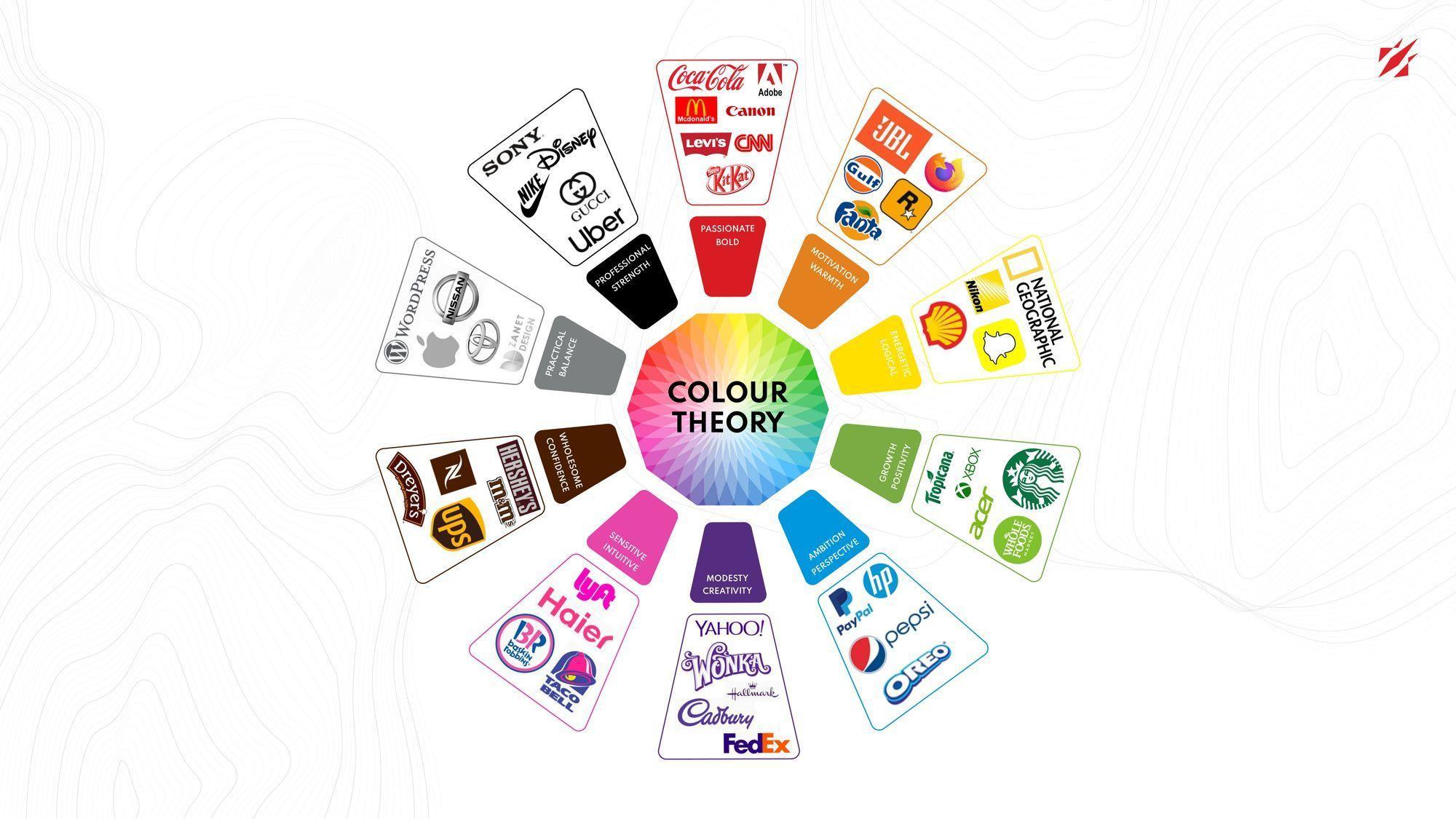
- Red: This color is known to increase appetite, which is why it’s commonly used in fast food logos like McDonald’s and KFC.
- Blue: Blue is associated with trust and reliability, making it a popular choice for financial institutions and technology companies.
- Green: Often used to represent eco-friendly and sustainable brands, green promotes feelings of health and harmony.
So next time you’re designing a logo or creating a marketing campaign, don’t underestimate the power of color! Choose wisely and watch as your brand’s message resonates with consumers on a whole new level.

Creating a Memorable Brand Identity with Color
Choosing the right colors for your brand is like finding the perfect outfit for a first date – it’s all about making a memorable impression. Here are some tips to help you create a brand identity that rocks the color wheel:
- Embrace Your Inner Rainbow: Don’t be afraid to experiment with different hues. Mix and match colors like a boss and watch your brand personality shine!
- Mood-Boosting Colors: Want your brand to spread positive vibes? Go for bright, cheerful colors like sunshine yellow and bubblegum pink. Who can resist a brand that brings a smile to their face?
- Color Psychology: Did you know that certain colors can evoke specific emotions? Use this to your advantage by choosing colors that resonate with your target audience. Feeling blue? Maybe it’s time to add some calming blues and greens to your brand palette.
Remember, your brand color scheme is like your signature scent – it should be uniquely you and leave a lasting impression. So go forth, brave color warrior, and paint the town red (or any other color that speaks to your brand’s soul).
Utilizing Color to Evoke Emotions in Consumers
When it comes to , it’s all about playing with their feelings like a master puppeteer. Just a simple splash of color can make or break a product’s success. Let’s dive into the wonderful world of hues and shades that can make your customers go from ”meh” to ”wow!”
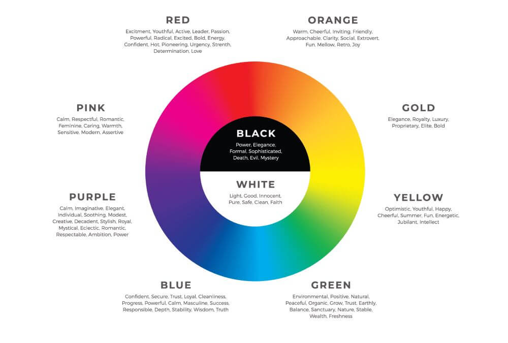
Imagine a world where red isn’t just a color, but a passionate love affair with your product. Use this bold hue to evoke feelings of excitement, urgency, and passion in your consumers. Whether it’s a fiery red lipstick or a vibrant red sports car, this color is sure to make hearts race and wallets open.
On the other hand, blue is like a cool drink of water on a hot summer day – refreshing and calming. This color is perfect for products that promote trust, reliability, and professionalism. From corporate logos to medical scrubs, blue is the go-to color for making consumers feel at ease.
But don’t forget about the power of yellow and orange! These sunny shades are like a burst of energy in a sea of neutrality. Use them to evoke feelings of warmth, happiness, and optimism in your consumers. Whether it’s a cheerful logo or a vibrant packaging design, these colors are sure to brighten up anyone’s day.

The Impact of Color in Logo Design on Brand Perception
When it comes to logo design, color plays a crucial role in shaping brand perception. The color palette you choose can send subtle (or not so subtle) messages to your audience about your brand’s personality, values, and even the products or services you offer.
Here are a few examples of how different colors can impact brand perception:
- Red: Known for evoking feelings of passion, excitement, and energy, red is often used by brands that want to make a bold statement. Think Coca-Cola or Target.
- Blue: A calming and trustworthy color, blue is often used by businesses that want to convey reliability and professionalism. Take a look at the logos of Facebook or IBM.
- Yellow: Associated with happiness and positivity, yellow is used by brands that want to appear friendly and approachable. Just think of McDonald’s iconic golden arches!
Ultimately, the impact of color in logo design is all about creating a cohesive brand identity that resonates with your target audience. So, don’t just pick a color because it’s your favorite – make sure it sends the right message about your brand!

Choosing the Right Colors for Your Logo: A Guide to Consumer Preferences
When it comes to choosing the right colors for your logo, it’s essential to keep consumer preferences in mind. After all, nobody wants a logo that looks like a neon sign on steroids, right?
So, how do you navigate through the endless sea of color options without making your logo scream “eyesore”? Here are a few tips to help you out:
- Research, research, research: Take a look at what colors your target audience prefers. You don’t want to end up choosing a color that makes them want to run for the hills.
- Stick to a color scheme: Don’t try to fit every color of the rainbow into your logo. Pick a few colors that complement each other and stick with them. Your logo will thank you.
Remember, a well-thought-out color scheme can make your logo stand out from the crowd and leave a lasting impression on your consumers. So, don’t be afraid to experiment with different colors until you find the perfect fit for your brand!
Color Associations and Their Influence on Consumer Behavior
Fashion Trends and How They Affect Your Wardrobe
When you think of the color red, what comes to mind? Perhaps passion, love, or even danger. This fiery hue is known to evoke strong emotions in individuals, making it a popular choice for brands looking to make a bold statement. Red has been associated with a sense of urgency and excitement, which is why you often see it used in marketing campaigns to grab your attention. Next time you see a red logo or packaging, take a moment to observe how it makes you feel – you may be surprised by the intensity of your reaction!
On the other end of the spectrum, we have the color blue. Calm, cool, and collected, this shade is often used to convey trustworthiness and reliability. It’s no wonder that many financial institutions and tech companies opt for blue in their branding – they want to instill a sense of security in their consumers. The next time you’re making a big purchase or signing up for a new service, pay attention to the color scheme of the website or store. If you see a lot of blues and cool tones, chances are they’re trying to make you feel at ease.
But what about yellow? This sunny color is often associated with happiness, optimism, and creativity. It’s no wonder that fast food chains like McDonald’s and Burger King use yellow in their branding – they want you to associate their food with a positive experience. Whether you realize it or not, the colors that surround you have a profound impact on your mood and behavior. So next time you’re out shopping, pay attention to the color palette of the stores you visit. You may be surprised by how much it affects your decision-making process!
FAQs
Why do certain colors evoke specific emotions in consumers?
Well, you see, colors are like little mood ring-wearing ninjas that sneak into your brain and trigger certain emotions. For example, red is like the bold, attention-grabbing friend who makes you feel energized and passionate, while blue is more like that chill buddy who helps you feel calm and trustworthy.
How can businesses use colors in logo design to attract customers?
Think of colors like the secret sauce in your logo design recipe. By strategically choosing the right colors, businesses can create a memorable brand identity that resonates with their target audience. It’s like a rainbow of persuasion leading customers straight to your door!
Are there universal meanings associated with certain colors?
Yes and no. While some colors have pretty consistent meanings across different cultures (like green being associated with nature and health), there’s also room for some cultural interpretation. So, when in doubt, just go with your gut (or your favorite color).
Can changing the color of a logo impact consumer behavior?
Absolutely! It’s like giving your logo a makeover and watching the magic happen. By switching up the colors, businesses can create a whole new vibe that attracts (or repels) customers. It’s like painting your way to success!
What are some examples of successful logo designs that use color psychology?
Oh, there are so many examples to choose from! Just think of the iconic golden arches of McDonald’s (hello, red and yellow combo) or the soothing blue hues of Facebook. These brands have cracked the color code and created logos that speak straight to our subconscious.
Time to Paint the Town Red… or Blue, or Green?
And there you have it, folks! The colorful world of logo design is more than just a pretty rainbow. It’s a carefully crafted strategy to tap into the minds and hearts of consumers. So next time you see a logo that catches your eye, remember that there’s a whole lot of psychology behind those vibrant hues.
Whether you’re feeling blue, seeing red, or simply green with envy, just know that the colors around you are playing tricks on your brain. So go ahead, paint the town with your favorite hues and watch as your logo game reaches new heights!
Stay colorful, stay curious, and remember: it’s not just a logo, it’s a work of art… in color!


