Picture this: a world without logos. No Nike swoosh guiding us to victory on the basketball court. No golden arches beckoning us with promises of deliciously greasy fries. No bitten apple whispering sweet nothings about technological innovation. It’s a bleak and confusing world, my friends. But fear not, for we are about to embark on a journey through the evolution of branding and the dynamic logo designs that have shaped the way we perceive and interact with our favorite brands. So buckle up, dear readers, as we explore the fascinating world of logo design and the ever-changing landscape of branding. It’s gonna be a wild ride!
Origins of Logo Design in Branding
Have you ever wondered how those iconic logos came to be? Well, let’s take a trip down memory lane and explore the !
Back in the day, before logos were a thing, businesses would use symbols and marks to differentiate themselves from the competition. These symbols were often simple and straightforward, like a blacksmith’s hammer or a baker’s loaf of bread. Basically, if you had a cool icon, you were in business!
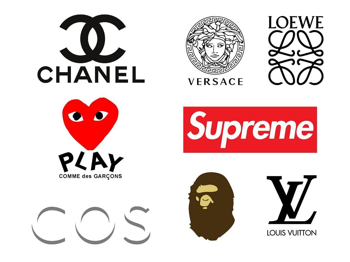
Fast forward to the modern era, and logos have become an essential part of any brand’s identity. From the golden arches of McDonald’s to the swoosh of Nike, these logos are instantly recognizable and evoke strong emotional responses from consumers.
So next time you see a logo, take a moment to appreciate the thought and creativity that went into its design. After all, a logo isn’t just a pretty picture – it’s a powerful tool that can make or break a brand’s success!

Evolution from Traditional to Modern Logos
Let’s face it: traditional logos are so last century. It’s time to kick things up a notch and embrace the modern era of logo design. Say goodbye to boring, static logos and hello to sleek, dynamic designs that will make your competitors green with envy.
With modern logos, the possibilities are endless. Want to incorporate bold, eye-catching colors? Go for it. Prefer a minimalist approach with clean lines and simple shapes? No problem. The sky’s the limit when it comes to creating a logo that truly represents your brand in the best possible light.
And let’s not forget about the power of technology in logo design. Thanks to advancements in digital tools and software, designers can now bring logos to life in ways that were once unimaginable. Imagine a logo that animates, morphs, and evolves right before your eyes. Talk about making a memorable impression!
So why settle for a traditional logo when you can have a modern masterpiece? Embrace the evolution of logo design and watch your brand soar to new heights. The future is bright, bold, and brimming with endless possibilities. Are you ready to make the leap?

Influence of Technology on Logo Design
Technology has completely revolutionized the way logo design is approached in today’s digital age. With the power of digital tools and software, logo designers have a plethora of options at their fingertips to create stunning and innovative designs. Here are some ways in which technology has influenced logo design:
- **Limitless creativity**: With the help of design software like Adobe Illustrator, designers can experiment with different colors, shapes, and styles with ease. Gone are the days of hand-drawn logos – now, the only limit is your imagination!
- **Instant feedback**: Thanks to the wonders of the internet, designers can now share their work with clients in real-time and receive instant feedback. No more waiting days for a response – now you can get that “I love it!” (or dreaded “can you make it pop more?”) within minutes.
- **Versatility**: Logos designed with technology in mind can easily be resized, modified, and adapted for different platforms and uses. Whether it’s for a business card or a massive billboard, technology ensures your logo looks great no matter the size.
Overall, the has truly taken the industry to new heights. So the next time you see a sleek, modern logo that catches your eye, just remember – it’s all thanks to the wonders of technology!

Role of Psychology in Creating Memorable Logos
Psychology plays a crucial role in creating memorable logos. When designing a logo, it’s not just about making it visually appealing, but also about tapping into the human mind and emotions. Here are some ways psychology influences the creation of logos:
- Color Psychology: The colors used in a logo can evoke different emotions and associations. For example, red can symbolize passion and energy, while blue can convey trust and reliability.
- Shape Psychology: The shapes in a logo can also impact how it is perceived. Curved shapes are often seen as friendly and approachable, while angular shapes can convey strength and stability.
- Simplicity: Psychologically, our brains prefer simplicity and easily recognizable patterns. Logos that are simple and clean are more likely to be remembered and recognized by consumers.
By understanding how the human mind works and incorporating psychological principles into logo design, companies can create logos that not only look good but also resonate with their target audience on a deeper level.
Case Studies of Successful Dynamic Logo Designs
Let’s dive into some juicy that really hit the mark!
First up, we have the logo for RocketFuel Energy Drinks. This logo features a rocket blasting off into space, with the fuel trail forming the shape of the letters in the brand name. It’s dynamic, energetic, and instantly captures the essence of the product. Plus, who doesn’t love a good pun in a logo?
Next, we have the logo for Zephyr Airlines, a budget airline that specializes in flights to tropical destinations. The logo features a stylized bird soaring through the sky, with its wings forming the shape of a plane. It’s simple yet clever, and perfectly embodies the idea of travel and adventure.
And finally, we have the logo for SnapClick Photography, a hip and trendy photography studio. The logo features a camera lens with a shutter that opens and closes, creating a sense of movement and action. It’s modern, sleek, and instantly recognizable – everything a dynamic logo should be!
Future Trends in Logo Design for Branding
Are you tired of seeing the same old logos everywhere? Well, get ready for some exciting future trends in logo design that will shake up the branding world!
First up, we have animated logos that will bring your brand to life in a whole new way. Forget static images, these logos will dance, jump, and even do cartwheels to grab the attention of your audience.
Next, we have minimalist logos that say more with less. These sleek and simple designs will make a big impact without all the fuss. Think of them as the Marie Kondo of logos – they spark joy and declutter your brand image at the same time.
And last but not least, interactive logos that engage your customers like never before. With a simple click or swipe, these logos will reveal hidden messages, play games, or even change colors based on user interaction. It’s like having a logo that’s a friend, not just a graphic!
FAQs
Why is logo design important in branding?
Well, if you think about it, your logo is like the face your brand presents to the world. And let’s be honest, first impressions are everything. So, a well-designed logo can help you stand out from the competition and make a lasting impact on your target audience.
How has logo design evolved over time?
Oh, logo design has come a long way, my friend. Back in the day, logos were simple, static images. But now, with advances in technology and design trends changing faster than you can say “Helvetica,” logos have gotten more dynamic and versatile. They can adapt to different platforms, evoke emotions, and tell a story all on their own.
What are some key elements to consider when designing a logo?
When it comes to logo design, you’ve got to think about versatility, memorability, and uniqueness. Your logo should look good on everything from a tiny business card to a giant billboard. It should be easy to recognize and should set you apart from the competition. And most importantly, it should reflect your brand’s personality and values.
How can businesses ensure their logo design stays relevant in a constantly changing market?
Ah, the million-dollar question. To keep your logo design fresh in a sea of ever-changing trends, you’ve got to stay on top of what’s happening in the design world. Keep an eye on what your competitors are doing, listen to feedback from your audience, and be willing to adapt and evolve. Remember, Rome wasn’t built in a day, and neither was the Nike swoosh.
Stay Ahead of the Logo Game
As you can see, the world of branding and logo design is constantly evolving. But fear not, dear reader, for with a little creativity and a keen eye for design, you too can keep up with the ever-changing trends. So go forth, armed with this newfound knowledge, and embrace the dynamic world of logo design. Remember, in the game of branding, it’s adapt or die (metaphorically speaking, of course).
Until next time, happy branding!


