In a world where everyone’s logo looks like it was crafted by the same minimalist, Helvetica-worshipping robot, it’s time to break free from the design doldrums and embrace the wild and wacky world of logo typography. From funky fonts to playful lettering, the emerging trends in logo typography design are anything but boring. So grab your favorite font (Comic Sans, anyone?) and get ready to inject some personality into your branding. It’s time to make typography fun again!
Typography as a Key Element in Logo Design
When it comes to logo design, typography plays a crucial role in conveying the brand’s identity. Choosing the right font can make or break a logo, so it’s important to give it the attention it deserves. Here are a few reasons why typography is a key element in logo design:
First and foremost, typography sets the tone for the brand. Whether you’re going for a playful, elegant, or modern look, the right font can instantly convey the desired message. Imagine using Comic Sans for a high-end fashion brand - it just wouldn’t work! Choose wisely, or suffer the consequences!
Secondly, typography can help make a logo memorable. A unique and eye-catching font can help your logo stand out among the competition. Just think about the iconic logos of Coca-Cola or Disney – their fonts are instantly recognizable and have become synonymous with their brands.
Lastly, typography can add personality to a logo. By selecting a font that aligns with the brand’s values and target audience, you can create a logo that resonates with customers on a deeper level. So, don’t underestimate the power of good typography in logo design – it’s not just about picking a pretty font, it’s about telling a story!

Innovative Use of Fonts in Modern Logos
Who knew that fonts could be so fancy? Gone are the days of plain old Times New Roman or Arial in logos. The modern world of design has brought about a revolution in the way fonts are used, especially in logos. Let’s take a look at some innovative examples:
**The Gradient Glamour:**
- This trend is all about blending colors seamlessly in the font. Think of a rainbow melting into each letter – sounds dreamy, right?
- It’s like having a unicorn as your brand spokesperson – magical and mesmerizing!
**Out of the Box:**
- Why limit yourself to straight lines and boring shapes? Some logos are breaking the mold by using wavy, curvy, or even jagged fonts.
- It’s like giving your brand a personality disorder – but in a good way!
**The Minimalistic Marvel:**
- Less is definitely more in this case. Some logos are using super sleek and simple fonts to make a statement.
- It’s like wearing a black turtleneck – classic, sophisticated, and a little pretentious.

Combining Traditional and Contemporary Typography Styles
When it comes to typography, why settle for just one style when you can have the best of both worlds? By , you can create dynamic and visually interesting designs that will stand out from the rest.
Imagine pairing a classic serif font with a sleek sans-serif font for a sophisticated yet modern look. Or mixing a bold slab serif with a playful script font for a fun and quirky design. The possibilities are endless when you mix and match different typographic elements.
Don’t be afraid to experiment with size, weight, and spacing to create contrast and hierarchy in your designs. Play around with different fonts and see how they interact with each other. Who knows, you might just discover a new favorite font combination that will become your go-to in future projects.
Remember, the key to successful typography is balance. Don’t overwhelm your design with too many fonts and styles. Keep it simple and let the typography speak for itself. With a little creativity and a lot of imagination, you can create typography that is both classic and cutting-edge.
Dynamic Shifts in Color and Type Pairings
Imagine a world where colors and fonts have a mind of their own, constantly shifting and changing to keep us on our toes. It’s like a game of cat and mouse, trying to keep up with the latest trends in design. In this chaotic yet exhilarating world, the only constant is change.
One day, you might wake up to find that your once elegant serif font has transformed into a quirky and playful sans-serif. And that muted pastel color palette you loved so much? It’s been replaced by bold and vibrant neons that scream for attention. Who knows what tomorrow will bring?
But fear not, dear designer, for in this world of , there is endless room for creativity and experimentation. Embrace the chaos, play with contrast, and see where the winds of change take you. Who knows, you might just stumble upon the perfect combination that sets your work apart from the rest.
So let go of your preconceived notions of design rules and let your imagination run wild. Mix and match unexpected color and font combinations, break free from tradition, and dare to be different. After all, in a world where everything is in a constant state of flux, why not have a little fun along the way?

Experimentation with Custom Lettering in Logo Creation
When it comes to logo creation, the possibilities are endless. One way to make your logo stand out is by experimenting with custom lettering. Forget about boring, generic fonts – let your creativity run wild and design a logo that truly represents your brand!
With custom lettering, you can tailor the typography to perfectly match your brand’s personality. Whether you want something sleek and modern or fun and playful, the sky’s the limit! Play around with different styles, sizes, and shapes until you find the perfect combination that screams “you”.
Don’t be afraid to think outside the box when it comes to custom lettering. Mix and match different fonts, add in quirky symbols or even create your own unique characters. The more original and eye-catching your logo is, the more memorable it will be to your audience.
So, grab your favorite design tools and let your imagination take the lead. Who knows, you might just come up with a logo that’s so amazing, people will be begging you to design one for them!
Utilizing Negative Space in Typography Design
Negative space is a secret weapon in the world of typography design. By harnessing the power of empty space, designers can create visually striking and impactful designs that grab the viewer’s attention.
One way to utilize negative space in typography design is to make use of oversized fonts. By allowing the letters to stand alone in a sea of empty space, you can create a bold and eye-catching design. Imagine each letter as a diva on stage, demanding all the attention for themselves.
Another fun trick is to play with the alignment of the text. Instead of sticking to the traditional left or center alignment, why not experiment with right or justified alignment? Or mix it up with some diagonal text for an unexpected twist. Just like a rebellious teenager, breaking the rules can lead to some truly exciting results.
And let’s not forget about playing with the spacing between letters and words. Sometimes, giving the text room to breathe can make all the difference in a design. Embrace the chaos and let the words float around the page like mischievous little sprites. Remember, in the world of typography design, sometimes less really is more.
Future Directions in Logo Typography Trends
When it comes to the future of logo typography trends, the possibilities are endless! With technology constantly evolving, we can expect to see some truly innovative designs in the world of logos. Here are a few predictions for where logo typography is headed:
- 3D Typography: Get ready to see logos that literally jump off the page (or screen)! With advancements in design software, 3D typography is becoming more popular than ever. Who wouldn’t want their logo to pop out at you?
- Motion Typography: Say goodbye to static logos - in the future, we can expect to see more logos with animated typography. From subtle movements to full-on animations, motion typography is sure to make a splash in the world of logo design.
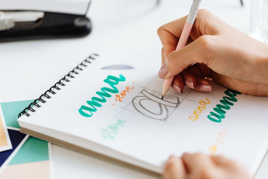
- Custom Hand-Drawn Typography: In a world where everything is digital, there’s something charming about a hand-drawn logo. It adds a personal touch and can make a brand feel more unique and authentic. Expect to see more custom hand-drawn typography in future logo designs.
Overall, the future of logo typography trends is looking bright and exciting. With so many possibilities at our fingertips, designers can really let their creativity shine. Whether it’s 3D, motion, or hand-drawn typography, the only limit is our imagination. So buckle up and get ready for some truly eye-catching logos in the years to come!
FAQs
Why is typography crucial in logo design?
Oh, darling, typography is the fanciest word for fonts, and fonts are like the outfits your logo wears. They can convey your brand’s personality, values, and overall vibe. So, choosing the right typography can make or break your logo design game.
What are some emerging trends in logo typography design?
Well, my dear, some of the hottest trends include custom hand-lettering, playful and whimsical fonts, and minimalistic sans-serif typefaces. It’s all about making a statement and standing out in the crowded world of logos.
How can I incorporate these trends into my logo design?
Oh, honey, it’s all about getting creative and pushing boundaries. Experiment with different fonts, play around with spacing and alignment, and don’t be afraid to mix and match styles. Just remember, confidence is key!
Why should I stay updated on logo typography trends?
Well, my darling, staying ahead of the curve can give your brand that extra oomph it needs to grab attention and make a lasting impression. Plus, who doesn’t want to be the trendiest logo on the block?
And the Font-tastic Adventure Continues…
So there you have it, folks! The world of logo typography design is constantly evolving, blending creativity and innovation in ways we never thought possible. Whether it’s sleek and modern or whimsical and bold, the future of logo typography is sure to keep us on our toes. Keep your eyes peeled for the next big trend, because in the world of fonts, you never know what surprising twist or turn awaits just around the corner!


