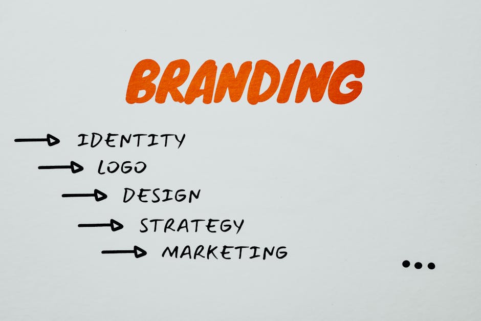
Are you tired of your logo being mistaken for a child’s doodle or a distant cousin of Comic Sans? It’s time to elevate your brand with a logo redesign that will make your competitors green with envy (or any color you prefer, really). In this article, we’ll explore the art of logo redesign and how a fresh new look can take your brand from meh to magnificent. So put on your creative thinking caps and get ready to level up your visual identity game!
Understanding the Importance of Logo Design
Imagine a world where logos didn’t exist. Chaos would ensue as companies scrambled to differentiate themselves from their competitors. And we’d all be left scratching our heads, trying to decipher which cereal box belongs to which brand.
But fear not, the power of logo design is here to save the day! Logos are like the superhero cape of a brand, swooping in to save the day and make a memorable first impression on consumers.
Here are a few reasons why logo design is crucial:
- Brand Identity: A logo is like a face for your brand, helping customers easily recognize and remember your business.
- First Impressions: Just like a fancy outfit at a party, a well-designed logo can make a great first impression and leave a lasting impact.
- Trust and Credibility: A professional logo shows that you mean business and can be trusted by customers.
So next time you’re tempted to skimp on logo design, remember the power it holds in shaping your brand’s identity and making you stand out in the crowded marketplace. Embrace the logo, embrace the power!

Identifying Signs that Your Logo Needs a Redesign
Is your logo feeling a little outdated? Maybe it’s time for a redesign! Here are some signs that your logo could use a fresh new look:
- Your logo looks like it was designed in the 90s and hasn’t been touched since.
- People keep mistaking your logo for a completely different company’s.
- Customers have asked if your logo was created by a five-year-old.
Don’t worry, it’s not the end of the world if your logo needs a redesign. In fact, it could be a great opportunity to give your brand a fresh, modern look that will attract new customers and make your business stand out in a sea of competitors.
So if your logo is whispering to you in the dead of night that it needs a makeover, don’t ignore it. Embrace the change and give your brand the facelift it deserves!

Developing a Clear and Consistent Brand Identity
When it comes to developing a brand identity, it’s important to remember the old saying: “Consistency is key.” You don’t want your brand to be like a bad sequel – all over the place and lacking any coherence. Instead, you want to create a brand that is as reliable as your favorite pair of sweatpants.
One way to ensure your brand is consistent is by using the same color palette across all platforms. This means no more rainbow explosions on your website or social media – unless, of course, your brand is all about unicorns and glitter. Consistent colors help create a cohesive look and feel that makes your brand instantly recognizable.
Another important aspect of brand identity is your tone of voice. Are you a laid-back, approachable brand that speaks to your customers like they’re your BFF? Or are you a more professional, informative brand that uses big words and industry jargon? Whatever your style, make sure it stays consistent across all your communications.
Lastly, don’t forget about your logo and visual assets. Your logo should be bold, memorable, and reflective of your brand’s personality. Whether you’re going for sleek and modern or quirky and fun, make sure your visual elements are consistent and help reinforce your brand identity.

Exploring Trends in Logo Design
When it comes to , there are a few key things to keep in mind. First and foremost, it’s important to stay current with the latest styles and techniques in the industry. Whether you’re a seasoned designer or just starting out, staying on top of what’s hot in the world of logos is crucial for creating designs that stand out.
One trend that has been gaining popularity in recent years is the use of bold, vibrant colors in logo design. From neon pinks to electric blues, there’s no shortage of eye-catching hues to choose from. Embracing bold colors can help your logo stand out in a crowded marketplace and grab the attention of potential customers.
Another trend to keep an eye on is the use of minimalist designs. Simple, clean logos are all the rage right now, with many companies opting for sleek, pared-down designs that make a big impact. Embracing a minimalist approach can help ensure that your logo remains timeless and versatile, able to adapt to changing trends without losing its appeal.
Finally, don’t be afraid to get creative with your logo design. Whether it’s incorporating unique typography, experimenting with negative space, or playing with different textures, there are endless ways to make your logo truly stand out. Remember, the goal is to create a design that not only looks great but also effectively communicates your brand’s message to your target audience.

Selecting the Right Design Elements for Your Brand
So, you’ve finally decided to take the plunge and create your own brand. Congratulations! Now comes the fun part – selecting the right design elements to make your brand shine brighter than a sequined disco ball.
Here are a few tips to help you navigate the treacherous waters of design decision-making:
- Color: Choose a color scheme that represents the essence of your brand. Are you a bold and daring brand? Go for vibrant, eye-catching colors. Or maybe you’re a sophisticated and elegant brand – in that case, sleek neutrals might be more your style.
- Typography: Fonts are like shoes – they should be stylish, but also comfortable. Pick a font that reflects your brand’s personality. Are you playful and whimsical? Opt for a quirky script font. If you’re all about professionalism and sleekness, a clean sans-serif font might be more your speed.
- Logo: Your logo is the face of your brand, so make it count! Whether you go for a minimalist design or a bold, intricate masterpiece, make sure it embodies the spirit of your brand. And remember, simplicity is key – you don’t want your logo to be busier than a beehive on a summer day.
Remember, the design elements you choose will be the first impression your brand makes on the world. So, take your time, have fun, and let your brand’s unique personality shine through!
Working with Design Professionals to Bring Your Vision to Life
So, you’ve got this grand vision in your head of the perfect design for your space, but let’s face it – your artistic skills are about as good as a toddler with a crayon. That’s where design professionals come in to save the day!
Working with design professionals is like having your own personal fairy godmother who can sprinkle a little magic (and a lot of expertise) on your project. They’ll take your jumbled ideas and turn them into a cohesive, stunning design that will make you wonder why you ever thought you could DIY in the first place.
Plus, design professionals have all the insider knowledge and resources to bring your vision to life in a way that you never could on your own. They’ll help you navigate the confusing world of color palettes, furniture placement, and lighting options so that you don’t have to spend hours scrolling through Pinterest trying to figure out what the heck “hygge” even means.
So, sit back, relax, and let the professionals work their magic. You’ll be amazed at how quickly your dream design becomes a reality, all thanks to the expertise and creativity of those design pros.
FAQs
Q: Why should I consider redesigning my logo?
A: Well, let’s put it this way – would you wear the same outfit every day for the rest of your life? Your logo is like your brand’s outfit, and just like fashion trends change, so do design trends. A fresh logo redesign can keep your brand looking modern and relevant.
Q: How do I know if it’s time for a logo redesign?
A: If your logo looks like it was designed in the 90s, it’s probably time for an update. Or if people frequently mistake your logo for something else (like the target symbol instead of a bullseye), it might be time for a change.
Q: What should I consider when redesigning my logo?
A: Think about what your current logo conveys about your brand – does it match your brand personality and values? Also, consider how your logo looks on different mediums - from business cards to billboards.
Q: How do I ensure my logo redesign is successful?
A: Get feedback from your target audience – after all, they’re the ones who will be interacting with your logo the most. And remember, a successful logo redesign doesn’t happen overnight – it takes time and iteration to get it just right.
So, in conclusion…!
Congratulations! You’ve successfully taken the first step in revamping your brand with a sleek new logo redesign. Remember, a logo is not just a symbol, but a representation of your brand’s identity and values. So, whether you’re going for a modern, minimalist look or a bold and vibrant design, make sure it captures the essence of your brand.
Now, go forth and conquer the world with your shiny new logo. And if all else fails, just remember: when in doubt, add more glitter! 😉


