Welcome to the enchanting world of brand logos, where shapes and colors come together to convey a company’s essence in a single glance. It’s like a secret code, a hidden language that only the coolest cats can decode. So grab your magnifying glass and prepare to delve into the mysterious world of brand voice - because when it comes to logos, there’s more than meets the eye. Let’s dive in and uncover the power of logos, one witty quip at a time.
Understanding Brand Voice
So you want to understand brand voice. Buckle up, because we’re about to take you on a wild ride through the magical world of brand communication. Strap in, hold onto your hats, and get ready to have your mind blown!
First things first, let’s talk about what brand voice is. It’s like the personality of your brand – the way it speaks, the words it chooses, the tone it uses. Basically, it’s the way your brand comes across to your audience. It’s like your brand’s own unique accent, but instead of saying “potato” funny, it’s all about how you communicate your brand’s message.
But why is brand voice so important, you ask? Well, because it’s what sets you apart from the competition. It’s what makes your brand memorable, relatable, and likable. It’s like dressing your brand up in a fabulous outfit that makes everyone turn their heads and say, “Wow, who is that?”
So how do you define your brand voice? It’s all about finding the right words, the right tone, and the right style that resonates with your target audience. You want your brand voice to be consistent, cohesive, and authentic. It’s like finding the perfect pair of shoes that make you feel confident, stylish, and ready to take on the world.
The Importance of Logos
Logos might just seem like a small part of a company’s branding, but in reality, they hold the key to a business’s identity. Think about it - without logos, how would you even know which fast food chain is serving up those greasy fries you love?
Here are a few reasons why logos are so important:
- Logos establish brand recognition – They are the first thing customers see and the last thing they remember.
- Logos convey professionalism – A sleek, well-designed logo shows customers that you mean business.
- Logos build trust – When customers see a logo they recognize, they feel a sense of familiarity and trust in the brand.
So next time you see a familiar logo, take a moment to appreciate all the hard work that went into creating it. Because without logos, the world would be a much more confusing place (not to mention, we’d have no idea where to get our caffeine fix).
Creating a Memorable Brand Image
When it comes to creating a brand image that sticks in people’s minds, there are a few key things to keep in mind. First and foremost, you want to make sure your brand is visually appealing and instantly recognizable. This means choosing a color scheme that stands out, a logo that is unforgettable, and a font that is easy to read (but not too boring).
Next, you’ll want to think about your brand’s personality. Are you fun and quirky, or serious and professional? Whatever vibe you’re going for, make sure it comes through in everything from your social media posts to your packaging design. Consistency is key when it comes to building a memorable brand image, so make sure you’re always staying true to your brand’s values and voice.
Another important aspect of is to think about the emotions you want your brand to evoke. Do you want people to feel inspired, happy, nostalgic? Whatever it is, make sure your branding reflects that emotion. Use storytelling and compelling visuals to draw people in and make them feel a connection to your brand.
Remember, building a memorable brand image takes time and effort, but with a little creativity and a lot of personality, you can create a brand that people will never forget!

The Psychology Behind Logos
Ever wondered why some logos grab your attention while others just fade into the background? It’s all about the psychology behind them! Logos are designed to evoke certain emotions and create a memorable brand image. Let’s dig into the fascinating world of logo psychology!
Here are some interesting factors that come into play when designing a logo:
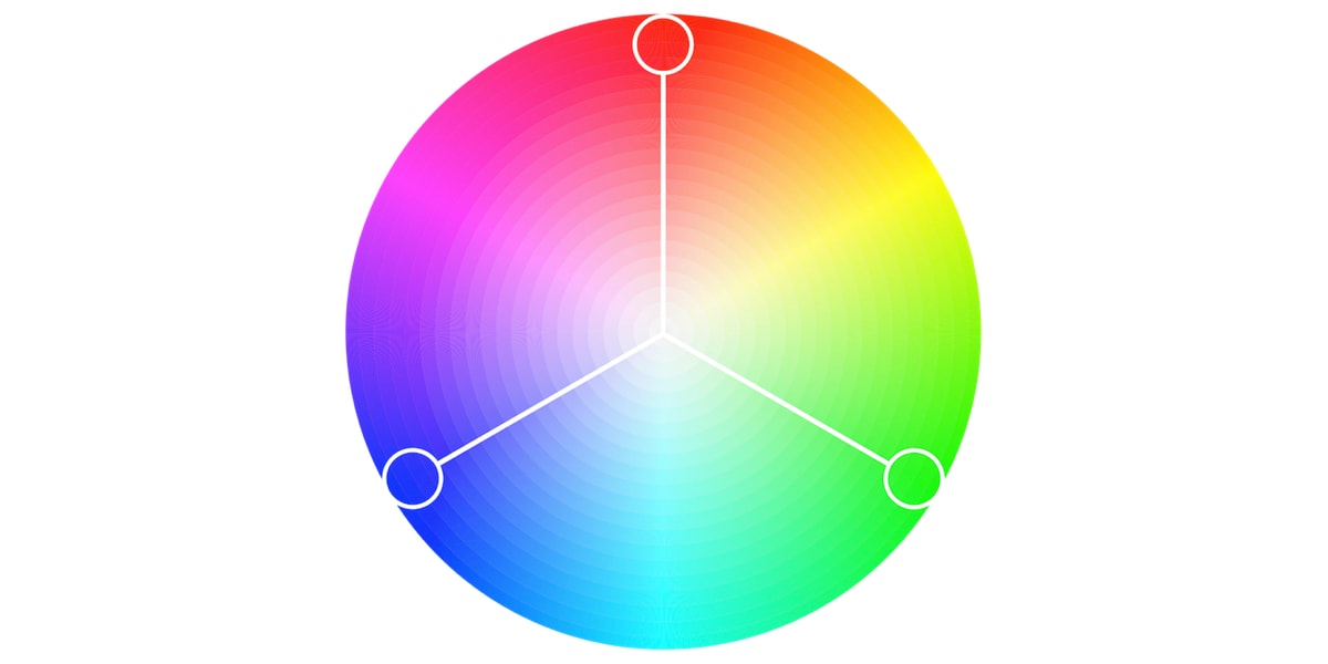
- Color: Certain colors can elicit specific feelings and associations in the viewer. For example, red can symbolize passion or excitement, while blue is often associated with trust and reliability.
- Shape: The shape of a logo can convey different messages. Curved lines are often seen as friendly and approachable, while sharp angles can suggest strength and authority.
- Typography: The font choice in a logo can have a big impact on how it is perceived. A modern, sleek font might appeal to a younger audience, while a more traditional font could attract an older demographic.
It’s no wonder that companies put so much thought into their logos – they’re a powerful tool for connecting with consumers on a subconscious level. Next time you see a logo, take a closer look and see if you can uncover the hidden messages behind the design!
Utilizing Color and Design
Color and design go hand in hand like peanut butter and jelly, cookies and milk, or Batman and Robin. Without a doubt, they are crucial elements in making your work pop like a bag of microwave popcorn in the oven. So, if you want to take your creations to the next level, pay attention to these tips like a squirrel on a nut hunt.
First off, don’t be afraid to experiment with different color combinations. Mix and match like a trendy chef creating a new fusion dish. Bold colors can catch the eye like a cat spotting a laser pointer, while softer hues can create a calming effect like a gentle breeze on a hot summer day.
When it comes to design, remember the power of simplicity. Sometimes less is more, like trying to resist that second slice of cake. Clean lines, minimalistic layouts, and strategic use of white space can make your work look sleek and professional, like a freshly waxed sports car.
Finally, don’t forget about the importance of contrast. Light versus dark, big versus small, curved versus straight – these juxtapositions can create visual interest and add depth to your work like a well-crafted magic trick. So, go forth and unleash your inner artist, to make your creations shine brighter than a glitter-covered unicorn on a sunny day!
Establishing Brand Consistency
So you’ve got your brand – congrats! Now it’s time to establish some consistency so people don’t mistake you for a knockoff brand of knockoff brands. Here are some tips to keep things on the up and up:
Logo Love: Make sure your logo is plastered everywhere. Like, everywhere. On your website, social media profiles, business cards, tattoos – you name it. It should be as recognizable as that one McDonald’s sign you always see on road trips.
Color Coordination: Pick a color scheme and stick with it. Don’t go rogue and start using neon green when your brand’s colors are a chic black and white. It’s like trying to wear stripes with plaid – just don’t do it.
Font Frenzy: Choose a font (or two) and use them consistently. Don’t get all wild and start using Comic Sans on your blog posts when your brand is all about sleek modern vibes. Keep it cohesive, people!
Connecting with Your Target Audience with Logos
Your target audience is like your high school crush - you want them to notice you, like you, and ultimately choose you over all the other options out there. And that’s where logos come in! Logos are like your best wingman, helping you make a great first impression and stand out from the crowd.
So, how do you make sure your logo connects with your target audience? Well, first things first, you need to do your homework. Get to know your audience inside and out – what they like, what they don’t like, what makes them tick. Armed with this knowledge, you can create a logo that speaks directly to their hearts (and wallets!).
Next, keep it simple! Your logo shouldn’t be an over-the-top, flashy cry for attention. Think of it as a smooth pick-up line – charming, clever, and to the point. Use bold colors, clean lines, and a memorable image to make sure your logo gets noticed in a sea of mediocrity.
And finally, don’t be afraid to show some personality! Your logo is your chance to let your brand’s unique voice shine through. Whether you’re quirky, sophisticated, or downright weird, let your logo reflect who you are and what you’re all about. After all, who wants to date a boring logo?
FAQs
What’s the big deal with logos anyways?
Logos are like the secret handshake of branding. They’re the symbol that represents everything your company stands for in a compact little package. It’s like the bat signal for your brand.
How can a logo help me stand out from the competition?
Think of your logo as your brand’s superhero costume. It’s what makes you instantly recognizable in a sea of blandness. Just like Superman’s cape or Wonder Woman’s tiara, your logo sets you apart from the rest.
What should I consider when designing a logo for my business?
When designing a logo, think about what makes your brand unique. Are you edgy and modern, or traditional and timeless? Your logo should be a visual representation of your brand’s personality. Don’t be afraid to think outside the box – or in this case, the rectangle.
How can I make sure my logo resonates with my target audience?
Do some research on your target audience and what appeals to them. Are they more into minimalistic designs, or do they prefer something bold and colorful? Your logo should speak to them on a deeper level, like a siren’s call luring sailors to their doom (but in a good way).
Can a logo really make or break my brand?
Absolutely! A well-designed logo can be the difference between being remembered and being forgotten. It’s like the difference between being a superhero and being a sidekick. So, choose your logo wisely – your brand’s fate depends on it.
So, What’s in a Logo?
Well, dear reader, after delving into the fascinating world of decoding brand voice through logos, it’s clear that a logo is not just a pretty picture. It’s a powerful tool that speaks volumes about a brand’s personality and values.
Next time you see a logo, take a closer look. What does it say about the company behind it? Does it evoke a sense of trust, excitement, or luxury? Remember, a logo is not just a symbol – it’s a window into a brand’s soul.
Keep decoding those logos, and who knows, you might just uncover the secret to world domination through clever branding. Just remember, with great branding power comes great branding responsibility. So go forth, logo sleuths, and decode on!


