Welcome, fellow font fanatics and logo-design/” title=”Farm Logo Design”>typography titans! Today, we’re diving into the wonderfully wild world of creative typography, where letters aren’t just letters - they’re works of art that can make or break a brand’s identity. So grab your trusty keyboard and strap in for a typographic rollercoaster ride as we explore the ins and outs of crafting unforgettable logo fonts. It’s time to put the “fun” back in ”font” and unleash your inner design diva! Let’s get started, shall we
Choosing the Right Typeface for Your Logo Design
When it comes to , there are a few key things to keep in mind. You want to make sure your typeface reflects the personality of your brand and conveys the right message to your audience. Here are some tips to help you find the perfect font:
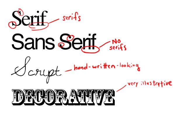
- Consider the vibe: Is your brand fun and playful? Maybe you should go for a whimsical script font. Is your brand sleek and modern? A clean sans-serif might be the way to go. Think about the overall mood you want to convey and choose a typeface that matches.
- Legibility is key: You want your logo to be easily readable, so avoid overly decorative or complex fonts that could confuse your audience. Keep it simple and easy to understand at a glance.
- Check for uniqueness: The last thing you want is for your logo to look like every other one out there. Make sure the typeface you choose is distinct and sets your brand apart from the competition.
Remember, your logo is often the first impression people will have of your brand, so it’s important to get it right. Take the time to experiment with different typefaces and find the one that best represents your brand’s personality. And above all, have fun with it – after all, choosing the right typeface is just another opportunity to show off your creative flair!

Exploring the Power of Custom Lettering
Who needs Times New Roman or Arial when you can have custom lettering that makes your text pop like confetti at a party? Custom lettering is like having a personalized designer wardrobe for your words - and who doesn’t want their text to be dressed to impress? With custom lettering, you can say goodbye to boring fonts and hello to a world where your words strut their stuff on the catwalk of creativity.
Imagine your words dressed up in fancy swirly fonts that make them look like they just stepped out of a fairy tale book. Or maybe you prefer a sleek, modern look that says “I mean business” – either way, custom lettering has got you covered. Plus, with custom lettering, you can add your own personal touch to your text, making it as unique as a unicorn in a sea of horses.
Not convinced yet? Here’s a secret: custom lettering is like a magic spell that makes your words jump off the page and dance around like they’re at a rave. It’s like giving your text a shot of espresso and watching it go from “meh” to “heck yeah!” So why settle for plain old fonts when you can unleash the power of custom lettering and turn your words into a party that everyone wants to join?

branding“>Understanding the Psychology of Typography in Branding
Ever wonder why certain fonts make you feel happy while others make you cringe? It’s all about the psychology of typography in branding!
When it comes to branding, choosing the right font is crucial. Serif fonts convey tradition and reliability, making them perfect for established brands looking to build trust with their customers. On the other hand, sans-serif fonts exude modernity and simplicity, ideal for tech companies or startups wanting to appear cutting-edge.
Did you know that the spacing between letters, known as kerning, can also impact how a brand is perceived? Tight kerning can make a brand feel more intimate and cohesive, while loose kerning can create a sense of openness and freedom.
So next time you’re designing a logo or creating a brand identity, remember that typography isn’t just about choosing pretty letters – it’s about understanding the psychological impact those letters can have on your audience!
Tips for Creating a Cohesive and Memorable Logo Font
When selecting a font for your logo, it’s important to choose one that not only looks good but also conveys the personality and style of your brand. Here are some tips to help you create a cohesive and memorable logo font:
- Keep it simple: Avoid using overly elaborate fonts that are difficult to read. A clean and simple font will make your logo easier to recognize and remember.
- Consider your brand: Think about the emotions and values you want your brand to convey. Choose a font that reflects these qualities, whether it’s bold and modern or elegant and sophisticated.
- Avoid trendy fonts: While it may be tempting to use the latest trendy font, remember that trends come and go. Opt for a timeless font that will still look great years from now.
Additionally, pay attention to factors such as spacing, letter shapes, and legibility. A well-designed logo font will help your brand stand out and make a lasting impression on customers.

Innovative Techniques for Manipulating Typography in Logo Design
Typography is the bread and butter of logo design, so why not get a little wild with it? Here are some unconventional techniques to really make those letters pop:
1. Letter Distortion: Stretch it, squish it, bend it, twist it – go crazy with those letters! Who said typography had to be boring and straight-laced? Let your creativity run wild and watch your logo come to life.
2. Layering: Forget about normal, one-dimensional type. Stack those letters on top of each other, create depth, add shadows – make your logo stand out from the crowd.
3. Mix and Match: Merge different fonts together, play with sizes, experiment with spacing. The more mismatched, the better! Don’t be afraid to break the rules and create something truly unique.
4. Texture: Add some flair to your typography by incorporating textures like wood, metal, or even glitter. Make your logo not just visually appealing, but physically interesting too.
So, next time you’re designing a logo, don’t be afraid to think outside the box and push the boundaries of typography. Who knows, you might just come up with the next design trend!
The Importance of Consistency and Versatility in Logo Fonts
When it comes to logo design, choosing the right font is crucial. The fonts you select can convey a lot about your brand’s personality, so it’s important to find a balance between consistency and versatility.
Consistency in logo fonts helps to establish brand recognition. If you’re constantly switching up your fonts, it can confuse your audience and make it harder for them to remember who you are. Stick with a few key fonts that represent your brand’s identity well.
On the other hand, versatility is also key. Your logo needs to look good across a variety of mediums and sizes, so choose fonts that can scale well without losing legibility. A versatile font will ensure that your logo looks just as good on a billboard as it does on a business card.
- Remember: Consistency breeds recognition.
- Don’t be afraid to experiment: Find a font that can adapt to different contexts.
- Choose wisely: Your font could make or break your brand’s image.
FAQs
Why is typography important in creating a memorable logo?
Typography is like the spice in a logo design – it adds the flavor and helps make your brand stand out from the bland sea of competitors. A well-crafted font can evoke emotions, convey personality, and stick in people’s minds like a catchy jingle.
What are some tips for choosing the right font for a logo?
Think of fonts like potential partners - you want someone who complements your brand’s personality and values. Consider factors like readability, uniqueness, and versatility. And please, no Comic Sans!
How can you make your logo font more creative and unique?
Get wild with it! Mix and match different fonts, play with custom lettering, or try incorporating symbols and illustrations into the typography. Just remember: there’s a fine line between creative genius and illegible mess.
What are some common mistakes to avoid when designing logo fonts?
Steer clear of cliches (looking at you, overused script fonts), generic typefaces, and poor legibility. Also, watch out for kerning disasters – no one wants a logo that spells ”comedy” as “come dye.”
Any advice for aspiring designers looking to improve their typography skills?
Practice, practice, practice! Experiment with different fonts, study design principles, and don’t be afraid to push the boundaries of traditional typography. And of course, always keep your sense of humor handy – design should be fun, not a fontastic chore.
In conclusion, let your font flag fly!
Now that you’ve learned the ins and outs of crafting unforgettable logo fonts, it’s time to get creative and start designing. Remember, typography is more than just letters on a page - it’s a chance to showcase your brand’s personality and make a lasting impression on your audience. So go forth, experiment with different styles, and don’t be afraid to push the boundaries. Who knows, maybe your next font creation will be the talk of the town!


