Are you tired of your small business being just another face in the crowd, like a potato in a sea of French fries? Well, it’s time to spice things up and give your brand a makeover that’ll have your competitors quaking in their boots. Say goodbye to boring, generic logos and hello to a custom design that screams “I’m here to slay!” Get ready to turn heads and make a lasting impression with our guide to creating a killer logo for your small business. Let’s get this branding party started!
Importance of a Professional Logo for Small Businesses
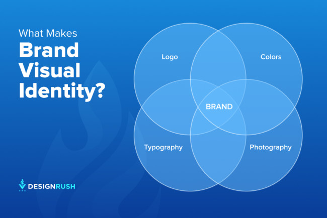
Having a professional logo for your small business is crucial for establishing a strong brand identity. Think of it as your business’s signature - it’s what sets you apart from your competitors and helps customers recognize you in a sea of other businesses.
A professional logo not only makes you look more credible and trustworthy, but it also helps you stand out in the crowded marketplace. Let’s face it, in today’s world where attention spans are shorter than a goldfish’s, you need something eye-catching to grab people’s attention. A well-designed logo does just that.
Plus, a professional logo can help you communicate what your business is all about without saying a single word. Imagine a logo so captivating that it conveys your brand’s personality and values in just a glance. Now that’s the power of a good logo!
So, if you’re a small business owner who wants to make a big impression, investing in a professional logo is a no-brainer. It’s like dressing up your business in a snazzy suit and tie - people are bound to take notice and remember you for all the right reasons.
Key Elements to Consider in Logo Design
So, you think you’re ready to design a killer logo for your brand, huh? Well, hold on just a sec! There are some key elements that you need to consider before you dive headfirst into the world of logo design. Let’s break it down for you, shall we?
First things first, you gotta think about the color scheme of your logo. Bright and bold or subtle and sophisticated? It’s a tough decision, but remember, color plays a huge role in how your brand is perceived. So choose wisely!
Next up, let’s talk about fonts. Choosing the right font can make or break your logo. Are you going for a sleek and modern look, or maybe something a bit more playful and quirky? Whatever you decide, make sure it fits the overall aesthetic of your brand.
And finally, don’t forget about scalability. Your logo needs to look just as good on a massive billboard as it does on a tiny business card. So, make sure you design something that can be resized without losing its impact. Trust us, your designer will thank you for it!

Understanding Your Brand Identity
So, you think you know your brand identity? Think again! It’s not just about your logo and colors; it’s about the soul of your company! Here are a few key things to consider:
First off, know your audience. Who are you trying to reach? Are they trendy millennials or sophisticated baby boomers? Understanding your target demographic will help you tailor your messaging and visuals to resonate with them.
Next, define your brand personality. Is your brand quirky and fun, or serious and professional? Maybe a little bit of both? Your personality should shine through in everything from your social media posts to your customer interactions.
Don’t forget about your brand values. What do you stand for? Whether it’s sustainability, innovation, or just making people smile, make sure your values are reflected in everything you do. This will help build trust and loyalty with your customers.

Choosing the Right Colors and Fonts
When it comes to for your project, it’s like picking the perfect outfit for a first date – you want to make a good impression, but you also want to be true to yourself. Here are a few tips to help you navigate this colorful and font-tastic world:
**Colors:**
– Go for colors that match the mood and tone of your project. Are you going for a sleek and professional look? Then opt for cool blues and grays. Want something more vibrant and fun? Go for bold reds and yellows.
– Don’t be afraid to mix and match colors! Just like pairing complementary colors in your wardrobe, mixing colors in your design can create a visually appealing contrast.
– When in doubt, stick to a color palette. Limit yourself to a few key colors to keep your design cohesive and cohesive.
**Fonts:**
– Fonts can make or break your design, so choose wisely! Think about the vibe you want to convey - sleek and modern? Try a sans-serif font. Fancy and elegant? Opt for a script font.
– Just like with colors, mixing different fonts can add visual interest to your design. Pair a bold headline font with a simple, easy-to-read body font for a winning combination.
– Consider the readability of your fonts. As much as you love that super fancy, ornate font, if it’s hard to read, it defeats the purpose. Choose fonts that are easy on the eyes and easy to read.
In the end, the most important thing is to have fun with your design choices! Experiment, play around with different colors and fonts, and don’t be afraid to step out of your comfort zone. Who knows, you might just find the perfect color and font combo that will make your design pop!
Working with a Graphic Designer to Bring Your Vision to Life
So, you’ve got this brilliant idea in your head, but you just can’t seem to bring it to life on paper. Enter the graphic designer – your knight in shining pixels, here to save the day! Working with a graphic designer can be a magical experience, like turning your wildest dreams into digital reality.
Here are a few tips to make sure you and your designer are on the same page (pun totally intended):
- Communicate, communicate, communicate! Your designer may good at reading minds, but they’re not mind readers. Be sure to clearly articulate your vision, goals, and expectations.
- Stay open to feedback. Your designer is a trained professional, so trust their expertise and don’t be afraid to try new ideas. Who knows, they might just come up with something even better than what you imagined!
- Be patient. Rome wasn’t built in a day, and neither is a masterpiece. Good design takes time, so sit back, relax, and let the creative juices flow.
So there you have it – the secret recipe for a successful collaboration with your graphic designer. With a little bit of patience, communication, and a whole lot of creativity, there’s no limit to what you can achieve together!
Testing and Implementing Your Logo Across Different Platforms
So, you’ve finally got your hands on a logo that screams “I am the next big thing!” But before you start printing it on shirts, hats, and maybe even your pet’s collar (why not?), you need to make sure it looks just as fabulous across all platforms. Here’s how to put your logo to the test and implement it like a pro:
First things first, size matters. Your logo should be scalable so it looks stunning whether it’s plastered on a billboard or squeezed into a tiny little favicon. Make sure it doesn’t lose its essence when you shrink it down to the size of an ant or blow it up to the size of Godzilla.
Next up, color coordination is key. Your logo should look just as classy in black and white as it does in full Technicolor. Test it out on different backgrounds to make sure it doesn’t clash like a neon green tie with a polka dot suit (yikes!).
Now onto the digital world – your logo should shine like a superstar on your website, social media profiles, and even in email signatures. Make sure it’s optimized for each platform so it doesn’t end up looking like a pixelated mess or worse, a blurry Bigfoot sighting.
Last but not least, don’t forget about the printing game. Your logo should look just as sharp on business cards, brochures, and any other print materials. Send it off to the printer with a big smile and make sure it comes back looking like a million bucks. Remember, a logo’s gotta do what a logo’s gotta do – look awesome everywhere! Time to unleash your logo into the wild and watch it conquer the world (or at least your target audience)!
Measuring the Success of Your New Logo Design
So you’ve got a shiny new logo design, huh? Congrats! Now, it’s time to figure out if all that blood, sweat, and tears (okay, maybe just a lot of coffee) was worth it. Here are a few ways to measure the success of your new logo:
- Feedback, Baby: Ask your friends, family, and that random guy you met at the coffee shop what they think of your logo. Their honest opinions can give you some insight into how well your design is resonating with others.
- Brand Recall: Can people actually remember your logo? If it’s more forgettable than last night’s dinner, it might be time to go back to the drawing board (literally).
- Social Media Buzz: Is your logo trending on Twitter? Are people using it as their profile picture on Insta? If not, you might need to amp up your marketing efforts.
Remember, measuring the success of your logo isn’t an exact science. It’s more like a weird, abstract painting that only makes sense if you squint really hard and turn your head to the side. So, grab a magnifying glass, put on your detective hat, and get to work!
FAQs
What is the importance of having a custom logo for my small business?
Having a custom logo sets your business apart from competitors and helps customers remember your brand. It also communicates your brand’s values and personality.
How can I ensure that my custom logo design reflects my brand effectively?
Discuss your brand’s identity, target audience, and values with your designer. Provide examples of logos you like and share any specific ideas you have in mind. Collaboration is key!
What factors should I consider when choosing colors for my custom logo?
Think about the emotions and associations different colors evoke. For example, blue can convey trustworthiness, while red can signify passion or excitement. Don’t just choose your favorite color—consider your brand values and target audience.
Should I include text in my custom logo design?
Including text in your logo can help reinforce your brand name and make it more memorable. Just make sure the text is legible and complements the overall design.
How can I use my custom logo to build brand recognition?
Use your logo consistently across all marketing materials, social media platforms, and your website. The more exposure your logo gets, the more recognizable it will become to your target audience.
Time to Show Off Your New Look!
Congratulations! You’ve officially taken the first step in creating a killer brand identity for your small business. With your snazzy new custom logo design, you’ll be turning heads and catching eyes in no time. So go ahead, slap that bad boy on your business cards, website, and social media profiles like the proud business owner you are. And remember, a strong brand is like a fine wine – it only gets better with time. Cheers to your success! 🥂


