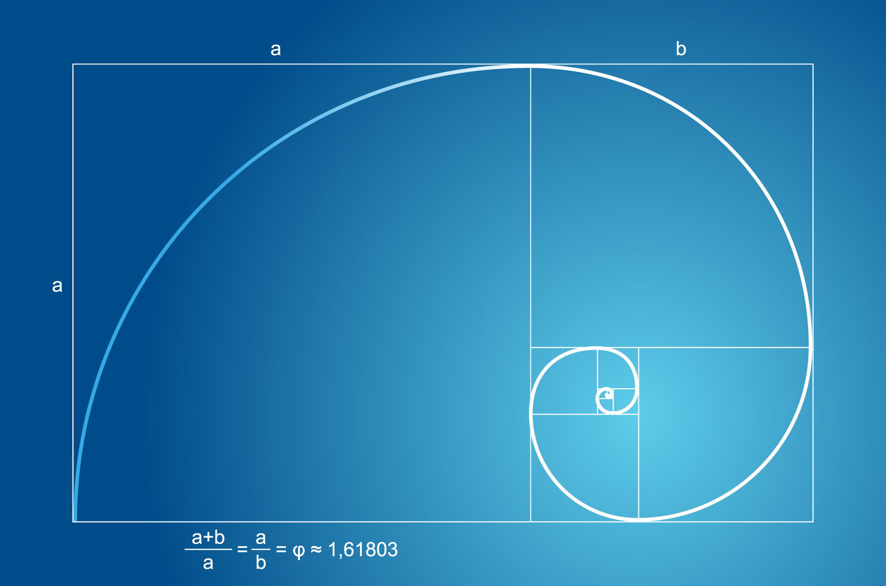
Welcome to the wonderful world of logo design, where balance is key and the Golden Ratio reigns supreme. Just like a perfectly crafted cocktail or a jenga tower that miraculously doesn’t collapse, creating a balanced logo with the Golden Ratio is an art form that takes skill, precision, and a dash of mathematical magic. So grab your protractor, dust off your creativity, and get ready to dive into the symmetrical symphony that is designing logos with the Golden Ratio. Cheers to perfectly proportioned logos that will make your brand stand out from the cluttered design landscape!
Understanding the Golden Ratio
The Golden Ratio is like the Beyoncé of math – it’s everywhere, and everyone can’t stop talking about how perfect it is. But what exactly is this mysterious number that seems to appear in everything from art to architecture?
Think of the Golden Ratio as the ultimate diva of numbers, always seeking attention and turning heads wherever it goes. It’s represented by the Greek letter Phi (Φ), and its value is approximately 1.61803398875 – which is basically just a fancy way of saying “I’m better than you.”
Like a high-maintenance celebrity, the Golden Ratio demands perfection in everything it touches. From the spirals of a seashell to the curves of a nautilus shell, this number is constantly showing off its beauty in nature. Even the Mona Lisa’s smile is rumored to be perfectly proportioned according to the Golden Ratio – talk about a mathematical masterpiece!
So next time you’re admiring the beauty of a sunflower or the elegance of a perfectly crafted piece of art, remember that it’s all thanks to the Golden Ratio – the diva of math that never fails to make a dramatic entrance.
Applying the Golden Ratio to Logo Design
So, you want to create a logo that is aesthetically pleasing and visually balanced? Well, look no further than the Golden Ratio! This magical mathematical formula has been used for centuries to create harmony and beauty in art and design.
When , keep in mind that it involves dividing a line into two parts so that the ratio of the whole line to the larger part is the same as the ratio of the larger part to the smaller part. Sounds confusing? Don’t worry, it’s simpler than it sounds!
Here are some tips to help you incorporate the Golden Ratio into your logo design:
- Use the Fibonacci sequence: Start with a simple square and use the Fibonacci sequence to create a spiral design that follows the Golden Ratio.
- Divide your logo into thirds: Divide your logo horizontally and vertically into thirds to create a balanced and visually appealing design.
- Experiment with different shapes: Try using circles, rectangles, or triangles in your logo design to create a pleasing geometric pattern that follows the Golden Ratio.

Achieving Balance and Harmony
Life can be a hectic whirlwind of chaos, throwing us off balance and disrupting our harmony. But fear not, for there are plenty of quirky and unconventional ways to achieve that perfect equilibrium!
One way to bring balance into your life is to create a daily routine that includes activities that bring you joy and relaxation. This could be anything from practicing yoga in your underwear to singing karaoke in the shower. Find what brings you peace and incorporate it into your daily schedule.
Another great way to achieve balance and harmony is through the power of dance. Put on your favorite song, crank up the volume, and let loose with some interpretive dance moves in your living room. Not only will this help release any pent-up energy, but it’s also a great way to have some fun and let go of your worries.
And finally, don’t underestimate the magic of laughter. Surround yourself with friends who make you laugh until your abs hurt, watch hilarious cat videos on repeat, or even try laughter yoga (yes, it’s a thing!). Laughter is truly the best medicine for bringing balance and harmony back into your life.

Mathematical Principles of the Golden Ratio
Have you ever wondered about the magical mathematical principles behind the Golden Ratio? Well, buckle up because we’re about to take a wild ride through the world of Fibonacci sequences and divine proportions!
First off, let’s talk about the Fibonacci sequence – a series of numbers where each number is the sum of the two preceding ones. It goes a little something like this: 0, 1, 1, 2, 3, 5, 8, 13, 21, and so on. It’s like a never-ending math party that just keeps getting bigger and better!
Now, imagine taking the ratio of two consecutive numbers in the Fibonacci sequence. Guess what you get? That’s right, the Golden Ratio – approximately 1.61803398875, but who’s counting? This ratio is like the Beyoncé of math – always perfect, always in demand.
And let’s not forget about the mesmerizing properties of the Golden Ratio in nature, art, and architecture. From the spiral of a seashell to the layout of the Parthenon, this proportion is everywhere you look. It’s like math’s way of saying, “Look at me, I’m fabulous!” So next time you see a swirl in a sunflower or a spiral in a galaxy, just remember – that’s the Golden Ratio showing off its math-mazing moves!

Examples of Famous Logos Using the Golden Ratio
Have you ever wondered why some logos catch your eye more than others? It might be because they’re secretly using the Golden Ratio to mesmerize you! Check out these famous logos that are mathematically designed to be visually pleasing:
- Apple: The iconic Apple logo, with its sleek bitten apple design, is rumored to have been crafted using the Golden Ratio. No wonder Apple products are so addictive!
- Twitter: Did you know that the Twitter bird logo is based on the Golden Ratio? It’s no wonder that Twitter is so tweet-worthy!
- Adidas: The three stripes in the Adidas logo are perfectly aligned with the Golden Ratio. No wonder Adidas gear makes you feel like a champion!
So next time you’re admiring a logo, take a closer look and see if you can spot the Golden Ratio at work. Who knew that math could be so stylish?
Tips for Utilizing the Golden Ratio in Logo Design
When it comes to designing a logo that screams sophistication and harmony, the Golden Ratio is your best friend. Here are some tips to help you nail that perfect logo using this age-old design technique.
One key tip to remember is to keep it simple. The Golden Ratio is all about balance and proportion, so don’t clutter your logo with unnecessary elements. Stick to the essentials and let the ratio do its magic.
Another handy trick is to find inspiration in nature. The Golden Ratio can be found everywhere in the natural world, from the spiral of a seashell to the petals of a flower. Take a leaf out of Mother Nature’s book and incorporate those natural shapes and patterns into your logo design.
Lastly, don’t forget to experiment! The beauty of the Golden Ratio is that there are endless possibilities for how you can use it in your design. Play around with different shapes, sizes, and layouts to see what works best for your logo. Who knows, you might just stumble upon a design that is truly golden!
FAQs
How can the Golden Ratio help in creating a balanced logo?
The Golden Ratio is like a designer’s best friend when it comes to creating logos. By using the mathematical proportion of 1:1.618, you can achieve visually pleasing and balanced designs that are sure to catch the eye.
What are some examples of famous logos that use the Golden Ratio?
Oh, where do I begin? We’ve got the Apple logo, Twitter logo, and even the UNICEF logo all rocking that Golden Ratio goodness. It’s like the secret sauce for creating iconic and memorable logos.
Is it difficult to incorporate the Golden Ratio into logo design?
Not at all! Think of it like sprinkling some magical fairy dust on your design. There are plenty of tools and resources out there that can help you easily implement the Golden Ratio into your logo creation process. It’s as easy as pie (or should I say, as easy as the Golden Ratio?).
What are some tips for beginners looking to use the Golden Ratio in their logo designs?
Don’t be intimidated by the fancy math lingo – just start experimenting and playing around with different proportions. Remember, the Golden Ratio is more of a guideline than a strict rule, so feel free to put your own creative spin on it. And most importantly, have fun with it!
Can the Golden Ratio be used for more than just logo design?
Absolutely! The Golden Ratio can be applied to all aspects of design, from website layouts to typography to even interior decorating. It’s like the Swiss Army knife of design principles – versatile, handy, and oh-so-pretty.
Achieving logo perfection with the Golden Ratio
Now that you’ve learned about creating balanced logos with the Golden Ratio, go forth and design with confidence! Remember, balance is key, just like a perfectly proportioned slice of pizza. So, embrace the mathematical magic of the Golden Ratio and watch your logos shine brighter than a disco ball at Studio 54. Happy designing!


