In the wild and wonderful world of branding, your logo is like the cherry on top of a sundae – it’s the finishing touch that ties everything together and makes everything just a little sweeter. But creating a cohesive brand isn’t as simple as slapping your logo onto everything in sight – it’s about seamlessly integrating it into every aspect of your business like a master of disguise. So grab your spy glasses and get ready to learn how to make your logo the James Bond of branding – smooth, sophisticated, and always ready for action. Let’s dive into the world of seamless logo integration and create a brand that’s on a mission to shake (not stir) things up!
Choosing the Right Logo Design
When it comes to for your business, it’s important to consider a few key factors to ensure you make the best decision possible. Here are some tips to help you on your logo design journey:
- Consider your audience – Who are you trying to attract with your logo? Make sure your design speaks to your target demographic.
- Keep it simple – A cluttered logo can be overwhelming and confusing. Opt for a clean, minimalist design that will stand the test of time.
- Think about versatility – Your logo should look good on a variety of platforms, from business cards to billboards. Make sure it’s scalable and adaptable.
As you embark on the quest for the perfect logo, remember that first impressions are everything. Your logo is often the first thing customers see, so make sure it accurately represents your brand and leaves a lasting impression. And don’t forget to have fun with it – getting creative with your logo design can be a great way to showcase your personality and stand out from the competition.

consistency-across-platforms”>Ensuring Consistency Across Platforms
Everyone knows that maintaining consistency across platforms is essential for brand recognition. But let’s face it, sometimes it feels like trying to herd cats! Here are a few tips to help you keep your messaging on-track no matter where it appears:
- Keep your brand colors consistent: Whether you’re posting on Instagram, sending out an email blast, or updating your website, make sure your colors are always on point. You don’t want your logo looking like a bad dye job that went terribly wrong!
- Stick to your brand voice: Are you a quirky, fun brand that likes to make jokes? Then don’t suddenly start sounding like a stuffy librarian on LinkedIn! Consistency in your tone of voice is key to keeping your audience engaged.
- Use the same imagery: You wouldn’t wear a clown costume to a business meeting, so don’t use drastically different images on your various platforms. Stick to a cohesive style that reflects your brand’s personality.
Remember, consistency is not about being boring – it’s about creating a harmonious experience for your audience. So go forth and conquer those platforms, dear marketer!
Maintaining Brand Recognition
When it comes to , consistency is key. Your brand should be like that one friend who always shows up at the party – reliable, memorable, and a little bit quirky. So how do you keep your brand top-of-mind for your customers? Here are a few tips:
- Update your logo regularly, but not so often that people start to wonder if your company is having an identity crisis. Think Madonna, not Miley Cyrus.
- Keep your messaging on point. If your brand is all about being environmentally friendly, don’t suddenly start promoting a gas-guzzling SUV. That’s like showing up to a vegan potluck with a bucket of fried chicken.
- Engage with your audience on social media. Respond to comments, share user-generated content, and show off your company’s personality. Just remember, there’s a fine line between being funny and being the office clown.
And last but not least, don’t be afraid to shake things up every now and then. Just like adding hot sauce to your morning coffee, a little unexpected twist can keep things interesting. Just make sure it still tastes like coffee - you don’t want your customers to end up with a mouthful of regret.

Integrating Brand Colors and Typography
So, you’ve finally picked out those perfect brand colors and typography that are going to make your brand pop like never before! Congratulations! But now comes the tricky part – integrating them seamlessly into your branding. Don’t worry, we’ve got you covered with some tips and tricks to make this process a piece of cake (or should I say, pixel?).
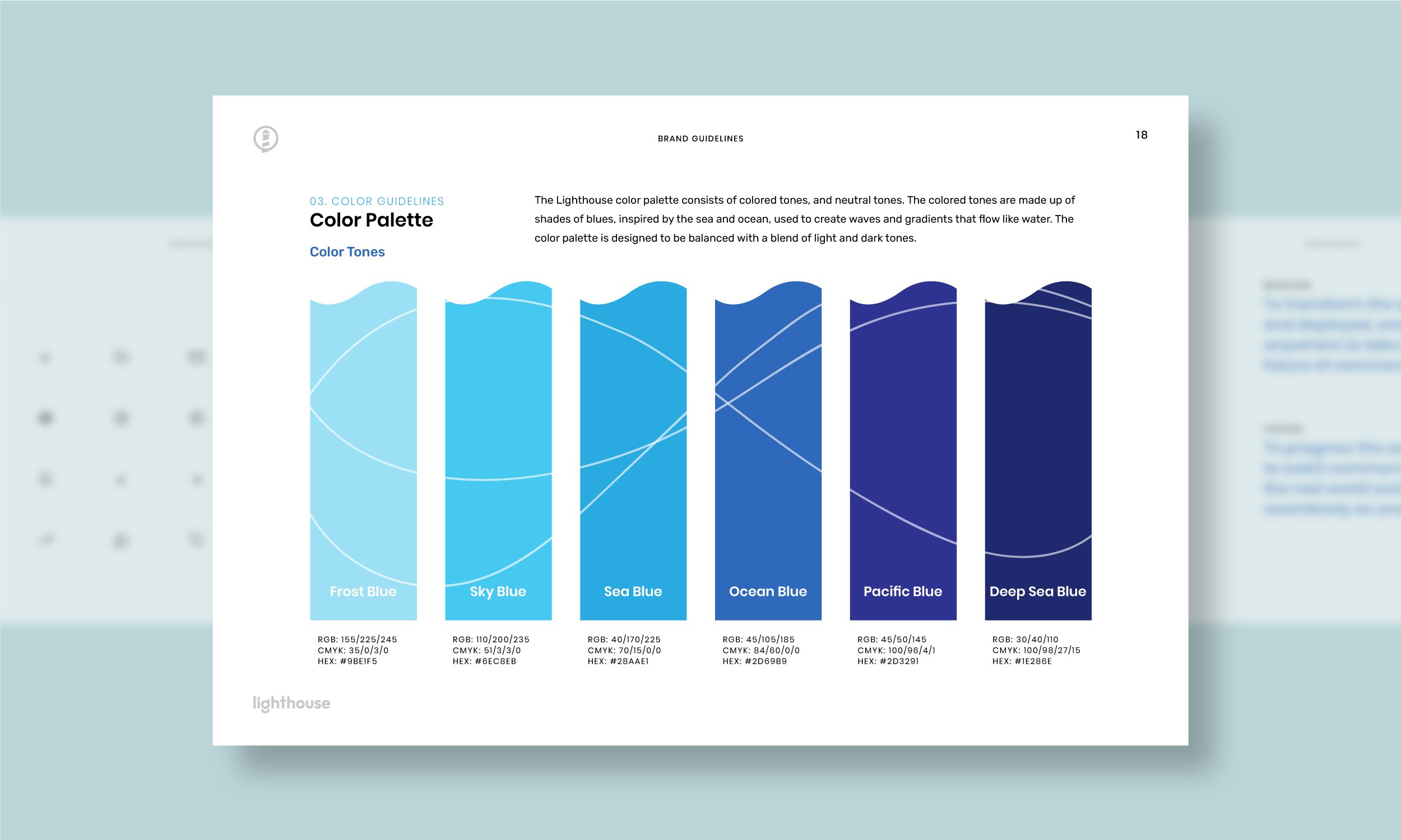
First things first, let’s talk about your brand colors. Make sure to use these consistently across all your digital and print materials. From your website to your business cards, **consistency is key**. This will not only create a cohesive look for your brand but will also make you look like a pro designer (even if you’re just faking it ’til you make it).
Next up, let’s tackle typography. Use your selected fonts wisely and sparingly. Don’t go overboard with too many different fonts – stick to a couple that complement each other well. **Mixing fonts is like making a cocktail** – you want the flavors to blend harmoniously, not clash like oil and water. Also, pay attention to font hierarchy – make sure your headers and body text are clearly defined and easy to read.
Lastly, remember to test out your new brand colors and typography on different platforms and devices. What looks great on your computer screen may not translate well to a mobile device or a printed brochure. Play around with sizes, spacing, and alignments until you find the perfect balance. And most importantly, have fun with it! After all, your brand should reflect your personality and style.
Implementing Logo Guidelines

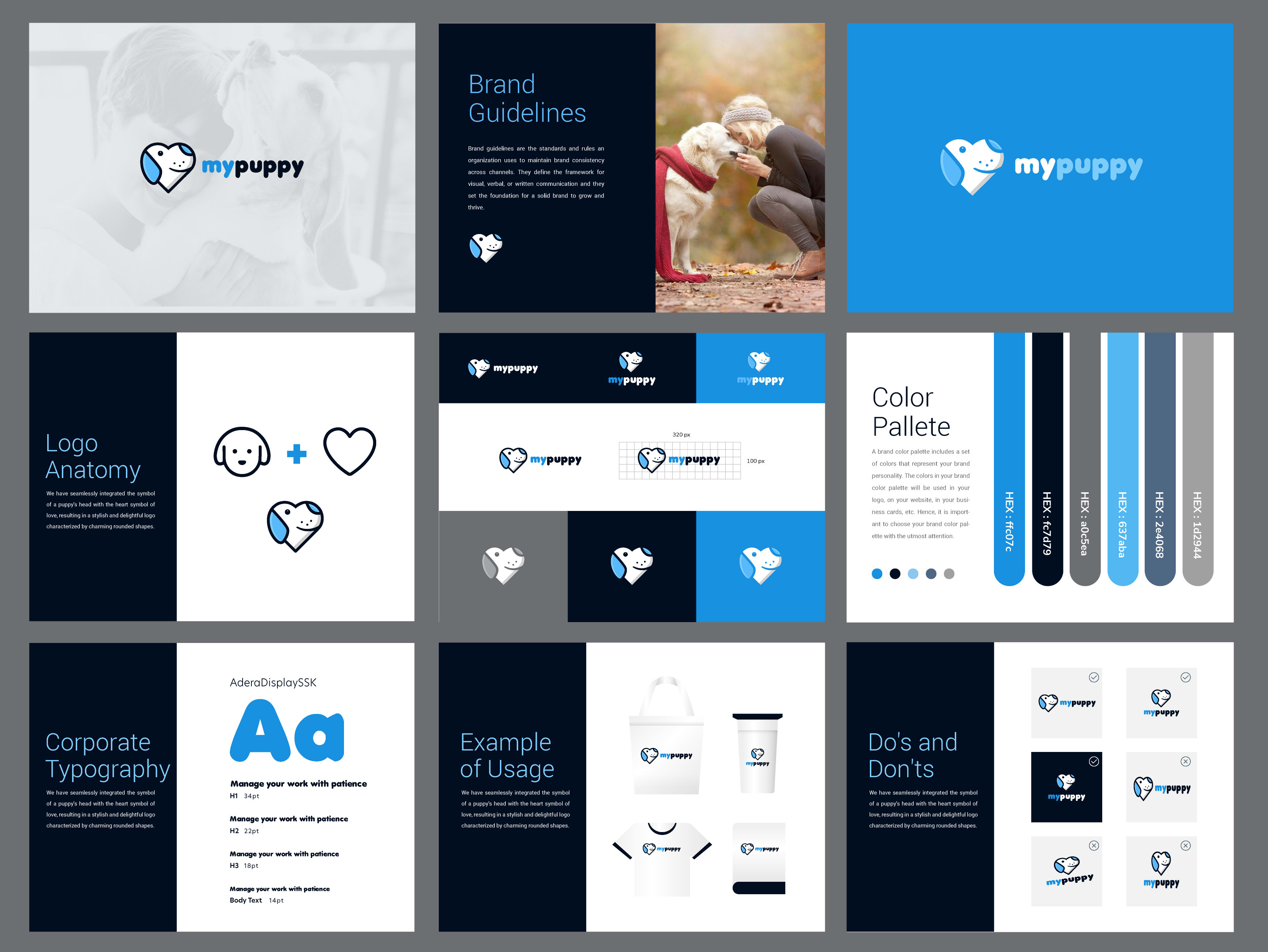
Your logo is the face of your brand, so it’s important to ensure it looks its best wherever it appears. can help maintain a consistent and professional image for your company. Here are a few tips to keep your logo looking fresh and fabulous:
- Use the correct colors: Make sure your logo is always displayed in the correct color palette. No one wants to see a neon pink version of your classy navy blue logo. Keep it classy, folks!
- Avoid stretching or distorting: Don’t let anyone mess with your logo’s proportions. It’s like giving your logo a bad haircut – it just won’t look right. Keep it looking sharp and symmetrical at all times.
- Space it out: Give your logo some breathing room. Don’t cramp it up against other elements – let it shine on its own. Your logo deserves its personal space, just like we all do.
By following these simple guidelines, you can ensure your logo remains the shining star of your brand. So next time someone tries to sneak a rainbow-colored version of your logo onto a flyer, you can kindly remind them that rules are rules, baby!
Creating a Unified Brand Message
So, you want to create a unified brand message? Well, first things first, you need to make sure everyone on your team is on the same page. Literally. Don’t let them go off and start scribbling their own messages willy-nilly. That’s a recipe for disaster. You need to corral them all together and get everyone singing from the same hymn sheet.
One way to do this is by coming up with a catchy slogan that encapsulates your brand’s essence. Something like “We’re the bee’s knees” or ”Making magic happen every day”. Just make sure it’s something that resonates with your target audience and doesn’t sound like it was written by a robot.
Next, think about the colors, fonts, and imagery you want to use to convey your message. You don’t want to have a mishmash of styles that confuses your audience. Keep it clean, keep it cohesive. That way, when someone sees your brand, they’ll know it’s you without even having to squint.
And lastly, remember to keep that message consistent across all your marketing channels. Whether it’s your website, social media, or even your business cards, make sure your brand message shines through loud and clear. Because if it’s not consistent, well, you might as well be speaking different languages to your audience. And that’s a brand message fail of epic proportions.
FAQs
Why is it important for my logo to integrate seamlessly with my brand?
Because if it doesn’t, your brand might end up looking like a hot mess. You want your logo to be the cherry on top of your brand sundae, not the fish sticking out like a sore thumb. Integration is key, my friend.
How can I ensure that my logo blends in seamlessly with my brand’s overall aesthetic?
Think of your logo as the chameleon of your brand – it should be able to adapt to any environment. Make sure it’s consistent in terms of color, font, and style with the rest of your brand elements. You don’t want your logo to be the rebel without a cause.
What are some tips for creating a cohesive brand identity with my logo?
First things first, make sure your logo is versatile. It should look just as good on a business card as it does on a billboard. Also, don’t be afraid to experiment with different variations of your logo to see what works best. And last but not least, always keep your target audience in mind – you don’t want your logo to be speaking a different language than your brand.
How can I make sure my logo stands out while still seamlessly integrating with my brand?
Think of your logo as the Beyoncé of your brand – it should be able to steal the show while still staying true to the brand’s overall vibe. Play around with elements like color, size, and placement to make sure your logo gets the attention it deserves without overpowering the rest of your brand.
What are some common mistakes to avoid when trying to integrate my logo seamlessly with my brand?
Avoid the temptation to go crazy with your logo. Keep it simple, keep it classy. Also, be wary of using too many colors or fonts in your logo – you don’t want it to look like a rainbow threw up on your brand. And lastly, make sure your logo is scalable - you don’t want it to look like a pixelated mess when blown up to a larger size.
In Conclusion: Don’t Logo-go Overboard!
So there you have it, folks! Remember, when it comes to creating a cohesive brand, integrating your logo seamlessly is key. But, just like adding too many toppings on a pizza, you don’t want to logo-go overboard! Keep it simple, keep it stylish, and keep it cohesive. Your brand will thank you for it! Stay logo-tastic, my friends!


