
In a digital world cluttered with logos as memorable as last week’s grocery list, standing out is the ultimate challenge. Crafting an unforgettable logo is like finding a needle in a haystack, except the haystack is on fire and the needle is singing “Sweet Caroline” at the top of its needle-y lungs. But fear not, brave logo warriors! With a dash of creativity, a sprinkle of wit, and a whole lotta pixel power, you can create a logo that shines brighter than a disco ball at Studio 54. So grab your metaphorical chisel and let’s sculpt some digital masterpieces that will have your competitors shaking in their designer boots.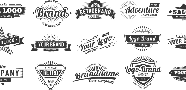
Understanding the Importance of Logos in Digital Marketing
Logos are the unsung heroes of digital marketing. They are the visual representation of a brand and convey the essence of a company in a single image. Think of them as the superhero capes of the business world.
Having a strong logo is crucial in creating brand recognition and building trust with consumers. Just like how Superman’s emblem inspires hope and confidence, a well-designed logo can make your brand stand out in a sea of competitors.
Here are a few reasons why logos are essential in digital marketing:
- First Impressions: Your logo is often the first thing customers see, so make it count!
- Brand Identity: A logo helps customers remember and identify your brand in a crowded marketplace.
- Professionalism: A sleek logo gives off the impression that your business is legit and not run out of your mom’s basement.
So, next time you’re brainstorming your digital marketing strategy, don’t underestimate the power of a well-designed logo. It could be the difference between being a hero or a zero in the eyes of your customers.

Researching the Latest Trends in Logo Design
So, you think you know all there is to know about logo design trends, huh? Well, think again! We’re diving into the latest and greatest in the world of logos, and trust me, you won’t want to miss this.
First up, we have the rise of minimalism. Gone are the days of cluttered logos with too much going on. Simple, clean designs are all the rage. Think Apple or Nike – clean, sleek, and instantly recognizable.
Next, we have geometric shapes making a comeback. Circles, squares, triangles – these classic shapes are being used in innovative ways to create eye-catching logos that stand out from the crowd.
And last but not least, we have bold colors taking center stage. Say goodbye to boring black and white logos – vibrant, eye-popping colors are where it’s at. Don’t be afraid to go bold with your color choices!
Choosing the Right Colors and Typography for Your Logo
When it comes to choosing the perfect colors and typography for your logo, you want to make sure it’s not just any old boring combination. Here are some tips to help you create a logo that stands out:
- **Go bold or go home**: Don’t be afraid to choose bright, eye-catching colors that will make your logo pop. Think neon pink or electric blue!
- **Mix it up**: Try using a combination of colors that you wouldn’t normally put together. Who says orange and purple don’t go well together?
- **Make it playful**: Experiment with different fonts and typography styles to give your logo a fun and quirky feel. Papyrus, anyone?
Remember, your logo is the face of your brand, so don’t be afraid to think outside the box and choose colors and typography that truly reflect your personality and the essence of your business. Be bold, be adventurous, and most importantly, be yourself!

Utilizing Negative Space and Simplistic Designs for Impact
Forget elaborate designs and cluttered compositions! Embrace the power of negative space and simplistic designs to make a bold impact with your creations.
By strategically leaving areas of your design empty, you can draw attention to the key elements and create a sense of balance and harmony. Don’t be afraid of the blank canvas – it’s your new best friend!
- Less is more: Simplify your designs by removing unnecessary elements and focusing on the essentials.
- Play with proportions: Use negative space to create visual interest and guide the viewer’s eye.
- Bold choices: Opt for clean lines, minimalistic shapes, and sharp contrasts to make a statement.
So next time you’re working on a project, remember that sometimes the most impactful designs come from what you don’t include. Embrace the beauty of simplicity and let negative space work its magic!

Testing Your Logo Across Different Digital Platforms
So you’ve designed the perfect logo for your brand, congratulations! But before you plaster it all over the digital universe, it’s important to make sure it looks good on all platforms. Because let’s face it, your logo might look like a boss on Instagram, but like a hot mess on LinkedIn. Here are a few tips to help you test your logo across different digital platforms:
First things first, make sure your logo looks fly on social media. Check how it appears on Facebook, Twitter, Instagram, and any other platforms where your brand is present. **Ain’t nobody got time for pixelated logos or awkward cropping**. Your logo should be instantly recognizable and make people say, “whoa, that brand must be cool!”
Next up, take a peek at your logo on your website. **Your logo is the Beyoncé of your branding**, so it should stand out like a diva on your homepage. Make sure it doesn’t clash with your website colors or get lost in the background. Your logo should be the shining star of your digital stage, darling!
Don’t forget about email marketing! Your logo needs to shine bright like a diamond in your email campaigns. Whether your subscribers are opening your emails on their laptops, tablets, or smartphones, your logo should be front and center, looking fresh to death. **Nobody wants to see a squished or blurry logo in their inbox**. So test, test, and test again to make sure your logo is looking its best in every email.
In conclusion, is essential to ensure your brand’s consistency and professionalism. Remember, your logo is the visual representation of your brand, so make sure it’s looking fierce wherever it appears online. **Don’t let your logo be the weak link in your digital presence**. Test it, tweak it, and show the digital world that your brand is a force to be reckoned with!
Ensuring Consistency and Adaptability in Logo Design
When it comes to logo design, consistency is key. Your logo should be recognizable across all platforms and mediums. Whether it’s on a billboard or a business card, your logo should remain consistent in its design elements, color scheme, and overall aesthetic.
To ensure consistency, always keep a style guide handy. This guide should include the correct color codes, font choices, and logo variations. Having a style guide will help you or anyone else working with your logo to maintain its consistency.
At the same time, it’s important for your logo to be adaptable. Your logo should be able to scale to different sizes without losing its clarity or impact. Make sure your logo is versatile enough to work in black and white, as well as in color.
Remember, a logo is the face of your brand, so make sure it’s both consistent and adaptable. The last thing you want is for your logo to look like a different creature every time it’s printed or displayed. Stay true to your brand identity while also allowing for some flexibility when needed.
Collaborating with Designers and Branding Experts for Logo Success
When it comes to logo design, partnering with designers and branding experts can make all the difference for your brand. These creative geniuses are like the wizards of the branding world, waving their magic wands and creating logos that are sure to captivate your audience.
Working with designers and branding experts is a bit like going on a blind date - you never know what you’re going to get, but when it’s a match made in design heaven, it’s pure logo bliss. They’ll listen to your ideas, understand your brand’s personality, and craft a logo that’s not just visually appealing, but also speaks to your target audience.
Collaborating with these experts is like a game of Designers and Branding Experts Bingo – you never know what quirky, creative ideas they’ll come up with. You might end up with a logo that’s sleek and minimalist, or one that’s bold and eye-catching. Either way, you can trust that they’ll always bring their A-game to the table.
So, if you want your logo to stand out in a sea of generic designs, consider teaming up with designers and branding experts. Together, you can create a logo that’s not just successful, but also a true reflection of your brand’s unique identity. Who knows, you might just end up with a logo that’s so awesome, it’ll make your competitors green with envy!
FAQs
What should I keep in mind when designing a logo for the digital sphere?
When designing a logo for the digital sphere, it’s important to consider scalability and versatility. Your logo should look great on a tiny app icon and a massive billboard. Also, remember that simplicity is key - overly complex designs can get lost in the digital noise.
How can I make my logo stand out in a crowded digital landscape?
To make your logo stand out, focus on creating a unique and memorable design that reflects your brand’s personality. Avoid cliches and trends that will make your logo blend in with the crowd. And don’t be afraid to take some creative risks!
What are some common pitfalls to avoid when crafting a logo for the digital sphere?
Avoid using too many colors or intricate details that may not translate well in digital formats. Make sure your logo is easily recognizable in both color and black and white versions. And remember, your logo should be timeless – avoid jumping on bandwagons that may date your design.
How can I ensure my logo is responsive and looks great on all devices?
To ensure your logo is responsive, test it across various devices and screen sizes. Make sure it looks just as good on a smartphone as it does on a desktop computer. And don’t forget to optimize your logo for high-resolution displays to ensure it looks crisp and professional.
What resources or tools can I use to help me craft a memorable logo for the digital sphere?
There are plenty of online resources and tools available to help you craft a killer logo. From design software like Adobe Illustrator to logo creation platforms like Canva, there’s something out there for every budget and skill level. Don’t be afraid to experiment and play around until you find the perfect design for your brand!
Now go forth and craft your legendary logo!
Whether you’re a seasoned designer or a newbie just starting out, remember that creating a memorable logo is all about thinking outside the box (or rectangle, in this case). Don’t be afraid to experiment with colors, shapes, and fonts until you find the perfect combination that truly represents your brand.
So grab your digital paintbrush and get to work. Who knows, maybe your logo will be the next iconic symbol that people can’t help but remember and recognize. Good luck, and may your designs be forever in the minds of your audience!


