Buckle up, auto brands, because we’re about to rev up your design/” title=”Law Firm Logo Design”>logo game! Crafting an unforgettable logo is key when it comes to standing out in the competitive world of cars, trucks, and everything in between. From sleek sports cars to rugged off-roaders, we’ve got the expert tips you need to design a logo that leaves a lasting impression and drives your brand to success. So grab your toolbox and get ready to hit the gas on your logo design journey. Let’s put the pedal to the metal and create some logo magic!![]()
Key Elements of Successful Auto Brand Logos
So, you want to create an auto brand logo that’s successful and drives customers wild? Well, you’re in luck because I’ve got the inside scoop on the key elements you need to make that happen. Let’s dive in!
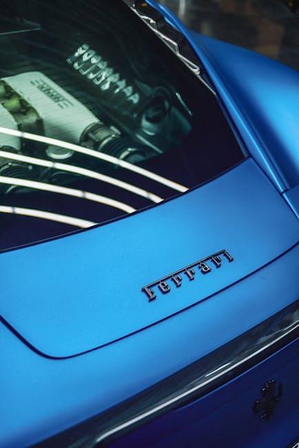
First things first, your logo needs to be memorable. You want people to see your logo once and never forget it. Think about brands like Ferrari or Mercedes-Benz – their logos are etched into our brains forever. Make sure your logo stands out from the crowd and leaves a lasting impression.
Next up, your logo should be timeless. You don’t want to be constantly redesigning your logo every few years to keep up with the trends. Aim for a classic design that will withstand the test of time. Remember, a good auto brand logo is like a fine wine – it only gets better with age.
And finally, make sure your logo is relevant to your brand. If you’re selling luxury cars, don’t use a cartoonish font and bright colors. Your logo should reflect the style and personality of your brand. Stay true to who you are and let your logo be a true representation of your auto brand.

Understanding the Importance of Simplicity and Memorability
Ever tried to memorize a password that looks like it was generated by a cat walking across a keyboard? Yeah, good luck with that. The importance of simplicity and memorability cannot be overstated when it comes to anything, really. From passwords to marketing slogans to your great aunt Mildred’s birthday (don’t forget the cake!), simplicity and memorability are key factors in ensuring that whatever you’re trying to remember sticks in your brain like gum on hot pavement.
So why is simplicity so important, you ask? Well, let me break it down for you:
- Simple things are easier to remember because they’re, well, simple.
- Simple things are easier to explain to a toddler (or your technologically challenged grandmother).
- Simple things are like that one friend who always shows up on time and never makes your life more complicated than it needs to be.
Memorability, on the other hand, is like that ex who just won’t go away (but in a good way, I promise). When something is memorable, it sticks in your brain like a catchy tune you can’t stop humming. It’s like your brain’s way of saying, ”Hey, this thing is important, pay attention to it!”

Incorporating Automotive Elements in Logo Design
When it comes to designing a logo, incorporating automotive elements can give your brand a sleek and speedy look that will have your competitors racing to catch up. Here are some tips and tricks to rev up your logo design:
Shift into high gear with these automotive-inspired design elements:
- Checkered flags: Nothing says speed like a checkered flag. Incorporate this classic racing symbol into your logo for an instant boost of adrenaline.
- Tire tracks: Leave your mark with tire tracks that show your brand is always on the move and never stops moving forward.
- Steering wheels: Steer your brand in the right direction with a sleek and stylish steering wheel icon that represents control and precision.
Don’t forget to add a splash of color to really make your logo pop:
- Bright reds, yellows, and oranges are perfect for conveying speed and excitement.
- Metallic tones like silver, chrome, and gold can give your logo a polished and professional look.
- Black and white are classic choices that never go out of style and exude sophistication and elegance.
Remember, a well-designed logo can drive your brand to success faster than a Ferrari on the Autobahn. So put the pedal to the metal and start incorporating automotive elements into your logo design today!

Choosing the Right Color Palette for Your Auto Brand Logo
When it comes to , it’s essential to think about the message you want to convey to your customers. After all, you don’t want to send the wrong impression with a neon pink logo for a rugged off-road vehicles brand!
Here are a few tips to help you pick the perfect colors for your auto brand logo:
- Consider your target audience: Are you targeting adventurous millennials or luxury-loving retirees? Choose colors that resonate with your target demographic.
- Think about the emotions you want to evoke: Do you want your customers to feel excited, calm, or powerful when they see your logo? Choose colors that evoke those emotions.
- Check out the competition: You don’t want your logo to blend in with all the other auto brands out there. Make sure your color palette stands out in a unique and memorable way.
Remember, a well-chosen color palette can make a huge difference in how your auto brand is perceived. So, take your time, experiment with different color combinations, and find the perfect hues that will make your logo pop!
Utilizing Typography to Convey Brand Identity
When it comes to using typography to convey brand identity, it’s all about finding the right font that speaks volumes about who you are as a company. Imagine using Comic Sans for a law firm – not a good look, right? Instead, opt for a sleek and professional font like Helvetica or Times New Roman to give off a more polished vibe.
Another way to utilize typography is by playing with the size and weight of your fonts. Want to emphasize a certain word or phrase? Make it bold or italicized to draw attention. Just be careful not to go overboard – no one wants to read a paragraph that looks like a ransom note with a mishmash of different fonts and sizes.
When choosing typography for your brand, consider the emotions and feelings you want to evoke in your audience. Are you a fun and quirky company? Opt for a whimsical and playful font like Lobster or Pacifico. Or maybe you’re a no-nonsense business looking to convey trust and reliability – in that case, a classic serif font like Georgia or Baskerville could be the way to go.
At the end of the day, typography is like the outfit your brand wears - it should be stylish, appropriate, and reflect your unique personality. So go ahead, experiment with different fonts, sizes, and styles until you find the one that truly embodies your brand identity. And remember, when it doubt, just stick to the classics – you can never go wrong with a good ol’ Helvetica.
Testing and Iterating to Ensure Logo Effectiveness
Once you’ve designed a logo, the real fun begins – testing and iterating to ensure its effectiveness! Think of it as giving your logo a makeover montage, with lots of trial and error and a sprinkle of creativity.
First things first, slap that logo on everything – t-shirts, coffee mugs, even your pet goldfish (just kidding, animal cruelty is not cool). The key is to see how your logo looks across different mediums and surfaces. Is it still recognizable when scaled down to the size of a pea? Does it lose its charm when printed in black and white? These are the questions that keep us up at night.
Next, gather a focus group of your most brutally honest friends and family members. Have them critique your logo with no mercy. Do they understand the message you’re trying to convey? Does it make them feel all warm and fuzzy inside, or does it remind them of that time they accidentally ate a whole raw onion (true story)? Take notes, make changes, and repeat until your logo is as flawless as a baby’s bottom.
Remember, Rome wasn’t built in a day, and neither was the Nike swoosh. Embrace the process of testing and iterating – it’s like a never-ending game of Logo Whack-a-Mole, but with less frustration and more design wizardry. Before you know it, your logo will be turning heads and breaking hearts (metaphorically speaking, of course).
FAQs
How can auto brands make their logos stand out from the competition?
Auto brands can make their logos stand out by incorporating unique elements that represent their brand identity, using bold colors and fonts, and keeping the design simple yet memorable. Think outside the box – a flaming tire or a sleek car silhouette could do the trick!
What role does color play in creating a memorable logo for auto brands?
Color plays a crucial role in logo design for auto brands. Red can symbolize speed and passion, while blue can convey trust and reliability. Choose colors wisely to evoke the right emotions in your audience – just don’t go overboard with a rainbow of colors!
How important is it to consider the target audience when designing a logo for auto brands?
Considering the target audience is key when designing a logo for auto brands. Take into account demographics, preferences, and behaviors to create a logo that resonates with your audience. After all, you wouldn’t want a flashy, neon pink logo for a rugged, off-road vehicle brand!
What are some common mistakes to avoid when designing a logo for auto brands?
Common mistakes to avoid when designing a logo for auto brands include using generic or cliché elements, overcrowding the design with too many details, and not considering scalability for various applications. Remember, less is more – unless you’re designing for a monster truck brand!
How can auto brands ensure their logos are timeless and not just a passing trend?
To ensure their logos stand the test of time, auto brands should focus on creating a design that is simple, versatile, and relevant to their brand values. Avoid trendy elements that may quickly become outdated - unless retro is your brand’s aesthetic! Here’s to crafting logos that rev up the engines of our imagination!
Revving Up Your Brand’s Image
And there you have it - the key to crafting unforgettable logos for auto brands! Remember, when it comes to designing a logo that truly stands out, creativity and attention to detail are your best allies. So grab your pencils, fire up your design software, and get ready to leave a lasting impression on the road (and in the minds of your customers)! Drive on, logo warriors!


