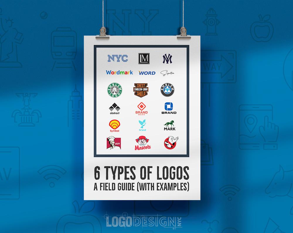
In a world where designer logos reign supreme and status symbols are as common as avocado toast, crafting timeless luxury in logo design has become an art form. From sleek monograms to extravagant emblems, the key to mastering prestige in logo design lies in the ability to make people say, “Wow, I didn’t know I needed that on a handbag until now.” So grab your fanciest pen and get ready to dive into the world of logo design, where dreams are made of gold foil and Helvetica Neue.
Crafting Elegant and Sophisticated Designs
Are you tired of your designs looking like they were made by a kindergartener with a glue stick? It’s time to level up and start that will make everyone’s jaws drop. But how, you ask? Fear not, dear designer, for I have some tips that will take your work from blah to ooh-la-la!
First off, less is more. Embrace white space like it’s your long-lost lover. Don’t clutter your designs with unnecessary elements – simplicity is key. Think of yourself as a minimalist guru, channeling your inner Marie Kondo and asking yourself, “Does this spark joy?” If the answer is no, toss it out like yesterday’s leftovers.
Next, play with typography. Fonts are like spices - the right ones can elevate your design to a whole new level. Experiment with different fonts and sizes, mixing and matching until you find the perfect combination. Just like a fine wine pairing, the right font can complement your design and bring out its best flavors.
Lastly, don’t forget about color. Like a magician with a wand, you can use color to create mood and evoke emotions in your designs. Choose a color palette that speaks to you – whether it’s bold and vibrant or soft and subtle. Just remember, a little pop of color can go a long way, so use it wisely.

Embracing Minimalism for Maximum Impact
When it comes to embracing minimalism, less is definitely more. By decluttering our lives and simplifying our surroundings, we can make a huge impact that will leave us feeling lighter and more focused. Think of it as a KonMari for your mind, body, and soul.
So, what are some ways we can incorporate minimalism into our daily lives for maximum impact? Here are a few ideas to get you started:
- Clear out the clutter: Your space should be a reflection of your mind – cluttered and chaotic. Get rid of anything that doesn’t bring you joy or serve a purpose. Be ruthless in your decluttering, and you’ll be amazed at how much lighter you feel.
- Simplify your wardrobe: Do you really need 20 pairs of jeans and 50 t-shirts? Probably not. Embrace a capsule wardrobe where you only keep pieces that you truly love and wear frequently. Plus, it’ll make getting dressed in the morning a breeze.
- Limit your screen time: In a world where we’re constantly bombarded with notifications and distractions, it’s important to take a step back and limit your screen time. Set boundaries for yourself, whether it’s turning off your phone an hour before bedtime or taking a digital detox on the weekends.

Choosing the Right Colors and Fonts
When it comes to for your project, it can be quite the daunting task. But fear not, my friends! I am here to guide you through this treacherous journey with a sprinkle of humor and a dash of wit.
First things first, let’s talk about colors. Colors can evoke different emotions and set the tone for your project. So, choose wisely! Think about what message you want to convey and pick colors that align with that. And remember, just because pink is your favorite color, doesn’t mean it’s the right choice for a professional business website (unless you’re in the business of selling unicorn merchandise).
Next up, fonts. Ah, fonts. They can make or break your design faster than you can say Comic Sans. When choosing fonts, consider readability and compatibility. Stick to a maximum of three fonts to avoid looking like a ransom note and make sure they complement each other like peanut butter and jelly (or bacon and eggs, depending on your preference).
Lastly, don’t be afraid to experiment and have fun with colors and fonts. After all, creativity knows no bounds! And remember, if all else fails, just close your eyes, spin in a circle three times, and pick a color and font at random. Who knows, it might just be a stroke of genius!

Incorporating Symbols of Prestige and Luxury
When it comes to conveying a sense of wealth and sophistication, is key. From designer labels to opulent materials, there are countless ways to add a touch of extravagance to your surroundings.
One way to elevate your space is to invest in pieces that are adorned with logos of high-end brands. Whether it’s a handbag, a pair of shoes, or even a throw pillow, displaying these symbols of affluence will instantly up the ante of any room.
Another way to bring a sense of luxury into your space is to incorporate materials that scream opulence. Think plush velvet, sumptuous silk, and gleaming gold accents. These extravagant materials will not only look fabulous but will also make you feel like a true VIP.
Lastly, don’t forget about the power of statement pieces. Whether it’s a chandelier dripping in crystals or a grandiose piece of artwork, these eye-catching items will serve as the ultimate symbol of extravagance. So go ahead, indulge in a little luxury – you deserve it!

Balancing Tradition with Modernity
When it comes to , it can often feel like trying to juggle cats and dogs - a chaotic mess that you’re not quite sure how to handle. But fear not, there are ways to navigate this delicate dance without losing your sanity!
One key strategy is to embrace both the old and the new in equal measure. Why not wear a traditional kimono while binge-watching the latest Netflix series? Or rock out to your favorite K-pop band while enjoying a traditional Korean feast. Mixing and matching can create a unique blend of the past and the present that is all your own.
Another tip is to find common ground between tradition and modernity. Consider incorporating traditional practices into your daily routine, but with a modern twist. For example, start your morning with a traditional Japanese tea ceremony, but using a sleek, minimalist teapot that fits in with your modern aesthetic.
Finally, remember that balance is key. Don’t feel like you have to choose between tradition and modernity – embrace both and find harmony between the two. After all, who says you can’t enjoy a traditional Turkish bath while scrolling through Instagram? Ultimately, finding your own unique blend of tradition and modernity is a journey worth taking.
Ensuring Consistency Across Various Platforms
When it comes to ****, it can sometimes feel like herding cats – challenging, chaotic, and full of surprises. But fear not, brave marketer! With a few key strategies, you can tame those wild platforms and bring harmony to your digital presence.
First and foremost, it’s crucial to establish clear brand guidelines that dictate everything from your logo size to your tone of voice. This will serve as the Holy Grail for consistency, ensuring that no matter where your audience encounters your brand, they’ll recognize it instantly. Think of it as your brand’s North Star, guiding you through the murky waters of social media, email marketing, and beyond.
Next, take a deep dive into each platform to understand its unique quirks and limitations. From Twitter’s character count to Instagram’s square format, each platform has its own set of rules that you must play by. By adapting your content to fit these parameters, you’ll avoid looking like that awkward guest who shows up to a party in a tuxedo when everyone else is in jeans and a t-shirt.
Lastly, remember that consistency doesn’t mean being boring. Mix things up with different types of content, but always stay true to your brand’s voice and values. Whether you’re cracking jokes on Twitter or sharing heartfelt stories on LinkedIn, make sure your audience knows it’s you behind the screen. By following these tips, you’ll be well on your way to reigning supreme across all platforms and conquering the digital realm like a true marketing ninja.
FAQs
Question: How can I create a logo that exudes luxury and prestige?
Answer: Well, darling, first you must understand that luxury is all about the details. Opt for sleek fonts, elegant colors, and intricate design elements to elevate your logo to prestigious heights.
Question: What are some common mistakes to avoid when crafting a luxury logo?
Answer: Darling, never ever opt for Comic Sans. And steer clear of garish colors or overly complicated designs. Remember, less is more when it comes to luxury.
Question: How can I ensure my logo stands the test of time?
Answer: Ah, darling, to create a timeless logo, focus on classic design elements that will never go out of style. Think simple yet sophisticated, and your logo will remain prestigious for years to come.
Question: Should I follow current design trends or stick to a more traditional approach?
Answer: Darling, trends come and go, but timeless elegance is forever. While it’s tempting to jump on the latest design bandwagon, it’s best to stick to a more traditional approach for a logo that exudes lasting prestige.
Question: How can I make my luxury logo stand out from the competition?
Answer: Ah, darling, the key to standing out is to be unique yet relatable. Study your competition, but don’t copy their style. Instead, focus on creating a logo that is distinctly yours and showcases your brand’s individuality.


