Welcome to the wild world of logo design, where creativity meets beginner-tips-for-exceptional-designs/” title=”Mastering Logo Crafting: Beginner Tips for Exceptional Designs”>chaos and Helvetica reigns supreme. As a beginner in the realm of crafting the perfect logo, you may feel like a lost fish in a sea of Comic Sans…but fear not, dear designer. We’re here to guide you through the treacherous waters of branding, so grab your pens, boot up your design software, and let’s dive into the art of logo creation!
Understanding the Fundamentals of Good Logo Design
So, you want to create a killer logo that will make all your competitors green with envy, huh? Well, strap in, because we’re about to dive into the wild world of logo design!
First things first, keep it simple, silly! A good logo should be clean, clear, and easily recognizable. Think about some of the most iconic logos out there - Apple, Nike, McDonald’s. What do they all have in common? They’re simple, yet memorable. So, resist the urge to add every color of the rainbow and a bunch of fancy fonts – less is definitely more in the logo design game.
Another key factor to keep in mind is versatility. Your logo should look just as snazzy on a business card as it does on a billboard. Make sure it works well in various sizes and formats. A logo that loses all its pizzazz when scaled down to tiny proportions is like a superhero without their cape – just sad and disappointing.
And lastly, make sure your logo represents your brand. Think about your company’s values, products, and target audience. Your logo should reflect all of these things in a clever and creative way. A logo that doesn’t resonate with your brand is like a unicorn in a sea of horses – cool, but totally out of place.
Choosing the Right Color Palette for Your Brand
So you’ve decided to take the plunge and establish your brand’s color palette. Congratulations! This is a pivotal moment in your business journey. However, the task of choosing the perfect hues can be quite daunting. Fear not, dear friend, for I am here to guide you through this colorful maze with wit and wisdom.
First things first, consider the emotions you want your brand to evoke. Is it sophistication and elegance? Playfulness and creativity? **Do some soul-searching (and color-searching) to find the perfect match**.
Next, think about your target audience. What colors resonate with them? **Check out trends and consumer preferences to stay ahead of the curve**.
Lastly, don’t be afraid to mix and match. Experiment with different combinations until you find the one that truly speaks to your brand’s identity. Remember, **a successful color palette is like a great cocktail – perfectly balanced and oh-so satisfying**.

Creating a Strong Visual Identity with Symbols and Icons
Ever heard the saying ”a picture is worth a thousand words”? Well, in the world of branding, that couldn’t be more true! Incorporating symbols and icons into your visual identity is like adding a secret sauce to your brand’s recipe – it’s what makes you stand out from the crowd and be memorable!
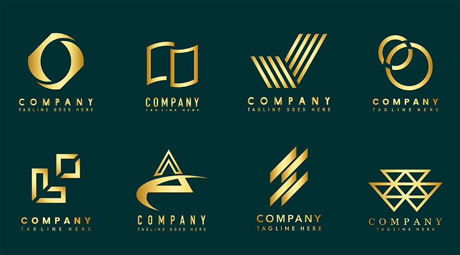
When choosing symbols and icons for your brand, think about what best represents your values and personality. Are you a bold and adventurous brand? Maybe a lightning bolt symbolizes your energy and excitement. Or are you a sophisticated and elegant brand? A sleek diamond icon could be just what you need to convey your classiness.
Another important factor to consider when designing your visual identity is consistency. Make sure all your symbols and icons share a similar style or color palette to create a cohesive look across all your branding materials. This way, when people see that symbol or icon, they’ll immediately think of your brand – like your very own bat signal in the sky!
So take the time to carefully select symbols and icons that truly represent who you are as a brand. Be bold, be creative, and most importantly, have fun with it! Because when your visual identity is strong and unique, you’ll be sure to catch the eye of your target audience and leave a lasting impression.

Typography Matters: Selecting the Perfect Font for Your Logo
Choosing the right font for your logo may seem like a daunting task, but fear not! With a little bit of guidance, you can find the perfect typeface that captures the essence of your brand. Here are a few tips to help you on your typography quest:
First and foremost, consider the personality of your brand. Is it playful and whimsical? Sleek and modern? Classic and timeless? Your font choice should reflect the overall vibe of your brand. Remember, your logo is like your brand’s signature, so make sure it speaks to who you are!
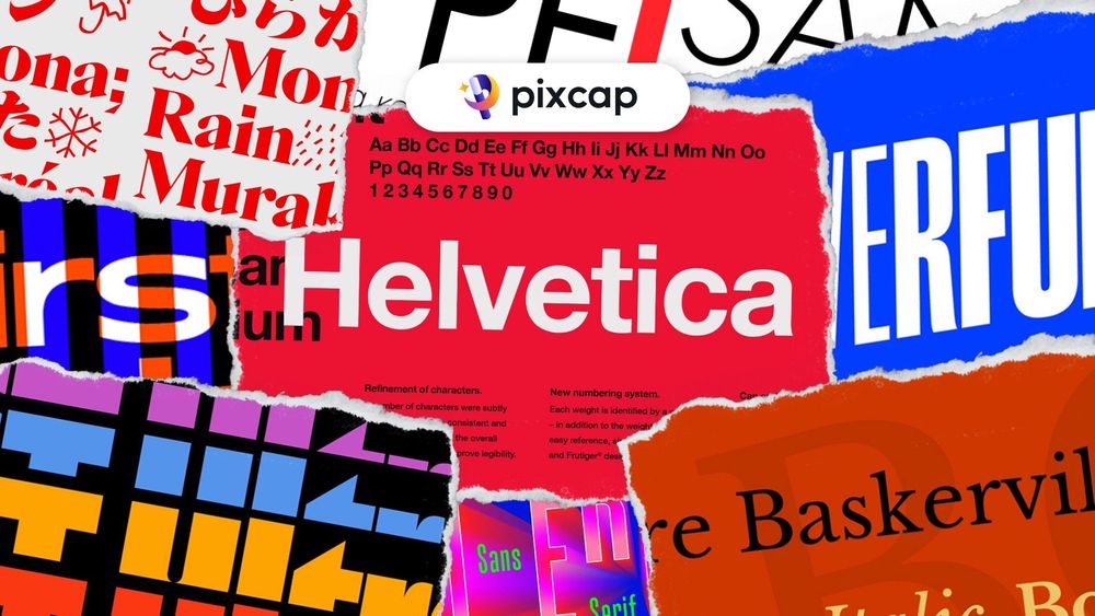
Next, think about readability. While that swirling, decorative script font may look beautiful, if it’s impossible to read at a glance, it’s not doing you any favors. Choose a font that is legible and conveys your message clearly. A good rule of thumb is to stick to sans-serif fonts for a clean, modern look, or serif fonts for a more traditional feel.
Lastly, don’t be afraid to experiment! Mix and match different fonts, sizes, and styles to see what catches your eye. Play around with spacing and alignment to see how it affects the overall look of your logo. Remember, typography is an art form, so have fun with it!

Balancing Simplicity and Complexity in Logo Design
When it comes to logo design, finding the perfect balance between simplicity and complexity can be a real challenge. On one hand, you want your logo to be instantly recognizable and easy to remember. On the other hand, you also want it to be unique and full of personality. So how do you strike that perfect balance? Here are a few tips:
- Keep it simple: Remember, less is often more when it comes to logos. A clean, minimalist design can be just as impactful as a more elaborate one.
- Think outside the box: Don’t be afraid to get a little creative with your logo. Sometimes, the most unexpected designs can be the most memorable.
- Consider your audience: Make sure your logo resonates with your target demographic. A logo that appeals to one group may not necessarily appeal to another.
At the end of the day, finding the right balance between simplicity and complexity is all about trial and error. Don’t be afraid to experiment with different designs until you find one that truly speaks to your brand. Remember, a successful logo is one that not only looks great, but also effectively communicates the essence of your business. So go ahead, get creative and have fun with it!
Testing and Refining Your Logo for Optimal Impact
So, you’ve finally created a logo for your business! Congratulations, you’re one step closer to world domination. But before you start plastering that bad boy everywhere, it’s time to put it to the test. Here are some ways to ensure your logo has optimal impact:
First things first, make sure your logo is versatile. Can it be scaled up to the size of a billboard or down to fit on a business card? If not, it’s back to the drawing board. You want your logo to be like a chameleon, blending in wherever it goes.
Next, test your logo in different color schemes. Your logo might look killer in neon pink, but will it still pack a punch in black and white? Make sure your logo looks good no matter what color it’s wearing.
Finally, get feedback from friends, family, and maybe even your neighbor’s dog. They’ll give you valuable insights on how your logo is perceived. Remember, you want your logo to be memorable, not forgettable. So, whip out that magnifying glass and start refining your logo for maximum impact!
FAQs
How do I choose the right colors for my logo?
Don’t just pick your favorite colors or the ones that are trending. Consider your brand’s personality and target audience. You want your logo to stand out, not blend in like a chameleon at a rainbow party.
Do I really need to hire a professional designer?
Only if you want your logo to look like it was designed by a monkey with a crayon. Just kidding! But seriously, investing in a professional designer can save you from ending up with a logo that looks like a hot mess.
What file formats should I use for my logo?
SVG, PNG, and EPS are your best friends in the logo world. They’re like the Powerpuff Girls of file formats – strong, versatile, and always ready to save the day.
Should I incorporate my company name into the logo?
Yes, unless you want people to play a guessing game every time they see your logo. Remember, you want your logo to be memorable, not a head-scratcher that leaves people wondering what the heck you do.
Is it okay to use clip art or stock images for my logo?
Sure, if you want your logo to be as bland and uninspired as a lukewarm cup of tea. Be original, be creative, be a logo-making maverick!
Ready to unleash your inner logo crafting genius?
Congratulations, you’ve made it to the end of our logo crafting extravaganza! Armed with these essential tips, you’re now equipped to dive headfirst into the world of logo design. Whether you’re creating a sleek and modern logo for a startup or channeling your inner Picasso for a more artistic approach, remember to have fun and let your creativity run wild. So go forth, brave logo designer, and craft the perfect logo that will dazzle the masses!


