
Welcome to the wild world of logo design, where pixels and creativity collide to create unforgettable brand identities. In this article, we’ll dive deep into the digital design strategies that will help you craft logos that are as memorable as your favorite childhood cartoons (minus the catchy theme song, unfortunately). So grab your graphic tablet and get ready to level up your logo game with some seriously savvy tips and tricks. Let’s make some pixel magic happen!
Understanding the Brand Identity
So, you think you understand your brand identity, huh? Buckle up, because this identity crisis is about to go deeper than you ever imagined.
Brand identity is not just a logo slapped on a product and called a day. It’s like trying to figure out your own personality – except your brand doesn’t have an existential crisis every other Tuesday. Your brand identity is what sets you apart from the competition, like wearing a feather boa to a business meeting – unconventional, but unforgettable.
Think of your brand identity like a superhero – it’s the cape that makes you fly, the mask that hides your true identity, and the symbol that strikes fear into the hearts of your enemies. Your brand’s color palette, tone of voice, and personality all work together to create a cohesive identity that screams, “I’m not just a company, I’m a superhero in khakis and a polo shirt!”
So, next time you think you understand your brand identity, remember that it’s not just about looking good – it’s about being a superhero in a world full of mere mortals. Now go forth, young brand warrior, and conquer the marketing world with your newfound understanding of brand identity!
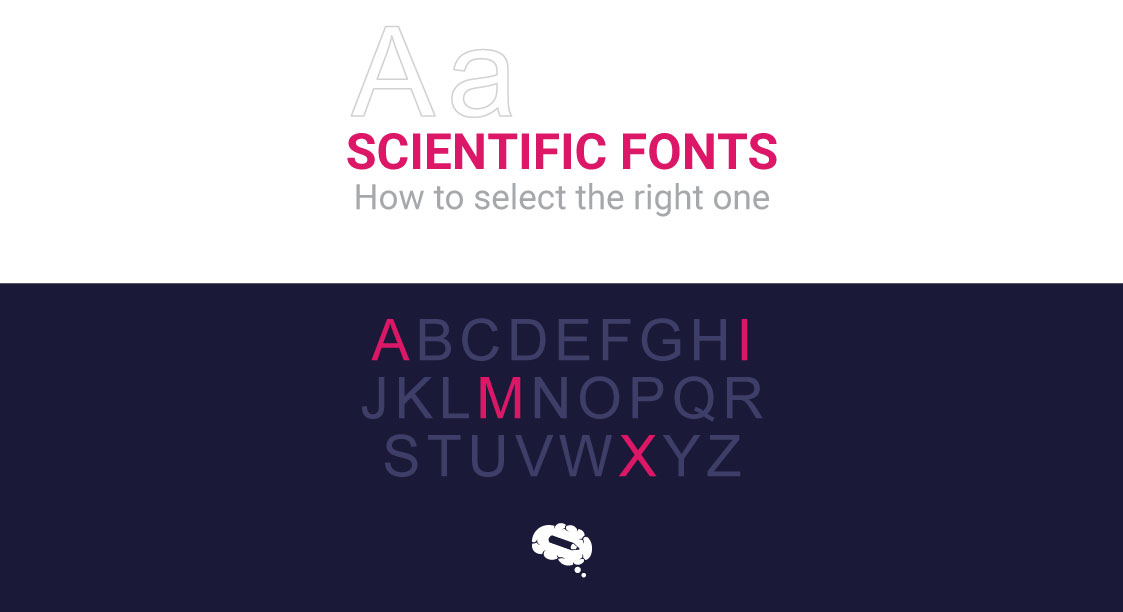
Choosing the Right Colors and Fonts
When it comes to for your project, it can feel like trying to decide between eating pizza or ice cream – why not have both? But before you go sprinkling neon colors and Comic Sans all over your design like confetti at a party, it’s important to consider a few key factors.
First, think about the overall vibe you want to convey. Are you going for a sleek and modern look, or something more cozy and traditional? Pick colors and fonts that match the mood you’re aiming for, like a fine wine paired with a gourmet meal. Mix and match until you find the perfect combination that leaves your audience drooling for more.
Next, consider the readability of your chosen fonts. Sure, that fancy cursive script may look elegant, but if it takes your readers longer to decipher than a cryptic crossword puzzle, you might want to rethink your choice. Opt for fonts that are easy on the eyes and make your message crystal clear, like a pair of stylish glasses that help you see clearly into the future.
Lastly, don’t be afraid to step out of your comfort zone and experiment with unconventional color palettes and font pairings. Who says you can’t mix lavender and lime green with a dash of bold typography? Embrace your inner design rebel and let your creativity run wild – after all, art is about breaking rules, not following them. And remember, the only limit to your creativity is your imagination. Let it soar like a majestic unicorn through a rainbow of endless possibilities.
Creating a Clean and Simple Design
When , less is always more. Remember, you want your website to be sleek and sophisticated, not cluttered and chaotic. Here are a few tips to help you achieve that minimalist look:
- Stick to a neutral color palette. Avoid the temptation to use every color in the rainbow. Instead, opt for a few muted tones that complement each other.
– Keep your fonts simple and easy to read. Stay away from overly decorative or flashy fonts that can distract from your content.
– Embrace white space. Don’t be afraid of a little breathing room between elements on your page. White space can actually help draw the eye to the most important parts of your design.
– Say no to unnecessary bells and whistles. Sure, that animated GIF might be cool, but does it really add anything to your design? Keep it simple and let your content shine.
So there you have it – follow these tips and you’ll be well on your way to that’s both visually appealing and easy to navigate. Happy designing!
Utilizing Negative Space Effectively
When it comes to design, sometimes less is more. can really make your work pop. Here are some tips to help you master the art of negative space:
- Keep it simple: Negative space doesn’t have to be complicated. Sometimes a little bit of empty space is all you need to make a big impact.
- Balance is key: Make sure your negative space is evenly distributed throughout your design. A lopsided composition can throw off the whole vibe.
- Don’t overcrowd: Too many elements can clutter up your design. Give your elements room to breathe and your design will thank you.
Think of negative space like a silent partner in your design. It may not be flashy or attention-grabbing, but it plays a crucial role in making your work stand out. Embrace the empty space and let it work its magic!

Testing for Scalability and Versatility
So, you think your product is ready to take on the world, huh? Well, before you start popping the champagne, let’s put it to the ultimate test - scalability and versatility. These two qualities are like the Batman and Robin of the tech world. Without them, your product is just a lonely Batmobile waiting to be driven by a superhero.
When it comes to scalability, think of it as the ability of your product to handle a sudden influx of users without breaking a sweat. It’s like hosting a party and realizing you invited the entire Avengers squad. Can your product handle the Hulk smashing buttons, Black Widow multitasking, and Iron Man flying through different features? If not, it’s back to the drawing board, Tony Stark.
Versatility, on the other hand, is like having a Swiss Army knife of a product. It should be able to adapt to any situation, like a chameleon changing colors. Can your product seamlessly switch from handling a small group of users to a massive crowd? Can it be used by tech-savvy millennials and tech-challenged boomers alike? If not, it’s time to add some flexibility and pizzazz.
So, sharpen your pencils, grab your lab coat, and let’s put your product through the ultimate stress test. It’s time to see if your baby can grow into a superhero or if it’s just a sidekick waiting to be forgotten. Remember, in the tech world, only the strong and versatile survive. Good luck, caped crusaders!
Implementing Mobile-Friendly Design Principles
So you’ve decided to enter the wonderful world of mobile-friendly design. Good for you! But before you dive headfirst into the deep end of responsive layouts and fluid grids, let’s take a moment to discuss some essential principles to keep in mind.
First off, **think about your users**. They’re the ones who will be navigating your site on those tiny screens, so make sure everything is easily accessible and readable. Consider things like font size, button spacing, and image placement to ensure a seamless user experience.
Next, **embrace simplicity**. Sure, it’s fun to cram every widget and plugin onto your mobile site, but remember: less is more. Stick to clean, minimalist designs that prioritize functionality over flashy graphics. Your users will thank you for it.
And speaking of functionality, don’t forget to **optimize for speed**. Mobile users are a busy bunch, so make sure your site loads quickly and efficiently. Minimize file sizes, eliminate unnecessary plugins, and streamline your code to keep things running smoothly.
Lastly, don’t be afraid to **test, test, test**. Throw your site on every device under the sun – iPhones, Androids, tablets, you name it. Make sure everything looks and works as intended, and don’t be afraid to make tweaks along the way. After all, Rome wasn’t built in a day – and neither was a fully mobile-friendly website!
FAQs
Why is it important for a business to have a memorable logo?
Well, imagine trying to stand out in a crowded room while dressed in plain beige. That’s what your business is like without a memorable logo. You want people to see your logo and immediately think of your brand – not scratch their heads in confusion!
What are some key digital design strategies for creating a memorable logo?
Think of digital design strategies as your secret recipe for logo success. Use clean lines, eye-catching colors, and unique shapes to create a logo that stands out like a neon pink elephant in a room full of grey mice.
How can businesses ensure their logo is versatile across different platforms?
Flexibility is key, my friend! Your logo needs to be like a chameleon – able to blend in seamlessly on everything from a tiny business card to a giant billboard. Make sure it looks just as fab in black and white as it does in color!
Why is simplicity important when designing a logo?
Keep it simple, silly! Complicated logos are like trying to untangle a ball of Christmas lights – frustrating, confusing, and not at all fun. A simple logo is like a breath of fresh air – easy to remember and easy to love!
Now go forth and create logos that will be remembered for centuries!
Crafting memorable logos is both an art and a science, but with the right digital design strategies, you too can leave a lasting impression on the world. So grab your tools, fire up your creativity, and get ready to make your mark on the design world. Remember, a great logo is like a fine wine – it only gets better with age. So go ahead, create something unforgettable, and let your design skills shine!


