In a world where our attention spans are shorter than a goldfish’s memory and our thumbs do more walking than our feet, crafting a logo for the modern digital era is no easy task. Gone are the days of painstakingly hand-drawn symbols etched onto parchment by candlelight – now we must impress in a split second swipe on a smartphone screen. So grab your fonts, fire up your design software, and let’s dive into the wild world of logo creation for the digital age!
Understanding the Importance of Logo Design in the Digital World
So, you think creating a logo for your business is just a cute little design project? Think again! In the digital world, your logo is your virtual fingerprint – it’s how people recognize and remember you in the vast sea of online businesses.
Here are a few reasons why logo design is crucial in the digital world:
- Brand Identity: Your logo is like your digital name tag – it tells people who you are, what you do, and what you stand for.
- First Impressions: In the blink of an eye, your logo can make or break a potential customer’s decision to click on your website or keep scrolling. Don’t let them swipe left on your logo!
- Consistency: A well-designed logo sets the tone for your entire brand and should be used consistently across all digital platforms - from your website to your social media profiles.
- Focus on the essentials: Strip away any unnecessary elements and focus on what’s truly important. Your goal is to create a logo that is clean, clear, and conveys your brand’s message in a matter of seconds.
- Play with negative space: Use negative space to your advantage. Think of the FedEx logo – the arrow hidden between the “E” and “X” is a brilliant example of utilizing negative space to convey a hidden message.
- Limit your color palette: A minimalist logo doesn’t need to be devoid of color, but limiting your color palette can create a more cohesive and impactful design. Choose colors that complement each other and reflect your brand’s identity.
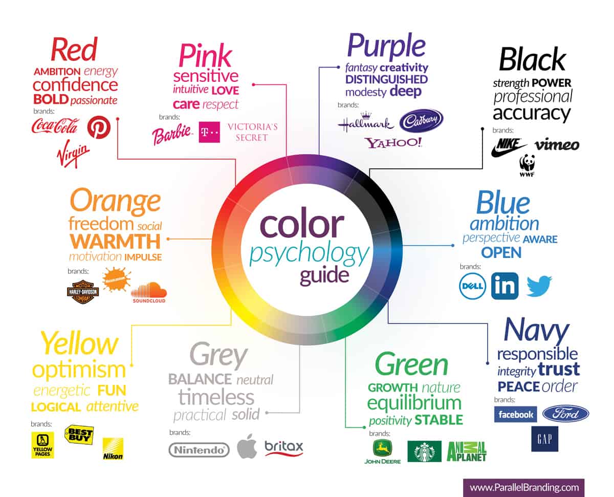
- Red: This bold and energetic color is often used to capture attention and create a sense of urgency. It can be found in logos for companies that want to convey power, passion, or excitement.
- Blue: A calming and trustworthy color, blue is commonly used in logos for businesses that want to build a sense of security and reliability. It can also evoke feelings of professionalism and knowledge.
- Yellow: Bright and optimistic, yellow is often used in logos to convey warmth, happiness, and energy. It is a popular choice for brands that want to stand out and inspire confidence.
So, don’t underestimate the power of a well-crafted logo in the digital world. Put some thought and creativity into it, and watch your business stand out in the digital crowd!
 Digital Era“>
Key Elements to Consider when Crafting a Logo for the Digital Era
When it comes to crafting a logo for the digital era, there are a few key elements you should definitely keep in mind. After all, you don’t want your logo to end up looking like something straight out of the early 2000s, do you?
First and foremost, **simplicity** is key. In a world where attention spans are short and social media scrolls are endless, you want your logo to be easily recognizable at a glance. Think of iconic logos like the golden arches of McDonald’s or the swoosh of Nike – simple, yet memorable.
Another important element to consider is **versatility**. Your logo should be able to be scaled down to fit a tiny app icon or blown up to cover the side of a building. If your logo only looks good in one size or format, you’re going to have a tough time making it work in the digital world.
**Color choice** is also crucial when it comes to crafting a logo for the digital era. You want to choose colors that not only look good on a screen but also evoke the right emotions for your brand. Bold and vibrant colors can grab attention, while more subdued tones can convey sophistication and class.

Utilizing Minimalism and Simplification in Logo Design
In logo design, less is more. By utilizing minimalism and simplification, you can create a logo that speaks volumes without saying much at all. Remember, the KISS principle – Keep It Simple, Stupid! Here are a few tips to help you streamline your logo design process:
Remember, minimalist design doesn’t mean boring design. By simplifying your logo, you can create a timeless and memorable symbol that will stand the test of time. So, embrace simplicity, think outside the box, and watch your logo shine!

Incorporating Adaptive and Responsive Design in Logos
When it comes to designing logos, incorporating adaptive and responsive design is crucial in today’s ever-changing digital landscape. Gone are the days of static logos that sit idly by while the world around them evolves. Brands need logos that can adapt and respond to different screen sizes, devices, and platforms.
With the rise of mobile devices and various screen resolutions, it’s important for logos to be flexible enough to look great no matter where they’re displayed. Using scalable vector graphics (SVG) can ensure that your logo looks sharp and clear on any screen, whether it’s a tiny smartphone or a massive billboard.
Another way to incorporate adaptive design into your logo is to create various versions that are optimized for different use cases. Consider creating a simplified version of your logo for smaller screens or social media profiles, while keeping a more detailed version for print or larger displays.
Don’t be afraid to get creative with how your logo responds to different situations. Maybe it morphs into a different shape when viewed on a mobile device, or changes colors based on the time of day. The possibilities are endless when it comes to designing logos that are both adaptive and responsive.

The Role of Color Psychology in Creating Memorable Logos
When it comes to creating memorable logos, the use of color psychology can make all the difference. Colors have the power to evoke emotions, create associations, and leave a lasting impression on viewers. Here are some ways color psychology plays a role in the design of logos:
By understanding the emotional impact of different colors, designers can strategically select hues that align with a company’s values, target audience, and overall branding strategy. Whether it’s using green to symbolize growth and health or purple to evoke luxury and sophistication, the right color choices can help a logo make a memorable impression.
Keeping Up with Trends in Logo Design for the Modern Digital Landscape
Are you tired of your outdated logo holding you back in the ever-evolving digital landscape? Well, fear not, because we’ve got you covered! Let’s talk about some key trends in logo design that will keep you ahead of the game.
First up, **minimalism** is all the rage right now. Gone are the days of cluttered and busy logos. Embrace simplicity and clean lines to make a bold statement. Think of iconic brands like Apple and Nike – their logos speak volumes with just a simple symbol or wordmark.
Next, **versatility** is crucial in the digital world. Your logo shouldn’t just look good on a billboard - it should also be able to scale down to fit on a mobile app or social media profile. Make sure your design is adaptable to different sizes and platforms.
Don’t forget about **animation**! Animated logos are taking the digital world by storm. Consider adding some movement or interactive elements to your logo to grab users’ attention and create a memorable brand experience.
FAQs
Q: How important is it to have a unique logo in the digital era?
A: Having a unique logo in the digital era is like having a killer outfit at a fancy party – it helps you stand out and make a lasting impression. With so much competition online, a distinctive logo can help your brand be memorable and recognizable amidst the sea of mediocrity.
Q: What elements should a modern logo incorporate?
A: Think of your logo as your brand’s Tinder profile pic - it needs to be eye-catching, concise, and give a sense of your personality. Incorporate elements that are relevant to your brand and audience, but keep it simple and versatile for different digital platforms.
Q: Should a logo be designed with mobile devices in mind?
A: Absolutely! In today’s world, most people interact with brands through their phones more than through any other medium. Your logo should look just as good on a tiny smartphone screen as it does on a giant computer monitor. Think of it as creating a logo that’s photogenic from any angle.
Q: How can a logo convey a brand’s values and identity in a digital space?
A: Your logo is the superhero cape of your brand – it should embody your values and identity in a visually striking way. Use colors, shapes, and fonts that reflect your brand’s personality and message. Remember, a picture is worth a thousand words, so make sure your logo speaks volumes about who you are as a brand.
Q: What role does simplicity play in logo design for the modern digital era?
A: In a world cluttered with information and distractions, simplicity is your brand’s best friend. A simple, clean logo design is more likely to be remembered and recognized in the digital jungle. Think of it as a minimalist art piece – less is often more when it comes to crafting a logo that will stand the test of time in the fast-paced digital era.
Time to Craft Your Digital Identity!
So there you have it, folks! Crafting logos for the modern digital era is a blend of creativity, strategy, and a touch of pixel perfection. Remember, your logo is the face of your brand in the digital world, so make sure it’s looking sharp and ready to shine. Now go forth and craft those logos like the digital design wizards you are!


