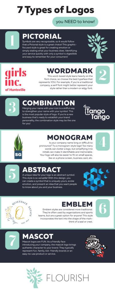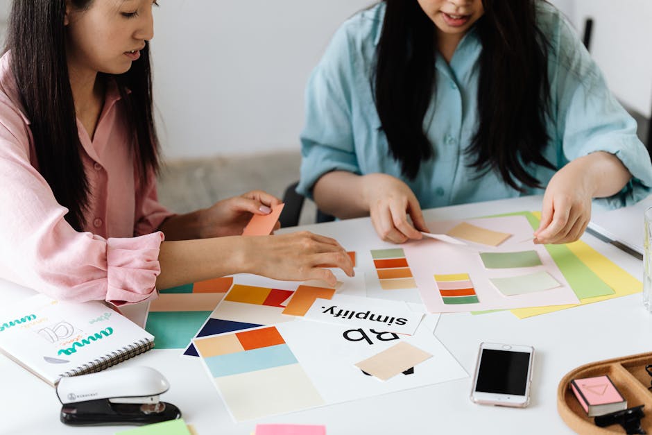
Crafting a custom logo for your small business is like designing the perfect outfit for a first date – you want it to make a killer first impression and leave a lasting impression. But fear not, fellow logo designers! With a little creativity and a dash of humor, you can create a logo that will make your business stand out from the crowd. So grab your sketchpad and let’s dive into some tips for crafting custom logos that will make your small business shine like a disco ball on a Saturday night.
Understanding Your Brand Identity
Your brand identity is like your personality - quirky, unique, and full of character. It’s what sets you apart from the rest of the pack, and boy, is it important! Here are some tips to help you get a grip on who you really are:
1. **Know thyself:** Take a deep dive into your brand’s history, values, and aspirations. Ask yourself the tough questions – What makes you, you? What do you stand for? What makes you different from your competitors?
2. **Dress the part:** Just like choosing the perfect outfit for a first date, your brand’s visual identity is critical. From your logo to your color scheme, make sure your brand looks the part.
3. **Speak up:** Your brand voice is like your best friend – witty, charming, and always on point. Define your brand’s tone of voice and make sure it shines through in all your communications.
4. **Walk the walk:** Your brand identity isn’t just about looking and sounding good – it’s about living your values every day. Make sure your actions reflect your brand identity, and watch as the world falls in love with you!

Researching Your Target Audience
So you want to know who your target audience is, huh? Don’t worry, I won’t make you go all Sherlock Holmes on me. But a little detective work never hurt anyone, right?
First things first, hit up social media like it’s your new best friend. Stalk, I mean, follow your potential customers and see what they’re into. Are they all about avocado toast and yoga? Or do they prefer bacon and beer? Take note of their interests and likes.
Next, check out those fancy analytics tools. They’ll tell you exactly who’s visiting your website and why. It’s like having your own personal data scientist. Pretty cool, huh?
And lastly, don’t be afraid to ask the people directly. Set up surveys or interviews to get the inside scoop on what makes your audience tick. Who knows, you might even make a new friend in the process.

Choosing the Right Design Elements
When it comes to for your project, there are a few things to keep in mind. First and foremost, you want to make sure that the design elements you choose align with your overall vision and goals. If you’re going for a sleek, modern look, don’t throw in a bunch of frilly, Victorian-inspired elements just because you think they look cool.
Another important factor to consider is your target audience. Are you designing for teenagers? Then maybe steer clear of anything too formal or stuffy. Are you targeting older adults? Maybe ditch the bright, neon colors and opt for more muted tones. Remember, your design should resonate with the people you’re trying to reach.
Don’t forget about the fundamentals of design either. Things like color theory, typography, and hierarchy are all crucial to creating a cohesive and visually appealing design. Make sure your color palette is harmonious, your fonts are easy to read, and your design elements are logically organized in a hierarchy that guides the viewer’s eye where you want it to go.
When in doubt, keep it simple. Sometimes less is more, and a clean, minimalist design can pack just as much punch as a busy, cluttered one. Just remember to let your creativity shine through, and don’t be afraid to take risks and try new things. After all, the best designs are often the ones that break the rules!

Working with a Professional Designer
So, you’ve decided to work with a professional designer to spruce up your space. Congratulations - you’re in for a wild ride! Here are a few things to keep in mind as you navigate this exciting journey:
First and foremost, remember that your designer is the expert – that’s why you hired them in the first place! Trust their judgment and let them work their magic. If they tell you that hot pink shag carpet is making a comeback, who are you to argue?
Communication is key when working with a designer. Be sure to clearly articulate your likes and dislikes, but be open to new ideas. After all, you hired a designer for their creativity and vision, not to execute your carbon copy Pinterest board.
Oh, and one more thing: be prepared for a few surprises along the way. That “subtle pop of color” might end up being a full-blown rainbow wall, but hey – who doesn’t love a little drama in their design?

Implementing Your Logo Across Platforms
So you’ve finally nailed down that perfect logo for your brand – congratulations! But now comes the hard part: implementing it across all platforms. Fear not, dear reader, for I am here to guide you through this treacherous journey.
First and foremost, make sure your logo is scalable. You don’t want it looking all wonky and distorted on different platforms. Use vector files for the best quality. Remember, size does matter - in this case, bigger is better!
Next, consider the color scheme of your logo. Make sure it looks just as fabulous in black and white as it does in color. You never know when you might need to bust out the monochrome version for a fancy event or maybe just because you’re feeling sophisticated AF.
Now, onto the nitty gritty details. When implementing your logo on different platforms, be sure to test it out on various backgrounds. You don’t want it getting lost in a sea of clutter. Experiment with different placements and sizes to find what works best. And don’t be afraid to get a little adventurous – try it out on some holographic foil if you’re feeling *extra*.
Lastly, consistency is key. Make sure your logo looks the same across all platforms. You don’t want to confuse your audience with multiple variations floating around. Keep it sleek, keep it stylish, and most importantly, keep it YOU.
Evaluating and Refining Your Logo Design
So, you’ve designed a logo that you think is the bee’s knees, huh? Well, hold your horses there, Picasso. It’s time to put your creation under the microscope and see if it’s truly worthy of representing your brand.
First things first, gather a focus group of friends, family, or unsuspecting strangers off the street to get some feedback on your logo. Ask them what they think it represents, how it makes them feel, and if they’d trust a company with that logo on their storefront. Use this valuable insight to make any necessary tweaks and refinements to your design.
Next up, take a good, hard look at the color scheme you’ve chosen for your logo. Are the colors eye-catching and memorable, or do they blend in with the background like a chameleon in a field of grass? Remember, bold is beautiful, so don’t be afraid to amp up the saturation and let your logo shine like a beacon of awesomeness.
Lastly, make sure your logo is versatile enough to look good on a variety of platforms. Whether it’s plastered on a billboard, printed on a business card, or displayed on a website, your logo should be able to hold its own in any situation. If it looks like a pixelated mess when scaled down to fit in the corner of a tiny Instagram post, it’s back to the drawing board, my friend.
FAQs
How can small businesses make their custom logos stand out?
Small businesses should focus on unique elements that reflect their brand’s personality. Incorporating bold colors, interesting fonts, and distinctive imagery can help logos grab attention and leave a lasting impression.
What are some common mistakes to avoid when designing a custom logo?
Avoid cluttering the design with too many elements, using overly complicated fonts, or creating a logo that doesn’t scale well. Remember, simplicity is key when it comes to effective logo design!
What is the importance of market research before crafting a custom logo?
Market research can help small businesses understand their target audience, competitor logos, and industry trends. This information can guide logo design choices and ensure that the final product resonates with customers.
How can small businesses ensure their custom logo is versatile and works across different platforms?
Test your logo design in various sizes and formats to ensure it looks good on everything from business cards to billboards. Choosing a simple design that is easily recognizable in both color and black and white can help maintain visibility across different platforms.
What role does branding play in the creation of a custom logo for small businesses?
Branding is essential for ensuring that a logo effectively communicates a business’s values, mission, and personality. Small businesses should consider how their logo fits into their overall brand identity to create a cohesive and memorable experience for customers.
Time to Get Crafty with Your Logo!
Congratulations on taking the first step to creating a custom logo that truly represents your small business! Remember, a great logo is like a fine wine – it gets better with time. So don’t rush the process and be sure to experiment with different designs until you find the perfect one. And most importantly, have fun with it! After all, crafting a custom logo is like creating a masterpiece – it’s all about letting your creativity shine. So go forth, small business owner, and let your logo be a reflection of your unique brand. Happy crafting!


