Are you tired of being remembered as the brand with the bland logo? Is your visual identity as exciting as a bowl of plain oatmeal? Fear not, dear reader, for we are here to guide you on the epic quest to crafting an iconic logo that will make your competitors quake in their boots. So buckle up, grab your design tools, and get ready to unleash your creativity in the world of visual branding. It’s time to make your mark and stand out from the crowd like a neon unicorn in a sea of grey donkeys. Let’s dive in and learn how to build a visual brand that leaves a lasting impression and has everyone saying, “Wow, now that’s a logo!
Identifying Your Brand Identity
Are you tired of blending in with the crowd? Want to stand out like a unicorn in a sea of donkeys? Well, it’s time to identify your brand identity and let your unique personality shine through!
First things first, think about what makes you different from your competitors. Are you the only donut shop in town that serves vegan pastries? Do you have a quirky sense of humor that sets you apart from the rest? Embrace your quirks and let them be the driving force behind your brand!
Next, think about your target audience. Who are the people that are most likely to connect with your brand? What do they value and how can you align your brand identity with their interests? Remember, it’s not about appealing to everyone, it’s about connecting with the right people!
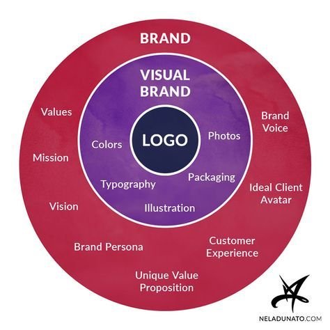
Once you have a clear understanding of what makes you unique and who you are trying to connect with, it’s time to brainstorm some key elements of your brand identity. This might include your brand colors, logo, tagline, and overall brand voice. Make sure these elements align with your brand values and personality so that your audience can easily recognize and connect with your brand!
Researching Your Target Audience
So you think you know your target audience like the back of your hand? Think again. is absolutely crucial if you want to have any chance of success in your marketing efforts. Here are some tips to help you dig deeper into the minds of your audience:
- Social Media Stalking: Yes, you heard it right. Facebook, Twitter, Instagram – stalk them on all platforms. What are they posting? What hashtags are they using? What memes are they sharing? It’s all fair game in the name of research!
- Focus Groups: Get a group of your target audience together and pick their brains. Ask them about their preferences, habits, and dislikes. Just be sure to have plenty of snacks on hand – people tend to open up more when they’re well-fed.
Remember, your target audience is not a monolithic entity. They’re a diverse group of individuals with varying interests and needs. By doing your homework and really understanding who they are, you’ll be able to tailor your marketing efforts to better reach and engage with them. So get out there and start researching – your audience is waiting!

Choosing the Right Color Palette
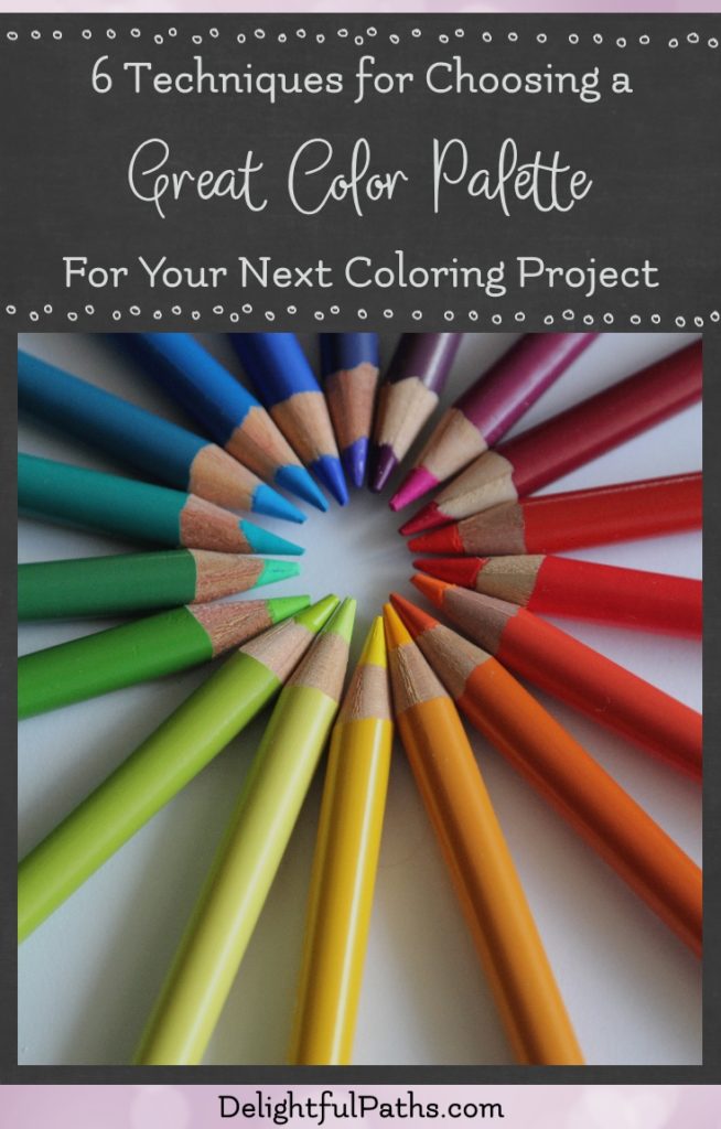
When it comes to , the options can be overwhelming. But fear not, dear reader, for I am here to guide you through the chaotic world of colors with humor and wit.
First off, consider the mood you want to convey. Do you want your space to feel cozy and inviting, or sleek and sophisticated? Once you’ve determined the vibe you’re going for, it’s time to start thinking about color combinations.
Pro tip: stick to three to five main colors for a cohesive look. Too many colors can make your space feel like a circus (unless that’s the vibe you’re going for, in which case, carry on).
Remember, there are no hard and fast rules when it comes to choosing a color palette. Trust your gut, experiment with different combinations, and most importantly, have fun with it! After all, a little color can go a long way in transforming a room from drab to fab. Happy painting!

Selecting the Perfect Typeface for Your Logo
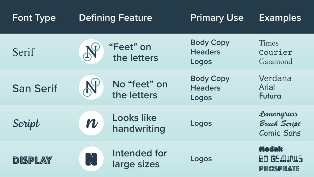
When it comes to , it’s important to choose one that matches the personality and message of your brand. After all, you wouldn’t want to use a playful, whimsical font for a law firm’s logo or a traditional, serif font for a children’s clothing store.
Here are a few tips to help you find the right typeface for your logo:
- Consider your brand personality: Are you a fun and quirky brand or a sophisticated and elegant one? Choose a typeface that reflects the vibe you want to convey.
- Think about readability: While a fancy script font may look beautiful, it may not be the best choice if it’s difficult to read. Make sure your chosen typeface is legible in different sizes and formats.
- Avoid trendy fonts: Choosing a trendy font may make your logo look dated in a few years. Opt for a classic and timeless typeface that will stand the test of time.
Remember, your logo is often the first impression customers will have of your brand, so make sure to choose a typeface that speaks to your target audience and accurately represents who you are as a business.

Creating a Timeless Design
Designing a timeless masterpiece is no easy feat. It takes skill, creativity, and a whole lot of trial and error. But fear not, young padawan, for I am here to bestow upon you the wisdom of creating a design that will stand the test of time.
First and foremost, simplicity is key. You don’t want your design to be too flashy or overdone. Keep it clean, keep it sleek, and above all, keep it simple. Think of it like a fine bottle of wine – the less is more approach always wins.
Next up, pay attention to detail. The devil is in the details, my friend. Make sure every element of your design is thoughtfully considered, from the font choices to the color palette. And don’t forget to have some fun with it! After all, a little whimsy never hurt anyone.
Lastly, remember that trends come and go, but true style is eternal. Don’t get caught up in the latest fads or crazes. Stay true to your vision and let your creativity shine. Who knows, maybe one day people will look back on your design and say, “Damn, that’s a timeless masterpiece!”
Ensuring Versatility Across Platforms
When it comes to , it’s important to be like a chameleon blending into any environment seamlessly. Just like how a chameleon changes its colors to adapt to its surroundings, your content should be able to do the same on different platforms.
Think of your content as a master of disguise, able to transform itself from a witty tweet on Twitter to a professional post on LinkedIn with just a snap of your fingers. With the right strategy and a touch of creativity, your content can be the ultimate shape-shifter across platforms.
Imagine your content as a superhero with the power of adaptability, able to conquer any platform with ease. Whether it’s Facebook, Instagram, or TikTok, your content should be like a fearless warrior, ready to take on any challenge that comes its way.
Embrace the power of versatility and watch your content thrive across platforms like never before. With a dash of humor here, a pinch of creativity there, and a sprinkle of boldness everywhere, your content will be unstoppable across all platforms. So go forth, brave content creator, and conquer the digital world with your versatile content!
Seeking Feedback and Iterating for Perfection
Ready to take on the world with your latest project? Not so fast! is the key to success. After all, even Mona Lisa needed a few touch-ups before becoming the masterpiece we all know and love.
So, how do you go about seeking feedback? Well, start by asking your most brutally honest friends and family for their thoughts. Don’t worry, they won’t hold back. And if they do, well, it might be time to find some new friends.
Next, turn to your target audience. They’re the ones who will ultimately determine the success of your project, so their feedback is crucial. Conduct surveys, focus groups, or even some good old-fashioned market research to get their thoughts.
Once you’ve gathered all the feedback, it’s time to start iterating. Make those tweaks, adjustments, and improvements until your project is as close to perfection as possible. Remember, Rome wasn’t built in a day, and neither was the Sistine Chapel. So keep at it until you’ve created a masterpiece worth showing off.
FAQs
Why is it important to have an iconic logo for your brand?
It’s crucial to have an iconic logo for your brand because who wants to be forgettable? You want your logo to be as memorable as your last embarrassing family holiday photo.
What factors should you consider when designing a logo?
When designing a logo, think about what message you want to convey, what colors represent your brand personality, and how you can make sure it doesn’t look like it was designed in Microsoft Paint by a 5-year-old.
How can you ensure your logo stands out from the competition?
To make sure your logo stands out from the competition, you need to be bold, be unique, and for goodness sake, don’t hop on the bandwagon of trends that will be outdated faster than you can say ”Pogs”.
What common mistakes should you avoid when creating a logo?
Avoid making your logo too cluttered, too complex, or too confusing to decipher. You don’t want people scratching their heads trying to figure out if your logo is a bird, a plane, or just a blob of random shapes.
How can you incorporate your brand’s story and values into your logo?
Incorporating your brand’s story and values into your logo is important – you don’t want your logo screaming “I have no idea what my brand stands for!” Think about what makes your brand unique, and find creative ways to weave those elements into your logo design.
Time to Make Your Logo Iconic!
Congratulations! You’ve learned all the tips and tricks to craft a killer logo that will make your brand stand out from the rest. Now go forth and dazzle the world with your visual branding prowess. Remember, Rome wasn’t built in a day, so take your time and create something truly iconic. And if all else fails, just slap a unicorn on it - everyone loves unicorns. Happy designing!


