Are you tired of your business looking like it was designed by a kindergartener on a sugar high? It’s time to put down the finger paints and step up your visual game with a logo that actually looks professional. In this article, we’re going to give you some tips on crafting a visual identity that will make your brand stand out (in a good way). So grab your glitter glue and let’s get started!
Choosing the Right Color Scheme
When it comes to for your project, it can feel like staring into a never-ending abyss of hues and shades. But fear not, dear reader! With a little creativity and some guidance, you’ll be well on your way to picking the perfect colors that will make your design pop.
First things first, consider the mood you want to convey. Is your project playful and whimsical? Opt for vibrant, eye-catching colors like neon pink and electric blue. Or perhaps you’re going for a more sophisticated and elegant look? In that case, you can’t go wrong with classic colors like navy blue, emerald green, and rich burgundy. Remember, the colors you choose will set the tone for your entire design, so choose wisely!
Next, think about color harmony. No, we’re not talking about a magical singing group (although that would be pretty awesome). Color harmony refers to the way colors interact with each other to create a visually pleasing composition. Consider using complementary colors (colors that are opposite each other on the color wheel) to create a bold contrast, or analogous colors (colors that are next to each other on the color wheel) for a more harmonious and soothing look.
And finally, don’t be afraid to experiment! Mix and match different colors, play around with different shades and tones, and see what works best for your project. After all, the beauty of design is that there are no hard and fast rules – so get creative and have fun with it!

Creating a Simple yet Memorable Design
Are you tired of overcomplicated, forgettable designs that look like a toddler’s art project gone wrong? It’s time to simplify and create something truly memorable.
First things first, keep it clean and minimal. Less is more, my friend. Focus on the essentials and let them shine. Use whitespace to your advantage and give your design room to breathe. Trust me, it will thank you later.
Next, pick a bold color palette that pops. Don’t be afraid to go bright and vibrant. Remember, you want your design to stand out in a sea of mediocrity. Play around with different combinations until you find the perfect mix that screams “look at me!”
Lastly, add a quirky and unexpected element that will leave a lasting impression. Whether it’s a witty slogan, a hidden message, or a funny illustration, make sure it’s something that will make people stop and take notice. After all, who wants to be boring when you can be unforgettable
symbols-or-icons“>Incorporating Relevant Symbols or Icons
When it comes to adding relevant symbols or icons to your design, think of it as your chance to spice things up and add some personality to your work. Symbols and icons are like the glitter of the design world – they make everything better! Here are a few tips on how to incorporate them seamlessly into your projects:
- Choose Wisely: Make sure the symbols or icons you choose actually relate to your content. A random unicorn emoji may be cute, but it won’t really make sense on a financial report (unless you’re reporting on unicorn investments, in which case, carry on).
- Keep It Simple: Don’t go overboard with symbols and icons. A few well-placed symbols can go a long way in enhancing your design. Remember, less is more (unless you’re going for a maximalist aesthetic, then by all means, go wild).
- Be Creative: Don’t limit yourself to the usual suspects like hearts, stars, and thumbs up icons. Think outside the box and consider using unconventional symbols that still tie into your theme. A tiny taco icon next to your lunch specials will definitely make mouths water!
Remember, symbols and icons are not just visual embellishments – they serve a purpose in guiding the viewer’s eye, conveying information, and adding a fun element to your design. So, embrace the power of symbols and icons, and let your creativity shine through!

Ensuring Versatility Across Platforms
When it comes to , it’s important to remember that not all devices are created equal. From smartphones to laptops to smart fridges (yes, they exist), your content needs to be adaptable and flexible enough to fit any screen size or resolution. This is where our trusty friend, responsive design, comes in to save the day.
With responsive design, your website can morph and shift like a Transformer, ensuring that it looks great on any device. No more awkward scrolling or pinching to zoom in on tiny text. Your content will flow seamlessly from one screen to another, like a graceful dancer gliding across the stage.
But wait, there’s more! In addition to responsive design, consider optimizing your content for different platforms. Whether it’s creating a sleek mobile app or investing in some snazzy SEO tactics, there are plenty of ways to ensure that your message reaches the masses. So go forth, fearless content creator, and conquer the digital realm with your versatile and adaptable content!

Seeking Professional Input and Feedback
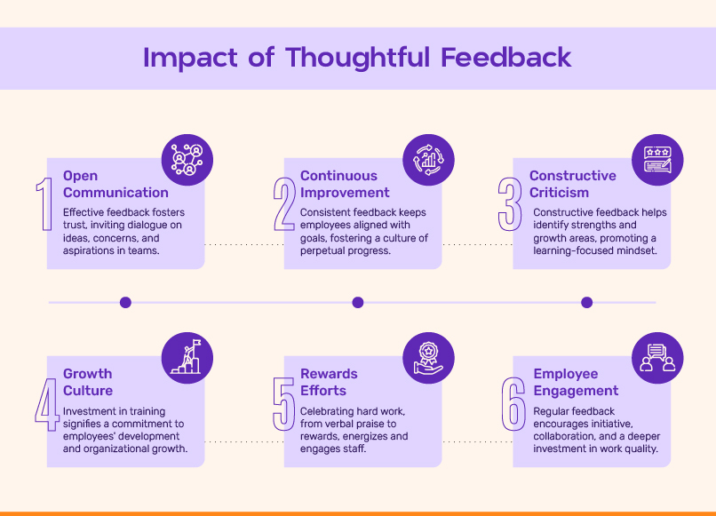
Are you tired of making decisions on your own and then realizing they were terrible ideas? Well, fear not! It’s time to seek some professional input and feedback, because let’s face it, we can’t all be experts at everything.
So, you’ve come to the right place. Here at **Professional Feedback HQ**, we’ve got a team of experts ready and waiting to give you the feedback you never knew you needed. Whether you’re stuck on a design project, struggling to make a decision, or just need someone to tell you that your outfit looks terrible, we’ve got you covered.
Don’t waste another second trying to figure things out on your own. Our team of professionals can provide you with the guidance and feedback you need to make informed decisions and avoid those embarrassing blunders. After all, it’s better to get input from someone who knows what they’re doing, right?
So, what are you waiting for? Let us help you avoid potential disaster and make better choices. Contact us today for the professional input and feedback you deserve!
Implementing a Scalable and Timeless Design
So you want to create a design that will stand the test of time and be able to grow with your expanding needs? Well, buckle up because we are about to dive into the world of scalability and timelessness in design!
First things first, when it comes to scalability, you want to make sure your design can adapt and evolve without breaking a sweat. Think of your design like a chameleon, able to blend in seamlessly with any changes that come its way. This means thinking ahead and planning for potential growth and updates down the line. **Flexibility** is key here!
Next, let’s talk about timelessness. Trends come and go faster than you can say “trendy.” To create a design that stands the test of time, you’ll want to focus on **classic elements** that will always be in style. Think clean lines, neutral colors, and simple typography. Of course, a little flair here and there never hurt anyone, but make sure it complements the overall design without overpowering it.
When , it’s important to think about **consistency** across all elements. Whether it’s your website, branding, or marketing materials, you want everything to have a cohesive look and feel. This not only creates a professional image but also makes it easier for your audience to recognize and remember your brand. Plus, who doesn’t love a little organization in their life?
In the end, creating a design that is both scalable and timeless is all about finding that sweet spot between adaptability and staying power. So go forth and conquer the design world with your newfound knowledge!
FAQs
Why is creating a logo important for a business?
Well, imagine if Batman didn’t have his iconic bat symbol as a logo – he’d just be a random guy in a cape fighting crime. A logo is like your business’s superhero costume - it sets you apart from the rest of the world and helps customers identify and remember you.
What should I consider when designing a logo?
Think of your logo as a first date outfit – it should be attractive, unique, and make a great first impression. Consider your target audience, the message you want to convey, and choose colors and fonts that reflect your brand’s personality. And remember, just like a bad outfit can ruin a date, a poorly designed logo can turn customers away!
How can I ensure my logo stands out in a crowded market?
Don’t be a sheep in a field of sheep – be a unicorn! Embrace your uniqueness and let it shine through in your logo. Be bold, be creative, and don’t be afraid to take risks. Just like a unicorn stands out in a sea of ordinary horses, your logo should make a statement and capture the attention of your target audience.
What are some common mistakes to avoid when creating a logo?
Avoid the dreaded Clip Art Trap – using generic, overused images that make your logo look like a middle school art project. Also, watch out for the Font Faux Pas – choosing a font that is unreadable or just plain ugly. And last but not least, steer clear of the Color Catastrophe – using clashing colors that make your logo look like a rainbow throw up. Remember, a logo should be memorable for the right reasons!
In conclusion, don’t leave your logo in the hands of amateurs!
Remember, crafting a visual identity is no easy feat. But with these tips in mind, you’ll be well on your way to creating a logo that truly represents your brand. So, go forth and conquer the design world with your newfound logo-making skills. And hey, if all else fails, there’s always Microsoft Paint!


