Welcome, brave souls embarking on the treacherous journey of logo design! Choosing the right colors may seem like a simple task, but beware, for lurking beneath the surface are the mysterious psychological factors that can make or break your brand image. So grab your color wheel and prepare to dive deep into the murky waters of human perception, where red isn’t just red and blue isn’t just blue. Join us as we unravel the colorful tapestry of logo design and discover the hidden powers of hue, saturation, and a splash of good old-fashioned psychology.
Understanding Color Theory
Color theory can seem like a daunting subject, but fear not! We’re here to break it down for you in the most entertaining way possible. So sit back, relax, and prepare to become a color theory master.
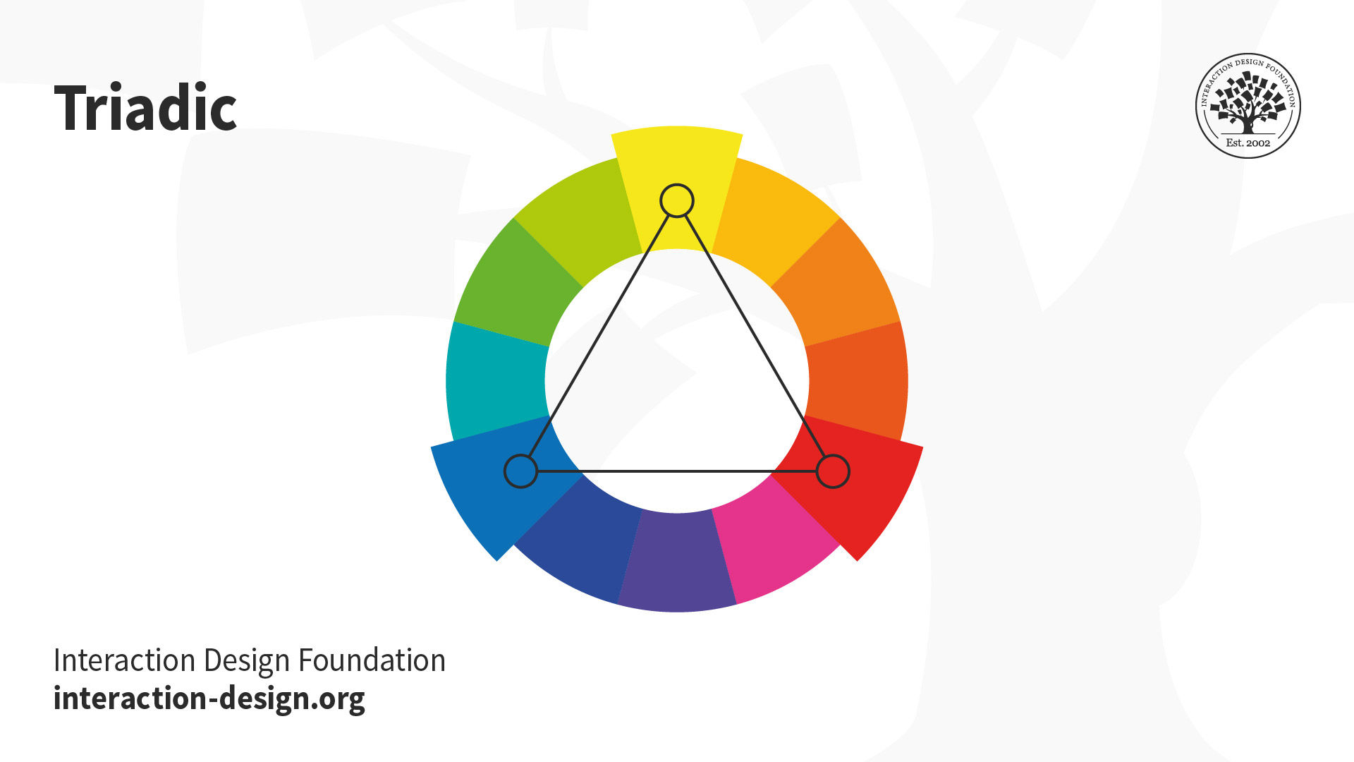
First things first, let’s talk about the color wheel. It’s not just a funky decoration, it’s actually a super helpful tool for understanding how different colors interact with each other. Remember: red, yellow, and blue are primary colors. Mix them together and you get secondary colors like orange, green, and purple. And if you keep mixing, you’ll eventually end up with a whole rainbow of possibilities.
Now, let’s delve into the world of color harmony. Here are a few key concepts to wrap your head around:
- Complementary Colors: These bad boys are opposite each other on the color wheel, like red and green. They might seem like they’re fighting, but put them together and they’ll make each other pop.
- Analogous Colors: These are besties that sit next to each other on the color wheel, like red, orange, and yellow. They just get each other, ya know?
And finally, don’t forget about color psychology. Different colors can evoke different emotions and vibes, so choose wisely when you’re painting your room or designing a logo. Remember, red might make you feel energized, but too much can also make you feel like you’re living inside a fire truck.

Impact of Color on Consumer Perception
Color is like the fairy godmother of consumer perception – it can magically transform how people view a product without them even realizing it. With just a splash of hue here and a dab of saturation there, you can make your brand stand out brighter than a neon sign at midnight. So, let’s dive into the colorful world of consumer psychology and see how different shades can play tricks on our brains!
First off, let’s talk about blue. This cool and calming color is like a massage for the eyes, making consumers feel at ease and trust the brand more. And did you know that red is not just for stop signs? It can actually increase appetite, which is probably why fast food chains use it in their logos. But be careful with yellow – while it’s cheery and attention-grabbing, it can also be associated with caution and anxiety. Nobody wants to feel anxious about buying a product!
Now, let’s not forget about green – the color of money and nature. This earthy tone can make consumers think your brand is eco-friendly and trustworthy. And pink isn’t just for princesses – it can actually create a sense of nurturing and care, perfect for beauty and healthcare products. So, next time you’re picking out colors for your brand, remember that it’s not just about looking pretty – it’s about influencing how consumers see you!

Creating Emotional Connections Through Color
Color is not just about aesthetics - it also has the power to evoke emotions and create strong connections with people. Think about it: do you feel differently when you see a bright, sunny yellow than when you see a deep, moody blue? Of course you do! That’s the magic of color.
When it comes to , it’s important to choose hues that resonate with your audience. Whether you’re designing a website, creating a logo, or painting a room, consider the following tips to help you make a lasting impression:
– **Red**: This bold color is often associated with passion, power, and excitement. Use red to grab attention and make a statement.
– **Blue**: Cool and calming, blue can evoke feelings of trust, stability, and serenity. Perfect for creating a sense of calm in stressful situations.
– **Yellow**: Cheerful and optimistic, yellow is the color of sunshine and happiness. Use it to inspire positivity and creativity.
– **Green**: Symbolizing growth, harmony, and balance, green is perfect for creating a sense of peace and tranquility. Incorporate it into your designs for a natural, soothing effect.
So don’t underestimate the power of color in making emotional connections with your audience. From warm and inviting to cool and calming, the right hues can speak volumes without saying a word. Embrace the rainbow and watch your designs come to life in ways you never thought possible.
Cultural Considerations in Color Choice
When selecting colors for a project, it’s important to consider the cultural implications of your choices. Different colors can convey different meanings and emotions across various cultures. Let’s take a look at some fun and quirky .
First up, red. In many Western cultures, red is associated with passion and love. However, in some Eastern cultures like China, red symbolizes luck and prosperity. So, whether you’re designing a Valentine’s Day card or a Lunar New Year poster, make sure you know your audience!
Next, let’s talk about yellow. In many Western countries, yellow is often associated with happiness and sunshine. But, in some Latin American countries, it can symbolize death and mourning. So, if you’re designing a travel brochure for Mexico, you might want to reconsider using too much yellow!
And finally, let’s not forget white. In Western cultures, white is often associated with purity and weddings. However, in many Asian cultures, white is the color of mourning and funerals. So, if you’re creating a branding logo for a global company, make sure you think twice before going all-white!

The Importance of Color Consistency Across Branding Materials
Imagine this: you walk into a store expecting to see your favorite brand’s logo plastered everywhere. But instead, you’re greeted with a mishmash of colors that look like they were picked by a blindfolded toddler. Talk about a branding fail!
Consistency in color across all branding materials is crucial for creating a strong and memorable brand identity. Think of your brand’s colors as the glue that holds everything together. Whether it’s your website, social media profiles, or business cards, your color scheme should be as consistent as your morning coffee order.
Remember, your brand’s colors play a huge role in shaping how customers perceive your company. So, don’t leave it up to chance. Here are a few reasons why color consistency is key:
- Recognition: Consistent colors make it easier for customers to recognize your brand, even from a mile away. It’s like having a neon sign that says, “Hey, it’s me, your favorite brand!”
- Trustworthiness: When your branding materials all sport the same colors, it shows that you’re a professional outfit that pays attention to the details. No one wants to do business with a company that can’t even get their colors straight.
FAQs
Why is color choice so important in logo design?
Oh, color choice is crucial in logo design! Think of it like choosing the right outfit for a first date – you want to make a good impression, right? Colors can evoke emotions, convey messages, and make your brand memorable.
How do different colors affect people’s moods and perceptions?
Well, let me tell you – colors are like little mood influencers. Red can make you feel passionate, while blue can have a calming effect. Yellow is all about happiness, and green is so chill and earthy. So, be strategic with your color choices to evoke the right emotions in your audience.
Should I consider cultural differences when choosing colors for my logo?
Absolutely! Cultural differences and perceptions of color vary across the globe. For example, white represents purity in Western cultures, but it symbolizes mourning in some Asian countries. So, do your research and make sure your color choices resonate with your target audience.
How many colors should I use in my logo for optimal impact?
Less is more, my friend! Stick to a few colors to avoid overwhelming your audience. Too many colors can be distracting and dilute your brand message. Keep it simple, yet impactful.
Can I use trendy colors in my logo, or should I stick with classic choices?
Trendy colors can be all the rage, but they can also quickly become outdated. Classic colors, on the other hand, stand the test of time. So, why not mix a trendy color with a classic one to create a logo that’s both fresh and timeless?
In conclusion: Don’t be green with envy, choose your colors wisely!
Thanks for reading our article on the psychological factors in logo design. Remember, color plays a crucial role in shaping consumer perception and emotional response. So whether you’re feeling blue or seeing red, make sure to think pink before settling on the perfect hue for your logo. And if you’re still feeling a bit color confused, just remember: when in doubt, go with rainbow – it’s bound to spark some colorful conversation!


