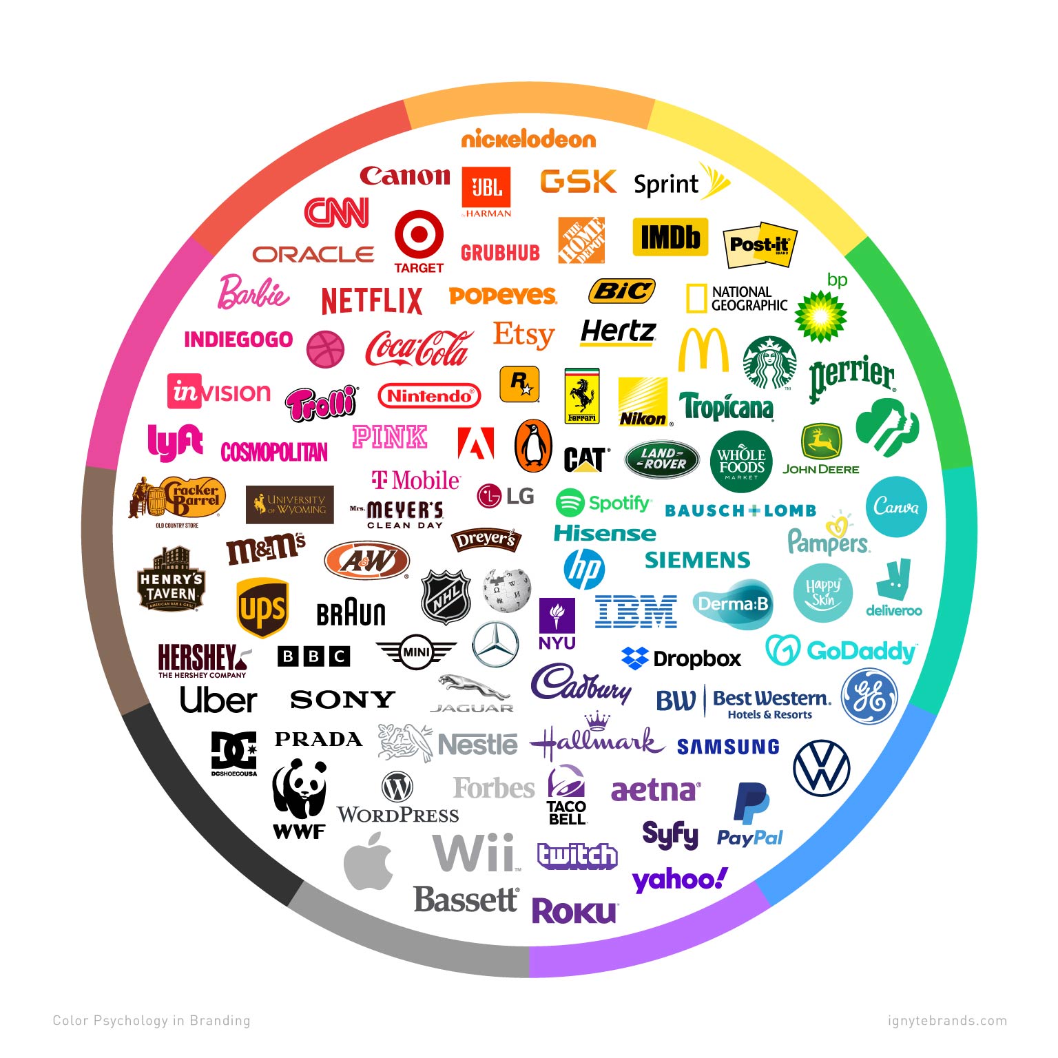
Picking the right color for your logo is like choosing the right outfit for a first date – you want to make a good impression without coming off too flashy or dull. In the world of branding, colors play a crucial role in setting the tone and personality of your company. So, if you’re ready to dive into the rainbow of possibilities, grab your color wheel and let’s explore how to select the perfect hues for your logo that will make your competitors green with envy (but hopefully not your customers!).
Primary Considerations when Choosing Colors for Logos
When it comes to choosing colors for logos, there are a few primary considerations you should keep in mind. After all, your logo is the face of your brand – you want to make sure it’s sending the right message!
First and foremost, consider your target audience. You wouldn’t want to use neon pink and lime green for a law firm logo, would you? Think about who you’re trying to appeal to and choose colors that will resonate with them.
Next, think about the emotions you want your logo to evoke. Different colors have different psychological associations. For example, blue is often associated with trust and reliability, while red can convey energy and excitement.
Don’t forget about contrast! You want your logo to stand out and be easily recognizable. Make sure your colors complement each other and don’t blend together into a muddy mess. A little pop of color can go a long way!
Understanding Color Psychology in Logo Design
Do you ever wonder why some logos make you feel all warm and fuzzy inside, while others instantly make you cringe? It’s all about color psychology, my friends. So let’s dive into the wonderful world of color and how it affects our logo design decisions!
First up, let’s talk about red. This fiery hue is often associated with passion, power, and energy. Think about all those fast food logos that use red – they want you to feel hungry and eager to chow down on a juicy burger. On the flip side, red can also evoke feelings of anger and danger, so maybe steer clear if you’re going for a more calming vibe.
Next, we have yellow. This bright and cheery color is all about happiness and optimism. It’s like a burst of sunshine in logo form. Yellow can also be associated with caution, so maybe stick to using it in moderation unless you want your customers to feel like they’re navigating a construction zone.
And let’s not forget about blue. This cool and calming color is often used to evoke feelings of trust and reliability. It’s like a cozy blanket for your logo. Blue can also be associated with sadness, so maybe avoid using it if you want to keep the waterworks at bay.

Choosing Colors that Reflect Brand Identity and Values
When selecting colors that truly reflect your brand identity and values, it’s important to consider what each color represents and how it aligns with your brand personality. Remember, colors speak louder than words! Here are some tips to help you choose the perfect hues:
- Think about the emotions you want to evoke with your brand. Use warm tones like red and orange for energy and excitement, or cool tones like blue and green for trust and serenity.
- Consider your target audience. What colors resonate with them? Are they more drawn to bold, eye-catching colors, or subtle, soothing shades?
- Look at your competitors’ colors. Do you want to stand out from the crowd with a unique color palette, or blend in with industry norms?
Don’t be afraid to get creative with your color choices! Mix and match different shades to create a visually appealing palette that captures the essence of your brand. Remember, your colors should not only reflect your brand identity, but also communicate your values to your audience.
Lastly, once you’ve chosen your colors, make sure to use them consistently across all your branding materials. From your logo to your website to your marketing materials, keep your color scheme cohesive to build a strong brand identity that resonates with your audience.

How to Ensure Logo Colors are Versatile and Memorable
When designing a logo, it’s crucial to choose colors that are both versatile and memorable. Your logo’s colors should be able to adapt to various backgrounds and mediums while still standing out in a crowd. Here are some tips to ensure your logo colors are up to the challenge:
First and foremost, opt for colors that are not only eye-catching, but also easy on the eyes. No one wants to stare at a neon green logo for too long – unless you’re trying to blind your competitors, that is. Stick to colors that are pleasing to look at and won’t cause any eye strain.
Next, consider how your logo will appear in both print and digital formats. Some colors may look great on a computer screen but end up looking dull or muddy when printed on paper. Test your logo colors across different mediums to ensure they maintain their vibrancy.
Lastly, don’t be afraid to get creative with your color choices. Think outside the box and consider using unexpected color combinations to make your logo truly memorable. After all, who says a hamburger can’t be purple or a sun can’t be blue? Embrace the unexpected and your logo will surely stand out from the crowd.

Exploring Popular Color Combinations in Logo Design
When it comes to logo design, color combinations play a crucial role in making a brand stand out. Let’s take a look at some popular and eye-catching color combinations that designers love to use:
1. Black & Gold: This classic combination exudes elegance and sophistication. It’s perfect for luxury brands looking to convey a sense of exclusivity and opulence.
2. Blue & White: The trustworthiness of blue paired with the purity of white creates a clean and professional look. It’s no wonder this combination is a favorite among corporate logos.
3. Red & Yellow: Bold and energetic, this vibrant duo is often used by fast-food chains and entertainment brands. It’s impossible to ignore the high-energy vibes this combo brings to a logo.
4. Purple & Green: Unconventional yet striking, this pairing is often seen in eco-friendly and wellness brands. The mystical allure of purple combined with the calming nature of green creates a unique visual identity.
Tips for Testing and Finalizing Logo Colors
So you’ve spent hours brainstorming, sketching, and designing the perfect logo for your brand. Now comes the fun part - testing and finalizing the colors! Here are some tips to make sure your logo pops and represents your brand in the best way possible:
First things first, test your logo colors in different contexts. Don’t just rely on what looks good on your computer screen – print it out, view it on different devices, and see how it looks in both color and grayscale. You want to make sure your logo is versatile and looks awesome no matter where it’s displayed.
Play around with different color combinations and shades. Use complementary colors to make certain elements stand out, or try out different hues to evoke different emotions. Remember, color psychology is a real thing – choose your colors wisely to convey the right message to your audience.
Don’t forget to get feedback from others! Show your logo to friends, family, colleagues, even strangers on the street. Get their opinions on the colors and ask for suggestions on how to improve. Sometimes a fresh pair of eyes can spot something you missed, so don’t be afraid to ask for help!
FAQs
What are some color combinations that work well in logos?
Think peanut butter and jelly, Batman and Robin, or macaroni and cheese - some colors just work better together than others. Classic combinations like blue and white, red and black, or yellow and gray are always a safe bet for logos.
How can I choose colors that reflect my brand’s personality?
Think about your brand as a person – is it fun and quirky, serious and professional, or somewhere in between? Choose colors that reflect that personality. If your brand is all about fun and adventure, go for bright, bold colors. If it’s more refined and elegant, stick with muted tones.
Should I consider color psychology when choosing colors for my logo?
Absolutely! Color psychology is the study of how different colors can affect our emotions and behaviors. For example, blue is often associated with trust and stability, while red can evoke feelings of passion and excitement. Consider what emotions you want your logo to evoke and choose your colors accordingly.
How many colors should I use in my logo?
Remember the old saying “less is more”? The same holds true for colors in logos. Stick to 2-3 colors max to avoid overwhelming your audience. Too many colors can make your logo look cluttered and confusing.
What if I can’t decide on a color scheme for my logo?
If you’re feeling stuck, try looking at your competitors’ logos for inspiration. Take note of the colors they use and think about how you can stand out from the crowd. You could also try using a color palette generator to help you find the perfect colors for your logo.
Now go forth and color your world with the perfect logo!
Remember, choosing the right colors for your logo can make all the difference in how your brand is perceived. So whether you’re feeling bold with a fiery red or keeping it cool with a tranquil blue, just remember to have fun and let your creativity shine through. And if all else fails, just remember that there is always room for a little bit of glitter – because who doesn’t love a logo that sparkles? Good luck and happy designing!


