Are you feeling stumped on what colors to choose for your logo design? Don’t worry, we’ve got you covered! In this article, we’ll dive into the wild world of color psychology and how it can help you pick the perfect hues for your brand. So sit back, relax, and let’s add a splash of color to your logo design dilemma!
Understanding color psychology
Have you ever wondered why some colors make you feel happy and others make you feel calm? Well, let me tell you, it’s all about color psychology! Understanding the psychology behind color can help you make better choices in everything from your wardrobe to your home decor.
One key concept in color psychology is the emotional associations we have with different colors. For example, **red** is often associated with passion and energy, while **blue** is known for its calming and serene vibes. So, if you want to create a cozy reading nook in your home, you might want to consider painting the walls a soothing shade of **green** or **purple**.
Another important aspect of color psychology is how colors can influence behavior. For instance, did you know that fast-food chains often use **red** and **yellow** in their logos and branding because these colors are thought to increase appetite and impulse buying? So next time you’re craving a burger, just remember it might be the **red** and **yellow** combo that’s making your mouth water!
When it comes to personal style, can also help you make fashion choices that make you feel confident and empowered. If you’re feeling a bit low-energy, try incorporating some **yellow** or **orange** into your outfit to lift your spirits. On the other hand, if you’re feeling overwhelmed and need to relax, opt for some **blue** or **purple** pieces to help calm your mind. Remember, the power of color is all around us, so use it wisely!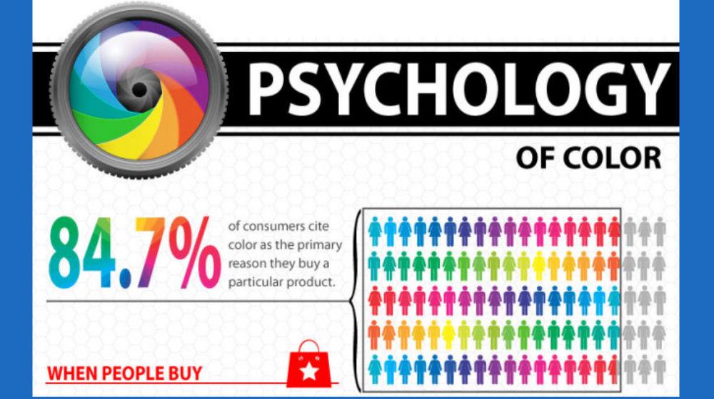
The impact of color on consumer behavior
Color psychology is a powerful tool that businesses use to influence consumer behavior. Have you ever noticed how certain colors can make you feel hungry or relaxed? That’s no coincidence, my friend. Let’s dive into how colors can manipulate our minds without us even realizing it.
One of the most well-known examples of color impact is the use of red and yellow in fast-food logos. These colors have been scientifically proven to stimulate appetite and make people feel hungry. That’s why you’ll find McDonald’s, Burger King, and KFC all using variations of red and yellow in their branding.
On the flip side, if you’re looking to create a calming atmosphere in your store, blues and greens are your best bet. These colors are associated with peace and tranquility, making customers feel more relaxed and willing to spend time browsing your products.
So, the next time you’re designing a marketing campaign or revamping your store layout, don’t underestimate the power of color. With a little bit of know-how, you can sway consumer behavior in your favor and boost your sales in no time!

Choosing colors that reflect your brand’s values
When it comes to choosing colors that reflect your brand’s values, you want to make sure you’re sending the right message to your audience. After all, no one wants to be known as the company with the neon green logo that hurts your eyes every time you look at it.
So, how do you choose colors that embody your brand’s values while also being visually appealing? One way is to think about what each color represents. For example, red could symbolize passion and energy, while blue might convey trust and reliability. Take some time to reflect on what values are important to your brand and see which colors align with those ideals.
Another important factor to consider is how your chosen colors will be perceived by your target audience. You don’t want to inadvertently choose colors that have a negative connotation in certain cultures or industries. Do some research to ensure that the colors you select will be well-received by your customers.
Remember, the colors you choose will not only influence how your brand is perceived, but they can also have a psychological impact on your audience. So, take the time to select colors that not only reflect your brand’s values, but also resonate with your customers on a deeper level.

The significance of color combinations in logo design
Have you ever stopped to think about why certain logo color combinations just work? It’s like magic, but with a dash of science sprinkled on top. Let’s dive into the wonderful world of colors in logo design!
First off, let’s talk about the power of contrast. Just like peanut butter and jelly or socks and sandals, some things are just meant to be paired together for maximum impact. When you combine contrasting colors in a logo, you’re basically creating a visual party that everyone wants to attend. Think about it - would Batman be as cool without his black and yellow logo? I think not.
Next up, let’s chat about complementary colors. These are the colors that are like two peas in a pod – they just get each other. When you use complementary colors in a logo, you’re basically ensuring that your brand will look like a match made in color heaven. It’s like Beyonce and Jay-Z, but with less drama.
And finally, let’s not forget about the psychology of color. Did you know that different colors can evoke different emotions in people? It’s like a secret code that only color nerds like us can decode. So when you’re choosing colors for your logo, remember that red may make people feel passionate or angry, while blue can make them feel calm and serene. It’s like a mood ring, but for your brand.
How to evoke emotions through color choices
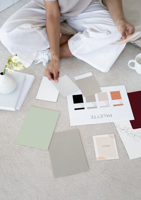
Color choices can have a powerful impact on evoking emotions in design. So, let’s dive into some fun and colorful ways to play with emotions through colors.
First things first, think about the feelings you want to convey. Are you going for a calming vibe or trying to amp up the energy? Choose your colors wisely to match the mood you’re aiming for.
Consider using warm tones like fiery reds and bright yellows to create a sense of excitement. These colors are like a shot of espresso for your design – they’ll wake it up and get your audience’s hearts racing. On the flip side, cool tones like soothing blues and calming greens can help create a more relaxed and tranquil atmosphere.
Don’t be afraid to mix and match colors to create contrast and visual interest. Pair complementary colors like blue and orange or purple and yellow to make your design pop. And remember, a little splash of bold color here and there can go a long way!
Tips for selecting colors that appeal to your target audience
When choosing colors to appeal to your target audience, it’s important to think about what emotions you want to evoke. Bright, bold colors like red and yellow can grab attention and express energy, while softer hues like pastels can create a more calming effect.
Consider the demographics of your target audience. Are they young and trendy? Maybe they would respond well to vibrant, on-trend colors like millennial pink or neon green. If your audience is more mature and sophisticated, you might want to stick to a more classic color palette like navy blue and forest green.
Don’t be afraid to get creative with your color choices! Think outside the box and consider unusual color combinations that can make your brand stand out. Experiment with contrasting colors like purple and yellow or complementary colors like blue and orange to create a visually striking design.
Remember, the key to selecting colors that appeal to your target audience is to test and refine your choices. Get feedback from your audience and be open to making adjustments as needed. With a little trial and error, you’ll find the perfect colors that resonate with your target demographic and make your brand truly stand out!
FAQs
What factors should I consider when choosing colors for my logo design?
Well, my dear logo designer, you should definitely think about the emotions and associations that different colors evoke in people. Also, consider your target audience and the message you want to convey with your logo. And hey, don’t forget about color theory!
Can you give me some examples of colors and their corresponding emotions?
Oh, I’d love to! Red is often associated with passion and energy, while blue can convey trust and professionalism. Green is all about nature and growth, and yellow is like a ray of sunshine, bringing joy and optimism. But remember, these associations can vary depending on cultural context, so do your research!
How can I ensure that my logo design stands out while still being appealing?
Ah, the eternal struggle of every designer! One trick is to use contrasting colors to make your logo pop. Also, consider using color combinations that are not commonly seen in your industry to set yourself apart. And hey, don’t forget about the power of simplicity – sometimes less is more!
Should I follow color trends when designing my logo, or stick to classic choices?
Well, my friend, it’s a tricky balance. While it’s important to stay relevant and modern, you don’t want your logo to look outdated as soon as the trend passes. Try combining trendy colors with timeless classics for a look that’s both fresh and enduring. And remember, confidence is the best accessory – if you love the colors you’ve chosen, that’s what truly matters!
In Conclusion: Let Your Colors Shine!
Thanks for diving into the colorful world of logo design with us! Remember, when choosing the perfect colors for your logo, go beyond the aesthetics and delve into the psychology behind them. After all, it’s not just about looking good – it’s about making a lasting impact on your audience.
So go ahead, pick those colors that best represent your brand’s personality and watch your logo come to life with the magic of psychology. Let your colors shine bright like a rainbow – or a disco ball – whichever suits your brand best!
Happy designing, and may the hues be ever in your favor!


