Welcome to the ultimate guide on how to make your logo and website look like they were made for each other, not like they met on a blind date set up by a distant relative. We’re here to help you create a brand image so cohesive, it’ll make milk and cookies jealous of how well they go together. So sit back, relax, and get ready to learn how to seamlessly unify your logo and website for a match made in branding heaven. Design Elements“>
Establishing Brand Identity Through Consistent Design Elements
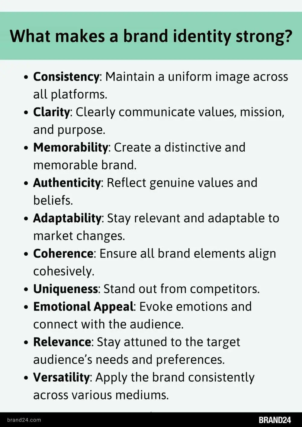
When it comes to establishing your brand identity, consistency is key. By incorporating consistent design elements throughout your marketing materials, you can create a strong and recognizable brand that stands out from the competition.
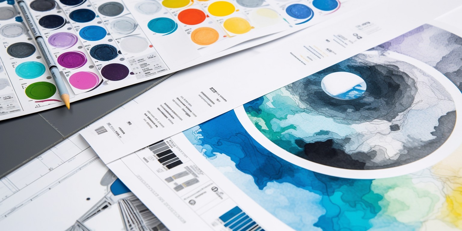
One way to achieve this consistency is through the use of color schemes. Choose a set of colors that represent your brand and use them consistently across all of your materials. Whether it’s a website, social media graphics, or print materials, sticking to the same color palette will help create a cohesive look that customers will come to associate with your brand.
Another important design element to consider is typography. Selecting a few key fonts to use across all of your materials can help establish a sense of professionalism and uniformity. Make sure to choose fonts that are easy to read and reflect the personality of your brand.
Lastly, don’t forget about logo placement. Your logo is often the first thing customers will associate with your brand, so make sure it’s prominently featured on all of your materials. Whether it’s in the corner of a flyer or at the top of a webpage, consistent logo placement will help reinforce your brand identity in the minds of consumers.

Choosing a Logo that Reflects Your Brand’s Values and Personality
When it comes to choosing a logo for your brand, it’s important to make sure it reflects your company’s values and personality. Think of your logo as your brand’s face – you want it to be memorable and convey the right message to your audience. Here are some tips on how to select a logo that truly represents your brand:
1. Know Your Brand Inside and Out: Before you start brainstorming logo ideas, take some time to really think about what your brand stands for. What values do you want to communicate? What makes your brand unique? Understanding your brand identity will help you create a logo that truly reflects who you are.
2. Consider Your Target Audience: Your logo should resonate with your target audience, so it’s important to consider their preferences and tastes when designing your logo. Think about what colors, shapes, and styles are most appealing to your target demographic and incorporate them into your logo design.
3. Keep It Simple: While it’s tempting to get carried away with intricate designs and elaborate details, it’s usually best to keep your logo simple and clean. A cluttered logo can be confusing and difficult to remember, so opt for a design that is easily recognizable and conveys your brand’s message in a clear and concise way.
 Website Design for a Unified Look”>
Incorporating Logo Colors and Fonts into Website Design for a Unified Look
When it comes to designing a website that truly stands out, incorporating your logo colors and fonts is key. Think of them as the dynamic duo of design, the Batman and Robin of branding. By seamlessly integrating these elements into your website, you can achieve a cohesive and unified look that will leave a lasting impression on your visitors.
First things first, let’s talk colors. Your logo palette is like a magical box of crayons – so many options, so little time. Choose a primary color that really pops, then add in a couple of complementary shades for variety. Use these colors strategically throughout your website for a harmonious visual experience. Remember, too much of a good thing can be overwhelming, so don’t go overboard with the neon pink unless you’re specifically targeting a unicorn-enthusiast demographic.
Next up, let’s chat fonts. Your logo font is like your website’s handwriting – it should be unique, recognizable, and easy to read. Choose a font that reflects your brand’s personality, whether that’s sleek and modern or quirky and fun. Be sure to use this font consistently for headings, subheadings, and body text to maintain that unified look. And hey, why not throw in a couple of fun web-safe fonts for good measure? Variety is the spice of life, after all.
Incorporating your logo colors and fonts into your website design isn’t just about aesthetics – it’s about creating a memorable and cohesive brand experience for your visitors. So grab your color wheels, dust off your font library, and get ready to design a website that’s as unique and unforgettable as you are. Happy designing!
Ensuring Logo Placement on Website is Strategic and Prominent
So, you’ve got a killer logo that screams ”SWAG!” and you want to make sure it’s front and center on your website for all to see. Well, my friend, you’ve come to the right place. We’re about to school you on the fine art of logo placement – it’s like a ballet of pixels, if you will.
First things first, your logo should be as visible as a Kardashian at a photo op. Stick it up in the header of your website, where all eyes naturally gravitate. Make it big, make it bold, make it impossible to ignore. You want people to see that logo and think, “Dang, that’s one sexy logo.”
Next up, consider slapping that bad boy on the top left corner of your website. Studies show that people read from left to right, so why not give them a little visual treat right off the bat? It’s like serving them up a delicious appetizer before the main course. Your logo is the amuse-bouche of your website, if you will.
And hey, while you’re at it, why not sprinkle your logo throughout your website like confetti at a parade? Stick it in the footer, toss it in the sidebar – heck, you could even watermark your images with it. The more you flaunt that logo, the more it becomes ingrained in people’s minds. Before you know it, they’ll be dreaming of your logo in their sleep. Now that’s what we call brand recognition, baby!

Using Similar Design Elements Across Logo and Website for Brand Recognition
So, you want to be the cool kid on the digital block and have your logo and website looking like they go together like peanut butter and jelly, huh? Don’t worry, I got you covered with some killer tips on how to make that happen!
First off, let’s talk about keeping those design elements consistent. Think of your logo as the superhero cape and your website as the secret lair – they need to match! Use the same colors, fonts, and overall aesthetic to create a seamless brand experience for your loyal minions, I mean customers.
Next up, let’s chat about imagery. Whether it’s a sassy llama or a menacing avocado (hey, we don’t judge), make sure your chosen images are used across both your logo and website. Consistency is key, people!
Lastly, don’t forget about those fancy navigation bars and buttons. Make sure they are styled in the same way across your logo and website. Your visitors should feel like they know exactly where they are, even if they’ve never met your sassy llama before.
Creating a Seamless User Experience by Aligning Logo and Website Design
So, you’ve got a shiny new logo and a snazzy website design, but is your user experience as smooth as a baby’s bottom? If not, fear not! Follow these simple steps to align your logo and website design for a seamless user experience that will have your users coming back for more.
First things first, make sure your logo and website design are like two peas in a pod. Your logo should be the star of the show, so make sure it’s front and center on your website. This will create consistency and make your brand instantly recognizable. It’s like a matching pair of socks – you wouldn’t want one to be a polka dot and the other a striped, right?
Next, pay attention to the color scheme. Your logo and website design should complement each other like peanut butter and jelly. Choose a color palette that reflects your brand’s personality and use it consistently throughout your website. This will create a visually appealing experience for your users and make your brand more memorable.
Lastly, make sure your logo and website design are both user-friendly. Keep things simple and easy to navigate. Use clear calls to action and make sure your logo is clickable and links back to your homepage. Remember, a confused user is a lost user!
Testing and Adjusting Logo and Website Integration for Optimal Cohesion
After many long hours of tireless work, it’s time to unveil the results of our testing and adjusting efforts for the logo and website integration. We wanted to ensure that the cohesion between the two elements was seamless and flawless, like a perfectly executed high-five.
First off, let’s talk about the logo. We played around with different sizes, colors, and placements to find the sweet spot that would make it pop on the website like a superhero bursting through a wall. We wanted it to be the shining star of the show, the Beyoncé of the web design world. And after some trial and error, we finally achieved logo perfection.
Next, onto the website integration. We wanted the website to be the stage for our logo superstar to shine, so we meticulously adjusted every pixel and font to create a harmonious blend. It was like a dance-off between the logo and website, with each element trying to outshine the other. But in the end, they came together like peanut butter and jelly, like Batman and Robin, like Bert and Ernie.
In conclusion, we are proud to say that our testing and adjusting efforts have resulted in optimal cohesion between the logo and website. They are now a dynamic duo, a dream team, a match made in web design heaven. So sit back, relax, and enjoy the visual feast that is our perfectly integrated logo and website.
FAQs
Why is it important to have a cohesive brand image?
Well, have you ever seen someone show up to a black-tie event in a Hawaiian shirt and flip flops? Yeah, not a good look. Just like that, your brand image should be consistent across all platforms to avoid confusion and establish trust with your audience.
How can I seamlessly unify my logo and website?
Think of your logo and website as two peas in a pod, or better yet, Batman and Robin – they just belong together. Make sure your logo is prominently displayed on your website, use the same color scheme, fonts, and imagery to create a harmonious brand experience for your visitors.
What should I consider when designing my logo and website?
First things first, make sure your logo is scalable and looks good in various sizes. As for your website, keep things user-friendly and visually appealing. Don’t go overboard with flashy designs - simplicity is key!
How can a cohesive brand image help my business?
Imagine if McDonald’s suddenly decided to change their logo to a purple unicorn – chaos, right? A cohesive brand image builds brand recognition, boosts credibility, and ultimately helps you stand out in a sea of competitors. So, stick to your brand like peanut butter sticks to jelly!
Any tips for maintaining a cohesive brand image in the long run?
Consistency is key! Create brand guidelines to keep everyone on the same page, regularly audit your logo and website to ensure they’re still in sync, and always put your brand’s best foot forward – because let’s face it, first impressions matter!
In Conclusion: Logo + Website = ❤️
So there you have it - the secret to creating a cohesive brand image lies in seamlessly unifying your logo and website. By incorporating your logo’s design elements, color scheme, and overall vibe into your website, you can ensure that your brand identity remains consistent across all platforms. So go forth, brave brand builder, and conquer the digital realm with your perfectly aligned logo and website. Your brand image will thank you for it!


