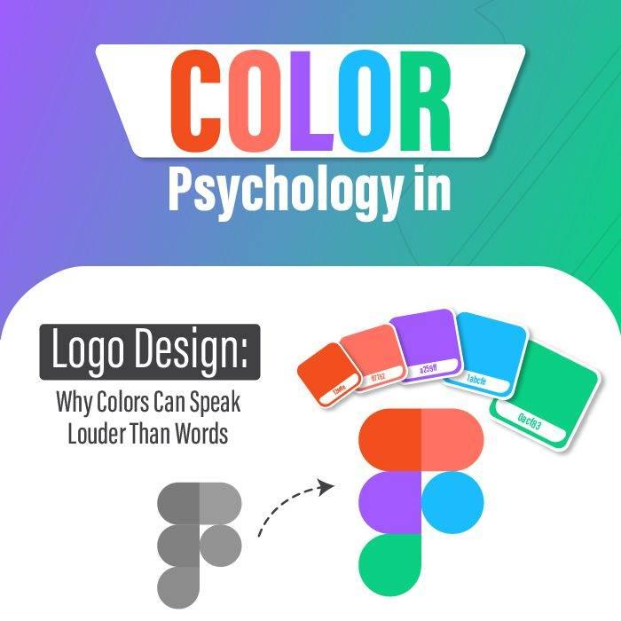
Have you ever stopped to think about why certain logos catch your eye and leave a design/” title=”Bank Logo Design”>lasting impression? Well, it turns out that colors play a huge role in the world of logo design! From bold reds that scream “attention-grabbing” to calming blues that evoke feelings of trust and reliability, the influence of colors in logo design is no joke. So grab your shades and prepare to dive into the colorful world of logo design!
The Psychology of Color in Logo Design
When it comes to logo design, color plays a crucial role in evoking emotions and conveying messages to the audience. Different colors have different psychological effects, and as a designer, it’s important to understand the impact of each hue on the viewer’s perception.
Colors like red and yellow are known to stimulate appetite, which is why so many fast-food chains use these vibrant hues in their branding. On the other hand, blues and greens are often associated with tranquility and trustworthiness, making them popular choices for healthcare and financial institutions.
In logo design, it’s essential to consider how colors interact with each other to create a cohesive and visually appealing design. Combining complementary colors can make a logo stand out and grab attention, while using analogous colors can create a sense of harmony and balance. Don’t forget about the power of contrast – a bold pop of color against a neutral backdrop can make a logo really pop.
So next time you’re designing a logo, think about the psychology of color and how you can use it to your advantage. Whether you’re aiming for excitement, trust, or sophistication, the right color palette can make all the difference in how your brand is perceived.
How Color Choice Affects Brand Perception
Have you ever stopped to think about how the color of a brand can affect your perception of it? Believe it or not, something as simple as a color choice can make or break a brand’s image. Let’s dive into how different colors can influence how we view a brand:
1. Red: This color screams excitement and passion. If a brand uses red in its logo or branding, it’s likely trying to convey a sense of urgency or energy. Think about brands like Coca-Cola or Target – they use red to grab your attention and make you feel something.
2. Blue: Blue is the color of trust and reliability. Brands that use blue are often seen as trustworthy and dependable. Just look at companies like Facebook or IBM – their use of blue helps consumers feel safe and secure.
3. Yellow: Yellow is all about optimism and cheerfulness. Brands that incorporate yellow into their branding are usually trying to convey a sense of positivity and happiness. Take a look at brands like McDonald’s or Best Buy – their use of yellow is meant to make you feel good about your purchase.

Creating Emotional Connections Through Color
Emotions are like colors – vibrant, unpredictable, and sometimes overwhelming. Just like how different hues can evoke different feelings, our choice of colors can make or break our emotional connections with others. Here are a few tips to help you create meaningful connections through the power of color:
– **Choose Your Palette Wisely**: When it comes to emotional connections, not all colors are created equal. Some shades can instantly brighten someone’s day, while others might leave them feeling blue. Experiment with warm and inviting tones like sunny yellows and fiery reds to create a sense of warmth and intimacy.
– **Go Beyond the Basic**: Sure, red might be the color of love and passion, but don’t be afraid to think outside the box. Play around with unexpected color combinations to add depth and complexity to your emotional connections. Who knows – a touch of neon green might just be the missing ingredient in your recipe for connection!
– **Consider Context**: Remember, the context in which you use colors can greatly impact the emotional response they evoke. A soft pastel pink might be perfect for a romantic gesture, but it might fall flat in a high-energy setting like a sports event. Be mindful of how your color choices align with the emotions you’re trying to convey.
So, the next time you want to forge a deeper emotional connection with someone, don’t be afraid to paint outside the lines. Get creative with colors, experiment with different shades, and watch as your relationships bloom in full technicolor brilliance.
Color Combinations for Maximum Impact in Logos
When it comes to creating a logo that really pops, it’s all about the color combination you choose. Here are some winning color combos that are sure to make an impact:
- Black and Gold: This classic pairing oozes sophistication and elegance. Perfect for luxury brands looking to make a statement.
- Red and Yellow: These bold, primary colors are attention-grabbing and energetic. Great for brands that want to stand out from the crowd.
- Blue and Green: A calming and harmonious combination that suggests trustworthiness and growth. Ideal for eco-friendly or health-related brands.
Remember, the key to creating a successful logo is to choose colors that not only look good together but also reflect the values and personality of your brand. So don’t be afraid to get creative and experiment with different color combinations until you find the perfect one that truly represents your brand!

Using Color Theory to Enhance Brand Identity
Have you ever wondered why certain brands just seem to have that “it” factor when it comes to their identity? It’s not just luck – it’s color theory at play! By strategically choosing colors that represent your brand’s personality and values, you can create a powerful and memorable brand identity that resonates with your target audience.
So, how can you use color theory to enhance your brand identity? Here are a few tips to get you started:
- **Understand the psychology of colors**: Different colors evoke different emotions and associations. For example, blue is often associated with trust and professionalism, while red is known for creating a sense of urgency and excitement.
- **Choose a color palette that reflects your brand’s personality**: Are you a fun and quirky brand? Opt for bright and playful colors. If you’re a luxury brand, go for more sophisticated and elegant hues.
- **Be consistent with your color usage**: Once you’ve chosen your brand’s colors, make sure to use them consistently across all your marketing materials and touchpoints. This will help reinforce your brand identity in the minds of your audience.
The Cultural Significance of Colors in Logo Design
Colors play a pivotal role in logo design, as they can convey a specific message or emotion without words. In the world of design, colors are like superheroes, each with their own superpowers and meaning. Let’s explore the cultural significance of some of these colorful characters in logo design:
Red: Ah, the color of passion and power! Red is like the spicy salsa of the design world – it grabs your attention and makes a bold statement. It’s often used in logos to convey excitement, energy, and courage.
Blue: Like a calm sea on a peaceful day, blue is the color of tranquility and trust. It’s often used by businesses to convey professionalism and reliability. Blue is the unsung hero of logo design, quietly instilling a sense of security and stability.
Yellow: The color of sunshine and happiness, yellow is like a ray of light in the design world. It’s commonly used to convey optimism, creativity, and warmth. Yellow logos are like a warm hug on a dreary day, spreading joy wherever they go.
FAQs
Why is color so important in logo design?
Color is like the spice of logo design – it can make the difference between a bland logo and an eye-catching one. Different colors evoke different emotions and can convey different messages, so choosing the right color can greatly impact how your logo is perceived.
How can I choose the right colors for my logo?
Well, first things first, you need to think about the message you want to convey. Are you going for a calming vibe? Try blues and greens. Want to grab attention? Go for red or yellow. And remember, there’s no right or wrong answer – just make sure your colors reflect your brand’s identity.
Can using too many colors in a logo be a bad thing?
Absolutely! Just like too many cooks can spoil the broth, too many colors can spoil your logo. Stick to a few key colors that complement each other and make sure they work together harmoniously.
What if I want to use a color that doesn’t typically represent my industry?
Go for it! Who says you have to follow the crowd? If you think a hot pink logo would make your funeral home stand out, then why not? Just be prepared to explain your color choice if anyone asks!
Time to get colorful!
And there you have it, folks! The power of colors in logo design is truly remarkable. So next time you’re creating a logo, don’t just pick a color willy-nilly – choose wisely and watch as your brand stands out from the crowd. Remember, colors are more than just pretty shades – they have the power to influence emotions, perceptions, and even purchasing decisions. So go ahead, paint the town red (or blue, or yellow, or green) with your logo design!


