You know what they say, “Never judge a book by its cover.” But when it comes to branding, the typeface you choose can make all the difference between looking like a polished professional or a disorganized mess. So, buckle up, because we’re about to dive into the wild world of fonts and their impact on brand image. Grab your magnifying glass and get ready to decipher the secret code of Comic Sans, the villainous reputation of Papyrus, and the timeless elegance of Helvetica. It’s a typographic adventure you won’t want to miss!
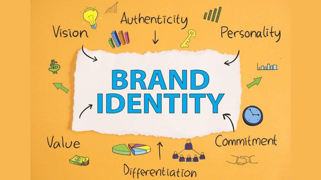
The Importance of Typeface in Branding
When it comes to branding, the typeface you choose can make all the difference in how your brand is perceived. So, how do you choose the right typeface? Well, here are a few tips to help you make the right choice:
- Personality: Make sure the typeface reflects the personality of your brand. Is your brand fun and quirky? Go for a playful typeface. Is it sleek and modern? Opt for a clean, minimalist typeface.
- Legibility: No one wants to strain their eyes trying to read your brand name. Choose a typeface that is easy to read, especially in small sizes.
- Consistency: Stick to one or two typefaces for your brand to maintain consistency across all your marketing materials. Mixing too many fonts can make your brand look chaotic.
Remember, the typeface you choose is not just a font – it’s a reflection of your brand’s personality and values. So, take the time to pick the right one, because when it comes to branding, every little detail counts!

Choosing the Right Typeface for Your Brand
So you’ve decided to choose a new typeface for your brand. Congratulations! This is a big step in establishing your brand identity, so it’s important to choose wisely. Here are some tips to help you navigate the often confusing world of typefaces:
First and foremost, you need to consider the personality of your brand. Are you a fun and quirky company, or are you more serious and professional? Make sure the typeface you choose reflects the essence of your brand. Remember, Comic Sans might be fun, but it’s probably not the best choice for a law firm. Keep this in mind when making your selection.
Next, think about readability. No matter how cool a typeface looks, if people can’t read it, it’s not doing its job. Make sure the typeface you choose is clear and easy to read, especially in smaller sizes. You want people to be able to easily digest the information you’re presenting, not strain their eyes trying to decipher your message.
Consider versatility. You want a typeface that can be used across various platforms and mediums. Whether it’s on your website, in print materials, or on social media, your typeface should look good in any situation. Bold, italicize, underline - make sure your typeface can handle whatever you throw at it.

Creating a Strong Visual Identity with Typeface Selection
When it comes to creating a strong visual identity for your brand, choosing the right typeface is crucial. Your typeface selection is like choosing the outfit for your brand – you want it to be stylish, on-trend, and most importantly, it needs to fit perfectly!
One key tip for selecting the perfect typeface is to consider the personality of your brand. Is your brand fun and quirky? Choose a playful, whimsical typeface. Is your brand sleek and modern? Opt for a clean, minimalist typeface. Remember, your typeface is like the accent piece that ties your entire brand together – choose wisely!
Don’t be afraid to mix and match different typefaces to create a unique look for your brand. Just like mixing prints in fashion, combining different typefaces can add depth and interest to your brand’s visual identity. Experiment with bold, italic, and different font weights to create a dynamic and eye-catching look that will make your brand stand out from the crowd.
Ultimately, the key to is to have fun and be creative! Your typeface selection should reflect the essence of your brand and communicate your brand’s unique personality to your audience. So go ahead, play around with different fonts, experiment with spacing and alignment, and watch as your brand’s visual identity comes to life!

Impacts of Typeface on Brand Recognition
When it comes to brand recognition, the typeface you use can make a huge difference. Think about it, would Coca-Cola be as iconic if they used Comic Sans? (Probably not). The font you choose can convey a lot about your brand’s personality and values, so it’s important to choose wisely.
Using a bold, modern typeface can make your brand seem cutting-edge and forward-thinking. On the other hand, a more traditional font might give off a sense of reliability and trustworthiness. Whatever typeface you choose, be sure it accurately reflects the image you want to project.
Consider how different typefaces can evoke different emotions in consumers. A playful, whimsical font might be perfect for a children’s toy company, while a sleek, minimalist font might be better suited for a high-end fashion brand. The right typeface can help your brand stand out and make a lasting impression on customers.
Remember, the devil is in the details (or in this case, the typeface). Don’t underestimate the power of choosing the right font for your brand. It could be the difference between blending in with the competition and standing out in a crowded marketplace.

Consistency in Typeface across Branding Materials
When it comes to branding materials, nothing sucks more than having different typefaces scattered all over the place like a poorly planned game of connect the dots. Imagine your logo screaming “Comic Sans” on your website, but suddenly whispers “Times New Roman” on your business cards. It’s like watching a movie with terrible audio syncing – frustrating and downright painful.
Consistency in typeface is like the glue that holds your brand together – it keeps things smooth, cohesive, and visually appealing. Think of it as the magical thread that stitches your brand’s identity across different platforms. Whether it’s your website, social media graphics, or print materials, keeping a consistent typeface is like giving your brand a high-five — it just feels right.
So, stick to one typeface to rule them all. Make sure your headlines and body text share the same font family like long-lost twins separated at birth. Keep it simple, keep it clean, keep it consistent. Trust us, your brand will thank you for it.
Remember, a brand without consistent typeface is like a cake without frosting - just plain wrong. So, let’s raise our font files high, and toast to the power of consistent typeface across all branding materials. Here’s to keeping it classy, seamless, and dare we say it, *Helvetica* of a good time.
Influence of Typeface on Consumer Perception of Brand
Have you ever stopped to consider how much impact the typeface of a brand has on how you perceive it? Well, let me tell you, it’s a big deal! Typeface can evoke feelings and associations that affect how consumers view a brand. Here’s a breakdown of how different typefaces can influence consumer perception:
- Serif Fonts: Fonts like Times New Roman or Georgia give off a sense of tradition and professionalism. They can make a brand seem more established and trustworthy, perfect for businesses looking to convey a sense of reliability.
- Sans-Serif Fonts: On the other hand, fonts like Arial or Helvetica are clean and modern. They give off a more contemporary and minimalist vibe, ideal for brands aiming to appear cutting-edge and innovative.
But wait, there’s more! Script Fonts: These elegant and flowing fonts can add a touch of sophistication and luxury to a brand’s image. Think high-end fashion or beauty brands aiming to convey a sense of glamour and exclusivity.
So next time you come across a brand, pay attention to the typeface they use. It might just give you a clue about how they want to be perceived and whether they’re worth your trust (or your hard-earned cash!)
FAQs
How does choosing the right typeface impact a brand’s image?
Choosing the right typeface is crucial because just like choosing the right outfit for a job interview, it communicates who you are and what you stand for. Whether you’re a quirky startup or a classic luxury brand, your typeface sets the tone for how customers perceive you.
Can using a unique typeface help a brand stand out?
Absolutely! A unique typeface is like having a signature dance move at a party – it catches people’s attention and makes you memorable. It can help your brand stand out in a sea of Times New Roman and Helvetica clones.
What can a mismatched typeface say about a brand?
Using a mismatched typeface is like wearing a Hawaiian shirt to a black-tie event – it just doesn’t work. It can make your brand look unprofessional, confused, and like you raided the Comic Sans bargain bin. So, unless your brand is going for the “hot mess” aesthetic, it’s best to stick with a cohesive typeface that aligns with your brand’s personality.
How can a brand find the perfect typeface for their image?
Finding the perfect typeface is like finding your soulmate – it takes time, patience, and a few bad dates with Papyrus. Start by defining your brand’s personality and values, then look for a typeface that reflects that. You can also seek the help of a designer who can guide you in the right direction. Remember, it’s not just about looks – it’s about finding a typeface that truly speaks to who you are.
Is it worth investing in a custom typeface for a brand?
Investing in a custom typeface is like buying a tailored suit – it may cost more upfront, but it’s worth it in the long run. A custom typeface can give your brand a one-of-a-kind look that no one else has, making you stand out from the crowd. Plus, it shows that you’re serious about your brand and willing to go the extra mile to make it shine.
Choosing the Right Font for Your Brand
As we’ve seen, the typeface you choose can have a big impact on your brand image. So next time you’re deciding on a font for your logo or website, remember to consider the message you want to convey and choose wisely. After all, Comic Sans might not be the best choice for a prestigious law firm, just like Papyrus might not convey a sense of modernity for a tech startup. So go forth and font wisely, my friends, and watch your brand image shine!


