Welcome to the wonderful world of fonts, where the curves and serifs are more powerful than a superhero cape. In the realm of branding, typography has the ability to make or break a company’s identity faster than you can say Comic Sans. So buckle up, buttercup, because we’re about to dive deep into the power of typography in brand identity, and trust us, it’s going to be a wild ride.
The Role of Typography in Creating Brand Identity
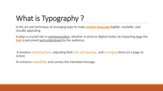
Typography is not just about choosing pretty fonts; it plays a crucial role in shaping a brand’s identity. Imagine if Coca-Cola used Comic Sans in their logo – it just wouldn’t have that same classic, timeless feel. Different typefaces convey different personalities, from sleek and modern to quirky and fun.
When creating a brand identity, it’s essential to choose fonts that reflect the brand’s values and message. For example, a luxury brand might opt for elegant serif fonts, while a tech startup may go for clean, sans-serif typefaces. Consistency is key – using the same fonts across all brand communications helps establish a cohesive look and feel.
Typography also helps to create brand recognition. Think about some of the most iconic logos out there – Nike’s bold, sporty text, or Disney’s whimsical, fairy tale-like font. These fonts have become synonymous with their respective brands and instantly evoke certain feelings and associations.
In conclusion, typography may seem like a small detail, but it can have a big impact on how a brand is perceived. So next time you’re designing a logo or brand materials, don’t just settle for the default font – take the time to choose typefaces that truly represent your brand’s personality and values. Your brand will thank you for it! Typeface for Your Brand”>
Choosing the Right Typeface for Your Brand
So you’ve decided it’s time to choose a typeface for your brand. Congratulations on taking this important step toward visual identity! But before you start flipping through font lists like a kid in a candy store, let’s take a moment to consider a few key factors that will help you make the right choice.
First and foremost, think about the personality of your brand. Is it fun and whimsical? Serious and professional? Whatever the vibe, your typeface should reflect that. Remember, Comic Sans has its place in the world – just not in your brand’s visual identity.
Next, consider legibility. Sure, that swirly cursive font might look fancy, but if your audience can’t actually read it, what’s the point? Stick to fonts that are clear and easy to read, especially when it comes to important information like your brand name or tagline.
Lastly, don’t be afraid to mix things up with different typefaces for different purposes. Maybe you use one font for headlines and another for body text. The key is to create a harmonious and cohesive look that represents your brand’s personality in the best possible way. And remember, when in doubt, you can never go wrong with a classic like Helvetica or Garamond.

The Impact of Typography on Consumer Perception
Typography is more than just choosing a font - it can really make or break how consumers perceive your brand. Whether it’s bold, italic, or Comic Sans (please, never Comic Sans), the way you present your text can have a huge impact on how your audience views your product or service.
Here are a few ways typography can influence consumer perception:
- First Impressions: The font you choose can convey a lot about your brand’s personality. A sleek, modern font might make consumers think you’re a cutting-edge company, while a fancy script font could give off a more elegant vibe (or make them wonder if your website was designed in the ’90s).
- Readability: If your text is hard to read, consumers might not bother trying to decipher it. Make sure your font is legible and appropriate for the content you’re presenting. Remember, no one wants to strain their eyes trying to understand your message.
- Consistency: Using the same font across all your marketing materials can help create a cohesive brand identity. Plus, it’ll make you look super professional and put-together. Just like matching socks, but less likely to get lost in the dryer.
So, next time you’re choosing a font for that big presentation or website redesign, remember: typography matters. Don’t be that person who uses Papyrus for everything. Your consumers will thank you.

Enhancing Brand Recognition Through Typography
Typography plays a crucial role in building brand recognition. It can convey the personality and values of a brand through the choice of fonts and styles used. To truly enhance brand recognition through typography, here are a few tips to keep in mind:
Choosing the Right Fonts: Selecting the right fonts is like picking out the perfect outfit for your brand. Avoid using Comic Sans unless your brand is a clown school. Opt for fonts that align with your brand’s personality and message. Think of it as finding the right font-mate for your brand soulmate!
Consistency is Key: Just like in relationships, consistency is key in typography. Use the same set of fonts across all your branding materials to create a cohesive look. Mixing and matching fonts is like wearing stripes with polka dots – it’s a fashion disaster!
Embrace White Space: Don’t be afraid of white space – it’s like the breath of fresh air in typography. Give your fonts room to breathe and your brand will thank you. Remember, sometimes less is more, just like in your dating profile bio!
Experiment and Have Fun: Typography is like playing dress-up for your brand. Experiment with different fonts, sizes, and styles to see what fits best. Don’t be afraid to break the rules and have a little fun with typography – after all, life’s too short to stick to Times New Roman!
Creating a Cohesive Brand Image with Typography
You may not realize this, but typography is the unsung hero of brand image. It’s like the trusty sidekick that quietly saves the day while the flashy superhero (i.e. logo) gets all the glory. But fear not, typography enthusiasts! With a few simple tips and tricks, you too can harness the power of fonts to create a cohesive and memorable brand image.
First things first, choose your fonts wisely. Just like a mismatched outfit can leave a bad impression, using conflicting fonts can confuse your audience and dilute your brand’s message. Stick to a select few fonts that complement each other well and reflect the personality of your brand. Consider using a serif font for a more traditional and elegant vibe, or a sans-serif font for a more modern and clean look.
Next, establish a hierarchy with your typography. This means using different font sizes, weights, and styles to guide the viewer’s eye and communicate information effectively. Consider using bold or italic text to emphasize important points, or varying font sizes to differentiate between headings and body text. A well-defined hierarchy not only makes your brand image more cohesive, but also helps make your content easier to read and digest.
Don’t forget about consistency! **Consistency is key** when it comes to . Use the same fonts, colors, and styles across all your marketing materials to reinforce your brand identity and build brand recognition. Whether it’s your website, social media posts, or business cards, keeping a consistent look and feel will help solidify your brand image in the minds of your audience.
Typography as a Tool for Establishing Brand Values
When it comes to establishing brand values, typography plays a crucial role in conveying the personality and essence of a brand. The font choices, spacing, and overall design of text can speak volumes about a brand’s values and identity.
By carefully selecting fonts that reflect a brand’s values, companies can communicate their mission, ethos, and personality to their audience. Whether it’s a sleek and modern sans-serif font or a classic and timeless serif font, typography can help set the tone for how customers perceive a brand.
With the use of **bold** and italic fonts, brands can emphasize key messages and create visual interest. By incorporating different font weights and styles, companies can guide the reader’s eye and draw attention to important information.
So next time you’re designing a brand’s visual identity, remember that typography is more than just picking a pretty font – it’s a powerful tool for establishing brand values and connecting with your audience on a deeper level.
The Evolution of Typography in Branding Strategy
In the world of branding, typography plays a crucial role in conveying a brand’s message and identity. From serif to sans-serif, has been nothing short of revolutionary.
With the rise of digital media, brands have been experimenting with various fonts and styles to stand out in a crowded marketplace. Comic Sans may have had its moment in the sun, but brands today are opting for more sophisticated and timeless fonts like Helvetica and Proxima Nova.
Typography is not just about choosing a pretty font – it’s about creating a visual language that resonates with your target audience. Brands like Apple and Google have mastered the art of typography, using clean, modern fonts to convey a sense of innovation and trustworthiness. In contrast, brands like Coca-Cola and Disney have stuck with their classic fonts, creating a sense of nostalgia and familiarity.
As we move into the future, the role of typography in branding strategy will only continue to evolve. With the rise of AI and virtual reality, who knows what the future holds for fonts and branding? One thing is for certain – in a world filled with text and images, typography will always be the unsung hero of branding.
FAQs
Why is typography important in brand identity?
Typography is like the fashion of the brand world – it sets the tone, style, and overall vibe of your brand. Just like wearing a sharp suit to a job interview, choosing the right typography can make a strong first impression and leave a lasting impact on customers.
How can typography help distinguish a brand from its competitors?
Imagine walking into a party and seeing someone wearing the exact same outfit as you. Awkward, right? Well, having unique and eye-catching typography can prevent your brand from blending in with the competition. It’s like having the only mermaid at the party – you stand out in a sea of regular folk.
Can the wrong typography negatively impact a brand?
Absolutely! Choosing the wrong typography is like buying a knockoff designer bag – everyone can tell it’s not the real deal. It can confuse customers, dilute your brand message, and make your brand look unprofessional. So, choose wisely, my friend.
How can typography evoke emotions and connect with customers?
Think of typography as the wingman to your brand - it can help convey emotions, personality, and values. Just like a heartfelt love letter can make your crush’s heart flutter, the right typography can make your customers feel all warm and fuzzy inside.
What are some tips for using typography effectively in brand identity?
First off, choose typography that matches your brand’s personality – don’t pair a whimsical font with a serious brand, it’s like wearing flip flops to a wedding. Also, consider legibility, scalability, and consistency across all brand materials. And most importantly, have fun with it! Typography is your brand’s chance to shine, so go wild (but not Comic Sans wild).
Thanks for sticking with us on this typographic journey! Remember, when it comes to brand identity, the right font can make all the difference. So next time you’re designing a logo or creating promotional materials, don’t underestimate the power of typography. Play around, have fun, and see just how a few well-chosen letters can elevate your brand to new heights! Happy typing!


