In a world where Comic Sans still lurks in the darkest corners of the internet, choosing the right design/” title=”Farm Logo Design”>typeface for your logo is more important than ever. From delicate serifs to bold sans-serifs, typography trends can make or break your brand identity faster than you can say “Papyrus”. So buckle up, buttercup, because we’re about to dive headfirst into the wild and wacky world of logo design and discover the power of the right Typeface.
The Importance of Typography in Logo Design
Typography is no joke when it comes to logo design. Choosing the right font can make or break your logo, so it’s crucial to pay attention to those little letters and numbers. A bad font choice can turn your sleek and professional logo into something that looks like it was made in Microsoft Paint.
Imagine your logo as the face of your company – would you want it to be wearing a snazzy suit with sneakers? I don’t think so. Typography can convey the personality of your brand, whether it’s playful, serious, or somewhere in between. Don’t let a boring font represent your company – spice things up and choose a font that speaks to your brand’s vibe.
Don’t settle for default fonts – be bold and experiment with different typefaces until you find the one that feels just right. Your logo is the first impression people will have of your brand, so make it a memorable one. Be adventurous, be daring, and most importantly, be unique.
Remember, a well-crafted logo can leave a lasting impression on your audience. So don’t underestimate the power of typography in logo design – it’s a game changer, my friends.

Choosing the Right Typeface for Brand Identity
When it comes to choosing the perfect typeface for your brand identity, the options can seem overwhelming. But fear not, dear reader, for I am here to guide you through this typographic jungle!
First things first, consider the personality of your brand. Is it sleek and modern, or traditional and elegant? Once you’ve nailed down the vibe you’re going for, it’s time to start browsing through those fonts.
Remember, not all typefaces are created equal. Some are tall and skinny, while others are short and stout. Some are simple and straightforward, while others are elaborate and ornate. Make sure the typeface you choose reflects the essence of your brand.
And lastly, don’t be afraid to get a little crazy! Mix and match different fonts to create a unique look that sets your brand apart. After all, who said branding had to be boring? Have fun with it, experiment, and let your creativity flow!

Exploring Current Typography Trends in Logo Design
When it comes to logo design, typography plays a crucial role in creating a memorable and effective brand identity. Let’s dive into some of the current typography trends that are making waves in the design world:
One popular trend is the use of custom fonts that are tailored to the brand’s unique personality. These custom fonts help create a one-of-a-kind look that sets the brand apart from the competition. From sleek and modern sans-serif fonts to quirky and playful script fonts, designers are getting creative with their type choices.
Another trend that we’re seeing is the use of bold, impactful type to make a statement. Whether it’s a striking all-caps font or a chunky slab serif, bold typography can help a logo stand out and grab the viewer’s attention. This trend is all about making a bold impression and leaving a lasting impact.
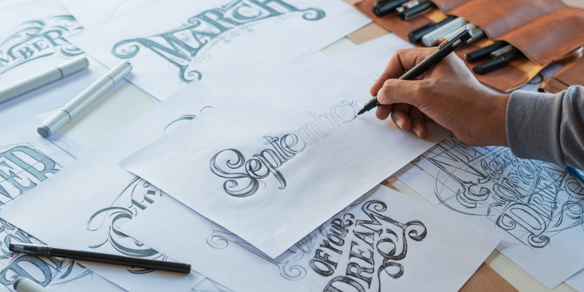
For those looking to add a touch of elegance and sophistication to their logos, hand-lettered fonts are a popular choice. These fonts have a handmade quality that adds a personal and artisanal touch to a brand’s identity. Whether it’s a delicate script font or a whimsical hand-drawn typeface, hand-lettered fonts are a timeless choice for logo design.

How Typography Impacts Brand Recognition
Choosing the right font can make or break a brand’s recognition. Think of it as the difference between showing up to a fancy gala in a tuxedo versus showing up in pajamas – it makes a statement! When customers see a consistent use of typography across a brand’s materials, they start to associate that font with the brand itself. It’s like seeing the golden arches and immediately craving a Big Mac.
Think about Coca-Cola’s iconic cursive script – you can practically taste the sugary goodness just looking at it! The font used in a brand’s logo, social media, and advertising creates a visual identity that sticks in people’s minds. Whether it’s a bold, sans-serif font or a whimsical script, the typography sets the tone for how the brand is perceived.
Make sure to keep your typography game strong by choosing fonts that reflect your brand’s personality. **Bold** fonts convey strength and professionalism, while quirky, handwritten fonts can show a fun and creative side. With the right typography, your brand recognition will soar to new heights – just like a pigeon with a jetpack!
So next time you’re designing a logo or creating marketing materials, remember that typography is more than just picking a font – it’s crafting a visual identity that leaves a lasting impression. Your font choice could be the secret sauce that sets your brand apart from the competition. Embrace the power of typography and watch your brand recognition skyrocket!

The Psychology Behind Typeface Selection for Logos
Understanding
When it comes to creating a logo, choosing the right typeface is crucial. Believe it or not, the font you select can have a significant impact on how consumers perceive your brand. Let’s dive into the fascinating world of typography and the psychology behind it!
First and foremost, it’s essential to consider the personality of your brand. Are you going for a sleek and modern look, or do you want to convey a sense of tradition and reliability? Different typefaces can evoke different emotions, so make sure you choose one that aligns with your brand’s identity.
Next, think about legibility. No matter how cool a font may look, if people can’t read it, it’s essentially useless. Avoid overly elaborate or thin typefaces that may be difficult to decipher, especially at smaller sizes. Remember, clarity is key!
Lastly, don’t be afraid to experiment. Mix and match different typefaces to see what works best for your logo. Play around with bold, italic, and underline styles to create a unique and eye-catching design. After all, your logo is the face of your brand, so make sure it’s a reflection of who you are!
Tips for Selecting the Perfect Typeface for Your Logo
Typography Tips for Your Logo
When it comes to choosing the perfect typeface for your logo, it can be overwhelming. But fear not, we’ve got some tips to help you make the right decision without pulling your hair out in frustration!
First off, consider the personality of your brand. Are you a sleek, modern company? Opt for a clean, sans-serif font. Is your business more whimsical and fun? Try a playful script font. Remember, your typeface should reflect the essence of your brand.
Next, think about readability. Your logo won’t do you any good if people can’t easily read it. Make sure your font is legible, even at smaller sizes. Bold, chunky fonts can make a statement, but be careful not to sacrifice readability for style.
Lastly, don’t be afraid to experiment! Mix and match different fonts to see what feels right for your brand. Play around with spacing, size, and color to create a unique look that sets you apart from the competition. After all, your logo is the face of your brand – make sure it’s one you’re proud of!
FAQs
What is the importance of choosing the right typeface for a logo?
Choosing the right typeface for a logo is crucial because it sets the tone for your brand’s identity. The font you choose can convey everything from professionalism to playfulness, so it’s important to pick one that aligns with your brand’s values.
How do typography trends impact logo design?
Typography trends play a huge role in logo design, as they can help your logo stand out in a crowded marketplace. By staying on top of the latest trends, you can ensure that your logo looks modern and relevant.
Can you give some examples of how different typefaces can evoke different emotions?
Certainly! For example, a sleek and modern sans-serif font can convey a sense of professionalism, while a playful script font can evoke a sense of fun and whimsy. It’s all about choosing a typeface that matches the message you want to convey.
What are some common typography mistakes to avoid when designing a logo?
Some common typography mistakes to avoid include using too many different fonts, choosing a font that is difficult to read, and not paying attention to kerning and spacing. Remember, less is often more when it comes to typography in logo design.
How can a designer use typography to create a unique and memorable logo?
To create a unique and memorable logo, a designer can play around with different typefaces, sizes, and styles to create a visually interesting composition. By thinking outside the box and experimenting with typography, a designer can create a logo that truly stands out.
Choose Wisely: The Typeface is Mightier Than the Pen!
In conclusion, it’s clear that the right typeface can make or break a logo design. So next time you’re tempted to settle for Comic Sans, just remember that there are plenty of other options that can convey your brand identity with style and sophistication. Embrace the power of typography trends and watch your logo come to life! And remember, a font choice is not just a font choice – it’s a lifestyle. Choose wisely, my friends!


