In the wild world of branding, logos are the unsung heroes that stand the test of time. From golden arches to swooshes that just do it, join us on a hilarious and unconventional journey through the ages as we explore the saga of iconic logos. Grab your magnifying glass and get ready to witness the evolution of visual identity – it’s going to be a logo-larious ride!
The evolution of iconic logos over centuries
Logos have come a long way since the cavemen drew stick figures on cave walls. Over the centuries, they have evolved into iconic symbols that are instantly recognizable around the world. Let’s take a look at how some of these logos have changed over time:
Remember the good old days when the Apple logo was just a simple drawing of an apple with a bite taken out of it? Now, it’s a sleek, minimalist design that screams “I’m a Mac user and I’m better than you.” Ah, how times have changed.
And what about the Nike swoosh? It used to be a basic check mark, but now it’s a bold, dynamic symbol that says ”Just do it, even if it means mortgaging your house to buy our overpriced sneakers.” Who knew a simple swoosh could have so much attitude?
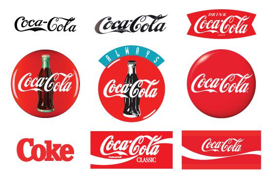
But perhaps the most iconic logo evolution of all is the Coca-Cola script. From its humble beginnings as a simple cursive writing, it has morphed into a timeless classic that whispers ”Have a Coke and a smile, and ignore the fact that we’re slowly destroying the planet with our plastic bottles.” It truly is a work of art, in its own sugary sweet way.

From hieroglyphics to modern branding
Imagine a world where instead of Nike’s iconic swoosh, we had hieroglyphics adorning our sneakers. Picture that on a billboard in Times Square! Ancient Egyptians may have been onto something with their intricate symbols, but let’s face it – a simple logo is so much easier to remember.
In the days of the pharaohs, branding was all about hieroglyphics. Each symbol represented a word or sound, much like emojis do for us today. But imagine trying to fit all those hieroglyphics on a tiny iPhone screen – talk about a headache!
Fast forward to the modern era, where slogans like “Just Do It” do all the talking. Can you imagine a world where every brand had a hieroglyphic slogan instead? Too much room for misinterpretation, if you ask me. Plus, can you really fit a complex message like ”Buy One, Get One Free” into a single hieroglyph? I don’t think so.
So next time you see a sleek logo or catchy slogan, be grateful that we’ve evolved . After all, who wants to decipher symbols when you can just do it?

The power of symbolic representation in logos
Logos are more than just pretty pictures slapped onto a product. They are powerful symbols that can evoke strong emotions and create lasting impressions. Just think of how seeing the golden arches of McDonald’s makes your mouth water, or how the swoosh of Nike’s logo makes you feel like you can conquer the world (or at least the treadmill).
But what makes these symbols so potent? It’s all in the carefully crafted design and the clever use of symbolism. A logo isn’t just a random assortment of colors and shapes; it’s a carefully curated representation of a company’s values, mission, and personality. It’s like a tiny work of art that packs a big punch.
Take the Apple logo, for example. That simple, sleek apple with a bite taken out of it isn’t just a nod to Adam and Eve; it’s a symbol of innovation, creativity, and the irresistible allure of all things tech. It’s no wonder that people line up around the block every time a new iPhone is released – that logo is like a siren’s call, beckoning you to join the cult of Apple.
So next time you see a logo, take a closer look. See beyond the surface and uncover the hidden meanings and powerful symbolism that lies within. Who knows, you might just discover a whole new world of meaning and magic in those seemingly innocuous symbols.

Influential logos that have stood the test of time
One logo that has truly stood the test of time is the iconic McDonald’s golden arches. This symbol of fast food dominance has been around since 1961, and let’s be honest, who could resist the call of those golden arches when you’re craving a Big Mac and fries?
Another logo that has cemented itself in the annals of history is the Nike swoosh. This simple yet powerful logo has been motivating people to “just do it” since 1971. It’s like the little symbol that could – it may not seem like much, but boy does it pack a punch.
And who can forget the Coca-Cola logo? That striking red and white color scheme is practically synonymous with happiness and refreshment. It’s like the logo equivalent of taking a sip of an ice-cold Coke on a hot summer day – pure bliss.
Lastly, the Apple logo. This half-eaten fruit has become a symbol of innovation and creativity since the company’s inception in 1976. It’s like the forbidden fruit of the tech world – you just can’t resist taking a bite out of the latest iPhone or MacBook.

The role of logos in shaping cultural identity
Logos are more than just symbols slapped on products – they play a crucial role in shaping cultural identity. From the golden arches of a certain fast food chain to the bitten apple of a tech giant, logos are everywhere, influencing how we perceive brands and even ourselves.
One of the main ways logos shape cultural identity is through symbolism. Think of the Nike swoosh – it’s not just a checkmark, it’s a representation of victory, athleticism, and just a touch of sweat (because let’s face it, exercise isn’t always glamorous). That swoosh tells the world that you’re a go-getter, a trendsetter, and maybe even a sneaker enthusiast.
Logos also create a sense of community and belonging. When you see someone sporting a logo of your favorite band or sports team, you feel an instant connection – like you’re part of an exclusive club of cool kids who appreciate good taste. It’s like having a secret handshake, but without all the awkward hand movements.
But let’s not forget the power of nostalgia when it comes to logos. Seeing the red and white swirl of a certain soda brand can transport you back to simpler times, when all you had to worry about was which flavor of ice cream to choose. Logos have a way of anchoring us in our past, reminding us of who we are and where we came from – even if we can’t remember where we put our keys five minutes ago.
How logos reflect societal values and norms
Logos are more than just symbols – they are mirrors reflecting the values and norms of society. Take a closer look at some of the most iconic logos, and you’ll see a reflection of our society’s quirks and trends. Here’s how logos tell us more than just the brand they represent:
- Color Psychology: Have you ever noticed that many fast food logos use red and yellow? These colors are known to stimulate appetite, reflecting our fast-paced, convenience-oriented culture. It’s no wonder why we can’t resist a burger and fries combo!
- Simplicity is Key: In a world full of distractions, simple and minimalist logos reign supreme. Think of how the Nike swoosh or the Apple logo embody the less is more mentality. Society values efficiency, and logos are no exception.
- Brand Identity: Logos not only reflect societal values, but they also help shape them. Take the rise of eco-friendly brands with earth-toned logos, influencing a shift towards sustainability. It’s like the logo saying, “Hey, let’s save the planet together!”
So the next time you see a logo, don’t just see it as a pretty symbol – see it as a snapshot of our society’s values and norms. Who knew a simple image could say so much?
The future of iconic logos: trends and predictions
Minimalistic Logos
One trend we are seeing in the future of iconic logos is the shift towards minimalistic designs. Companies are realizing that less is more when it comes to logo design. Gone are the days of cluttered, busy logos that are hard to read and remember. Instead, logos of the future will be clean, simple, and easy to identify at a glance. Think Apple, Nike, and McDonald’s. These companies have already embraced the minimalist trend, and we predict that more will follow suit in the coming years.
Dynamic Logos
Another exciting prediction for the future of iconic logos is the rise of dynamic designs. Companies are starting to realize that a static logo doesn’t cut it in today’s fast-paced world. Instead, they are looking for ways to make their logos more interactive and engaging. Imagine a logo that changes color depending on the time of day, or one that responds to the user’s movements. The possibilities are endless, and we can’t wait to see what creative minds come up with next!
Personalized Logos
In a world where personalization is key, we predict that iconic logos will become more customized to fit the individual consumer. Companies will start to create different versions of their logos based on factors such as location, age, and interests. Imagine walking into a store and seeing a version of the logo that speaks directly to you. It’s a bold move, but one that we believe will pay off in the long run. Get ready to see logos like you’ve never seen them before!
FAQs
Why are logos so important in the business world?
Logos are crucial in the business world because they are like a celebrity’s autograph. They represent a brand’s identity and values, making them instantly recognizable to consumers. Plus, they’re like the cherry on top of a sundae – without them, a business just isn’t as sweet.
How have iconic logos evolved over time?
Iconic logos have gone through quite the glow-up over the years. They started off as simple, straightforward designs, kind of like your first crush in middle school. But as time went on, they got more sophisticated and stylish, much like your glow-up from awkward teen to fabulous adult.
What makes a logo truly iconic?
An iconic logo is like a unicorn – rare, magical, and highly sought-after. It needs to be simple yet memorable, versatile yet distinctive, and above all, it needs to stand the test of time. Just like a good wine, an iconic logo only gets better with age.
Can you give us some examples of iconic logos from history?
Oh, definitely! We’ve got the golden arches of McDonald’s, the swoosh of Nike, the bitten apple of Apple – these logos are so iconic, they’re practically celebrities in their own right. They’ve stood the test of time and continue to be recognized and loved by millions worldwide.
What can businesses learn from the journey of iconic logos?
Businesses can learn a lot from iconic logos – like how a little creativity, consistency, and a whole lot of personality can go a long way. Just like a good relationship, a well-crafted logo takes time, effort, and a whole lot of heart. And hey, who knows – maybe one day your logo will be the next big celebrity in the business world.


