Colors have the ability to evoke logo-design/” title=”Aviation Logo Design”>emotions, spark memories, and elicit strong reactions. So why not use this powerful tool to create a logo that truly makes a statement? In the world of logo design, color psychology is like having a secret weapon up your sleeve – and boy, is it a stylish one. So buckle up, logo designers, because we’re about to dive into the colorful world of harnessing the power of color psychology in logo design.
Understanding Color Psychology
So, you want to delve into the fascinating world of color psychology, huh? Well buckle up, because things are about to get seriously colorful!
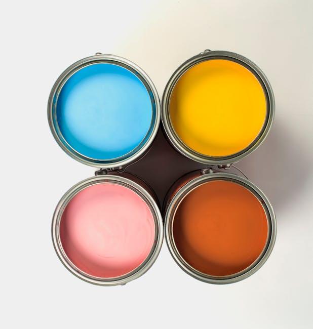
First things first, let’s talk about the primary colors. You’ve got your reds, blues, and yellows – the OGs of the color wheel. Red is often associated with passion and energy, blue with calm and tranquility, and yellow with happiness and optimism. Who knew colors could have such personality, right?
Next up, let’s chat about how colors can influence our emotions. Ever noticed how fast-food restaurants love using red and yellow in their logos? That’s because those colors are known to stimulate appetite and grab your attention. On the flip side, blues and greens are often used in healthcare settings to promote a sense of calm and healing. It’s like our brains have a secret language with colors!
But wait, there’s more! Did you know that certain cultures associate different meanings with colors? For example, in Western cultures, white symbolizes purity and innocence, while in some Eastern cultures, it’s the color of mourning. It just goes to show that colors can speak volumes without ever saying a word.

The Impact of Color on Consumer Behavior
When it comes to consumer behavior, one of the most underrated factors is the impact of color. Different colors can evoke various emotions and influence purchasing decisions in ways that most people don’t even realize. Here are some ways color can sway consumers:
- Red: This fiery hue is known for creating a sense of urgency and excitement. That’s why you always see it in clearance sales or as a call-to-action button on websites. It’s like the color equivalent of yelling “BUY NOW!” at the top of your lungs.
- Blue: The color of trust and dependability, blue is often used by banks and financial institutions to instill confidence in customers. It’s like saying, “We won’t screw you over, we promise!”
- Yellow: The color of sunshine and happiness, yellow is great for grabbing attention and making people feel cheerful. That’s why you see it in fast-food logos – because who wouldn’t be happy while scarfing down a burger?
It’s fascinating to think about how something as simple as color can have such a profound impact on our behavior as consumers. Next time you’re shopping, pay attention to the colors around you – they might just be swaying your decisions without you even realizing it!

Choosing the Right Color Palette for Your Logo
So you’ve decided to create a logo for your brand, but now comes the daunting task of choosing the perfect color palette. Fear not, dear reader, for I am here to guide you through this treacherous journey with wit and wisdom.
First and foremost, consider the message you want to convey with your logo. Are you a bold and daring brand? Then perhaps a vibrant red or electric blue would suit you best. Or maybe you’re a more tranquil and calm business – in which case, a soothing green or soft pastel could be the way to go.
Next, think about your target audience. Are you catering to young hipsters who love all things neon and flashy? Or are you targeting sophisticated professionals who prefer muted tones and classic elegance? Knowing your audience is key to picking the right colors that will resonate with them.
And lastly, don’t be afraid to think outside the box. Who says a logo has to be limited to just one or two colors? Be bold, be daring, be creative! Mix and match different hues to create a truly unique color palette that will make your logo stand out from the crowd.

Creating a Strong Emotional Connection Through Color
Have you ever been emotionally moved by a color? No, I’m not talking about the time you accidentally dyed your hair pink instead of blonde. I’m talking about the power of color to evoke strong feelings and connections.
When it comes to , it’s all about choosing the right hues that resonate with your audience. Think of it like picking the perfect outfit for a first date – you want to make a statement, but you don’t want to come off as too flashy.
Some colors are known for their ability to stir up specific emotions. For example, blue is often associated with calmness and trust, while red can evoke feelings of passion and excitement. By strategically incorporating these colors into your design, you can tap into your audience’s emotions and create a lasting connection.
So next time you’re trying to make a bold statement or tug at heartstrings, don’t underestimate the power of color. Remember, a little splash of green or a touch of purple can go a long way in creating a memorable and emotionally resonant experience for your audience.

Utilizing Color Theory to Amplify Brand Messaging
Color theory isn’t just for artists and interior designers – it’s also a powerful tool for amplifying your brand messaging. By strategically choosing colors that evoke the right emotions and associations, you can create a brand identity that truly stands out. So, let’s dive into the rainbow of possibilities and learn how to harness the power of color for your brand!
One of the first things to consider when utilizing color theory for your brand is the psychological impact of different colors. For example, **bold** red can evoke feelings of passion and excitement, while calming blue may bring to mind trust and professionalism. By understanding how different colors are perceived by your audience, you can choose hues that best align with your brand’s values and messaging.
In addition to the emotions they evoke, colors can also convey important messages about your brand’s identity. **Bright and playful colors** like yellow and orange are often associated with youthfulness and creativity, making them perfect choices for brands targeting a younger audience. On the other hand, **sophisticated and elegant colors** like navy blue and gold can convey a sense of luxury and exclusivity.
By incorporating a consistent color scheme across all of your brand’s touchpoints – from your logo and website to your marketing materials and packaging – you can create a cohesive and memorable brand identity. So, don’t be afraid to get creative with color and let your brand’s personality shine through!
Evaluating Cultural Perceptions of Color in Logo Design
Cultural Perceptions of Color in Logo Design
When it comes to logo design, color is more than just a visual element – it’s a powerful tool that can evoke certain emotions and perceptions. But did you know that the way we perceive color can vary greatly depending on our cultural background? Here are some interesting insights into how different cultures view color in logo design:
– In Western cultures, blue is often associated with trust, reliability, and professionalism. Think of brands like IBM and Ford, whose logos prominently feature the color blue. However, in some Eastern cultures, blue can be seen as a symbol of immortality or mourning. So maybe think twice before slapping a blue logo on your funeral home website!
– Yellow is a cheerful and energetic color in many cultures, symbolizing happiness and sunshine. However, in France, yellow can be associated with jealousy and betrayal. So if you’re thinking of targeting the French market, maybe steer clear of that bright yellow logo you had in mind.
– Green is universally seen as a symbol of nature and health, making it a popular choice for eco-friendly brands. But in some countries, like Indonesia, green is associated with jealousy and infidelity. So if you’re trying to market your organic, vegan skincare line in Indonesia, you might want to consider a different color scheme.
So next time you’re designing a logo with a global audience in mind, remember to consider the cultural perceptions of color. Who knew that something as simple as choosing the right shade of blue could make such a big difference
Mastering the Art of Color Selection for Effective Brand Communication
When it comes to selecting colors for your brand, it’s not just about picking your favorite shade of blue and calling it a day. No, my friend, there is an art to it. A method to the madness. A science, if you will. And if you want to effectively communicate your brand’s message, you need to master the art of color selection.
First things first, think about the emotions you want to evoke with your brand. Do you want to inspire trust and reliability? Go for a calming blue. Want to convey energy and excitement? A bold red might be more your speed. Just remember, colors have meaning and can subconsciously influence how people perceive your brand.
Next, consider your target audience. Are you trying to appeal to millennials? Then maybe a trendy, modern color palette is the way to go. Or maybe you’re targeting older, more conservative folks. In that case, stick to classic, timeless colors that exude sophistication.
And finally, don’t forget about the power of contrast. If your brand colors are too similar, your message might get lost in the sea of sameness. Mix it up with bold pops of color here and there to make your brand stand out from the crowd. Remember, a little color can go a long way in making your brand memorable and impactful.
FAQs
Why is color psychology important in logo design?
Well, color psychology is like the secret sauce of logo design. It can evoke emotions, convey messages, and even influence decision-making. It’s basically the ninja of the design world.
How do I choose the right colors for my logo?
Think of it like choosing an outfit for a first date – you want to make a good impression. Consider your brand personality and target audience. Are you trying to come across as playful and fun or professional and serious? Pick colors that match that vibe.
Can using the wrong colors in a logo impact my business?
Absolutely! Just like wearing socks with sandals, using the wrong colors in your logo can be a major faux pas. The wrong colors can turn people off, send mixed messages, and ultimately harm your brand image. So, choose wisely!
Are there any colors that are universally appealing in logo design?
Well, there’s no one-size-fits-all answer to this question, but there are definitely some colors that tend to be more universally appealing. Blues are calming and trustworthy, while greens are associated with nature and growth. So, you can never go wrong with those shades!
Should I follow color trends in logo design?
Color trends come and go faster than a plate of nachos at a party. While it’s good to stay current, don’t feel pressure to constantly chase the latest color fads. Focus on creating a timeless logo that will stand the test of time, like a good bottle of wine.
Color Your World with the Perfect Logo!
Congratulations, you’ve now unlocked the secret to creating eye-catching logos that speak directly to your audience’s subconscious! Remember, when it comes to logo design, it’s not just about what looks pretty – it’s about tapping into the power of color psychology to convey your brand’s message loud and clear. So go forth, unleash your inner color wizard, and paint the town (and your logo) red, blue, or whatever hue speaks to your brand’s personality. Happy designing!


