
Are you tired of your gaming logo being about as stylish as a level one noob? Well, fear not, fellow gamers, because we’re here to help you level up your image with some expert tips on creating the coolest gaming logo on the block. So grab your controller, dust off your keyboard, and get ready to elevate your game with some logo design wizardry. It’s time to give your avatar the swag it deserves!
Key Elements of a Successful Gaming Logo
When designing a gaming logo, there are a few key elements you need to keep in mind to ensure its success in the competitive world of gaming. First and foremost, your logo needs to be visually appealing and memorable. Nobody’s going to remember your logo if it looks like it was designed by your 5-year-old cousin who just discovered MS Paint.
Next, make sure your logo reflects the style and tone of your game. Are you creating a whimsical, fantasy RPG? Then maybe go for a logo with mystical dragons and unicorns. Is your game a gritty, post-apocalyptic shooter? Then skulls and fire might be more up your alley. Just remember, consistency is key here!
Another important element of a successful gaming logo is versatility. Your logo needs to look good whether it’s plastered on a billboard, printed on a t-shirt, or emblazoned on a Twitch streamer’s profile. Make sure it scales well and looks great in both color and black and white.
And finally, make sure your logo has that “wow” factor. You want people to see your logo and be instantly drawn to it. Whether it’s a clever use of negative space, a unique color palette, or a hidden Easter egg, make sure your logo stands out from the rest. After all, you want people to remember your game, not just scroll past it on Steam.
Unique Design Concepts for Gaming Logos
Are you tired of seeing the same old cliché gaming logos everywhere you turn? Want something fresh and exciting to set your brand apart from the rest? Well, look no further! We’ve compiled a list of unique design concepts that will take your gaming logo to the next level.
Forget about the boring old joystick or console controller – why not try incorporating some of these fun elements into your logo:
- Pixelated Power-Up: Embrace your love for retro gaming with a pixelated power-up icon that’s sure to bring back memories of your favorite classic games.
- Gaming Gauntlet: Show off your competitive spirit with a sleek gauntlet design that screams “I’m ready for battle!”
- Cosmic Controller: Take your logo to the stars with a cosmic controller design that’s truly out of this world.
Don’t be afraid to think outside the box and get creative with your gaming logo. After all, your logo is the face of your brand, so why not make it a face worth remembering? Whether you’re a hardcore gamer or just a casual player, these unique design concepts are sure to level up your logo game in no time!
Choosing the Right Color Palette for Your Gaming Logo
When it comes to creating a gaming logo, choosing the right color palette is crucial. Your colors can make or break your logo, so it’s important to choose wisely. Here are some tips to help you pick the perfect colors for your gaming masterpiece:
- Consider the Theme: Think about the theme of your game and choose colors that reflect that. If you’re going for a futuristic look, metallic shades like silver and blue might be the way to go. If your game is more whimsical, bright, vibrant colors could be the way to go.
- Think About Contrast: Make sure your colors contrast enough to be easily distinguishable. You don’t want your logo to look like a blob of color – unless that’s the look you’re going for, in which case, go wild!
- Take Inspiration from Other Logos: Look at other gaming logos for inspiration. What colors do successful gaming logos use? Is there a color scheme that seems to work well in the gaming world? Use these as a starting point for your own color choices.
Remember, your gaming logo is a reflection of you and your game, so make sure the colors you choose represent that. Don’t be afraid to get creative and experiment with different color combinations until you find the perfect one. And most importantly, have fun with it!
Typography and Font Selection for an Impactful Gaming Logo
When it comes to creating an eye-catching gaming logo, typography and font selection are key players in the game. Your font choice can make or break your logo design, so it’s important to choose wisely.
One way to make a bold statement with your gaming logo is to opt for a **thick, bold font**. This type of font exudes power and strength, making it perfect for a logo that demands attention. Plus, bold fonts are easier to read from a distance, which is crucial for gaming logos that will be plastered on banners and merchandise.
Another way to spice up your gaming logo is to mix and match fonts. Combining different fonts can create a dynamic visual effect that draws the eye in. Just be sure to choose fonts that complement each other rather than clash. For example, pairing a **bold, sans-serif font** with a **elegant script font** can create a nice balance of strength and sophistication.
Don’t be afraid to get creative with your typography. Experiment with different font styles, sizes, and arrangements until you find the perfect combination that screams “game on!” Remember, your gaming logo is a reflection of your brand, so make sure it packs a punch and leaves a lasting impression on your audience.
Incorporating Symbols and Graphics in Your Gaming Logo
When designing your gaming logo, it’s crucial to incorporate symbols and graphics that reflect the essence of your brand. Think of these elements as the cherry on top of a perfectly crafted gaming sundae - they can make or break your logo design!
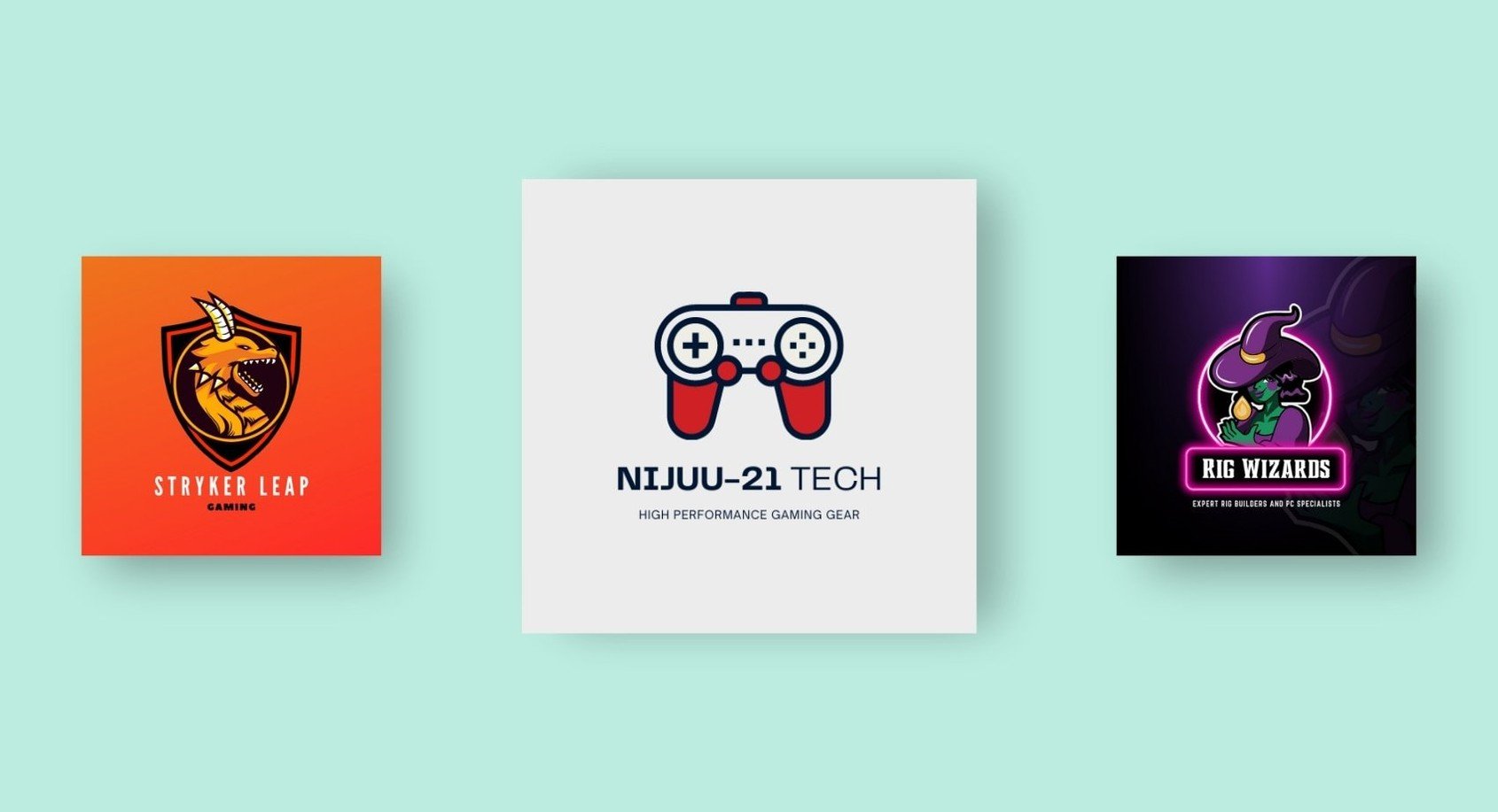
One way to make your logo stand out is to use bold and eye-catching symbols that represent the core values of your gaming brand. Whether it’s a fierce dragon for a fantasy game or a sleek spaceship for a sci-fi adventure, choosing the right symbol can instantly convey the theme of your game.
Graphics are another fun way to add personality to your gaming logo. From intricate designs to minimalist shapes, the possibilities are endless. Use graphics to enhance the overall aesthetics of your logo and make it memorable to players.
Remember, a great gaming logo should be like a puzzle – each piece (symbol, graphic, color) fitting together perfectly to create a cohesive and visually appealing design. So get creative, play around with different combinations, and have fun with incorporating symbols and graphics into your gaming logo!
Tips for Ensuring Your Gaming Logo is Memorable and Versatile
When designing your gaming logo, it’s important to keep in mind that you want it to be memorable and versatile. After all, you don’t want your logo to be forgotten faster than you can say “Game Over.” Here are some tips to make sure that doesn’t happen:
First and foremost, you need to choose a design that is unique and stands out. You don’t want your logo to be mistaken for another gamer’s logo, do you? Make sure your logo is as one-of-a-kind as your skills on the battlefield.
Next, consider using bold colors and sharp lines to make your logo pop. You want your logo to catch the eye of anyone who sees it, whether it’s on a screen or a t-shirt. Don’t be afraid to go a little over the top – after all, gamers love a little drama.
Finally, think about how your logo will look in different sizes and formats. You want your logo to look just as amazing on a tiny avatar as it does on a giant banner. Test it out in various sizes to make sure it still looks fierce no matter what.
FAQs
Why is having a professionally designed gaming logo important?
Having a professionally designed gaming logo is important because it helps to establish your brand identity and make you stand out in the crowded gaming world. Plus, it just looks cool!
What elements should a gaming logo include?
A gaming logo should include elements that reflect your gaming style or personality, such as bold colors, sleek lines, and maybe even a hint of your favorite game or character.
How can I make my gaming logo memorable?
To make your gaming logo memorable, try incorporating unique and eye-catching design elements, like unusual shapes or funky fonts. You want people to see your logo and instantly think, “Wow, that’s cool!”
Is it worth investing in professional logo design for my gaming brand?
Absolutely! Investing in professional logo design for your gaming brand can make a huge difference in how your brand is perceived. Plus, a killer logo can help attract more followers and fans to your gaming channel.
What are some common mistakes to avoid when designing a gaming logo?
Some common mistakes to avoid when designing a gaming logo include using too many colors, overcomplicating the design, and not considering how the logo will look in different sizes. Keep it simple, bold, and versatile!
Level up your logo game!
Congratulations, novice designer! You’ve reached the end of our expert gaming logo design tips. Now that you’ve armed yourself with the knowledge to elevate your image, go forth and conquer the design world like a true boss level! Remember, in the world of gaming logos, it’s not about the size of your pixels, but the power of your creativity. So go forth, fellow gamer, and may your designs always be legendary!


