Once upon a time, logos were as simple as a cave painting of a buffalo or a stick figure running away from a dinosaur. But oh, how times have changed! Nowadays, logo design is like a high-stakes game of visual charades, with companies striving to create intricate brand identities that speak volumes without saying a word. Join me on a journey through the evolution of logo design, from humble beginnings to the dizzying heights of modern branding madness. Grab your magnifying glass and hold onto your hats, because we’re about to dive headfirst into the world of logos – where the only limit is your imagination (and maybe a pesky budget or two).
The Evolution of Logo Design
Logos have come a long way since the days of cave drawings and hieroglyphs. From simple symbols to intricate designs, has been nothing short of fascinating. Let’s take a look at how logos have evolved over the years:
First came the basic symbols – think stick figures and simple shapes. These logos were easy to remember, but lacked the wow factor. Then someone had the bright idea to add a bit of color. Suddenly, logos were popping off the page and grabbing people’s attention. Next came the era of typography – logos that were all about the font. Fancy lettering, bold prints, and even the occasional Comic Sans.
- Logos went 3D – because why settle for a flat design when you can have depth and dimension?
- Logos embraced negative space – sometimes it’s what you don’t see that makes the biggest impact.
Today, we’re in the age of minimalism – where less is more, and a simple swoosh or apple is all it takes to convey a brand’s message. Who knows what the future holds for logo design? Maybe holographic logos or even logos that can interact with you. The possibilities are endless!

Transition from Simple to Complex Logos
So you’ve finally decided to level up your brand with a more intricate logo design. Say goodbye to those basic shapes and generic fonts, and hello to a logo that screams sophistication (in a good way, of course).
But transitioning from a simple logo to a complex one isn’t as easy as upgrading from a flip phone to a smartphone. It requires some serious creativity and a touch of finesse. Here are a few tips to help you navigate this logo design journey:
- **Embrace the Details**: Don’t be afraid to add intricate details to your logo. Whether it’s a subtle gradient, a fancy swirl, or a hidden symbol, these little touches can take your logo from basic to breathtaking.
- **Experiment with Color**: Ditch the black and white color scheme and get playful with a vibrant palette. Let your logo stand out from the crowd with bold hues that capture attention and convey your brand’s personality.
- **Layer Up**: Adding depth to your logo can create a sense of complexity without overwhelming the design. Experiment with overlapping elements, shadows, and highlights to give your logo that extra oomph.
Remember, the is a journey, not a sprint. Take your time, play around with different ideas, and don’t be afraid to push the boundaries of creativity. Before you know it, you’ll have a logo that’s as unique and complex as your brand!
symbolism-and-visual-elements”>Incorporating Symbolism and Visual Elements
When it comes to into your work, it’s important to remember the power of imagery and representation. Just like a well-placed emoji can completely change the tone of a text message, using visual elements can add depth and meaning to your work.
One way to incorporate symbolism is by using objects or images that have a deeper meaning. For example, a red rose can represent love and passion, while a broken mirror can symbolize bad luck or shattered dreams. By incorporating these elements into your work, you can add layers of depth that will keep your audience engaged and intrigued.
Visual elements, such as color schemes and typography, can also play a huge role in conveying symbolism. For example, using bold, dark colors can create a sense of mystery or danger, while soft pastels can evoke feelings of calm or nostalgia. Experiment with different visual elements to see how they can enhance the overall message of your work.
Remember, is all about being creative and daring to take risks. Whether you’re using a subtle nod to classic literature or creating your own unique visual language, don’t be afraid to push the boundaries and see where your imagination takes you!

Impact of Digital Tools on Logo Design
In a world where Photoshop is king and Illustrator reigns supreme, logo design has evolved into a digital playground for designers to flex their creative muscles. Gone are the days of painstakingly hand-drawing every curve and line. Thanks to digital tools, creating a logo has never been easier (or more fun!).
With the click of a mouse and the stroke of a stylus, designers can now manipulate shapes, colors, and fonts with ease. No longer are we limited to just a handful of design elements. The possibilities are endless, and the only limit is your imagination (and maybe your computer’s processing power).
Forget about cutting and pasting, digital tools allow designers to experiment and play with different variations of a logo in a matter of minutes. Want to see what your logo would look like in a different color scheme? Easy peasy. How about trying out a new font or layout? Just a few clicks away. The flexibility and versatility afforded by digital tools have truly revolutionized the logo design process.
So, the next time you see a beautifully crafted logo, take a moment to appreciate the impact of digital tools on its creation. Behind every great logo is a designer who embraced the power of technology to bring their vision to life. And remember, with great digital tools comes great responsibility…to create some seriously awesome logos.
Creating Memorable Brand Identities
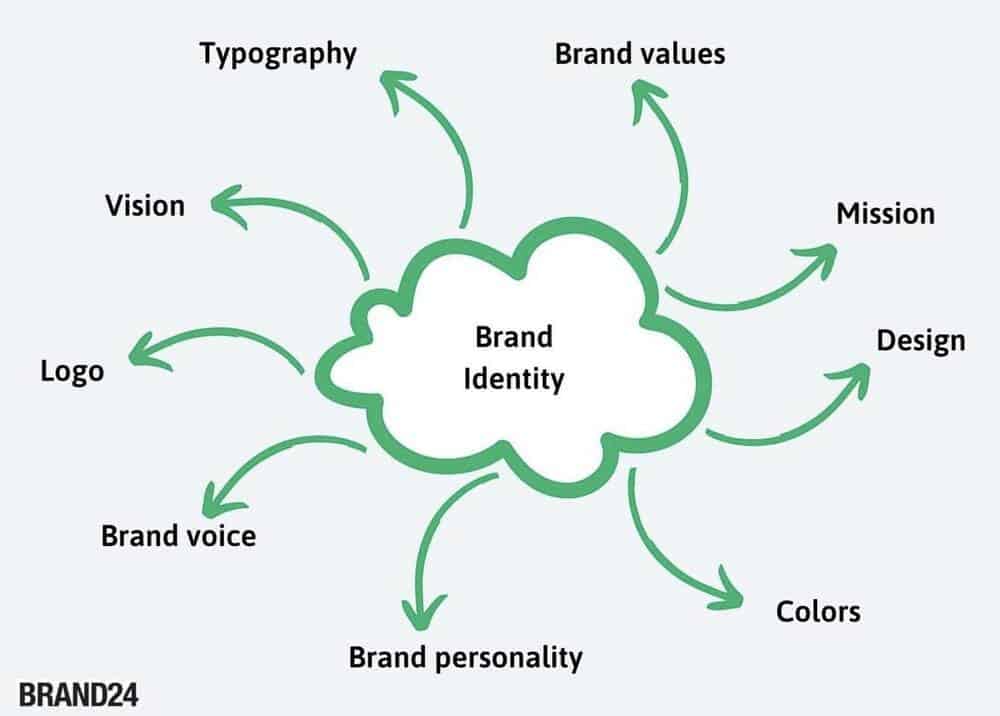
involves more than just slapping a logo on a product and calling it a day. It’s about crafting a cohesive visual language that speaks to your target audience and leaves a lasting impression. Here are some tips to help you create a brand identity that stands out:
- Research, research, research: Before you start designing your brand identity, take the time to research your target market, competitors, and industry trends. This will help you understand what sets your brand apart and how you can best communicate that visually.
- Think outside the box: Don’t be afraid to push the boundaries and try something unconventional with your brand identity. Look for inspiration in unexpected places and don’t be afraid to take risks.
- Keep it consistent: Consistency is key when it comes to building a strong brand identity. Make sure all of your visual elements – from your logo to your color palette to your typography – are cohesive and work together harmoniously.
Remember, your brand identity is the first thing that people see when they encounter your brand. Make sure it’s memorable, unique, and reflective of your brand’s personality and values. With a little creativity and a lot of research, you can create a brand identity that truly stands out from the crowd.
Balancing Simplicity and Complexity in Logo Design
When it comes to logo design, finding the perfect balance between simplicity and complexity can feel like trying to juggle flaming torches while riding a unicycle on a tightrope. It’s a delicate dance that requires finesse, creativity, and maybe a little bit of luck.
On one hand, you want your logo to be simple and easily recognizable. You don’t want potential customers to have to squint and tilt their heads to figure out what your company is all about. However, you also don’t want your logo to be so basic that it gets lost in a sea of other bland, forgettable designs.
One way to strike the perfect balance is to focus on a few key elements that represent your brand. Whether it’s a bold color scheme, a unique font, or a clever graphic, honing in on these details can help your logo stand out without overwhelming your audience.
At the end of the day, the key to creating a memorable and impactful logo is to keep it simple enough to be easily digestible, but complex enough to leave a lasting impression. So, grab your design tools, roll up your sleeves, and get ready to walk the tightrope of logo design. It may be a challenging journey, but the end result will be well worth it!
FAQs
What are some key factors that have contributed to the evolution of logo design towards more intricate brand identities?
Well, imagine if brands were still using logos from the stone age – yeah, not a pretty picture! In all seriousness, advancements in technology, global competition, and the need for differentiation have all played a role in pushing logo designs towards more complex and intricate identities.
How does intricate logo design help in creating a strong brand identity?
Think of it this way - if you show up to a party in a flashy outfit, people are more likely to remember you, right? The same goes for brands! A detailed logo helps stand out in a crowded marketplace and leaves a lasting impression on consumers.
Are there any potential drawbacks to adopting a more intricate logo design for a brand?
Well, if your logo is so complicated that it looks like a Picasso painting, chances are people might not get what you’re trying to convey. It’s all about finding the right balance between intricate design and clear messaging to avoid confusion.
How can a brand ensure that their intricate logo design resonates with their target audience?
It’s like dating – you need to know what your audience likes and tailor your approach to match their preferences. Conducting market research, soliciting feedback, and keeping an eye on trends can help ensure that your intricate logo design hits the mark with your target demographic.
What role does storytelling play in the evolution of logo design towards more intricate brand identities?
Storytelling is like the secret sauce in logo design – it adds depth, meaning, and emotion to your brand identity. Intricate logos have the power to tell a compelling story about your brand’s values, mission, and personality, creating a deeper connection with consumers.
Parting Thoughts on the Art of Logo Design
As we bid adieu to this journey through the evolution of logo design, let us remember one thing: Rome wasn’t built in a day, and neither was the Nike swoosh. From the simplistic days of yore to the intricate brand identities of today, one thing remains constant - the importance of a well-crafted logo in defining a brand’s identity.
So next time you see a logo, take a moment to appreciate the thought, creativity, and skill that went into its creation. And who knows, maybe one day, you’ll be the mastermind behind the next iconic emblem that graces billboards and screens worldwide.
Until then, keep designing, keep innovating, and keep pushing the boundaries of what a logo can be. The future is yours to shape, one pixel at a time. Farewell, fellow logo enthusiasts!


