Colors are like the secret agents of the marketing world. They have the power to infiltrate our minds, manipulate our emotions, and persuade us to do things we never thought possible. And when it comes to logos, color is the secret weapon that can make or break a brand’s success. So sit back, relax, and get ready to learn all about the mysterious influence of color in logo psychology – it’s like a rainbow, but with way more brainwashing.
The Importance of Color Choice in Logo Design
When it comes to logo design, choosing the right colors is crucial. Colors have the power to convey emotions, set the mood, and even influence consumer behavior. Here are a few reasons why color choice is so important in logo design:
1. Brand Identity: Colors play a key role in establishing brand identity. Think of McDonald’s golden arches or Starbucks’ green mermaid—these colors are instantly recognizable and help to create a strong brand image.
2. Psychological Impact: Different colors evoke different emotions. For example, blue is often associated with trust and reliability, while red can create a sense of urgency or excitement. By strategically choosing colors that reflect your brand’s values and personality, you can connect with your target audience on a deeper level.
3. Stand Out from the Competition: In a sea of logos, standing out is essential. Choosing the right color combination can help your logo grab people’s attention and make a lasting impression. Whether you opt for bold and vibrant colors or a more subdued palette, make sure your logo stands out in all the right ways.
How Color Affects Consumer Perception
Have you ever wondered why McDonald’s uses red and yellow in their logo? Or why insurance companies often choose blue for their branding? It’s because color plays a huge role in consumer perception! Let’s dive into some ways different colors can affect how consumers view a product or brand:
- Red: This color is associated with energy, excitement, and urgency. It’s often used to grab attention and create a sense of urgency. That’s why fast-food restaurants like McDonald’s and Wendy’s love to use it!
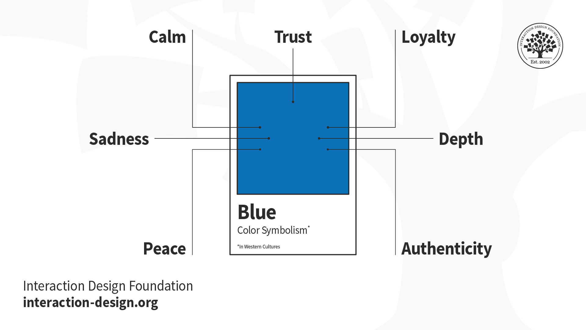
- Blue: Blue is calming, trustworthy, and secure. That’s why many banks and insurance companies use blue in their branding – they want you to feel safe and secure when dealing with your money.
- Green: Green is associated with nature, health, and wealth. It’s often used to promote eco-friendly products and portray a sense of freshness and vitality.
So, the next time you’re shopping, pay attention to the colors used in branding. They might just be influencing your perception more than you realize!

The Role of Color Psychology in Branding
Have you ever stopped to think about why certain brands use specific colors in their logos and marketing materials? Well, my friend, that’s where color psychology comes into play. It’s like the secret sauce of branding – the magic ingredient that makes you want to buy that fancy new gadget or luxury handbag.
Color psychology is all about how different colors evoke different emotions and reactions in people. It’s like a Jedi mind trick, but with more pastels. For example, did you know that red can make you feel hungry? That’s why all those fast food joints use it in their logos. Or how about blue, the color of trust and stability? No wonder banks and insurance companies love to slap it on their marketing materials.
So, when it comes to branding, choosing the right colors is key. You want to evoke the right emotions in your customers and make them feel all warm and fuzzy inside. Think of it as your brand’s own personal color therapy session. Go ahead, let that teal and magenta combo soothe your soul.

Cultural Associations and Color Symbolism in Logos
When it comes to designing a logo, cultural associations and color symbolism play a huge role in how your audience perceives your brand. Let’s dive into some examples of how different colors can convey various meanings in logos:
Red: Often associated with passion, energy, and action, red is a popular choice for logos that want to convey excitement and vibrancy. Just think about the bold red logos of Coca-Cola or Netflix!
Blue: Blue is a calming and trustworthy color, making it a top choice for logos in industries like finance and technology. Companies like Facebook and IBM use blue to instill a sense of reliability in their logos.
Yellow: Bright and cheerful, yellow is often used in logos to convey warmth and positivity. Brands like McDonald’s and Best Buy use yellow to evoke feelings of happiness and friendliness.

Creating Emotional Connections Through Color in Logos
When it comes to designing a logo, color plays a crucial role in creating emotional connections with the target audience. By choosing the right hues, you can evoke specific feelings and associations that will leave a lasting impression. Let’s dive into how different colors can influence our emotions and how they can be used effectively in logo design.
Red: This vibrant color is often associated with passion, energy, and excitement. It can grab attention and create a sense of urgency. Red is perfect for brands that want to convey a sense of action and dynamism.
Blue: Calm, trustworthy, and reliable – these are just some of the emotions that blue can evoke. Brands that want to establish a sense of security and professionalism often opt for this soothing color.
Green: Green is the color of growth, balance, and harmony. It’s often used by brands that want to convey a sense of sustainability and nature. With green, you can create a sense of freshness and vitality that resonates with your audience.
The Impact of Color Contrast and Harmony in Logo Design
Creating a logo that pops is important for any business. One of the key elements to consider is color contrast and harmony. These elements can either make your logo stand out or blend into the background like a high school wallflower.
Color contrast is like the salt and pepper of logo design – it adds that extra kick that makes your logo memorable. **Bold** colors that are opposite on the color wheel, such as red and green or blue and orange, create a visual punch that is hard to ignore. On the other hand, using colors that are too similar can make your logo look bland and forgettable.
Harmony in logo design is like a well-choreographed dance – all the colors work together in perfect unison. By using colors that complement each other, like a fine wine and cheese pairing, you can create a logo that is pleasing to the eye and easy to remember. A monochromatic color scheme, where different shades of the same color are used, can also create a sense of unity and cohesion in your logo.
So, whether you’re aiming for a bold and eye-catching logo or a harmonious and cohesive design, don’t underestimate the power of color contrast and harmony. Remember, a good logo is like a good joke – it’s all about the delivery!
FAQs
Why is color important in logo psychology?
Well, my friend, color has a way of speaking to our subconscious minds without us even realizing it. Different colors can evoke emotions, memories, and associations, so it’s crucial to choose the right hue for your logo to connect with your audience on a deeper level.
What emotions do different colors evoke?
Oh, colors are like little emotional ninjas sneaking into our brains and stirring up all sorts of feelings! For example, red can signal passion and excitement, while blue might make you feel calm and trustful. It’s like setting the mood for a first date, but with more Pantone swatches.
How can I choose the right color for my logo?
Consider your brand’s personality and the message you want to convey. Are you a fun and quirky ice cream shop? Maybe go for a playful pastel palette. Are you a serious law firm? Stick to strong, professional colors like navy or grey. Think of it as picking out the perfect outfit for your brand to wear to a party!
Can I use multiple colors in my logo, or should I stick to just one?
Hey, variety is the spice of life, right? Mixing and matching colors can add depth and complexity to your logo, just like adding extra layers of frosting to a cake (yum). Just make sure to maintain balance and harmony so it doesn’t end up looking like a chaotic rainbow explosion!
How can I test if my logo’s color is effective?
Get out there and do some good ol’ fashioned market research! Show your logo to a sample of your target audience and see how they react. Do they think your eco-friendly brand looks more like a toxic waste dump with that neon green? Or do they instantly crave a green smoothie and a hug from a tree? Their gut reactions will give you some valuable insight!
In conclusion, remember: it’s not just about looking good, it’s about feeling good too!
So the next time you’re designing a logo, don’t underestimate the power of color. Let your creativity shine through and watch as your logo becomes a true work of art, capturing the hearts and minds of your audience. And who knows, maybe your logo will be the next big thing to paint the town red…figuratively speaking, of course!


